Anna Jordan
Assistant Professor
Rochester Institute of Technology
Aisha Al Nouri, Jatin Joshi, Unika Dhakhwa
M.F.A. candidates
Rochester Institute of Technology
Design is a global language, yet beginning typography courses in the U.S. rarely teach beyond the Latin alphabet.
The topic of multilingual typography is largely confined to brief mentions in select textbooks, highly specialized design books, or rare elective courses available to very few students. Prior research underscores that awareness of the topic is essential for modern designers because visual communication operates across global contexts, yet it remains largely inaccessible to entry-level students. This study investigates whether short-format sprint workshops can effectively integrate multilingual scripts into foundational typography curricula.
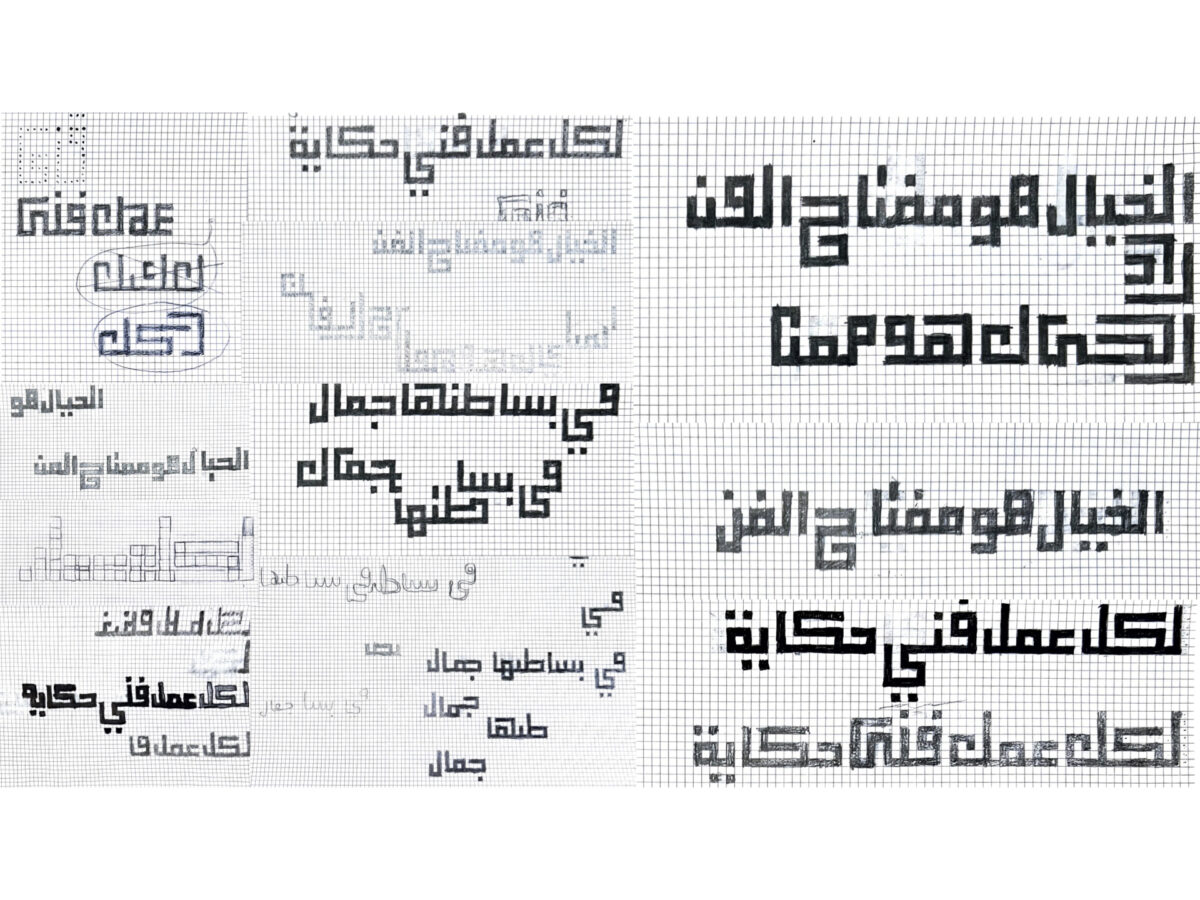
We found that multilingual scripts can be introduced into existing typography courses through short, structured workshops. We designed three single-class-session sprint workshops woven into a beginning typography course. Each workshop introduced a different script (Arabic, Hangeul, and Gujarati) and was led by graduate instructors with expertise in each script. The core approach was a “Learn-Play-Make” method that embraced the short format.
We focused on the visual and graphic qualities of the scripts rather than strict translation, while teaching foundational design skills applicable to typography across any language. The workshops produced distinct outcomes rooted in each script’s formal properties: connections in Arabic, geometry in Hangeul, and three-dimensional form in Gujarati. Students expanded their typographic visual vocabulary and grew more confident working with unfamiliar scripts.
Post-workshop surveys revealed four themes: students stepped outside Latin-centric thinking and recognized that design skills are not language-dependent; the sprint format reduced fear and made learning feel like play; even brief exposure sparked curiosity that extended beyond the classroom; and students grew more confident while expressing thoughtful ethical responsibility toward the cultures whose scripts they were working with. These findings demonstrate that multilingual typography can be effectively introduced within existing entry-level courses, offering a scalable way to prepare the next generation of typographers for the global design industry.
This design research is presented at Design Incubation Colloquium 12.3: Virtual Summer on Friday, June 26, 2026.