Molly Haig, Lecturer & Dr. Till Julian Huss, Professor
University of Europe for the Applied Sciences
Berlin, Germany
The study of media ecology offers design students vital insights into our culture, but like any detailed framework of ideas, these should be approached with precision, care, and scaffolding. Ecological thinking engages with the interconnectedness of complex systems, from the environment to technology and culture (Hörl 2017). Using ecological thinking as a conceptual entry point and typography as a visual one, we built a course that effectively engaged a cohort of international first-semester masters students in complex theoretical concepts by encouraging self-reflection and creative authorship.
The theoretical branch of the course involves lectures and discussions, engaging with theories of media ecology from their early anticipations (Kiesler 1939) to their defining approaches (McLuhan 1967, Strate 2017). Design is understood through the environment, or as transformation of lived environments (i.e. the Future Ecologies series ed. Löffler, Mareis, & Sprenger since 2021, and in a historical perspective Busbea 2020). Gibson’s (1979) concept of affordances, which Don Norman (2013) translated to a key principle for user-centric design, offers a bridge to design practice, and the theory of metaphors is introduced as a foundational mode of creative thinking.
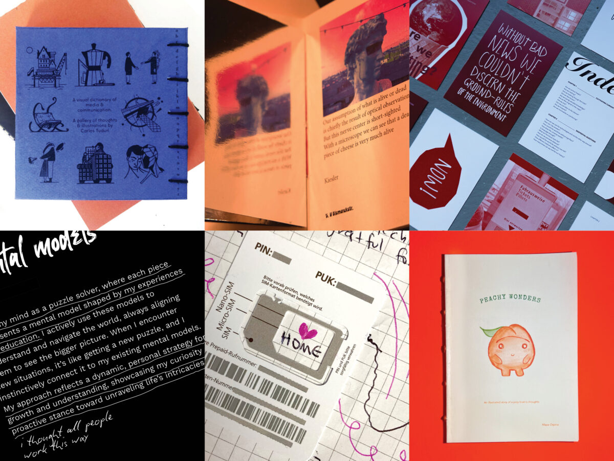
The practical branch of the course frames typography and publication as tools for conceptual analysis, integrating excerpts from the theoretical texts into increasingly complex visual assignments. Students also keep a scrappy physical journal or “commonplace book” with 30 entries, each linking an in-class idea to an external one. Each student’s final publication is an “autobiographical user manual” guiding the “user” through the course based on the student’s subjective experience.
Student work revealed unique representations of theoretical content and strong metaphorical thinking, and many projects were reflective of students’ fresh experiences of a new environment during their first semester in a foreign country. Publications ranged from a hand-bound dictionary of terms, to ChatGPT’s “diary,” to directions through a distorted Berlin, to thirty existential questions posed by a whimsical humanoid peach. We heard from many students who found the course structure engaging and welcoming.
Our theoretical/practical approach is supported by an abundance of research on the educational benefits of multimodal learning, or engaging with more than one “mode” of accessing information (i.e. Moreno & Mayer 2007, Serafini 2015) especially when studying in a second language (Yi & Choi 2015), as well as metacognitive reflection (understanding one’s own understanding of a topic, i.e. Cummings 2015).
Our course offers an example of how explorations of ecological thinking and typography can support each other, but more broadly how collaborations across disciplines can be mutually beneficial, and increase the accessibility of both.
This design research is presented at Design Incubation Colloquium 11.1: Boston University on Friday, October 25, 2024.