Lee is committed to making the field of art and design more diverse and inclusive with people from diverse ethnic, cultural, social, and economic backgrounds.
Taekyeom Lee
Assistant Professor
University of Wisconsin-Madison
The project, Tangible Graphic Design, was initiated during Taekyeom Lee’s graduate study. The eye surgery and the face-down recovery were life-changing experiences academically and personally. For a young graphic designer and an international student, it was a horrifying experience, especially the surgery. A gas bubble injected into the eyeball applies gentle pressure and helps the detached retina to reattach to the eyeball. It took almost three months to recover fully. After the surgery, Taekyeom Lee was fully healed, but it left minor vision issues. This invisible disability made Taekyeom Lee embrace the experience and initiate a new graphic design project with vision, tactility, design, and materiality.
Since graduation in 2014, Taekyeom Lee lost access to the ceramics facility. It inspired him to build DIY 3D printers to work with various conventional and unconventional materials in three-dimensional printing. The most exciting feature of these Do-It-Yourself 3D printers is that anyone can be a tool maker building affordable machines and customizing them for individual creative practices. The project was a self-funded low budget project. Since Taekyeom Lee SNS went viral, the project inspired many people across the globe to build their own 3D ceramic printers. During the artist in residency at the Internet Archive, Taekyeom Lee created and shared the detailed plan and instructions online to make it accessible to everyone.
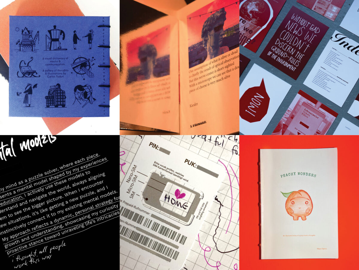
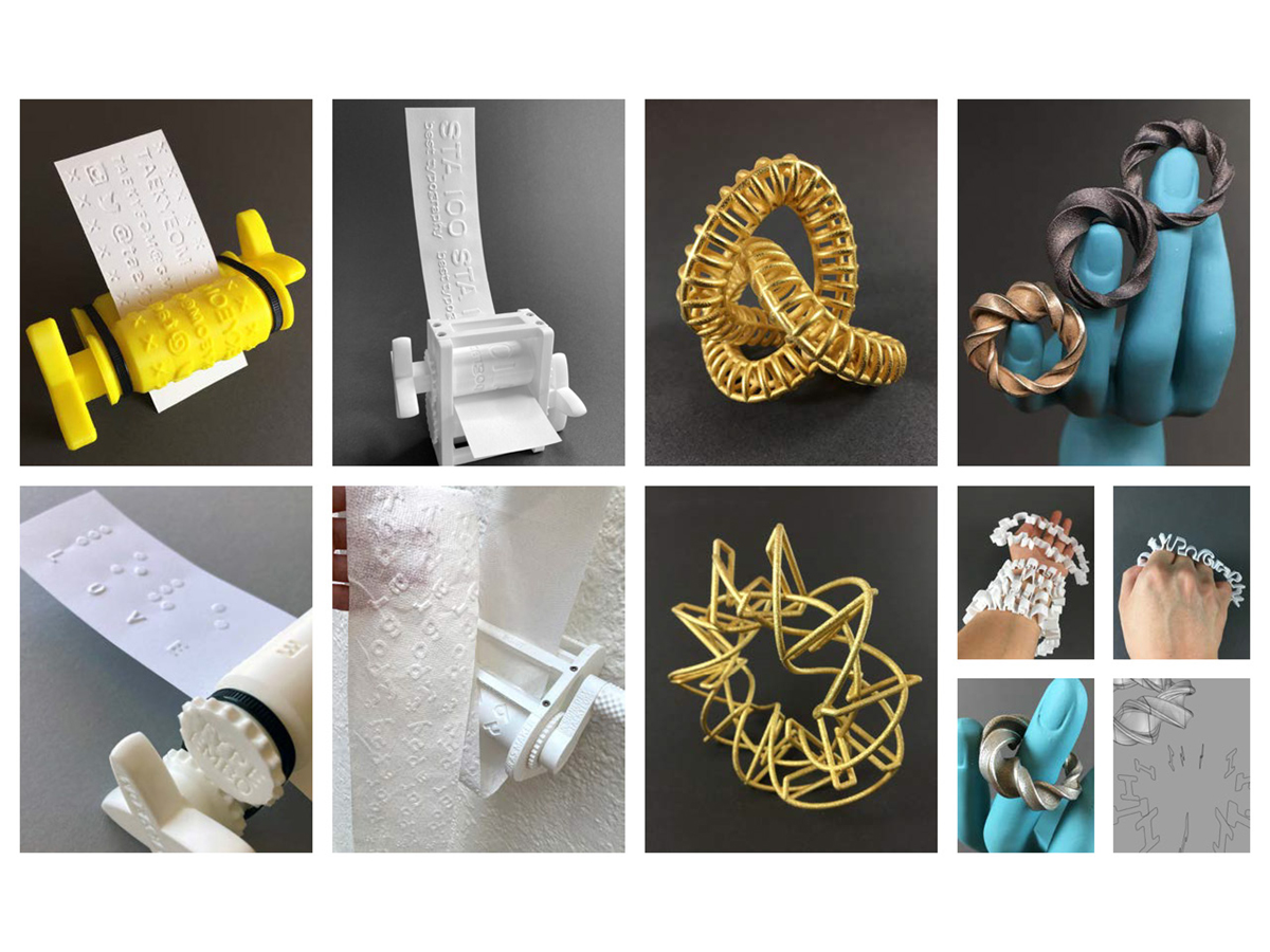
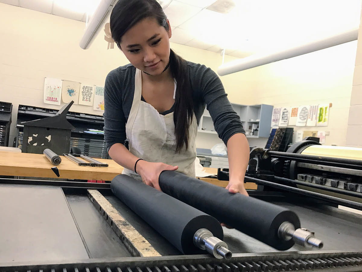
Designers can use various printing techniques to produce visual materials and solve visual problems. Since the invention of printing technologies, type designers have spent hundreds of years developing impeccably proportioned, beautiful typefaces to use on flat and static space and print technologies to support the perfection of printed materials. Digital fabrication can change the notion of printed text and how we experience materialized type since the tangible type does not lie on the static surface or live on-screen as a mirrored image. Digital fabrication, particularly 3D printing, has become more refined, common, and accessible. These new technologies have introduced new tools for pushing the boundaries of typography both in terms of concept and medium. 3D-printed tangible graphic elements acquire characteristics such as dimension, structure, materiality, and even physical interactivity. For this project, various conventional and unconventional materials in 3D printing were used to explore both the challenges and potential for typography. 3D printed tangible type not only amplified visual but physical interactions. The tangible type provides engaging tactile experiences, which would be more intuitive, expressive, and memorable.
Humans have five basic senses. Sensing organs send information to the brain to help us perceive the surroundings and the world. The sense of touch is the first sense to develop, and we have the largest sensing organ for touch as touch occurs across the whole body. Visuals and touch are closely linked together, although touch is fundamentally a non-visual perception. Touch can enhance and reinforce the user’s experience with the text, and the idea has been done with traditional printing methods.
The 3D printed embosser and other tangible graphic design applications combine both senses. The concept of the embossing technique can trace back to the cylinder seal, invented around 3500 BC to make an impression in wet clay. As this new embosser is portable, affordable, and customizable, there are a few possible applications. It can be used for participatory activities for promotional events and campaigns. It provided not only visual experiences but also engaging physical experiences. Not like today’s digital printing, the process involves a rich tangible experience, which is more intuitive, fun, and memorable. As the outcome provides a three-dimensional experience and substance, with braille, it could be developed for people with vision impairment.
Through his research, Taekyeom Lee has tried to bridge different areas of art and design. There are more design tools and processes in different industries, such as product design, architecture, sculpture, and metal smithing that have been working with various physical media. The tools and processes those areas have developed could be adapted to graphic design education. An extension of the project addressed how dimensional typography could utilize Rhino, computer-aided design (CAD) software, and Grasshopper 3D, a visual programming language run within Rhino, could be implemented in design processes and methods for typography in graphic design education. They bring extended physical experiences in typography from computer screen to physical space to enhance the interaction of typography directly. The outcome of the method was exhibited via many exhibitions.
Diversity is more than just a popular buzzword in discussions about art and design, and education. Taekyeom Lee is committed to making the field of art and design more diverse and inclusive with people from diverse ethnic, cultural, social, and economic backgrounds. As a first-generation college student and a foreign-born (Korean-born) designer, Taekyeom Lee wants to create opportunities to appreciate and embrace diversity and inclusion. Hangul Alphabet typeface highlights intercultural and bicultural experiences between Korean and English. Currently, Taekyeom Lee is working on a collaborative project with a group of design educators.He is very interested in supporting the new generation of artists and designers using emerging technologies such as 3D printing, digital fabrication, and creative coding.
The next chapter of my research is called Graphic Design for Accessibility, based on years of experience working with tactility as a graphic designer. Crafting better and more accessible experiences for people with low vision and vision impairment has been demanded. Fostering accessibility is inevitable. It will be developed as a regular course to embed my research and practice into my teaching and increase the understanding of diversity and inclusion for future graphic design students. The course will be an introduction to visual communication design for accessibility. Fostering accessibility in Graphic Design education is inevitable. This direction has excellent potential as a future design research project.
Biography
Taekyeom Lee is an educator, multidisciplinary designer, and maker. He is currently an Assistant professor of Graphic Design at the University of Wisconsin–Madison. He received an MFA degree in Graphic Design from the University of Illinois at Urbana-Champaign. His research explores unconventional materials and alternative solutions to create tangible typography, graphics, and even designed objects using digital fabrication. He infused 3D printing into his research and has been experimenting with various methods and materials. He presented through national and international conferences, including AIGA Design Conference, AIGA DEC, UCDA Design Incubation, DEL, ISEA, IEEE VIS, ATypI, TypeCon, Education Summit, Tipografia México, and NCECA. His work has been featured in various media. His research draws attention nationally and internationally. He exhibited his work and provided workshops and lectures across the country and abroad.