Visual authority can be used to validate any endeavor.
Claire Bula Adjunct Professor Boston University
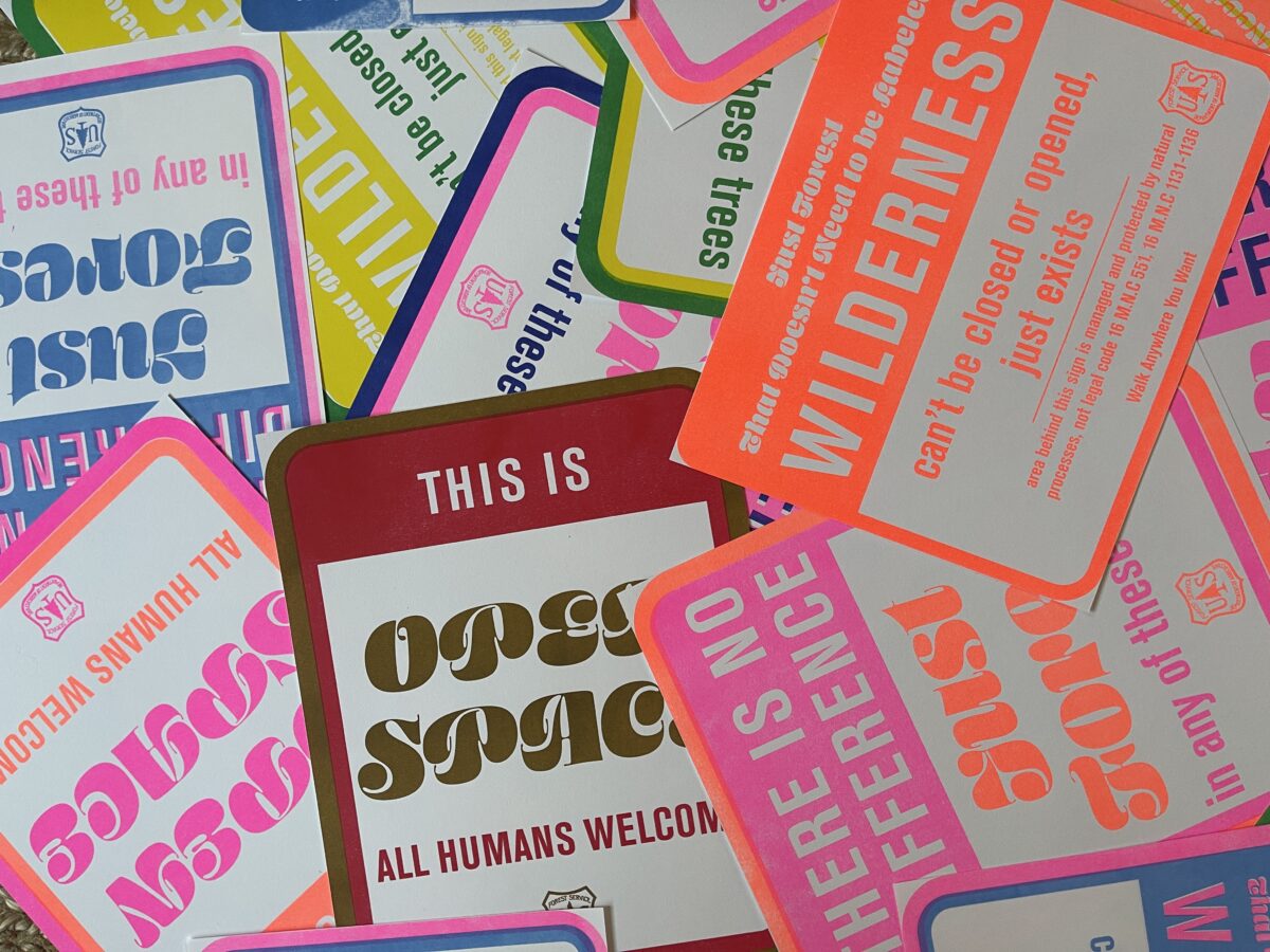
The visual design of all legal and political documents, such as deeds, permits, identification & maps, employ a specific visual language enhancing their power. Design choices relating to layout, typefaces, symbols, embellishments, impressions, white space, signatures/certifications, and materials amalgamate to display power purely through visual appearance.
Because the visual design of a document can confer authority regardless of authenticity, It is important to analyze how visual appearance alone can be interpreted. A visual language of power exists and can instill feelings of hesitation, dominance, or fear leading individuals into subservience or subordination. Visual authority can be employed by true legal sources of power or used as a device to deceive or invalidly show power. Visual authority can be used to validate any endeavor, whether its intent is beneficial and egalitarian or manipulative and oppressive. Designers should be aware of how the use of visually authoritative means have been used throughout history to control, intimidate, and outright steal basic human rights and dignities.
Through multidisciplinary research across history, philosophy, political science, and sociology, I studied the means by which power and authority have been constructed in the United States. In addition, reading design texts and conducting visual surveys of documents employing elements of visual authority led to the creation of a diagram of design elements that create the library for visual language of authority.
In response, I authored a visual essay, designed a poster illustrating visual authority’s form language via personal documents, and printed risograph signage subverting authoritative signage through type and color. This body of work serves to document my research and surfaces questions about how visual authority was developed and how it is employed today.
Made during research visits at university libraries in Texas and California, hubs of the Chicano movement.
Joshua Duttweiler Assistant Professor Texas A&M University-Corpus Christi
Alexandria Victoria Canchola Assistant Professor Texas A&M University-Corpus Christi
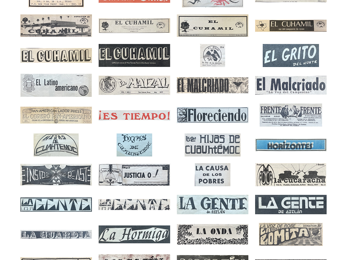
We demonstrate how the design of Chicano independent publication mastheads from the 1960’s and 1970’s in the United States used the visual language of the Chicano community to engage directly with their audience. In publication design, mastheads serve as the reader’s first indication as to a publication’s purpose and credibility. Our analysis of these independent publications is based on observations made during research visits at university libraries in Texas and California, hubs of the Chicano movement. Based on our research, the mastheads used typography, icons, and organization symbols to attract readers in service to the publication’s goals of raising awareness on local issues such as labor inequality and racial violence. The efforts made by these publications not only mobilized their audience to fight for social justice but utilized visual means as a way of uniting their readers toward a cause.
These Chicano publications, not typically referenced in the traditional white graphic design canon, provide an opportunity to learn from past designers in a parallel time of societal unrest and analyze their successful methods of advocacy and activism. The political climate of the time cultivated diverse printing practitioners; far different than the editorial staffs we see today. Activists, many without formal design training, worked to combine text and images into design that would speak to their audience. By observing the evolution of masthead design throughout the Chicano movement we can observe the progress of the publication designers’ skill as they sought to increase their audience and ability to communicate.
By understanding the role and unity of the visual language of independent Chicano newspapers, we encourage designers, historians, and students to further investigate the design semiotics of community-focused publications both within its historical context and contemporary practice.
22 cassette taped interviews with Black residents of Pontiac, Michigan from the mid-1970s
Kimmie Parker Assistant Professor Oakland University
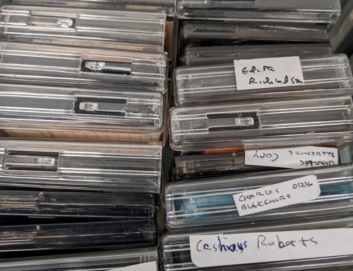
The Pontiac Oral History Archive, housed in Oakland University’s Kresge Library, contains 22 cassette taped interviews with Black residents of Pontiac, Michigan from the mid-1970s. To date, this archive has been largely inaccessible, available only to those who can come to our campus to listen to the cassettes. My collaborator, [name anonymized for peer-review], and I see immense value in this archive and have been working to create a public website to house the recordings, historical photographs, and other related artifacts.
For decades, Pontiac was a vibrant city with one of the largest populations of working-class Black Americans in the US; after the auto industry moved much of its operations away from the city, an already disenfranchised population struggled to move forward. Society then, as today, grappled with racism, racial inequality, socio-economic inequality, and police brutality. The stories on these tapes range from first-hand accounts of the Great Migration to industrial working conditions to racist encounters to social and family life in the 1970s. The voices of everyday people, particularly people of color, often go unheard. The preservation of and accessibility to these important historical accounts are critical as we work towards a more just society.
Since fall of 2021, we have worked on this project in collaboration with members of the Pontiac community and colleagues across our campus. We have obtained funding for the digitization and transcription of the cassette tapes, introduced students and community members to the archive, obtained permissions and made connections with living relatives, and began designing an online archival website. This interdisciplinary and wide-ranging process has become much more than a design project: this work lives at the intersection of design, community activism, historical preservation, and digital humanities. I look forward to sharing our work-in-progress as we strive to equalize access to these important voices.
Investigating how space, social consciousness, and populations interact between the relationship of individual-level actions and community-level outcomes
Mia Cinelli Assistant Professor The University of Kentucky
Shoshana Shapiro PhD Candidate University of Michigan
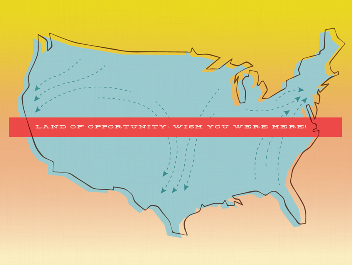
At the intersections of art, design, and sociology, “Addressing Opportunity: The Landscape of Inequality” is a collaboration between Shoshana Shapiro, PhD candidate in Public Policy and Sociology at the University of Michigan, and Mia Cinelli, Assistant Professor of Art Studio & Digital Design at the University of Kentucky. This series of designed postcards showcases the impact of individual actions on income inequality in the United States. These works explore narrative constriction and dissemination of data through visual sociology, which uses visual communication to convey or explore sociological concepts and relationships.
Addressing Opportunity examines how space, social consciousness, and populations interact by investigating the relationship between individual-level actions and community-level outcomes. Borrowing the visual language of postcards, this series references desired locations, geographic movement, and brevity of communication across distance. Subversively alluding to idealized imagery of mid-century suburbia, each postcard features information on income inequality relative to history, personal choices, and observed national trends. Using accessible exhibitions as a catalyst for discourse, these postcards are displayed as a narrative series, each revealing new information. In addition, these works are accompanied by free postcards for audience members to send, as well as a brochure on individual actions to consider.
This presentation explores the development of this body of work, as well as the opportunities presented by interdisciplinary collaboration between design and the empirical social sciences more generally. We consider our work in conversation with other narrative or data-driven projects such Dear Data and the Opioid Spoon Project, while works such as Postsecret, Zoe Leonard’s You see I am here after all or Robert Graves and Didier Madoc-Jones’s Postcards From the Future project set precedent for postcards as a discursive design medium. By designing artwork about data, we hope to make information accessible that can inform people’s decisions and engender positive change.
Students experience the natural world in the urban setting of New York City
Mark Randall Assistant Professor The New School, Parsons School of Design
As reflected in the fossil record, honeybees extend back at least 30 million years and were well established as Homo Sapiens emerged. One of the earliest known images of human/bee interaction is from an 8,000, year-old Mesolithic cave painting of honey hunters in eastern Spain.
Bees have not only provided honey and beeswax, they have impacted human society throughout history; creatively, culturally and spiritually. Bees are a powerful metaphor for life; a lens through which we can explore art, design, science and culture.
Building a single-subject course from such rich material, allows for a dynamic and vibrant multi-disciplinary classroom that engages a diverse cohort of design, science and liberal arts students.
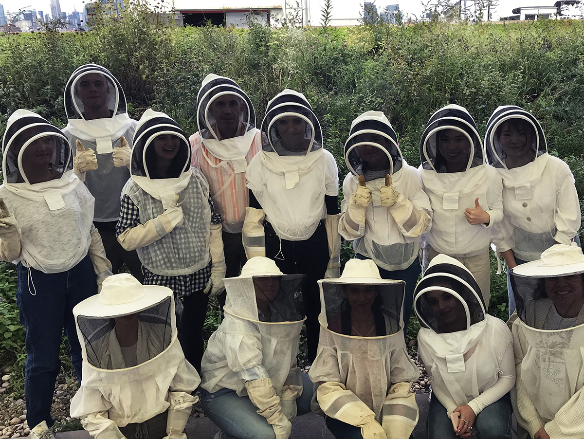
Based on student interest at Parsons School of Design, Honeybee Colonies: Art, Design, Science, and Culture was developed to explore the world of the honeybee in all of its complexity. Through science labs in bee biology, a bee-hunting field trip to Central Park, and a visit to a rooftop urban farm in Brooklyn, the course allowed students to experience the natural world in the urban setting of New York City. Guest lectures from designers, artists, an architect, and a filmmaker, demonstrated how bees have profoundly influenced their work.
Informed by their research and classroom experience, each student produced a final project on the subject of their choice. Diverse outcomes included, a line of honey-based skincare products inspired by ancient Egyptian beauty regiments; an agro-tourism business for the student’s family agricultural ranch in Puerto Rico; a cultural collection of honey recipes; and the design of a children’s community garden in Harlem. The universally positive course evaluations underscored students’ deep desire for interdisciplinary learning. This presentation will share how the studio space was activated through the multiple disciplines; and what specific methods and projects supported this approach.
Scholarship: Creative Works Award Runner Up
Jury Commendation for Diversity, Equity, and Inclusion
Scholarship: Creative Works: Expanding the Canon
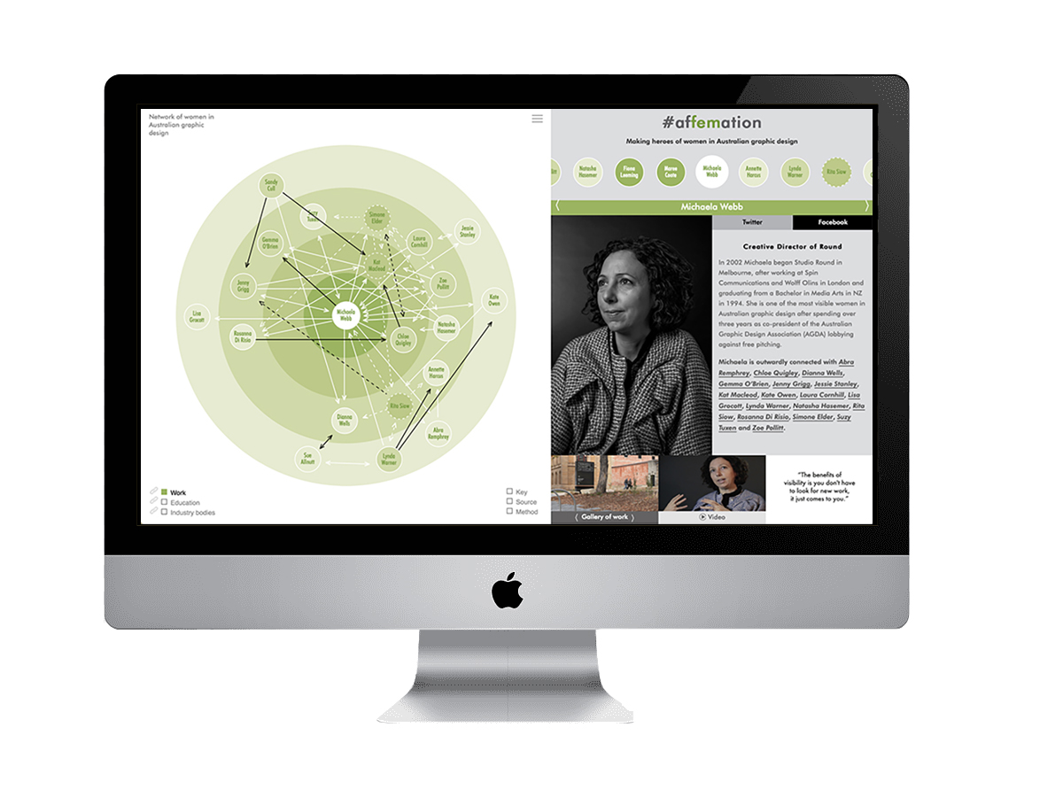
The afFEMation.com online, interactive, archive addresses the previous invisibility of women in the history of women in Australian graphic design.1 This problem was demonstrated in the low representation of women in the Australian Graphic Design Associations (AGDA) Hall of Fame which had only one-woman inductee prior to the site’s launch. However, since the launch three more women’s biographies have been added, one which cites afFEMation.com.2 The data set demonstrating this was published in the appendix of The View from Here.3
CONTRIBUTION
#afFEMation – demonstrating a framework for gender-equitable histories, is an article outlining a methodological innovation that emerged from an analysis of the site’s build.4 This framework consists of five steps designed to assist researchers, historians and archivists consider gender-equitable histories. The steps include systemized privilege checking and the prioritizing of recent histories.
AIM
Filling the gendered gaps in Australia’s graphic design history and increasing the visibility of women was the aim of afFEMation.com. Right through the UK, US and Australia women are graduating from graphic design qualifications in a high majority.[5] afFEMation.com was designed to make this new knowledge available as accessible and sharable portraits, biographies, galleries of work, videoed interviews and visualised networks.
SIGNIFICANCE
The significant and interactive design of afFEMation.com was reviewed by HOW Magazine as one of the ‘10 Best Design Websites’.6 The site was also launched at the Women in Design symposium and reviewed on-line as “thought-provoking”.7 Design industry blogs also published articles demonstrating the interest in equitable design histories, citing afFEMation.com.8
afFEMation.com was a collaborative project which profiled Michaela Webb, Annette Harcus, Lynda Warner, Rita Siow, Lisa Grocott, Abra Remphrey, Dianna Wells, Sandy Cull, Sue Allnutt, Fiona Sweet, Gemma O’Brien, Jenny Grigg, Jessie Stanley, Kat Macleod, Simone Elder, Chloe Quigley, Kate Owen, Laura Cornhill, Rosanna Di Risio, Suzy Tuxen, Zoe Pollitt, Natasha Hasemer, Fiona Leeming and Maree Coote. Research, writing, art direction, and design was by Jane Connory, photography, sound, and image recording by Deborah Jane Carruthers and Carmen Holder, assistance from William Aung, and website development by Danni Liu. Jane Connory (2017) “#afFEMation. Making heroes of women in Australian graphic design”, http://affemation.com (website accessed April 9, 2020). See more in Figures 1-12 in Documentation of the work itself. For evidence of the public launch at the Women in Design conference in Design Tasmania, 2017, see Document1_WomenInDesign.pdf in Other Uploaded Documents.
The AGDA Hall of Fame began in 1992 and was published in the AGDA award compendiums before being compiled on their current website. afFEMation.com is cited in Graham Rendoth (2018) “Annette Harcus”, https://www.agda.com.au/hall-of-fame/annette-harcus (accessed April 9, 2020). See more in Figure 13 in Evidence of Publication and Significance.
https://www.howdesign.com/web-design-resources-technology/website-and-responsive-design/top-10-sites-for-designers-october-2017-edition/ (attempted accessed April 9, 2020). Unfortunately, this online magazine has since gone into receivership and this link is no longer live.
Dr Jane Connory has a PhD from Monash University, Art, Design, and Architecture, which worked towards a gender-inclusive history of Australian graphic design. She was awarded a Master of Communication Design (Design Management) with Distinction from RMIT and has been a practising designer in the advertising, branding, and publishing sectors, in both London and Melbourne, since 1997. She has also lectured in and convened communication design programs in both the VET and Higher Education sectors since 2005. Alongside her research exploring the visibility of women in design, she is currently a lecturer in Design Futures and Design Strategy at Swinburne University of Technology.
Thank you to all the women profiled on the website including: Michaela Webb, Annette Harcus, Lynda Warner, Rita Siow, Lisa Grocott, Abra Remphrey, Dianna Wells, Sandy Cull, Sue Allnutt, Fiona Sweet, Gemma O’Brien, Jenny Grigg, Jessie Stanley, Kat Macleod, Simone Elder, Chloe Quigley, Kate Owen, Laura Cornhill, Rosanna Di Risio, Suzy Tuxen, Zoe Pollitt, Natasha Hasemer, Fiona Leeming and Maree Coote.
Photography, sound & image recording: Deborah Jane Carruthers & Carmen Holder, assistance from William Aung.
Website development: Danni Liu & ClickTap Digital Media.
Research supervision: Pamela Salen & Gene Bawden.
Research assistants: Rachael Vaughan, Luke Robinson, Kristy Gay & Nick Fox.
The growing global refugee crisis in the recent decade has reached a staggering height—in nearly 80 million displaced people, 26 million are registered refugees—and over half of the refugees are under the age of 18. The phenomenon of displaced people has existed since the dawn of human civilizations caused by wars, famines, mass migrations, pandemics, climate change, political persecutions, natural disasters, and more. In these calamities, children have been the first victims of conflict and displacement experiences. As of today, no digital platforms have been built for displaced children—the most vulnerable group who doesn’t have cell phones.
The Cradlr project was created in the hope of developing not only a digital tool but a vision for a global network that might help displaced children to overcome many adversities in life and receive more love and brighter futures. After examining historical evidence and current situations, this project goes beyond the realm of digital product design in an attempt to find a humanitarian solution for a complex social challenge. The final product embraces the connection and communication among the displaced children, their families and temporary guardians, education affiliations, international and regional organizations, as well as volunteers and donors. The stories and personal data of displaced children accumulated by adults are stored and protected by the Cradlr Network Database, which becomes a collective digital memory. Cradlr offers a blueprint whose purpose is to serve as a possible testing ground envisioning a digital network system that transcends political boundaries so that various parties can connect to rescue and nurture young lives collectively on a global scale.
* Cradlr is a United Nations Academic Impact (UNAI) project at Monmouth University.
Rationale
The seed of this project was sown two years ago when the designer started the Jiang Jian project [www.jiangjianz.com/eng]—a research and design project that sheds light upon the forgotten stories of Jiang Jian and the Mothers’ Movement in China during the Second Sino-Japanese War (1937-1945)—a major achievement of the Chinese Women’s Movement in the first half of the 20th century. Supported mainly by donations, the Mothers’ Movement rescued and educated 30,000 displaced children during the war. Based on this research, the designer learned many aspects of wartime refugees—forcibly displaced people—in China and complex stories behind the scenes. She soon started to question how other countries protected and rescued children at that time and acquired historical evidence in European countries during WWII. Through her study, some social patterns gradually unveiled, from which the inception of this project began to sprout.
Furthermore, the growing global refugee crisis has reached a staggering height in the recent decade. Lining up incidences from different regions and eras, the designer recognized ineffable human suffering repeated continuously in devastating and grotesque ways, such as mass killing, abduction, raping, child trafficking, the fact that refugee parents murdered or abandoned their children due to untamable obstacles, and so on.
Although incapable of stopping wars and adversities, the designer hopes to learn from facts and history to help displaced children today. In this digital age, many refugees have access to cell phones, so creating mobile apps to assist humanitarian work is not a novel idea. However, the project presented here goes beyond the realm of digital product design in an attempt to find a humanitarian solution for a complex social challenge by connecting various parties to rescue and nurture refugee children worldwide.
Jing Zhou is an interdisciplinary artist, designer, researcher, and Associate Professor at Monmouth University in New Jersey. She works at the intersection of visual and interaction design, interactive media, animation/video, and fine arts. Her work has been shown and collected internationally including: Triennale Design Museum, Milan; British Computer Society, London; Asian Cultural Center, Manhattan; SIGGRAPH Art Gallery; ISEA; IEEE; CAA; Les Abattoirs Museum, France; Royal Institution of Australia; Danish Poster Museum; Athens Digital Art Festival, Greece; Taksim Republic Art Gallery, Istanbul; FILE, Sao Paulo; Korea Visual Information Design Assn.; Stanford University; Yale University; public collection of the WRO Media Art Center, Poland; Waikato Museum, New Zealand; Moravian Gallery in Brno, Czech Republic; and Chinese Culture Center of San Francisco. Ms. Zhou has received many awards in the U.S. and Europe.
A research project with the intent of understanding the parallels between chefs and designers
Nicholas Rock Assistant Professor Boston University
Design is present in visible and invisible ways in contemporary society such that the term “design” has permeated everyday language—resulting in a situation where everyone knows what design is and no one knows what design is. Design is becoming further integrated with business, and socio-economic demands require a constant pursuit of data and technological advances while leaving behind the personal and social side of those same topics. Design is altering our human experience under the illusion of increasing our connectedness.
We have begun an examination of how design can enable a return to more meaningful connections with people. Since design as a concept is becoming increasingly universal, we are looking at it through the lens of something as culturally ubiquitous as food. How can our relationship with food inform our relationship with design in society? How might we improve our approach to how we both practice and teach design by investigating practitioners of gastronomy and culinary arts?
Our studio began this research project with the intent of understanding the parallels between chefs and designers—hoping to learn from the creative process of chefs pushing the limits of their profession as a way of advancing our own. Through a series of interviews and collaborative experiences, we have held conversations with designers, architects, chefs, restauranteurs, food historians, and farmers to better understand both a historical and contemporary relationship between food, design, and culture. We encountered a shared philosophy of creating opportunities for human connection. Using this insight, we are forming new design methodologies and altering our approach to design education.
We need to reinforce our connection to each other as human beings. If we return to this as a core principle in design practice and education, then we can create new opportunities to bring people together instead of driving people apart.
Teaching methods based on tutorials, cumulative projects, and concept based learning strategies.
Dannell MacIlwraith Assistant Professor Kutztown University
More and more colleges and universities are beginning to
explore offering traditional studio art and design courses online. At Kutztown
University, first year students are required to take an online Digital
Foundations course. This course gives a solid grounding in basic computer
skills, software knowledge, and visual thinking, a framework for more complex
areas of digital media. By giving the flexibility of an online class — students
can still have hands-on techniques, experience constructive critique, hand-in
physical prints, and have a good mentor/student relationship.
As the curriculum designer, I based my teaching methods
on tutorials, cumulative projects, and concept based learning strategies. The
short tutorials are designed to maintain attention. I have abandoned the
traditional discussion forums of online education, instead utilizing social
media for critiquing techniques. Finally, through surveys, quizzes and an
‘artifact’ project the faculty assess Digital Foundations for tweaking and modifying
for future sections.
Many colleges and universities are moving classrooms online for financial savings. What are the most effective strategies for teaching art & design online? What about ensuring the same rigor and quality as an in-person course? We’ll explore possible solutions to these problems that are facing the early pioneers of online education in design.
Min Choi Adjunct Professor San Diego State University San Diego City College
Low
vision is a part of the natural aging process, and we all have the potential to
face it at some point in our lives. Though there are many exceptional high-tech
devices to help people with visually impaired and blind, there has not been
enough attention given to applying accessible design when creating affordable
everyday products to benefit them. The
statistic shows that in the U.S., only around 30%1 of people with a
visual disabilities are fully employed, and cannot afford to buy assistive
technologies that may be awesome for them, but costs hundreds or even thousands
of dollars.
To
address this issue, I am researching how people with low vision could
experience high-contrast colors and basic shapes with tactility at a reasonable
price. In-person, human-centered design approach guided me to build a deep
empathy towards my audience and explore design process and solutions that would
help celebrate their disabilities.
A home
product line incorporates high-color contrasts and tactility using universal
symbols for people with visual impairment. It is an experiment to help them to
be independent and empower their everyday activities those of us with good
vision often take for granted—including eating, getting ready for bed, and
getting dressed in style.
At its
heart, we must identity what the audiences’ needs are—and the only way to
create design solutions is to connect with those who will benefit the most. Design
with purpose and function is beneficial for everyone—especially those with
disabilities.