Leslie Atzmon
Professor
Eastern Michigan University
According to the editors, Sami Sjöberg, Mikko Keskinen, Arja Karhumaa, the volume The Experimental Book Object considers how “historical and contemporary experimentation… has challenged what books are and could be from the perspectives of materiality [and] mediation.” Separating holy artifacts from mundane objects is one the most crucial mediations within most cultures—and it typically involves design. This mediation of materials commonly takes place through an elaborate series of ritual performances, some of which end up with a freshly designed sacred object.
In my chapter for The Experimental Book Object, “Gender, Transgression, and Ritual Torah Preparation,” I focus on the creation of a kosher Torah scroll. I am particularly interested in the highly scripted ritual performances, material processes, and acts of mediation that characterize the Torah scribing process.
This rule-bound undertaking—which involves interactions among the mundane materials used to make a kosher Torah scroll, the bodily and cognitive actions of its scribe, and the environment in which it is created—transforms a set of quotidian materials into a singular holy book object. Because the creating parameters are so strict, one could argue that a kosher Torah is not an experimental book. But I maintain that it is.
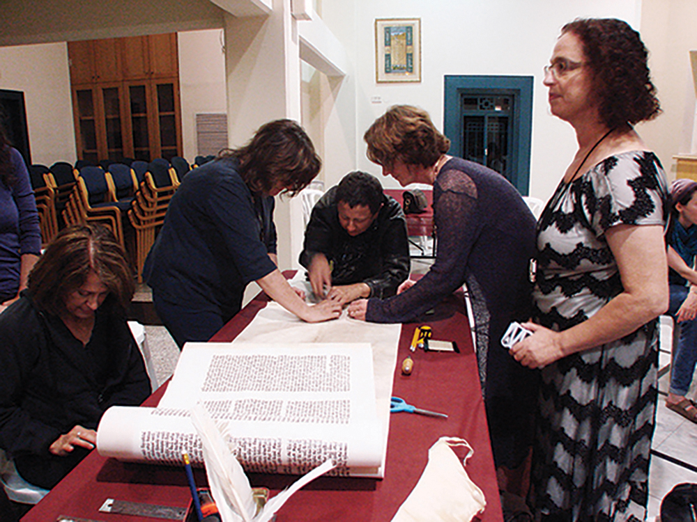
Making a kosher Torah scroll that is fit for ritual use is traditionally believed to be prohibited for women. I argue that this is due to women being considered contaminated two weeks out of every month due to menstruation. In this chapter, I use The Women’s Torah Project (2010)—which produced the first Torah written and embellished by an international community of women—as a test case for the role that gender or the gendered body might play in creating an experimental book.
I have long been fascinated by how designers use embodied thinking and making processes to transform raw materials into functioning objects. I have also been fascinated by the processes for making objects that are ostensibly imbued with holiness, such as a kosher Torah scroll. Exploring the relationship between these parallel processes taught me something about design and embodiment. Considering the role that bodily contamination plays in the Jewish bias against female Torah scribes, and realizing that the Torah scribing script is inherently ungendered, gave me new insights into how critical embodiment is to making processes. It also revealed that embodied making or ritual can be exclusive—or inclusive.
Writing this chapter also tested my response to the question “what makes an experimental book?” In The Open Book Project (2014) (https://infinitemiledetroit.com/The_Open_Book_Project.html), Ryan Molloy and I argue that experimental books challenge the definition of what a book can be, and that those who make experimental books interrogate aspects of book-ness. By this definition a Torah scroll is not an experimental book. In her Afterword for The Experimental Book Object, Johanna Drucker writes: “Leslie Atzmon’s discussion of the Women’s Torah Project…offers a significant insight into the way an act as basic as participation in the scribal production of a sacred text can be profoundly transgressive” (Drucker 2024, 306). By understanding making as an embodied process that involves the interplay of the scribe, materials, and environment, I argue that the transgressive act of a female Torah scribe challenges the making process and does interrogate book-ness. In this way, a Torah scribed by one woman or a group of women is indeed an experimental book.
Excerpt
Leslie Atzmon, “Gender, Transgression, and Ritual Torah Preparation” in The Experimental Book Object: Materiality, Media, Design, Sami Sjöberg, Mikko Keskinen, Arja Karhumaa, eds., London: Routledge, Copyright (2024), 216-217. Reproduced by permission of Taylor & Francis Group.
The guidelines for the Hebrew letter beit … illustrate the meticulous process to be used for drawing each letter, as well as the critical traditional relationships between each letterform and the other letters (Hebrew letter names are in italic):
Beit: One should take care that the part which protrudes behind is square, so that it will not resemble khaf. If it resembles khaf, it is invalid, and if it is unclear, one shows it to a child (as explained in siman 6). Ideally the right-hand side of the roof has a little prickle pointing to the right and the left-hand side has a little prickle pointing upwards. According to the kabbalah [mysticism, or tradition] it has a thick heel at the bottom so that it resembles a dalet in the throat of a vav; if so, it must be squared at the top to resemble dalet, and have a substantial heel at the bottom which would be the head of the vav. Its height and width should both be three nib-widths, and the gap in the middle should be one nib-width wide (Darkhei Moshe) (Keset Ha Sofer as quoted in Taylor Friedman).
Each letter has specific detailed scribing rules like these ones for beit. Each letter must also have a certain amount of white parchment showing around it. The white spaces within and between letters are analogous to the white fire of the primordial Torah discussed in the previous section, and this letterspacing is integral to a Torah being considered kosher.
This project was the 2024 Design Incubation Educators Awards winning recipient in the category of Scholarship: Publication.
Biography
A designer and design historian, Leslie Atzmon writes on both experimental books and design and science.
In 2014, she edited The Open Book Project book, featuring a critical Introduction by Atzmon, a related exhibition catalogue, essays on the book, and an experimental book design workshop section. Currently she investigates the intersections between design and science.
In 2016, Atzmon was in the UK on a Fulbright fellowship at Central Saint Martins, UAL doing research on Darwin and design thinking.
In 2019/2020, she curated the exhibition Design and Science, which ran at Eastern Michigan’s University Gallery and The Esther Klein Gallery/Science Center in Philadelphia. Atzmon also edited a collection entitled Design and Science (Bloomsbury 2023). This collection examines overlap between design and science through visual metaphor and modeling; biomimicry and biodesign; makers and users; and data manifestation. Atzmon is working on a biodesign textbook with Professor Diana Nicholas of Drexel University.