Dr. Christopher Dingwall
Assistant Professor
Washington University in St. Louis
Dr. Bess Williamson
Professor
North Carolina State University in Raleigh
Dr. J. Dakota Brown
Visiting Associate Professor
University of Illinois, Chicago
Amira Hegazy
Adjunct Assistant Professor
University of Illinois Chicago
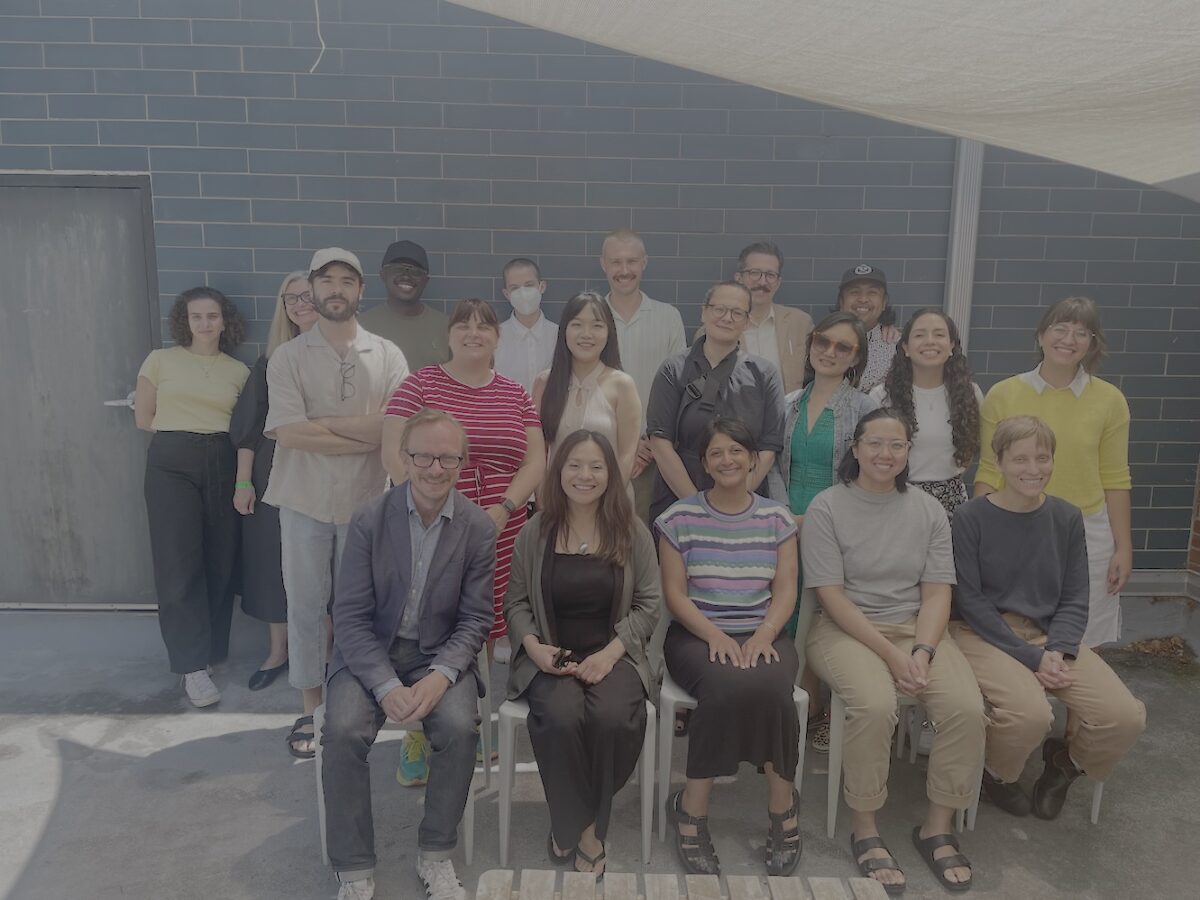
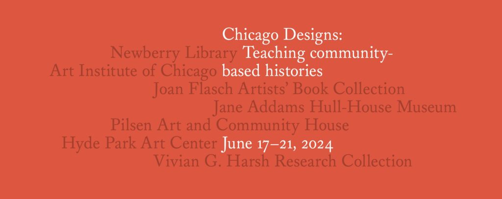
Chicago Designs: Teaching Community-Based Histories is a workshop that promotes the teaching of local design archives in studio and classroom instruction at the college level. First held in June 2022, the workshop provides a dynamic forum for university teachers to develop more inclusive approaches to teaching design history in a variety of pedagogical settings and through a range of disciplinary lenses. For its second iteration in June 2024, we welcomed fifteen participants from around the country to explore methods of archival pedagogy in Chicago. In two virtual meetings afterward, participants developed teaching materials to bring design archives into their own classrooms.
Chicago Designs joins a broader movement of scholars and practitioners who are expanding the definition of design history beyond established canons that emphasize the commercial output of mostly white or European men. Because the teaching of design history is not yet firmly established in either design schools or humanities departments in the United States, we organized the workshop to help teachers gain facility in archive-based pedagogy: the art and craft of using archival materials to make history come alive. Combining hands-on archival exercises, seminar-style reading discussions, and peer mentorship, the workshop provides a rare opportunity for teachers in design and in the humanities to learn from each other while modeling community-based design research.
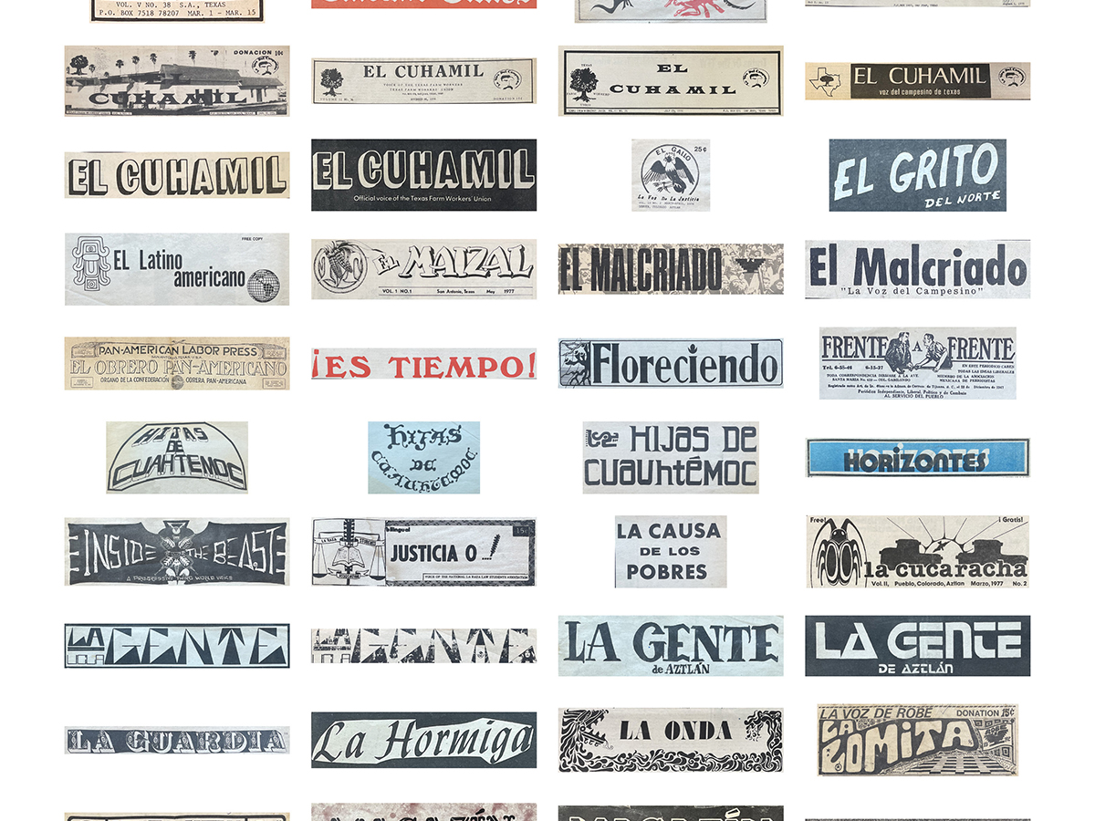
The interdisciplinary approach is represented by the workshop organizers: two historians who study design (Williamson and Dingwall) and two designers who center historical research in their practices (Hegazy and Brown). Together we led site visits, discussions, and exercises at major museums and libraries as well as community arts organizations. At each site, participants explored the significance of design to Chicago history from its rise as a hub of global consumer capitalism to the level of everyday neighborhood life. Ranging from themes of labor activism in printing trades to the typographic politics of graffiti and commercial sign painting, our five days of activities showed participants design histories from the bottom up while surveying the city’s rich landscape of archival collections and practices.
Our institutional host and base of operations was the School of the Art Institute of Chicago, where we met the first morning to discuss readings that set the intellectual and practical agendas for the week. What is design history? What does it mean to make that history inclusive of diverse design cultures? How can archival materials advance those goals in the classroom? In our afternoon session, we visited the Newberry Library — a major repository of Chicago social and cultural history – where J. Dakota Brown and curators Paul Gehl and Jill Gage led a workshop on the labor history of print culture in the city. On Tuesday, we visited the Jane Addams Hull House Museum where Bess Williamson led a discussion on accessible teaching followed by a tour of the museum and critical discussion about historic house museums as an archive for design and immigration histories. On Wednesday, Amira Hegazy led a visit to Pilsen Arts and Community House focused on the history and impact of Chicago gang writing and printing with graffiti writer Sir Charles, followed by an afternoon exercise in neighborhood-based design study. On Thursday, Bess Williamson led a visit to the Art Institute of Chicago for discussion of design and library management with curator Leslie Wilson followed by a gallery teaching exercise with curator Elizabeth McGoey, followed by an afternoon visit to Joan Flasch Artists Book Collection to examine its zine collection. On Friday, Chris Dingwall led a visit to Hyde Park Art Center where textile design and fabric artist Robert Paige and curator Allison Peters Quinn guided us through Paige’s exhibition (The United Colors of Robert Earl Paige), followed by an afternoon visit to the Vivian G. Harsh Collection of African American History where Dingwall and archivist Beth Loch modeled an archival exercise featuring print culture from Chicago’s Black Renaissance.
Building a cohort was one of our major ambitions and accomplishments. Selected from an open application call, our fifteen participants consisted of university teachers in design schools and humanities departments as well as museum educators. After the week in Chicago, we reconvened twice virtually to share and develop curricular projects that connect archival materials with their teaching goals. Projects include:
- Design history modules based on artifacts that represent diverse racial and ethnic histories
- Field-based observation exercises connecting with neighborhoods, local media, and non-human species communities
- Study trips and out-of-class experiences for art and design students in Chicago, Baltimore, Fresno, San Francisco, New York, and Philadelphia
- Critical theory and research modules on community-based design and artifact interpretation
- Classroom and public engagement projects in identity design, interactive exhibition design, and accessible media
We envision the workshop as a living resource. The teaching projects are publicly available as an online resource hosted by the Design Museum of Chicago. It is a resource for educators to understand how to effectively utilize collections and engage in communities where they teach. These projects applied the workshop’s themes to their own teaching environments internationally and in online communities. In addition to the teaching resource, the website features a scholarly bibliography as well as descriptions about each of the sites visited during the workshop with the goal of raising their profile for design history study.
Chicago Designs is an effective model for supporting the teaching of design history by providing educators a space to learn new teaching methods, develop teaching materials, and build professional networks. Thanks to funding from the Terra Foundation of American Art, each participant received a stipend of $250, as well as support for travel up to $600. We prioritized supporting contingent faculty and graduate student participants by providing them with an additional stipend to offset the costs that are generally covered through academic salary research benefits. Our application review process was centered around ensuring a diverse cohort with at least one third of the participants coming from non-tenure track positions to be able to emphasize and build mentorship and professional development opportunities.
This project was the 2023 Design Incubation Educators Awards runner-up recipient in the category of Teaching.
Biography
Dr. Bess Williamson is a historian of design and material culture and Professor of Art History, Theory, and Criticism at the NC State University in Raleigh. She is the author of Accessible America: A History of Disability and Design (2019) and co-editor of Making Disability Modern: Design Histories (2020). Her work explores diverse histories and practices of design that extend expertise to users and communities, and challenge designers to address access and power in their work.
Dr. Christopher Dingwall is Assistant Professor of Design History in the Sam Fox School of Design and Visual Arts at Washington University in St. Louis. He is a historian of American and African American culture, with interests in material culture, political economy, and race. He is currently working on Black Designers in Chicago (for the University of Chicago Press), a chronicle of African American artists and craftspeople in the American design industry during the twentieth century. This project began as an exhibition at the Chicago Cultural Center in 2018 and is supported by the Terra Foundation for American Art and the Graham Foundation for Advanced Studies in the Fine Arts.
Dr. J. Dakota Brown teaches and writes on the intertwined histories of design, labor, and capital. After studying graphic design at North Carolina State University, he completed an MA in visual studies at the School of the Art Institute of Chicago. In 2022, he graduated from Northwestern University’s PhD program in Rhetoric and Public Culture. He is currently a visiting associate professor at the UIC School of Design. Dakota’s writing has appeared in Jacobin, Post45, and the edited volume After the Bauhaus, Before the Internet: A History of Graphic Design Pedagogy. A short collection of his essays was recently published in Portuguese translation by Brazil’s Clube do Livro do Design.
Amira Hegazy is an artist and design historian investigating the relationship of design artifacts to memory, belonging, and community identity. Trained as a printmaker and book artist, Amira earned her MFA from the School of the Art Institute of Chicago. She teaches design practice and theory at the University of Illinois Chicago as an Adjunct Assistant Professor. She is the curator of Letters Beyond Form: Chicago Types at the Design Museum of Chicago supported by the Terra Foundation for American Art. The exhibition centers the typography in Chicago’s diverse neighborhoods to illuminate design legacies and their contemporary echoes, especially alternative modernisms and love as an organizing principle in design. Amira has exhibited her visual work at the International Print Center of New York, The Grolier Club, The William King Museum of Art, Hyde Park Art Center, Bird Show Chicago, and other venues internationally.