Subject, Material, Tool: A Strategy for Harnessing the Visual Communication Possibilities of Physical Materials

A set of limitations designers can play with in order to get the most image-making possibilities out of any given material

Anne Jordan
Assistant Professor
Rochester Institute of Technology

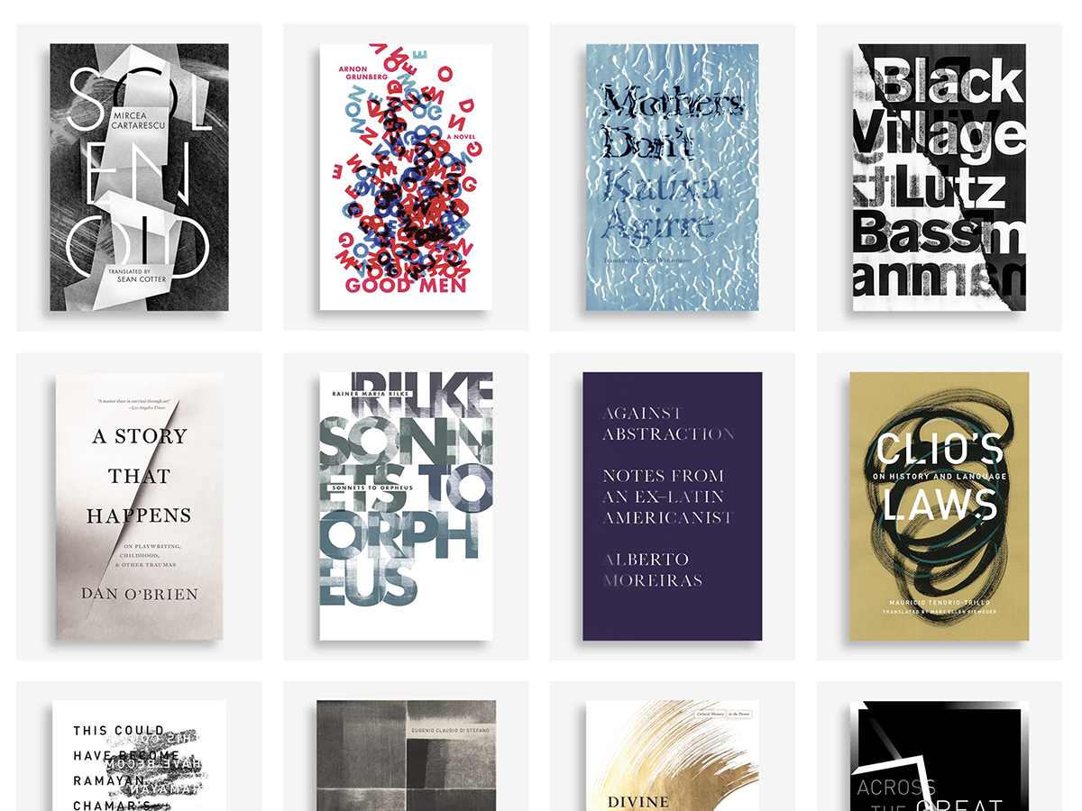
I am a book cover designer. My work consists primarily of typography as image. I aim to find that perfect point of verbal-visual connection, where what the title says and how that typography was made snap into place to reinforce each other. I do this by incorporating image-making techniques that harness the visual communication possibilities of physical materials.

Over the past fifteen years, I have developed a unique process to turn these physical materials into engaging digital images that I call “Subject, Material, Tool.” This process is a structured way to create images in which the materials used to make the images both form and inform the meaning of the typography.

“Subject, Material, Tool” is a set of limitations designers can play with in order to get the most image-making possibilities out of any given material. Essentially, it prompts designers to examine each material through three distinct lenses: as a subject, as a raw material, and as a tool. My presentation will demonstrate exactly how “Subject, Material, Tool” works via a series of applied case studies in book cover design.

I am also a design educator at the graduate level and have used “Subject, Material, Tool” as a creative prompt in the classroom with great success. My students have benefited from learning “Subject, Material, Tool” because it provides them with a concrete strategy for coming up with ideas and creating images, significantly improving their creativity in the image-making process. I will share several examples of student work as evidence of such.

Image-making, the verbal-visual connection, and type as image are topics that have been well researched by colleagues such as Nancy Skolos and Thomas Wedell, Cassie Hester, Annabelle Gould, Renee Seward, Keetra Dean Dixon, and others. This is for good reason, because finding an ideal verbal-visual connection is one of the biggest challenges designers face. “Subject, Material, Tool” fits into this area of research, but is different from existing research. “Subject, Material, Tool” is a new take on the image-making process, offering a unique structure and point of view, therefore adding valuable scholarship to this important area of research.

This presentation will be directed at design educators looking for ideas about teaching process in their classrooms. “Subject, Material, Tool” is specific enough to be helpful, but open enough that it can be broadly used across many areas of art and design.

This design research was presented at Design Incubation Colloquium 9.1: Kent State University on Saturday, October 15, 2022.

Explorations of Data Lists: How Type, Hierarchy, and Color Reveal the Stories About the Titanic

Level one typography students think about data and typographic hierarchy.

Peggy Bloomer
Adjunct Professor
Quinnipiac University
Southern Connecticut State University

In this project I hoped to make level one typography students think about data and typographic hierarchy with. In my experience, students are not concerned about the data that is collected about them. I hoped to broaden their understanding of the power of data through their creation of a large format poster (24” x 26”) using lists about the passengers on the Titanic purchased from the “Encyclopedia Britannica.”

The textbook for the class is Ellen Lupton’s Thinking About Type. This assignment is an adaptation of Lupton’s hierarchy assignment “Long Lists.” According to Lupton, hierarchy is the organization of content using the spatial clues of indents, line spacing and placement. Other graphic elements that distinguish content include size, style and color.

Researching the list of passengers, students were asked to find human stories. The lists contained information about 1st, 2nd, 3rd class passengers and employees of the Titanic. Surnames, servants, gender, age, nationalities and origin of embarkment were provided. The poster was created in InDesign without photographic images. Students could use and InDesign tools to create color elements and many created ships, funnels, waves and other shapes.

The traditional process of information gathering, sketching and mocking up was used for designing the posters. In-class critiques of 3 smaller 11 x 17” versions helped students realize what was successful or not. Final versions were created to the larger size, printed, presented in class and hung in the department hallway for viewing.

In conclusion, most students realized the economic and gender consequences for passengers. One student used color to emphasize families and the impact was powerful: families died from infants to parents. The students gained knowledge about the power of simple data and almost all of them used size, style and color effectively. The use of indents, line spacing and style guides were not as successful. In the future, I plan to incorporate a slide show of memorials that include powerful images such as Flanders Field, The Vietnam Memorial and the Holocaust Memorial.

This research was presented at the Design Incubation Colloquium 6.1: Quinnipiac University on October 5, 2019.