Narges Sedaghat
Graduate student
East Carolina University
In an increasingly globalized and diasporic world, the negotiation of cultural identity has become a central concern in design. Scholars such as Homi Bhabha and Stuart Hall have theorized identity not as a fixed essence but as a fluid process shaped by historical and aesthetic negotiations. Visual culture, particularly typography, can play a critical role in reinterpreting heritage within new cultural frameworks. This project explores how typography and interactive media can bridge Iranian cultural heritage and contemporary American aesthetics, contributing to broader conversations around hybridity, migration, and representation.
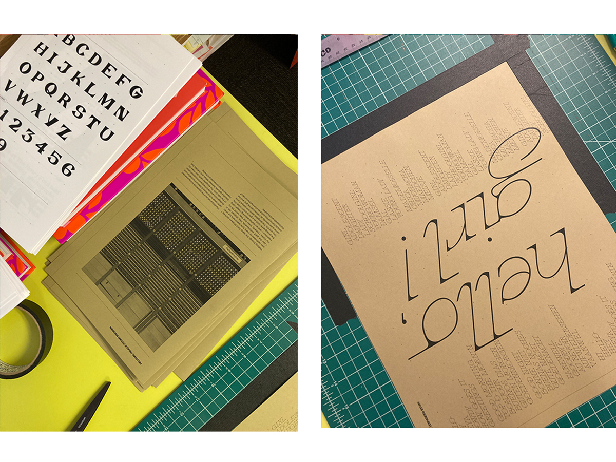
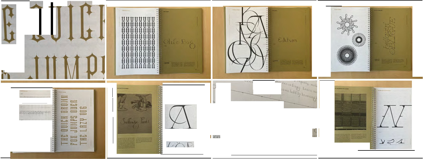
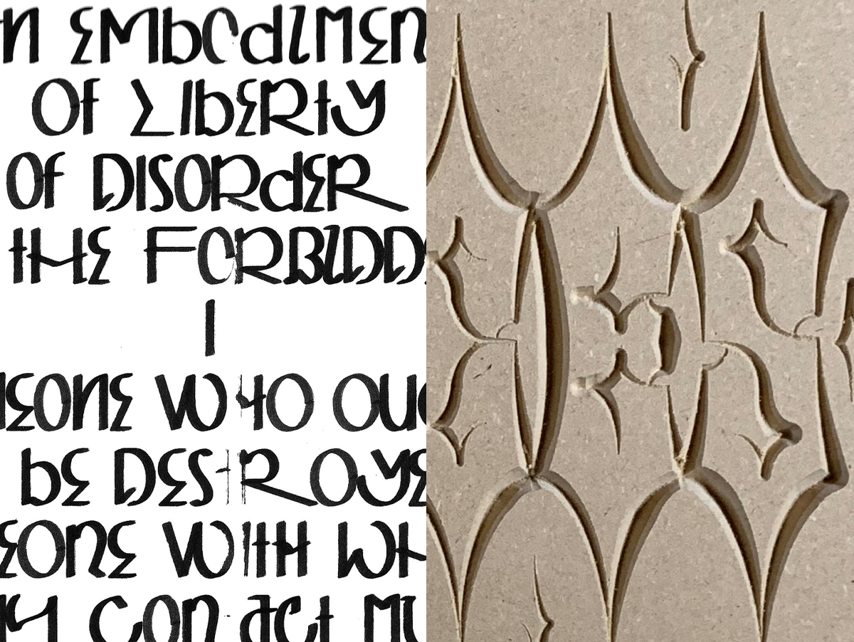
The project unfolds in two interrelated phases. The first phase focuses on type design as a medium for cultural storytelling. A full English A-to-Z typeface was developed, inspired by ancient Persian motifs, particularly the Achaemenid lotus. This typeface merges traditional Iranian elements with modern typographic forms, reframing Iranian identity not as fixed or nostalgic, but hybrid and dynamic, aligned with Bhabha’s concept of the third space that conceptualizes identity as a process shaped by hybridity and negotiation.
The second phase of the project centers on participation and interactivity. It takes the form of a web-based experience built with p5.js, where users type their names using the custom font. This action triggers a system that algorithmically generates Iranian-inspired motifs. Users can download or print their designs as postcards, transforming the experience from passive viewing to active participation.
By creating a custom typeface, this project aims to bridge Iranian heritage and contemporary design. This typeface serves as a tool for cultural exchange, and by inviting user interaction, the project becomes a participatory platform. It illustrates how design can embody migration, hybridity, and transformation. Ultimately, this research positions visual design not only as a means of cultural preservation but as a forward-looking method for negotiating hybrid identities and fostering inclusive, multisensory storytelling.
This design research is presented at Design Incubation Colloquium 11.3: Virtual Summer on Friday, June 20, 2025.