Mark Addison Smith
Associate Professor
DePaul University
On November 23, 2008, in the Chicago downtown loop, while hurrying to catch the subway, a young woman approached Mark Addison Smith and asked for a cigarette. “I don’t smoke,” he said. She snapped her fingers and replied: “Ahhh, you look like the right type.” Suddenly and strangely inspired by the exchange, he raced home and illustrated their brief conversation with expressive hand lettering, and a daily artistic practice was born.
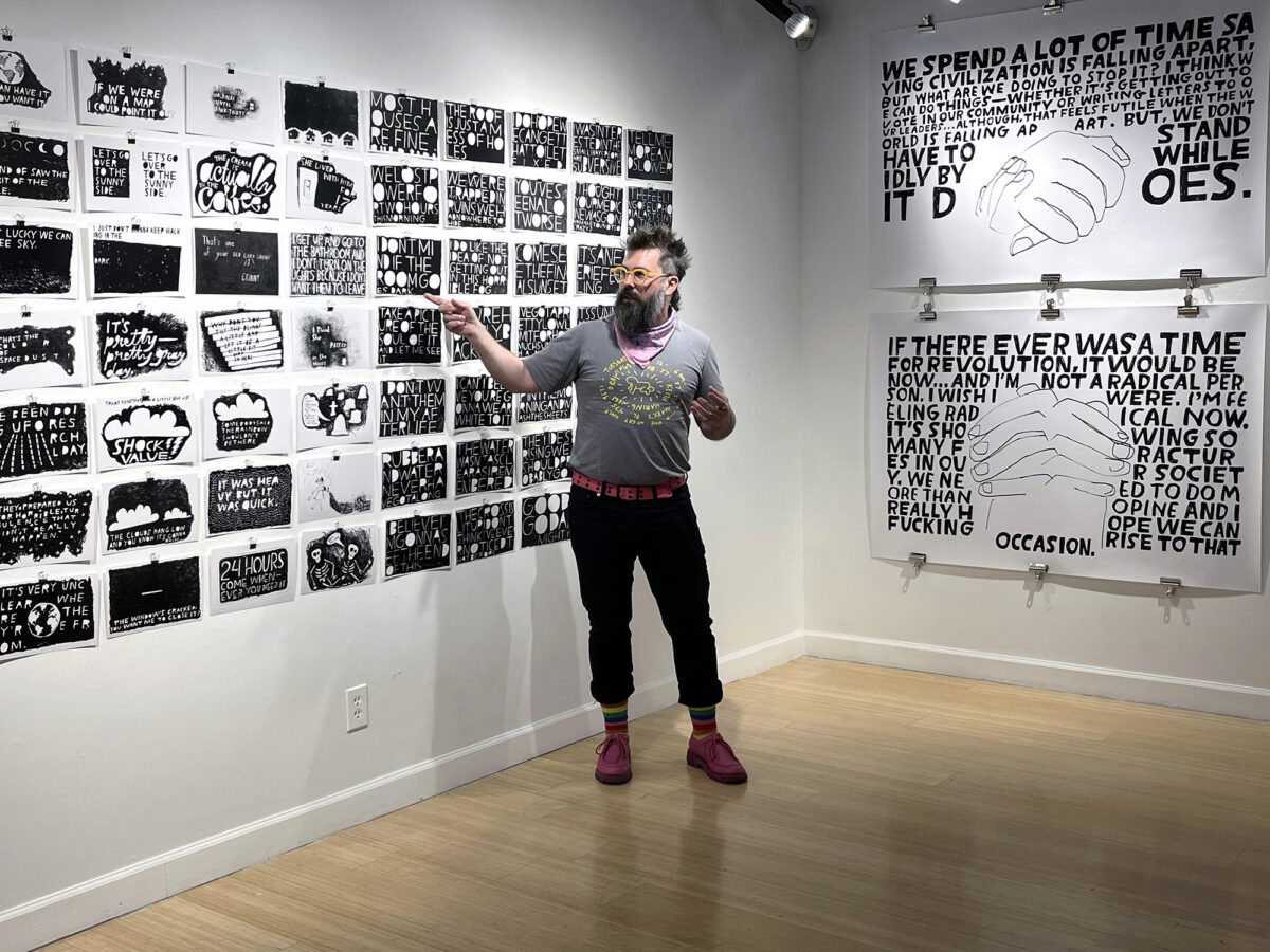
In a daily ritual since 2008, Smith redraws exact-dialogue fragments of overheard conversations as 7×11-inch India ink works-on-paper, combining verbatim, hand-drawn text with visual and tonal embellishment; he often draws more than one quote per day. For gallery installations and artist’s books, Smith edits the single drawings into larger, theme-based conversations between people who have never met or exchanged words. When amassed together as modular narratives, the black and white drawings—voiced by strangers and collectively titled You Look Like The Right Type—share grayscale conversations across time, place, age, and gender (the who, what, when, where, why, and how of documentary storytelling). And the audience, as interlocutor, triangulates the conversation by reading that which was once spoken (a tenet of grammatology) and making their own non-linear, grayscale associations between text, image, and completion of what’s left unsaid.
https://www.markaddisonsmith.com/you-look-like-the-right-type
November 2023 marked the fifteenth anniversary of Mark Addison Smith’s You Look Like The Right Type archive, now containing over 6,000 works-on-paper; he has never missed a day of eavesdropping and drawing other people’s words since he first began this series.
Select exhibitions:
In 2023, McMaster Gallery, within the School of Visual Art and Design at the University of South Carolina, celebrated the fifteenth anniversary of You Look Like The Right Type with an exhibition of Smith’s drawings, artist’s books, and sketchbooks. The exhibition spotlighted drawings Smith generated during the 2020 COVID-19 lockdown, in which he held remote conversations with strangers across the world and translated their words into drawn, visual essays of how they were grappling with the pandemic.
In 2019, The Bakery Atlanta, co-presented by Atlanta’s Eyedrum Gallery, celebrated the tenth anniversary of You Look Like The Right Type with an exhibition of 365 drawings.
Other solo exhibitions include Chicago’s Center on Halsted Gallery, where Smith showcased the original 24 drawings from his Years Yet Yesterday drawing series, sourced in language spoken by gay rights activist Larry Kramer, to commemorate World AIDS Day.
Group exhibitions include the Center for Book Arts in New York, Co-Prosperity in Chicago, Hegyvidék Gallery in Budapest, the Kinsey Institute in Bloomington, Leslie-Lohman Museum of Art in New York, and Minnesota Center for Book Arts (MCBA).
Mark Addison Smith’s type specimens and broadsides are included in the permanent collections at Emory University, the Kinsey Institute, Leslie-Lohman, Ringling College of Art and Design, and Virginia Commonwealth University.
Select interviews with Mark Addison Smith about this work:
Steven Heller, “The Daily Heller: Drawing to Manage Stress,” PRINT, July 1, 2022.
Debbie Millman, “Illustrating Sound,” The Mic, produced by NYCxDesign, episode one, October 30, 2020.
Mark S. King, “This gay artist draws what he (secretly) hears you say on the streets,” Queerty, September 5, 2020.
Steven Heller, “The Daily Heller: Typographic Eavesdropping,” PRINT, May 5, 2020.
Kathryn Weinstein, “Sharing Loudly,” Designer, University & College Designers Association, Volume 24, Number 2, Summer 2017.
This project was the 2023 Design Incubation Educators Awards winner recipient in the category of Scholarship: Creative Works.
Mark Addison Smith is a queer artist whose design specialization is typographic storytelling: allowing illustrative text to convey a visual narrative through printed matter, artist books, and site installations. With his on-going, text-based archive, You Look Like The Right Type, he has been drawing snippets of overheard conversations every single day since 2008 and exhibiting the works as larger-scale conversations between strangers exchanging words on topics never spoken. You Look Like the Right Type has been featured in All Things Letters, Deadline, Design Sponge, Goodtype, Hyperallergic, I Love Typography, PRINT Magazine’s The Daily Heller, Queerty, MAGMA Brand Design’s Slanted Magazine, and in conversation with Debbie Millman for the very first episode of NYCxDesign’s podcast, The Mic. His artist’s books are housed in over 80 permanent collections and library archives, including Brooklyn Museum Artists’ Books Collection, Center for Book Arts, Cooper Hewitt Smithsonian Design Museum, Getty Research Institute, Guggenheim Museum Library and Archives, Joan Flasch Artists’ Book Collection, Library of Congress, The Metropolitan Museum of Art Thomas J. Watson Library, MoMA Franklin Furnace, Museum of Contemporary Art (MCA) Chicago, ONE National Gay and Lesbian Archives at the University of Southern California, Smithsonian American Art and National Portrait Gallery Library Artists’ Book Collection, Walker Art Center Archives and Library, and the Whitney Museum of American Art Frances Mulhall Achilles Library. Smith holds a Master of Fine Arts in Visual Communication Design from the School of the Art Institute of Chicago (SAIC).