Design Incubation Colloquium 6.2: CAA 2020 Chicago
Friday, February 14, 2020
Two colloquia will be presented at the 108th Annual CAA Conference, hosted by CAA Affiliated Society, Design Incubation.
- Design Intervention and Engagement
8:30 AM – 10:00 AM
Hilton Chicago – Lower Level – Salon C-1 - Technological Frontiers
4:00 PM – 5:30 PM
Hilton Chicago – Lower Level – Salon C-1
Research in Communication Design. Presentation of unique, significant creative work, design education, practice of design, case studies, contemporary practice, new technologies, methods, and design research. A moderated discussion will follow the series of presentations.
The colloquium session is open to all conference attendees.
Design Intervention and Engagement: Design Incubation Colloquium 6.2
There is a presumed canon of visual communication design, one that includes its history, theory, practice, and even the interpretation of its global impact. While it is convenient to take this canon at face value, there are alternative lenses through which we can view the field. In order to continue advancing the discipline in equitable ways, to be inclusive and engage with a variety of practitioners and users, it is important to consider a multitude of alternative viewpoints. Interventions in our attitudes happen in many ways—from envisioning how design alters the world, to methods we use to interpret design in new contexts. This panel will explore such critical interventions, uncovering new ways to re-engage with design education, design practice, and design communities.
Friday, February 14, 2020
8:30 AM – 10:00 AM
Hilton Chicago – Lower Level – Salon C-1
Co-Chairs
Heather Quinn
Assistant Professor
DePaul University
Nathan Matteson
Assistant Professor
DePaul University
PRESENTATIONS
Four Counter-Narratives for Graphic Design History
Augusta Rose Toppins
Associate Professor
University of Tennessee at Chattanooga
Women’s Vote 2020: A Case Study in Civic Design
Kelly Salchow MacArthur
Associate Professor
Michigan State University
Lost on the Trail: Investigating Hiking Wayfinding and Trail Navigation within the National Parks
Sara Mitschke
Graduate Teaching Assistant
Texas State University
Strategy + Creative: Cross-Disciplinary Collaboration
Kathy Mueller
Assistant Professor
Temple University
Jennifer Freeman
Assistant Professor of Instruction
Temple University
Hierarchical Space: How the Use of Space Creates Bias
Katherine Krcmarik
Assistant Professor
University of Nebraska–Lincoln
Technological Frontiers: Design Incubation Colloquium 6.2
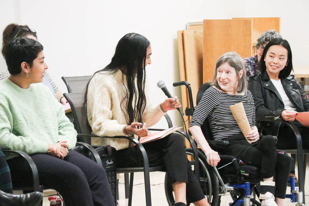
Recent advances in technology and improvements of accessibility allow designers to deliver meaningful experiences to broad populations of ages, cultures, abilities, etc.—those who have previously been isolated from the discourse. These rapid changes in technology have also changed the landscape of design practice (for both better and worse) creating the conditions for more collaborative and multi-disciplinary teams who leverage these new or improved tools. This panel will address research projects working at the edge of contemporary technology, across disciplines, and within emerging disciplines. They leverage technological innovation to address issues of representation and access.
Friday, February 14, 2020
4:00 PM – 5:30 PM
Hilton Chicago – Lower Level – Salon C-1
Co-Chairs
Alex Girard
Assistant Professor
Southern Connecticut State University
Dan Wong
Associate Professor
New York City College of Technology, CUNY
PRESENTATIONS
The Fusion of Art, Science and Technology
Min Kyong Pak
Assistant Professor
University of Southern Indiana
Chicago Design Milestones
Sharon Oiga
Associate Professor
University of Illinois at Chicago
Guy Villa Jr.
Assistant Professor
Columbia College
Daria Tsoupikova
Associate Professor
University of Illinois at Chicago
Interactive Game Design: Sisters Are Doin’ It for Themselves
Leigh Hughes
Assistant Professor
Coastal Carolina University
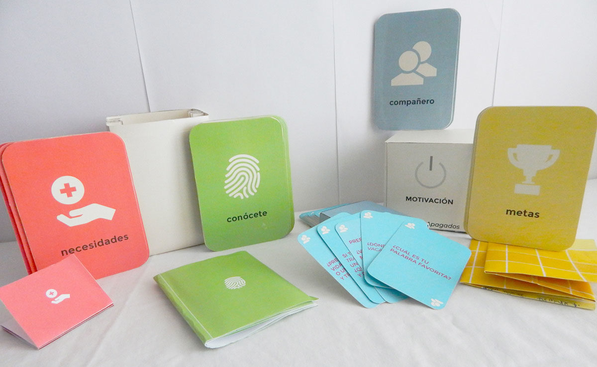
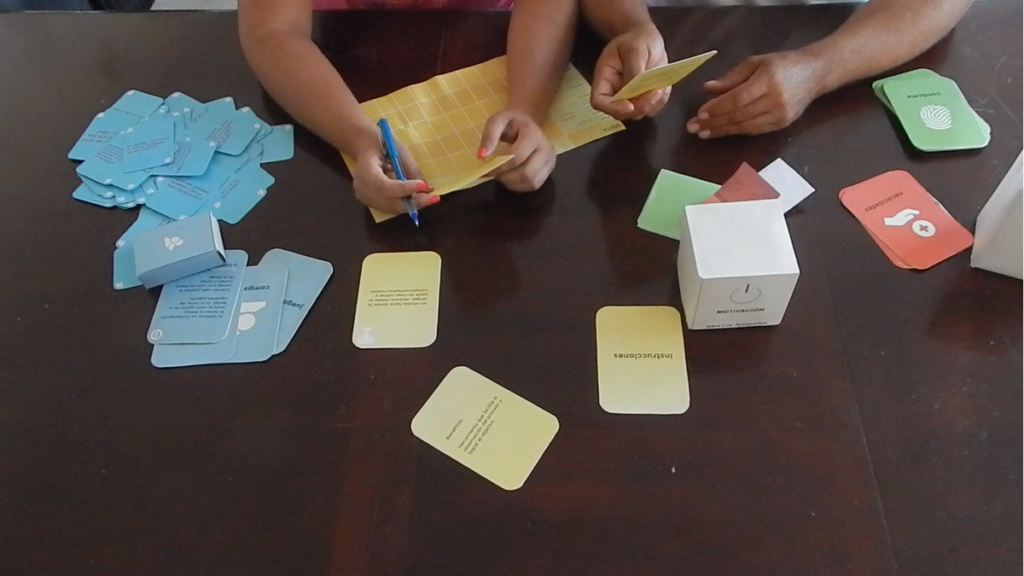
Design Delight: A Framework For The Analysis And Generation Of Pleasurable Designs
Omar Sosa-Tzec
Assistant Professor
University of Michigan
Critical Visual Analysis of Graphic Expressions of Emotions Over Time
Ann McDonald
Associate Professor
Northeastern University
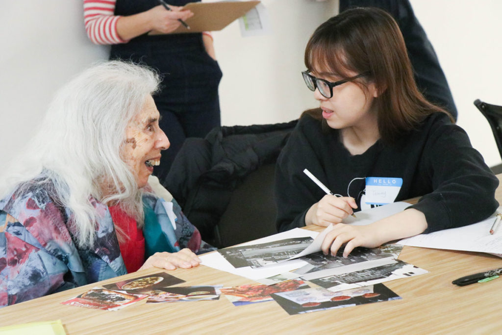
A Peace of Mind: Design Research for Pervasive Healthcare
Hyuna Park
Assistant Professor
University of Kansas
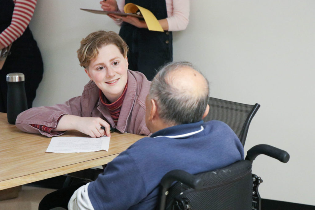
Designing for the Visually Impaired
Min Choi
Adjunct Professor
San Diego State University
San Diego City College