Designing for the Visually Impaired

Affordable accessibility design.

Min Choi
Adjunct Professor
San Diego State University
San Diego City College

Low vision is a part of the natural aging process, and we all have the potential to face it at some point in our lives. Though there are many exceptional high-tech devices to help people with visually impaired and blind, there has not been enough attention given to applying accessible design when creating affordable everyday products to benefit them.  The statistic shows that in the U.S., only around 30%1 of people with a visual disabilities are fully employed, and cannot afford to buy assistive technologies that may be awesome for them, but costs hundreds or even thousands of dollars.

To address this issue, I am researching how people with low vision could experience high-contrast colors and basic shapes with tactility at a reasonable price. In-person, human-centered design approach guided me to build a deep empathy towards my audience and explore design process and solutions that would help celebrate their disabilities.

A home product line incorporates high-color contrasts and tactility using universal symbols for people with visual impairment. It is an experiment to help them to be independent and empower their everyday activities those of us with good vision often take for granted—including eating, getting ready for bed, and getting dressed in style.

At its heart, we must identity what the audiences’ needs are—and the only way to create design solutions is to connect with those who will benefit the most. Design with purpose and function is beneficial for everyone—especially those with disabilities.

This research was presented at the Design Incubation Colloquium 6.2: CAA 2020 Conference Chicago on February 14, 2020.

A Peace of Mind: Design Research for Pervasive Healthcare

User Interface and User Experience in Industry Design education.

Hyuna Park
Assistant Professor
University of Kansas

Although User Interface and User Experience (UIUX) design has generally been taught as part of visual communication (VisCom) design education, its principles including human-centered approach and systems thinking can also complement the other design disciplines’ curricula such as industrial design (ID). A design department in a Midwestern state university has recognized an unexpected tendency; an increasing number of the department’s ID graduates becomes UIUX designers. In support of this non-traditional ID career path, the department initiated to integrate UIUX design into one of its required ID courses.

As a pilot project of this initiative, a group of ID students participated in a UIUX design project, Peace of Mind, which aims to provide pervasive healthcare products for people with disabilities. Pervasive healthcare refers to the remote healthcare monitoring and management system that removes locational and time restraints. The students had to understand their users’ lifestyles as well as the existing technologies to deliver the healthcare service successfully. This multifaceted project focused on design research methods including A/B test, convergence map, daily journey map, empathy map, prescriptive value web, and semantic differences, to gain a deeper understanding of the stakeholders’ needs.

Through this design project, the ID students designed various pervasive healthcare products including a smart lap desk for helping stroke survivors’ rehabilitation and a smart ring for a diabetic lifestyle in conjunction with a continuous glucose monitoring system. The students presented the project outcomes to the administrators of community engagement and telemedicine programs at the university’s medical center. By sharing the process and outcomes of Peace of Mind project, the presentation will address the critical attributes for successful UIUX design introduction to ID students. Furthermore, we will also discuss the benefits of integrating UIUX design into the ID curriculum and the challenges the educators may be faced.

This research was presented at the Design Incubation Colloquium 6.2: CAA 2020 Conference Chicago on February 14, 2020.

Critical Visual Analysis of Graphic Expressions of Emotions Over Time

The ‘feeling’ aspect of the typical ‘thinking, feeling, doing’ channels.

Ann McDonald
Associate Professor
Northeastern University

This presentation will provide critical visual analysis of various methods currently used for mapping emotions over time in experience maps and point to possible alternate methods. The intent is to challenge designers and researchers to examine the value of more meaningful data collection and visual synthesis of the emotional component or the ‘feeling’ aspect of the typical ‘thinking, feeling, doing’ channels represented in experience maps. (1)

Experience maps are timelines or chronologies created to help understand complex, abstract interactions that occur over time in the context of a customer or user achieving a goal or meeting a need. Design teams use experience and customer journey mapping and storyboard templates (2, 3) as a means to collect, analyze, and visually synthesize research observations of user experiences. These maps aid in the understanding of existing conditions, help identify pain points, and foster consensus about how to improve product and service offerings.

Mapping experiences is one of the multiple methods used to foster empathy in designers and collaborators. We develop understanding and empathy through interviews, observation, and the willingness to take time to discover the internal thoughts and reactions that drive others. A key element of experience mapping is representing changes in emotions over time. But temporal emotions are often simplified to a y-axis mapping of the intensity of vaguely identified emotions across an x-axis of phases over time. Emoticons and color are often added to define changes in positive and negative emotions. Conventions from literature also inform these models based on highs and lows of story arcs over narrative time.

We need to ensure there is adequate data collected by design research teams so we can meaningfully represent changes in emotional states. As humans, we readily pay attention to physical changes in the face, voice, and body as a means for expressing emotions. But understanding another’s cognitive and emotional states takes time and training in observation and interview techniques. Experience maps are often a synthesis of multiple individuals’ journeys and represent the experience of a persona–a summary user archetype crafted from research on multiple individuals in order to represent varied user types.

Some concerns found with personas development and use—they can be biased by their creators, based on insufficient or non-representative data, or used to justify preconceptions—may also follow as concerns for emotion mapping. (4) If we openly question experience mapping templates and assumptions, what alternate visual models of understanding experience and temporal emotions can evolve? What can be learned from other temporal representation models and fields to enrich research synthesis and visualization connecting storytelling (qualitative) and data (quantitative) to increase understanding and envisioning? How can we better use the power of information design to explain events and expose narratives, patterns, emotional responses, and relationships across time? How can we be more mindful of any culturally specific connotations of color and emotional response?

As information designers, we have an opportunity to create alternative models to communicate emotions and relations and connect multiple scales and time frames. Design teams could benefit from the use of more rigorous methods to offer nuanced representations of complex experiences that occur over both micro and macro time frames. This work is part of a broader investigation of notational systems and historical and innovative mapping as scores of experiences across multiple fields such as music, dance, performance, improvisation, urban planning, sports, etc.

1 Adaptive Path’s A guide to Experience Mapping, 2013.

2 Kalbach, James. Mapping Experiences: A Complete Guide to Creating Value through  Journeys, Blueprints, and Diagrams. O’Reilly Media, 2016.

3 Lupton, Ellen. Design Is Storytelling. Smithsonian Design Museum, 2017.

4 Salminen, J., Jansen, J., An, J., Kwak, H., & Jung, S. (2018). Are personas done? Evaluating their usefulness in the age of digital analytics. Persona Studies, 4, 47.

Barrett, L. F. (2012). Emotions are real. Emotion, 12(3), 413–429.

McCloud, S. (1994). Understanding Comics. Harper Collins.

Rodrigues, D., Prada, M., Gaspar, R., Garrido, M. V., & Lopes, D. (2018). Lisbon Emoji and Emoticon Database (LEED): Norms for emoji and emoticons in seven evaluative dimensions. Behavior Research Methods, 50(1), 392–405. image: The “rose of temperaments” (Temperamenten-Rose) compiled by Goethe and Schiller in 1798/9. https://en.wikipedia.org/wiki/Color_psychology#/media/File:Goethe_Schiller_Die_Temperamentenrose.jpg

This research was presented at the Design Incubation Colloquium 6.2: CAA 2020 Conference Chicago on February 14, 2020.

Design Delight: A Framework For The Analysis And Generation Of Pleasurable Designs

Engendering experiential qualities: surprise, vitality, cuteness, serendipity, and reassurance.

Omar Sosa-Tzec
Assistant Professor
University of Michigan

This research introduces a framework named design delight, which is intended to analyze and give form to features of design products that provoke delight. In all human experiences, including designed experiences, delight plays a significant role. Particularly in modern societies, whose everyday life can be stressful, encountering moments of high pleasure can remind people that good things and individuals are part of such a life. It is no surprise that delight has been acknowledged as noteworthy element of experiences shaped by design. Design products that are delightful, no matter whether these are objects, graphics, or services, create emotional bonds, stronger memories, higher levels of loyalty, engagement, motivation for repurchase, and product promotion by word of mouth [1]–[6].

Design delight focuses on how 
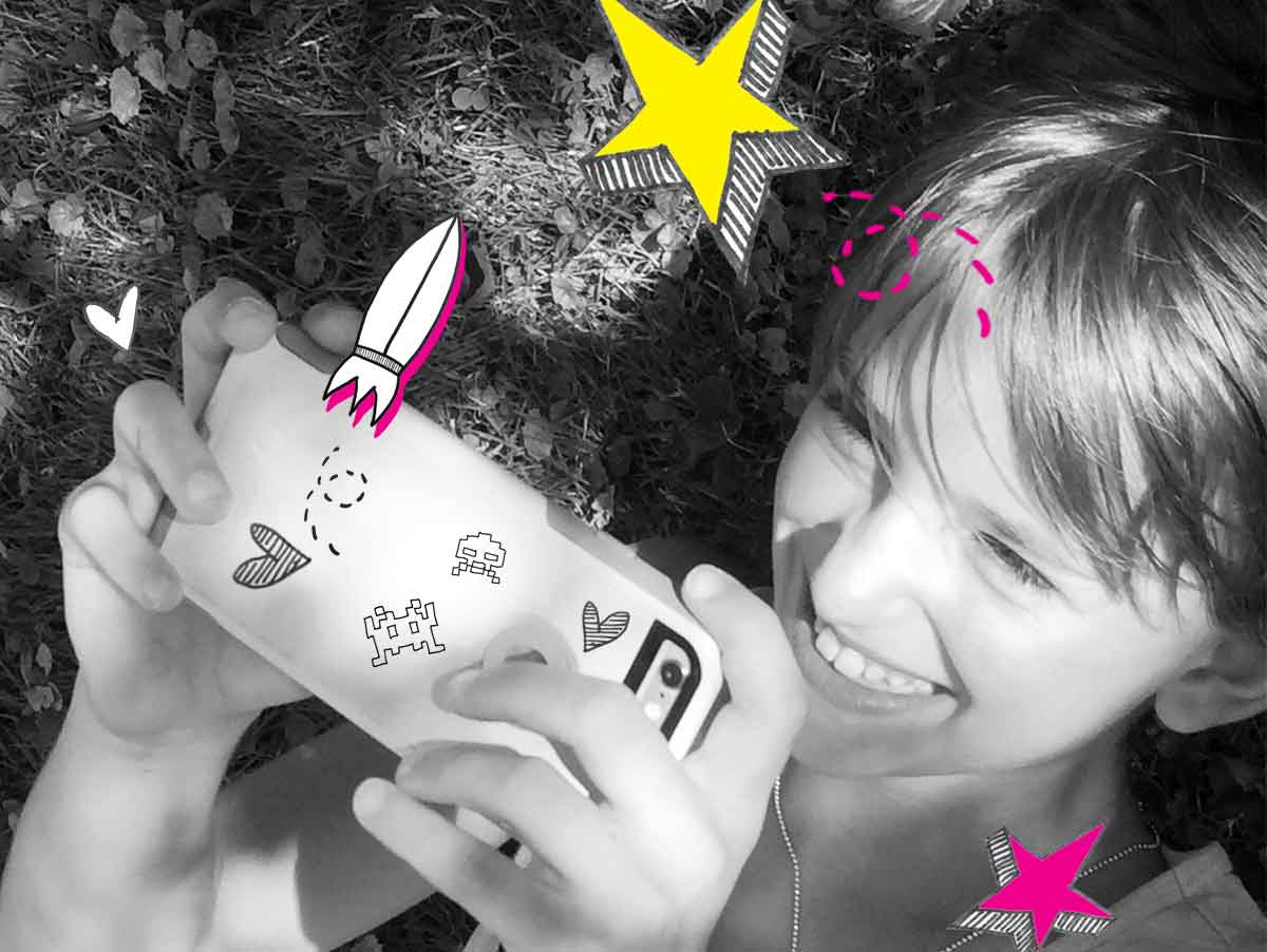
design features are capable of engendering five particular experiential qualities: surprise, vitality, cuteness, serendipity, and reassurance. For design delight, these qualities characterize those instants of significant pleasure that a person encounters while she makes use a design product. Design delight is attentive to how design features help one or more of these qualities manifest or become salient in an interval of the user experience. This research argues that moments of pleasure derived from the combination of surprise, vitality, cuteness, serendipity, and reassurance constitute a rhetorical dimension of design products. A designer can make use of these five qualities to influence people’s behavior, attitudes, and beliefs. Design delight pays particular attention to how its constituents persuade, promote identification, invite to understanding, aid in self-discovery and self-knowledge, and shape reality.  

Design delight derives from the semiotic and rhetorical analysis [7]–[9] of numerous design products, including different kinds of user interfaces and interactive media, analog objects, and services. It also derives from secondary research on the notions of pleasure, delight, and aesthetics from the perspective of a variety of disciplines, including marketing, philosophy, and human-computer interaction. As a framework, design delight unifies foundations of semiotics, rhetoric, multimodal argumentation, and design for its theoretical underpinning. Design delight regards design features as multimodal signs which come into existence through a combination of six basic elements, namely, the visual, verbal, aural, olfactory, tactile, and temporal. Seen as signs, design features represent a means by which the designer communicates her intent; particularly, to invoke one or more of the five qualities happen. However, this semiotic perspective also considers that the context of use and how it affects the user’s process of generating meaning have an impact in how she grasps and reacts to such an intent.

Design delight is formulated as a conceptual framework to aid design practitioners and scholars in analyzing and elaborating on how design features engender significant moments instants of pleasure. Design delight is not a universal or quantifiable characterization of delight. Rather, design delight offers design practitioners and scholars a lens to view delight as something that shapes everyday life through design products. As making products that are surprising, lively, cute, serendipitous, and reassuring can contribute to living a good life, they can also lead to undesirable behaviors, beliefs, and attitudes. Professionals and scholars of design simply cannot be oblivious to the impact of delight in modern life and its connection with people’s psychological, physical, and emotional well-being. Whether design delight is used for generative or analytical purposes, this framework urges design practitioners and scholars keep in mind that creating pleasurable products entails an ethical responsibility.

References

[1]             M. W. Alexander, “Customer Delight: A Review,” Academy of Marketing Studies Journal; Arden, vol. 14, no. 1, pp. 39–53, 2010.

[2]             M. J. Arnold, K. E. Reynolds, N. Ponder, and J. E. Lueg, “Customer delight in a retail context: investigating delightful and terrible shopping experiences,” Journal of Business Research, vol. 58, no. 8, pp. 1132–1145, Aug. 2005.

[3]             R. Chitturi, R. Raghunathan, and V. Mahajan, “Delight by Design: The Role of Hedonic versus Utilitarian Benefits,” Journal of Marketing, vol. 72, no. 3, pp. 48–63, 2008.

[4]             J. S.-C. Hsu, T.-C. Lin, T.-W. Fu, and Y.-W. Hung, “The effect of unexpected features on app users’ continuance intention,” Electronic Commerce Research and Applications, vol. 14, no. 6, pp. 418–430, Oct. 2015.

[5]             A. Kumar, R. W. Olshavsky, and M. F. King, “Exploring alternative antecedents of customer delight,” Journal of Consumer Satisfaction, Dissatisfaction and Complaining Behavior, vol. 14, pp. 14–26, 2001.

[6]             R. T. Rust and R. L. Oliver, “Should we delight the customer?,” J. of the Acad. Mark. Sci., vol. 28, no. 1, p. 86, 2000.

[7]             C. S. de Souza, C. F. Leitão, R. O. Prates, S. Amélia Bim, and E. J. da Silva, “Can inspection methods generate valid new knowledge in HCI? The case of semiotic inspection,” International Journal of Human-Computer Studies, vol. 68, no. 1–2, pp. 22–40, Jan. 2010.

[8]             O. Sosa-Tzec and M. A. Siegel, “Rhetorical Evaluation of User Interfaces,” in Proceedings of the 8th Nordic Conference on Human-Computer Interaction: Fun, Fast, Foundational, New York, NY, USA, 2014, pp. 175–178.

[9]             J. Bardzell, “Interaction criticism: An introduction to the practice,” Interacting with Computers, vol. 23, no. 6, pp. 604–621, 2011.

This research was presented at the Design Incubation Colloquium 6.2: CAA 2020 Conference Chicago on February 14, 2020.

Interactive Game Design: Sisters Are Doin’ It for Themselves

Giving access and inspiring young women in STEM.

Leigh Hughes
Assistant Professor
Coastal Carolina University

Women need to step it up a notch—or two—in the land of interactive game design, an area still lacking in female representation. According to recent U.S. Department of Education statistics, women have been dominating higher education enrollment and earning more than half of all bachelor’s degrees, yet only 15 percent of those are computer science degrees. Because a passion for design and technology can be stoked from a young age, giving girls engaging, gender-appropriate video games may help to inspire an ardor and love for learning, ultimately leading to more female game designers.

Providing access to interactive gaming, game making, and post-play narrative modding, girls gain confidence while attaining technical fluency to pursue higher degrees in STEM. Game industry statistics show that 22 percent of game developers are female and only 2 percent identify as transgender or non-binary. Due to low representation, there is a limited understanding of how young women and minorities might envision themselves as part of a male-dominated field with a potential future in game development. To help bridge this gender gap, a thorough mechanical thought process and creative problem-solving skills are essential to the advancement of women in computer science and interactive game design—all of which can be learned through gaming.

In the end, well thought out, gender-considerate game design, where girls’ playing preferences are thought of during conceptualization as opposed to being an afterthought, can have a great impact on whether or not girls become engaged in video games and remain interested. Interactive game play and modding can be very effective tools to bring females into the game design conversation, in turn providing choice within game play. Women game designers can change the face of digital game design and allow for a more inclusive gaming community by designing for themselves.

This research was presented at the Design Incubation Colloquium 6.2: CAA 2020 Conference Chicago on February 14, 2020.

Chicago Design Milestones

An installation showcasing the evolution of design from 1920s to the present.

Sharon Oiga
Associate Professor
University of Illinois at Chicago

Guy Villa Jr.
Assistant Professor
Columbia College

Daria Tsoupikova
Associate Professor
UIC School of Design

Chicago Design Milestones is a media installation that brings to life the evolution of Chicago design by examining and showcasing the historic characteristics of design works from the 1920s to the present. Project material was researched and culled from the robust collection of the Chicago Design Archive (CDA), which holds over 3,200 works from over 1,100 designers and 400 firms. The CDA, the UIC School of Design & Electronic Visualization Laboratory, and Columbia College Chicago collaborated together on this project, as their underlying and ongoing quest is to spotlight the role of Chicago as a major national design center through the use of innovative technologies.

A significant challenge was figuring out how to represent the thousands of archived works from the past 100 years. This was done by scouring every single image, over countless hours, and selecting representative works for each decade.

Another challenge was figuring out how to best employ the distinctive installation structure of 150 Media Stream, comprised of 89 LED vertical blades that reach 22 feet high and span 150 feet wide — a vertical pattern combined with massive horizontality, which are opposing but interesting dynamics. These are constructs the team made sure to utilize, by ensuring that particular images animate to traverse the unique terrain.

Chicago design history is not commonly brought to the attention of the general public. The project offers it outside of the confines and prompting of a book, classroom or school, and it is instead framed in the context of an immersive technological experience.

The aim is to engage onlookers and inspire them with the city’s creative history. Hopefully, viewers delight and marvel in what they see. Perhaps they will feel a sense of nostalgia, a feeling of pride for the city, or gain a stronger appreciation for Chicago history and creativity.

This research was presented at the Design Incubation Colloquium 6.2: CAA 2020 Conference Chicago on February 14, 2020.

The Fusion of Art, Science and Technology

The integration of artistic expression into current technological design methods.

Min Kyong Pak
Assistant Professor
University of Southern Indiana

In our high-tech modern world, scientists and artists push the limits of fusion and innovation to create new avant-garde narratives, emerging formats, and technological platforms. Technology and medium are constantly evolving. The demand for better quality in new media, storytelling and medium continue to evolve. Examples of new media include artificial intelligence, augmented reality, data visualization, interactive media, human-computer interface, video games, and virtual reality. In order to create this new media, artists are required to use code, data, and algorithms.

Storytelling is not merely confined to spoken or written words. There are many ways by which a designer can tell a story. A designer can exploit cutting-edge advances in science and technology to tell a story with artistic influence. My interest is to integrate artistic expression into current technological design methods. This project will give a voice to ideas that touch and affect us on a daily basis, search for who we are, and relate to our environmental world around us. The result is to infuse art, technology, and culture in the context of a community or geographical location. The greatest work of art connects and engages with our senses, heart, soul, and mind.

We live in a complex world. The digital age provides us with many opportunities to rebuild and adapt to an ever-evolving continuum. Both art and science are forms of exploration. Designers explore innovative designs, and scientists find the answers. Both transform reality and innovation to push our expectations and imaginations. My vision is to bridge the gap between art and science to create the best 21st century design. I believe the fusion of art, science, and technology is transformative and revolutionary.

This research was presented at the Design Incubation Colloquium 6.2: CAA 2020 Conference Chicago on February 14, 2020.

Hierarchical Space: How the Use of Space Creates Bias

Investigations of data visualizations used to maintain bias about gender and race.

Katherine Krcmarik
Assistant Professor
University of Nebraska–Lincoln

Commonly used visuals such as the United States’ Electoral College map and the Mercator projection—the most common visual of a world map—support distortions of reality. In both examples, the use of space, or more accurately, the misuse of space, distorts our perception of the visual story and perpetuates long-held biases. These two examples lead to the investigation of hundreds of data visualizations from which a clear pattern emerged of hierarchy used to maintain biases about gender and race.

In design, hierarchy serves as a key building block of practice. The use of space to establish hierarchy is one of the first concepts we learn and teach in design education and remains one of the most valued tools for designers. However, hierarchy—vertical hierarchy specifically—relies on the concept that the amount of space and the location of an image or word occupies determines the importance of it in relation to all other elements. Hierarchy allows for the easy access of information but also, whether intentionally or inadvertently, may reflect gender and race biases in the decisions made when establishing the hierarchy.

The design profession needs to explore how our basic structures and precepts contribute to the cultural construct to find a new approach to design that eliminates bias. In a vertical hierarchy, one voice, style, right, or reality reigns dominant over all possibilities. Possible solutions to breaking down the biases present in the current vertical hierarchical system may reside in explorations of horizontal hierarchy, heterarchy, and semilattices.

This research was presented at the Design Incubation Colloquium 6.2: CAA 2020 Conference Chicago on February 14, 2020.

Strategy + Creative: Cross-Disciplinary Collaboration

Simulating the working relationship between strategists and creatives.

Kathy Mueller
Assistant Professor
Temple University

Jennifer Freeman
Assistant Professor of Instruction
Temple University

This presentation will provide case studies for design educators to imagine collaborative interdisciplinary projects with their colleagues in media, communication, and business. It will include an overview of project structure, process, and outcomes. The presentation will also examine the advantages and drawbacks to the variety of approaches the presenting professors have taken to this collaboration. It will illuminate the challenge of fulfilling the needs of two different student groups.

Examples will be pulled from seven years of collaboration between an Art Direction class and an Advertising Account Planning class. Projects were structured to simulate the working relationship between strategists and creatives—cultivating teamwork and mutual respect among students using experiential learning. Art Direction students learned the value of market research and strategy insights. Account Planning students gained an appreciation for the creative process.

The professors have experimented with modifications to the assignment, to varying degrees of success. In addition to discussing collaboration techniques, this presentation will examine the learnings from teaching with a variety of client approaches—theoretical client assignments; partnerships with student entrepreneur clients through a campus incubator; partnerships with external clients, such as Urban Outfitters Inc.; and most recently, in partnership with a design studio specialized in the non-profit sector.

This research was presented at the Design Incubation Colloquium 6.2: CAA 2020 Conference Chicago on February 14, 2020.

Women’s Vote 2020: A Case Study in Civic Design

A case study of women in design, voting rights, citizenship, community, and diversity

Kelly Salchow MacArthur
Associate Professor
Michigan State University

2020 marks the centennial of the ratification of the 19th Amendment, granting women the right to vote in the United States in 1920. At over 167 million, women make up 50.6% of the American population.(1) In every presidential election since 1964, more women have voted than men. In 2016, 63.3% of women cast ballots.(2) Graphic design has consistently been implemented as a powerful tool in politics, with poster design running parallel to activism and social change for over 100 years. In light of the approaching 2020 election, design educators and practitioners Nancy Skolos and Kelly Salchow MacArthur, have merged these concepts to create the Women’s Vote 2020 initiative. This presentation will share the case study of this historic opportunity to catalyze women in design, voting rights, citizenship, community, and diversity—through a poster design initiative commemorating the milestone and promoting voter participation.

_________________

1. “United States of America (USA) Population Clock,” n.d., https://countrymeters.info/en/United_States_of_America_(USA) (accessed July 12, 2019).

2. “Gender Differences in Voter Turnout,” 2019, http://www.cawp.rutgers.edu/sites/default/files/resources/genderdiff.pdf (accessed July 15, 2019).

This research was presented at the Design Incubation Colloquium 6.2: CAA 2020 Conference Chicago on February 14, 2020.