Peggy Bloomer
Adjunct Professor
Quinnipiac University
Southern Connecticut State University
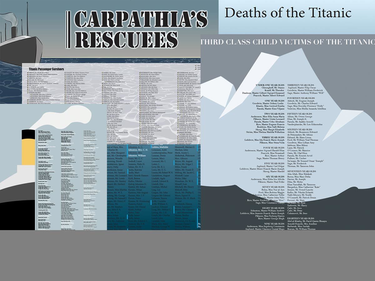
In this project I hoped to make level one typography students think about data and typographic hierarchy with. In my experience, students are not concerned about the data that is collected about them. I hoped to broaden their understanding of the power of data through their creation of a large format poster (24” x 26”) using lists about the passengers on the Titanic purchased from the “Encyclopedia Britannica.”
The textbook for the class is Ellen Lupton’s Thinking About Type. This assignment is an adaptation of Lupton’s hierarchy assignment “Long Lists.” According to Lupton, hierarchy is the organization of content using the spatial clues of indents, line spacing and placement. Other graphic elements that distinguish content include size, style and color.
Researching the list of passengers, students were asked to find human stories. The lists contained information about 1st, 2nd, 3rd class passengers and employees of the Titanic. Surnames, servants, gender, age, nationalities and origin of embarkment were provided. The poster was created in InDesign without photographic images. Students could use and InDesign tools to create color elements and many created ships, funnels, waves and other shapes.
The traditional process of information gathering, sketching and mocking up was used for designing the posters. In-class critiques of 3 smaller 11 x 17” versions helped students realize what was successful or not. Final versions were created to the larger size, printed, presented in class and hung in the department hallway for viewing.
In conclusion, most students realized the economic and gender consequences for passengers. One student used color to emphasize families and the impact was powerful: families died from infants to parents. The students gained knowledge about the power of simple data and almost all of them used size, style and color effectively. The use of indents, line spacing and style guides were not as successful. In the future, I plan to incorporate a slide show of memorials that include powerful images such as Flanders Field, The Vietnam Memorial and the Holocaust Memorial.
This research was presented at the Design Incubation Colloquium 6.1: Quinnipiac University on October 5, 2019.