Obstruction by Graphical Construction: How Graphical Sculptures Can Counteract Symbols of Hate

At the intersection of art and law is the Visual Artists Rights Act (VARA) 1990, which forbids the destruction or manipulation of copyrightable works of art.

Brian McSherry
Adjunct Professor
Borough of Manhattan Community College

By using art, design, and law how can one legally affect politics and social equity in the United States, specifically when it comes to symbols of hate? This proposal looks towards a specific intersection of art, design, physical property, and legal loopholes to answer the aforementioned question as it relates to proposed border policies in the United States. At the intersection of art and law in the United States is the Visual Artists Rights Act (VARA) of 1990, which forbids the destruction or manipulation of copyrightable works of art.[1]

Recently, the destruction of 5pointz, a derelict graffiti haven in Long Island City, exemplified the power that VARA has as it relates to real estate production (Feuer, 2018).[2] Jerry Wolkoff, the owner and developer of 5pointz, was forced to pay 45 graffiti artists a total of $6.7million in restitution for the destruction of the artists’ work.

However, can VARA be used as an estoppel to the destruction of art, or is it merely a remedy for damages? According to the case of David Phillips, VARA allows for a temporary restraining order to protect works that are likely to be altered (Lipez, 2006).[3]

This proposal looks at these cases, the history of VARA, temporary restraining orders as a guide to create site-specific graphical work to stop border wall production. In order to halt the production of a border wall, one must purchase a parcel of land and create a site-specific graphical structure.

Here, one will not only have real estate protection, but also protection in the intellectual property of the work and the protection granted under VARA. Thus, an artist can use law as art and art as law to create a visual and physical safe haven in an area brimming with symbols of hate and exclusion.


[1] Visual Artists Rights Act of 1990, Pub. L. No. 101-650, 104 Stat. 5128 (codified in scattered sections of 17 U.S.C.).

[2] Feuer, Alan, “Graffiti Artists Awarded $6.7 Million for Destroyed 5Pointz Murals”, New York Times, 2018.

[3] Phillips v. Pembroke Ral Estate, Inc., 459 F.3d 128 (1st Cir. 2006).

American Woman: Societal Perceptions of Femininity as Impacted by Gendered Branding, and the Social Responsibility of Designers

Biased perceptions of femininity have not been taught but rather internalized by individuals from visuals encountered daily.

Mikaela Buck
Graduate Student
Texas State University

In the last 100 years the expectation for American women has been, more often than not, that she is demure, dressed to perfection, gracious in any interaction, with hair perfectly coiffed and makeup flawlessly applied no matter the situation. In the advertising age of the 50s and 60s women were portrayed as subservient and/or a sex-object. While the blatant sexism of that era is not as overtly expressed today and women have expanded this definition for themselves over the last half-century, gender bias and inequality still persist. These biased perceptions of femininity, typically, have not been taught but rather internalized by individuals—male and female—from the visuals encountered on a daily basis. 

Visual input has an effect on human’s innermost being without even a conscious realization as we are psychologically programmed to find meaning in visual forms. Therefore, the message conveyed through the colors, forms, typographic and illustrative representations on packaging and branding have served to deeply engrain in our society the ideology that women are objects and less than men.

Since perceptions of normality are formed during childhood development these biases—showcased through toy packaging and branding—are shaping our society at an early age. While no one aspect can be faulted for socialization, design does reach every nook of our lives and in branding it is about appealing to a target market so that products are sold. That said, can the same outcome be achieved while reinforcing positive thought processes rather than ones which marginalize or disadvantage nondominant groups?

What if we were to utilize design research methods to examine the role of brand and package design in the United States on cultural perceptions of femininity. The goal of this research would be to determine the social responsibility of designers in creating appealing designs for adolescent products in order to create greater access to equal social and economic opportunities for tomorrow’s women.

This research was presented at the Design Incubation Colloquium 6.1: Quinnipiac University on October 5, 2019.

Using Things to Scaffold Difficult Conversations for Collegiate Residence Life Orientation Participants

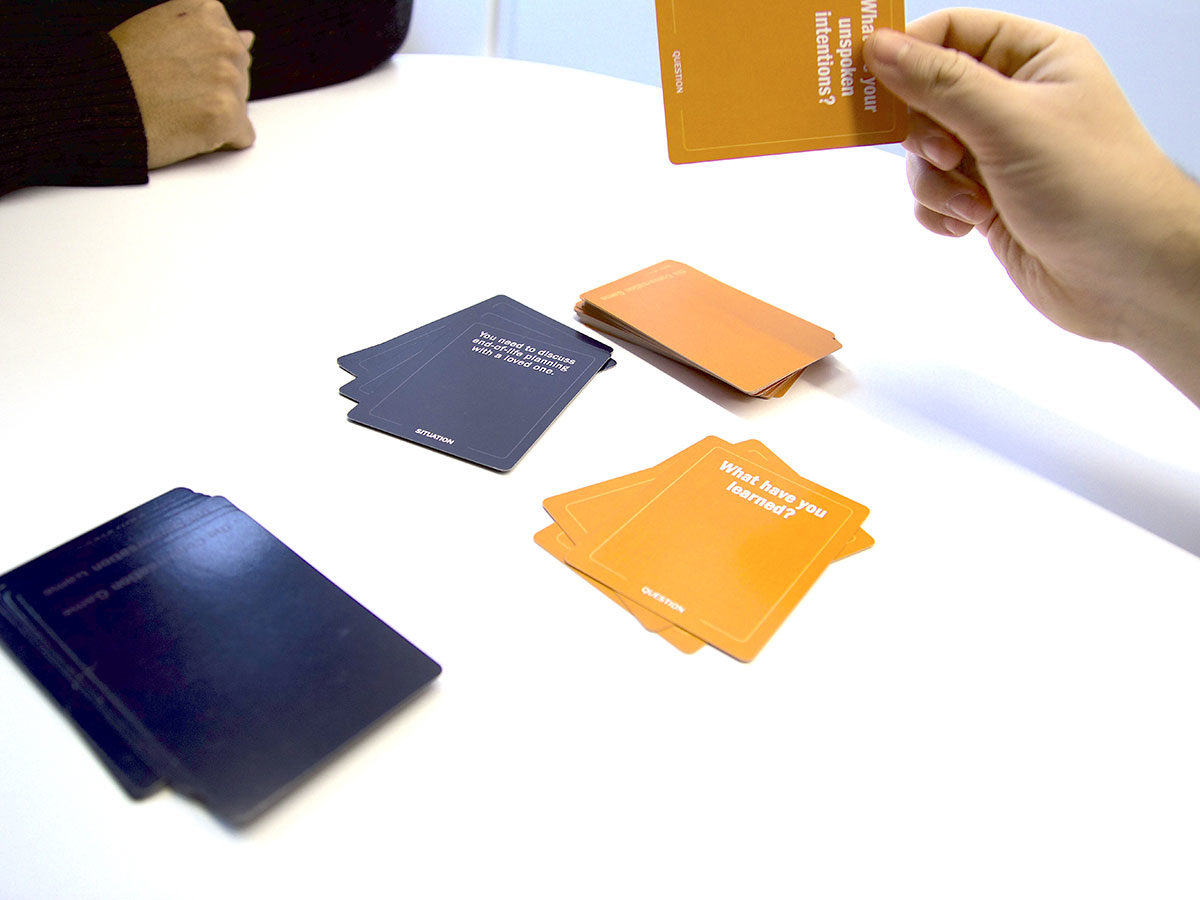
Students use diagramming and conversation to explore aspects of social identity, and a card game/training program.

Michael Arnold Mages
Assistant Professor
Northeastern University

People can have a tough time talking with others about certain topics. Some topics, in combination with certain relationships can threaten the social identity of participants (Stone, Patton, Heen 2010), which can limit the potential for effective, replete relationships between people (Flores 2012). To help people begin to develop strategies for difficult conversations, designed things can serve in a number of ways: things can offer a frame to help people visualize challenging concepts, can provide an avatar upon which a person can project difficult subject matter, can offer prompts to help a person to develop responses. In short, things can act as scaffolding (Sanders, William 2001) extending the capacity of people to engage with difficult subject matter.

In the context of college residence life, some students assume formalized leadership roles within the student community, as resident assistants or orientation counselors. Beyond the anticipated duties of conducting the orientation activities, these students become de facto counselors and play a subtle but informal role throughout the year, helping students adjust to academic and residence life in college. These students, however, are not always prepared to serve as mediator in difficult conversations, or to fully consider the perspective that other students’ intersectional social identity might lend to a particular situation.

This presentation will share work done in collaboration with the Carnegie Mellon University Office of Residential Education and Center for Student Diversity and Inclusion where students used diagramming and conversation to explore aspects of social identity, and a card game/training program that was developed through an iterative process with design students. This presentation will discuss these artifacts, and propose a model describing a range of approaches by which things might moderate difficult conversation that may be useful for further work in this area.

Flores, F. (2012). Conversations for Action and Collected Essays. (M. F. Letelier, Ed.) (1st ed.). North Charleston, South Carolina: CreateSpace Independent Publishing Platform.

Sanders, E. B., & William, C. T. (2001). Harnessing People’s Creativity : Ideation and Expression through Visual Communication. In J. Langford & D. McDonagh-Philp (Eds.), Focus Groups: Supporting Effective Product Development. Taylor and Francis.

Stone, D., Patton, B., & Heen, S. (2010). Difficult conversations: how to discuss what matters most  (2. ed., 10). New York: Penguin Books.

This research was presented at the Design Incubation Colloquium 6.1: Quinnipiac University on October 5, 2019.

Explorations of Data Lists: How Type, Hierarchy, and Color Reveal the Stories About the Titanic

Level one typography students think about data and typographic hierarchy.

Peggy Bloomer
Adjunct Professor
Quinnipiac University
Southern Connecticut State University

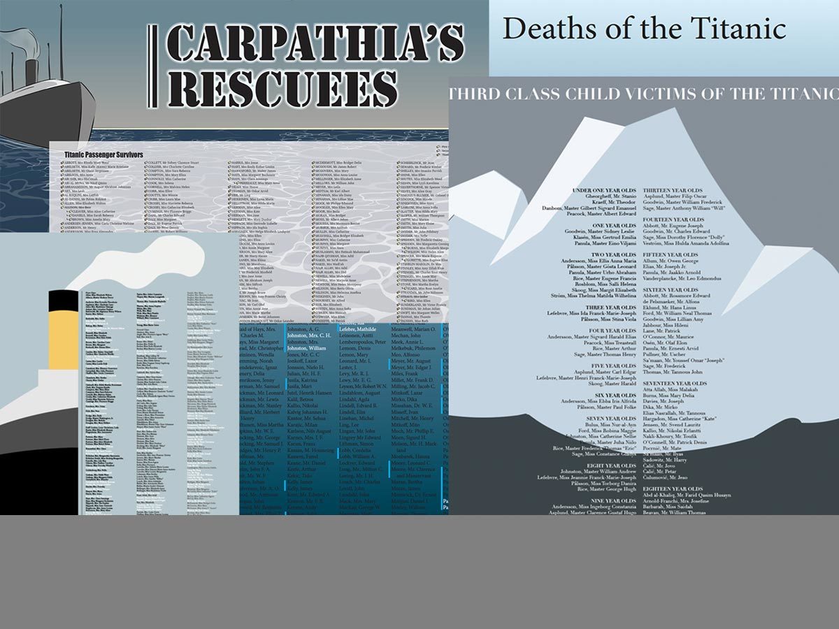
In this project I hoped to make level one typography students think about data and typographic hierarchy with. In my experience, students are not concerned about the data that is collected about them. I hoped to broaden their understanding of the power of data through their creation of a large format poster (24” x 26”) using lists about the passengers on the Titanic purchased from the “Encyclopedia Britannica.”

The textbook for the class is Ellen Lupton’s Thinking About Type. This assignment is an adaptation of Lupton’s hierarchy assignment “Long Lists.” According to Lupton, hierarchy is the organization of content using the spatial clues of indents, line spacing and placement. Other graphic elements that distinguish content include size, style and color.

Researching the list of passengers, students were asked to find human stories. The lists contained information about 1st, 2nd, 3rd class passengers and employees of the Titanic. Surnames, servants, gender, age, nationalities and origin of embarkment were provided. The poster was created in InDesign without photographic images. Students could use and InDesign tools to create color elements and many created ships, funnels, waves and other shapes.

The traditional process of information gathering, sketching and mocking up was used for designing the posters. In-class critiques of 3 smaller 11 x 17” versions helped students realize what was successful or not. Final versions were created to the larger size, printed, presented in class and hung in the department hallway for viewing.

In conclusion, most students realized the economic and gender consequences for passengers. One student used color to emphasize families and the impact was powerful: families died from infants to parents. The students gained knowledge about the power of simple data and almost all of them used size, style and color effectively. The use of indents, line spacing and style guides were not as successful. In the future, I plan to incorporate a slide show of memorials that include powerful images such as Flanders Field, The Vietnam Memorial and the Holocaust Memorial.

This research was presented at the Design Incubation Colloquium 6.1: Quinnipiac University on October 5, 2019.

Understanding Potential Benefits and Consequences of Art Therapy in Arts Education

Many artists use personal experiences naturally, which often include traumatic memories.

David Graves
Adjunct Professor
Bristol Community College

Art and design educators often encourage students to use personal experience in their creative practice, and many artists use these experiences naturally, which often include traumatic memories. Through this process, art education implicitly utilizes techniques developed and used by art therapists, almost always without the formal training and education of an art therapist. How are these practices beneficial, and what are the potential risks of this kind of teaching/learning, specifically when the educator is not using these approaches intentionally? Is this mode of teaching exclusive to art and design, or can it be found ingrained in pedagogy throughout the Humanities, and beyond?

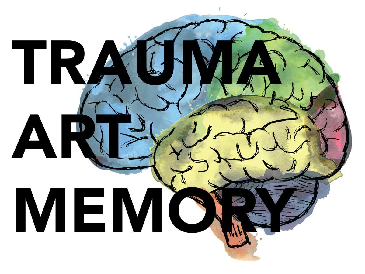
By understanding how memory works, and which parts of the brain are activated when recalling and talking about traumatic experiences versus creating work about those same traumatic experiences, we know that different biological responses are triggered. This includes the fight/flight/freeze response. Avoiding that trigger is the basis of many art therapy approaches, and is part of the appeal of creating art about trauma rather than talking about it. If we as art and design educators are utilizing this and other therapeutic approaches in our classrooms and studios, perhaps we would benefit from some formal training by professionals in the art therapy field.

This research was initiated by self-exploration into my art and design practice during my graduate studies, before ultimately exploring the experiences of others, in and outside of the creative fields. My research includes an exploration of the making process to cope with trauma, art therapy techniques in children and adults, as well as candid interviews with others about traumatic memory.

This research was presented at the Design Incubation Colloquium 6.1: Quinnipiac University on October 5, 2019.

Developing Design Curriculum Assessment Goals and Student Learning Outcomes; A Case Study: Typography

Walk through the process of project creation to meet learning outcomes, evaluation of success, and mapping outcomes to student learning.

Andrea Hempstead
Assistant Professor
Texas A&M University – Corpus Christi

No matter your design school pedagogy, the need for defined and executed assessment and student learning outcomes is important for institutional and programmatic accreditation. This can seem a daunting task for most educators, and particularly so for those teaching in creative disciplines. When academics hear “assessment” and “learning outcomes” they often become angry. This anger, is often fueled by fear that the “institution” is trying to control classrooms, or worse, justify teaching positions and approaches. Ultimately, these institutional measures have the best interests of the student at heart. Done correctly, assessment and defined student learning outcomes help to guide instructors to create and revise curriculum to meet student needs and are flexible enough to allow for unique classroom experiences.

Assessment models favor a tiered approach to learning. Typically, there are touch points throughout curriculum where student learning outcomes are introduced, reinforced and mastered. Ideally, outcomes are not addressed solely in one course, but built upon as the student learns and progresses through the program. Once developed and implemented, these learning outcomes can be assessed to evaluate where student learning could be improved, but also can reinforce successes and program strengths. Additionally, program assessments can serve as documentation to reinforce the need for program funding to improve areas of weakness. Assessment documents can serve as justification for improved facilities, software purchases or even faculty lines.

This case study walks through the process of project creation and implementation to meet course student learning outcomes, evaluation of student success regarding course outcomes, and mapping these outcomes to how program student learning outcomes are introduced, reinforced and mastered. Assessment of the project includes analyzing student course outcomes and progression of overall program student learning.

This research was presented at the Design Incubation Colloquium 6.1: Quinnipiac University on October 5, 2019.

In Restless Aesthetic Pursuit: Recontextualizing Typography

Finding new ways to inject creativity, typographic expression, and a sense of play into typography.

Maria Smith Bohannon
Assistant Professor
Oakland University

Communication and aesthetic resolution are primary considerations in solving design problems. Good, solid typography skills are critical for students, and for practicing designers. But once the typographic skills are honed, what’s next? This study takes a look at how we can inject more creativity, more typographic expression, and a sense of play into typography through analog and digital means, and how that might manifest creative growth.

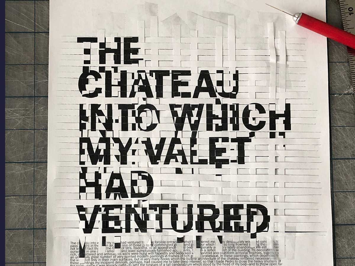
Expressive forms of design and typography have gained favor at various points throughout design’s history, and two that struck a chord for this project include Futurist poems and Weingart’s typographic studies that intentionally sought rule-breaking. One of the propelling goals of this project was to find new ways to recontextualize typography—modifying letterforms—through physical slicing, cutting, rearranging, stabbing, altering and generally modifying portions of the text, whether it was taking cues from the written words or by analyzing an entire page. The idea of play is an overarching theme, as well as Robert Bjork’s “desirable difficulties”—more difficult tasks will slow down the learning process, but create better retention of the information.

Visual examples include interpretative typographic studies from students, as well as a series of personal studies based on Edgar Allen Poe’s The Oval Portrait. These examples explore typographic methodologies that follow traditional typographic hierarchies and communication goals, as well as designs that break rules, push creative norms, practice self-directed expression and explore personally motivated designs—with the simple goal of discovery and creative expression.

This research was presented at the Design Incubation Colloquium 6.1: Quinnipiac University on October 5, 2019.

Reading Color: Type in and on Color

A synthesized, inductive approach using Itten’s contrast of extension and Albers’s experimental color studies in application to the visual gestalt of typography.

Jeanne Criscola
Assistant Professor
Central Connecticut State University

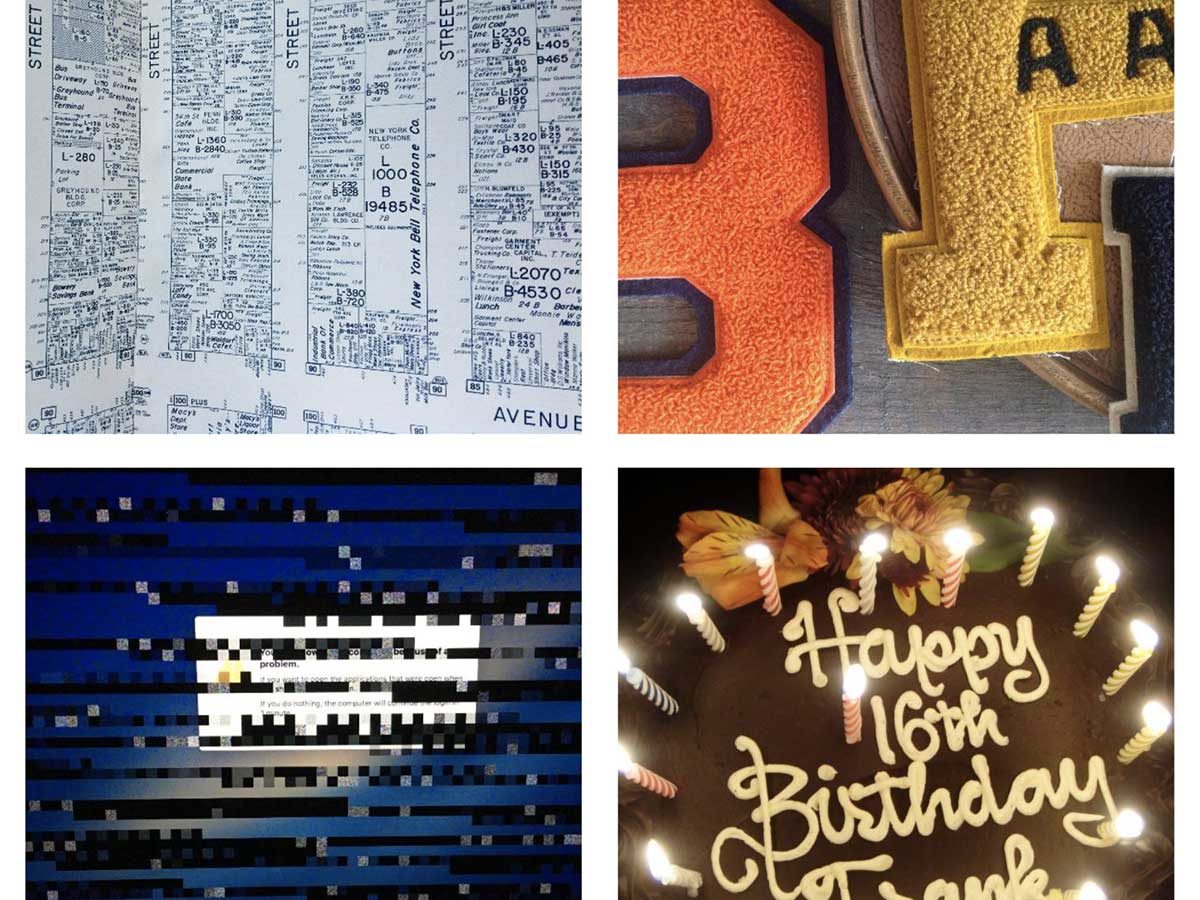
Much has been theorized about the transformation of communication from cave paintings to written language and how humans employing materials and technologies impacted their evolution. In 1493, Johannes Gutenberg’s technologies marked a milestone for communication and its distribution with the mechanization of movable type printing. The transition from hot type that went obsolete in the 1950s, to cold type that met its demise around 1985 with desktop publishing, was short-lived. Now, digital typesetting technologies offering myriad configurations of size, font, and layout—in seemingly infinite spectrums of color—present limitless opportunities for the practice of communication design.

This fusion of type and color presents challenges for pedagogy and discourse in the fields of typography and color where they have historically been considered separately in books and in coursework. In typography books, examples typically use letterforms in varying degrees of sizes and contrast to demonstrate colors’ influence on legibility. In books on color theory, the properties of color are often demonstrated with pie-shaped diagrams, color wheels, grids, and in continuous bands. Each pedagogy falls short of modeling today’s communication technologies where typography and color are intrinsic, inseparable, and synergistic.

Methodologies that facilitate the study of typography and color in context and in situ would be welcome by educators and professionals alike. For educators, infusing color theory into the study of typography has advantages for curriculum and course development. For the design student, learning color theory with letterforms integrates their study and practice.

This paper sets out to initiate a synthesized, inductive approach using Johannes Itten’s contrast of extension and Joseph Albers’s experimental color studies in application to the visual gestalt of typography.

This research was presented at the Design Incubation Colloquium 6.1: Quinnipiac University on October 5, 2019.

Place Matters: Design for Regenerating Under-Utilized Spaces

An investigation of the affordances of a local theatre and an escape room in Ohio to seek for opportunities of under-utilized space design.

Yi-Fan Chen
Assistant Professor of Interaction Design
Farmingdale State College

Jerald Belich
Assistant Professor
Armstrong Institute for Interactive Media Studies
Miami University

Yashodhan Mandke
User Experience Consultant
Fusion Alliance

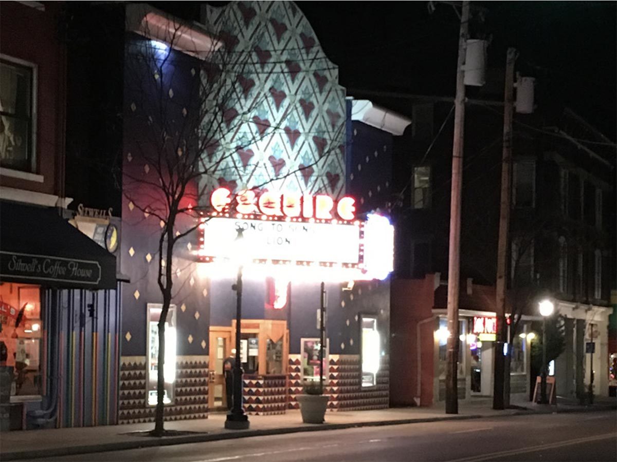
This design research project began with an investigation of the affordances of a local theatre and an escape room in Ohio to seek for opportunities of under-utilized space design. The participation observations were conducted and found that people, community, content, and environment made positive user experience and increase the users’ loyalty to the spaces. When people co-create a meaning of the spaces, they are likely to make the spaces “their own” and bring their social networks to the spaces.

Kenneth Burke’s Dramatism provides this project with a theoretical framework for the design process. Dramatism analyzes human relationships and has been applied to a broader range of cultural productions. Design researchers and scholars are seeking opportunities to apply Dramatistic Approach to analyze and create designs. For examples, Sadler and Bellew (2009) propose to utilize Burke’s perspectives to analyze and understand a usability situation of design whereas Bowie (2015) proposes to employ Dramatism to examine design products, processes, and discourses. Moreover, Bemer (2010) utilizes Dramatism to design a computer lab for an English Department. According to Burke (1945, 1950, 1968), just as in any plays, the acts in life are keys to revealing human motives. Dramatism provides researchers a method to examine the relationship among human, text, and environments.

A prototype was created by combining empirical research findings and Burke’s (1945) pentad, including act, agent, agency, scene, and purpose, to build positive user experience and increase the users’ loyalty to the spaces. The space design includes three phases, before during and exiting the space. Each phase tells stories that focus on how users see, touch, hear, smell, and feel. Additionally, the design is hoping to change the under-utilized space into a new community space. The users could make the space to their own and revisit the space often with their social networks.

References

Bemer, A. N. M. (2010). The rhetoric of space in the design of academic writing locations. (Unpublished doctoral dissertation). Utah State University, Logan, Utah. Retrieved from  https://digitalcommons.usu.edu/etd/752

Bowie, A. (2015, April 22-24). Exploring the rhetorical orientations of design trends: A Kenneth Burkean approach. In L. Valentine, B. B. de Mozota, J. Nelson, S. Merter, and P. Atkinson (Eds.), Proceedings of the 11th International European Academy of Design Conference. “The Value of Design Research”, Sheffield: Sheffield Hallam University, UK. Retrieved from https://ead.yasar.edu.tr/conferences/ead-11-france-2015/11th-ead-proceedings/?csrt=9122487017854515442

Sadler, V., & Bellew, K. (2009, July). Introducing rhetoric into usability: Applying Burke’s pentad. In 2009 IEEE International Professional Communication Conference (pp. 1-5). IEEE.

This research was presented at the Design Incubation Colloquium 6.1: Quinnipiac University on October 5, 2019.

The Hamden Hunger Project

Addressing the often-overlooked issue of food insecurity in our local community.

Courtney Marchese
Associate Professor of Interactive Media + Design
School of Communications
Quinnipiac University

Amy Walker
Assistant Professor
Journalism
Quinnipiac University

Michaela Mendygral
Design, Journalism Student
Quinnipiac University

https://www.hamdenhungerproject.com/

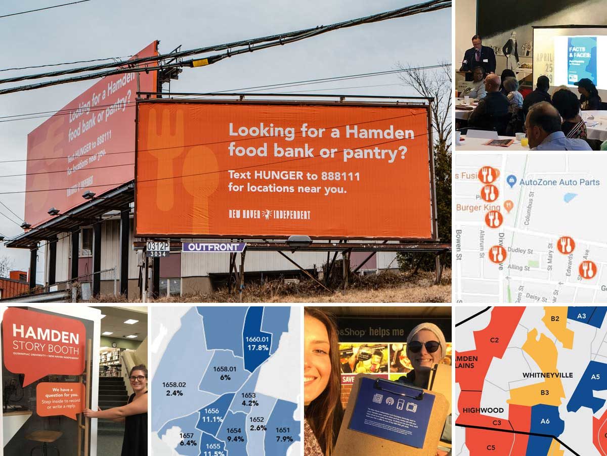
Over the past year, an interdisciplinary team of faculty and students from the School of Communications have worked to address the often-overlooked issue of food insecurity in our local community of Hamden. Members of the journalism and graphic design programs have been using a combination of listening booths, two-way texting, billboards, flyers, surveys, and data visuals to build a dialogue with the community. That dialogue has helped raise awareness of hunger in Hamden, and guide those in need of food to available resources near them. Through this project, we also designed a comprehensive report with the United Way of Greater New Haven to help share key findings with the town, news outlets, and government figures.

The project is part of a broader endeavor to not only “design for good,” but to embrace all that is possible in a School of Communications. Our goal is to make important data and stories more accessible–aesthetically, strategically, and verbally–while teaching students to be collaborative, informed citizens.

This research was presented at the Design Incubation Colloquium 6.1: Quinnipiac University on October 5, 2019.