A Modular Approach to Type Design: The Identification and Design of Particular Elements and Patterns

Leon Butler
Research Fellow
National University of Ireland, Galway

Leon Butler
Research Fellow
National University of Ireland, Galway

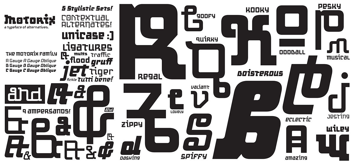
All lettering uses modularity as the basis of form can be seen across different cultures such as the Roman order systems for construction numerical and Chinese types always adhering to a square grid structure. Johann Neudörffer the Elder the author of Fundament, [Becker, 2005], and credited with the development of a blackletter type ‘Fraktur’ which he released in copybooks for people to develop the calligraphic style. He also constructed full type systems using a square which provided the basis for each letter and was divided into ten equal parts allowing for a grid to be placed in his copybooks. While researching historical modular type systems a little know typeface ‘Fregio Mecano’ was identified, a modular typeface of Italian origin that dates to the 1920s. The designer of ‘Fregio Mecano’ is unknown but it features in The Encyclopedia of Type Faces by W. Turner Berry [Berry, 1990], alongside the typeface, Fregio Razional attributed to Giulio da Milano for Nebiolo, so it can be assumed that da Milano designed Fregio Mecano also. Using the original grid form of ‘Fregio Mecano’ as a basis, the twenty elements were created in various orientations and positions to construct the letterform. By investigating visual forms in upper and lowercase characters, it is hope to be able to draw insights around the use of vertical sections, curved joins, negative counters, and other comparative elements common across the forms. The system of typographic modularity was developed through simple graphical techniques, such as layering. Comparative insights were generated relating to various themes and visual characteristics that were common across each of the glyphs.  A completed typeface – including numerals and punctuation, has now been constructed. This has allowed an exploration of how these modular elements combine to demonstrate how this practice-based method can help designers, students or educators build a modulator typeface from a fixed palette of visual elements. The arrangement of these elements can create various styles of type for use in different contexts or visual approaches.

This research was presented at the Affiliated Society Meeting: Design Incubation Special Program on Typography on February 23, 2018.
Basic Web Design as Foundation of Publication Design

Bruno Ribeiro
Assistant Professor of Graphic Design
Department of Art and Design
California Polytechnic State University

When introduced to the design of print publications, students often struggle with type hierarchy and sometimes they lack appreciation for simplicity. Learning HTML and its tagging system, however, can help them in both matters.

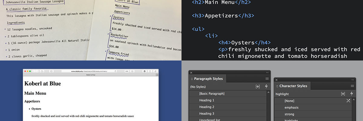
After taking their first web class, students tend to have a better understanding of systematic typography and make more conscious decision about typographical design. Through the logical language of HTML and the tagging system, students clearly see the supporting structure of type hierarchy. Pedagogically, it helps educators guide students to make better choices. Because web design is completely new to most of the students, it’s an opportunity to frame its structure as an approach on how to properly treat type hierarchy and consistency. Even the default style for HTML documents, with no formatting of any kind, provides a clear correlation between content hierarchy and visual hierarchy. Therefore, an early web design class improves students’ understanding of systematic formatting a wide range media. Web design can also promote an appreciation for simplicity in design. Every non-designer knows how to (often badly) format a printed page in their text processor of choice. Design students, then, tend to overly design to differentiate their work from what non-designers do. Simple design on the web, however, already brings a sense of accomplishment to the student who is able to make something they built from scratch available online. Even utterly simple designs are more tangible as a learned skill.

Web design should not be seen only as a skill that students need to learn. It is an effective means to teach the principles of systematic typography and visual hierarchy. The earlier students learn these concepts, better are the chances they will have of fully integrating them into their creative practice.

This research was presented at the Design Incubation Colloquium 4.1: San Jose State on Saturday, Sept 30, 2017.

Rethinking the Capstone in a Graphic Design BFA Program

Regina Gardner Milan
Lecturer
Department of Art & Design
University of Massachusetts Lowell

Evolving the BFA capstone project to develop professional competencies for emerging designers.

Encouraging students to develop projects that address their competencies and those that they need to develop. A year-long course sequence encouraging extensive creative exploration while working within developed constraints that are specific to each student. These constraints are developed through a reflective process of research and critical analysis of their skill sets and portfolio. They then apply these skills and making to a defined set of projects.

Projects are developed across complex design systems encouraging personal design thinking and and challenging student’s skillsets. Projects include both analog and digital solutions including app design, web design, interactive installations and motion graphics.  Faculty encourage growth mind-set and conceptual development of projects that help define a student’s aesthetic and aspirations for their post-college practice.

Developed two years ago, this new capstone has proven successful in encouraging critical design thinking, content development, and putting students in the strongest possible position for entering their professional design practice. Students graduate with a strong social media presence, robust resumes and expanded portfolios.

This research was presented at the Design Incubation Colloquium 4.0: SUNY New Paltz on September 9, 2017.

Making the Machine Human: Embracing Printing Technologies in Crafting a Present-Day Moveable Typeface

Peter P. Bella, Jr
Assistant Professor

Indiana University–Purdue University Fort Wayne

How human can the machine become in relation to the craft of moveable type and modern printing technologies? The letterpress has been an instrumental aspect of typography for centuries. The mechanical process of raised letterforms transferring ink to paper has a humanistic quality that exemplifies our senses and emotions. Movable type has seen centuries of adaptations—lead, wood, polymer and more; along with the creation tools and technologies—such as pantographs, plate makers, and computer. Has moveable type met its end, has letterpress found its zenith? Has technology surpassed this mechanical time machine and the cold nature of cast metal?

3D printing has varying qualities and expectations dependent on numerous variables. These virtues of 3D printing offer the design of typography, moveable type, and printing techniques an amplitude of potential expressions and experiential opportunities. Examples of 3D printing’s use in the realm of typography are found in 3D sculptures expressive of the letters architecture, and letterforms designed in three-dimensional space, never intended for physical traditional letterpress printing methods. This research is concerned with something entirely different finding a middle ground between perfection and form defining its own voice and concept through the qualities that are characteristically built into the machine.

This research suggest letterpress printing and moveable type has untapped life yet to be revealed presenting the challenging demands of typography and the mechanical properties of 3D printing methods applied to the creation of moveable type, its design, printing, and communicative qualities by personifying 3D printing technologies to create a moveable typeface with humanistic qualities and design voice. This moveable type exploration embraces the 3D printer as a machine to create a typeface never intended to meet the standards of perfection, but to embody the inherent artistic and humanistic aesthetics of the machine by pushing technology to its limits and discovering how human a 3D printed movable typeface can become.

This research was presented at the Design Incubation Colloquium 4.0: SUNY New Paltz on September 9, 2017.

Drawing Type, Drawing Connections

Joel Mason
Professor Emeritus
Department of Communication Design
New York City College of Technology, CUNY

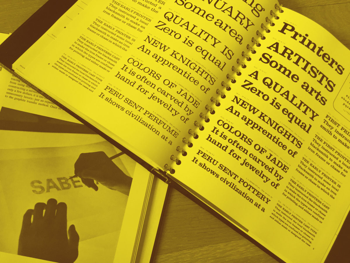
In 1979, as a full-time member of the Communication Design department at NYC College of Technology, I was assigned Lettering and Typography, a first semester course teaching students to draw three basic alphabets: Caslon, Bodoni and Helvetica using the “built-up” method with broad sketching pencils. Reviewing the course outline and required textbook, David Gates’ Lettering for Reproduction I realized there were gaps in my education.

When I was a student, classes in graphic design history/theory didn’t exist. Gates briefly covered design history and theory but also explained the role of geometry, visual perception, printing technology, history and aesthetics in the design and evolution of letterforms. Now, I understood that while demonstrating lettering techniques, I would also need to relate them to these other disciplines. As a result, my thinking about teaching typography changed, seeing its potential as a multidisciplinary subject with links to the liberal arts and sciences.

Lectures included the role of geometry in shaping the proportional systems underlying Old Style and Modern Style typefaces, along with discussions and demonstrations of the role of visual perception and illusion in adjusting shapes to create harmonious optical relationships among letterforms. Examples of how Caslon and Bodoni appeared when first printed in the 18th century and how paper, ink and presswork affected their appearance were integrated into the narrative. History could also be introduced in surprising ways, by explaining for example, that the first copies of the American Declaration of Independence were printed using Caslon, which was imported from England prior to the Revolution. Drawing and constructing letterforms also demonstrated how fundamental design principles (also being taught in other first year design classes) such as contrast, balance, proportion and rhythm contributed to an aesthetically pleasing result. The class was also showed thow organic forms in nature served as a source of inspiration.

Taken together, students not only learned to draw letterforms, but saw how the broad web of connections with other disciplines could enrich their learning experience. I taught the course for five years, but by the early 90’s digital technology replaced hand-lettering. Recently, there has been a resurgence of interest in calligraphy and hand-lettering. Regardless of the technology used, teaching typography, particularly at the introductory level, can be transformed by the multidisciplinary approach.

This research was presented at the Design Incubation Colloquium 4.0: SUNY New Paltz on September 9, 2017.

Recap of Teaching Type: A Panel Conversation

http://www.alphabettes.org/takeaways-on-teaching-type/

Read Amy Papaelias’ delightful synopsis of the panel discussion on Teaching Typography. Amy is Assistant Professor of Graphic Design at SUNY New Paltz and was one of the distinguished panelists at this past Saturday’s event at the Type Director’s Club.


Type Thursday Interview With Liz Deluna and Mark Zurolo

Read the interview with Thomas Jockin of Type Thursday, Liz Deluna and Mark Zurolo.

View at Medium.com

The Avant-Garde of Iranian Graphic Design

Pouya Jahanshahi
Assistant Professor of Graphic Design
Department of Art, Graphic Design and Art History
Oklahoma State University

The advent of the Apple Macintosh brought about a rapid flow of technological change which affected almost every part of visual communication arena, in one way or another. Since the start of this digital revolution, most graphic design communities around the world succeeded in maintaining their national identities, while implementing the technological changes into their industries, hence joining the global world of graphic design. However, because of challenges related to mark-making and the specifics of calligraphic-based scripts, Iranian typography – and by extension graphic design – struggled to maintain and its rich historic traditions and visual aesthetics, as Perso-Arabic characters necessitated a process of digitization for use in dominant graphic software applications of the time.

Furthermore, during this global digital revolution, various socio-political and technological circumstances resulted in the isolation of the Iranian graphic design arena from the global culture, for more than a decade. More recently, the dusk of 20th-century, brought forth an impenitent generation of innovative thinkers and designers, keen to define their lost identity. Through inwards nationalistic perspectives as well as technical and conceptual innovations, this generation made giant leaps and set forth a trajectory toward joining the global graphic design arena.

This research delves into the nuanced traditions of Iranian calligraphy and the struggle for its adaption to western printing technologies. Specifically, it focuses on the process, and the eventual arrival of what may be referred to as a hybrid graphic form – one comprising of the traditional eastern calligraphic forms and nuances, merged with the characteristics found in western typographic structures and letterform design.

This research was presented at the Design Incubation Colloquium 3.2: Parsons Integrated Design on Thursday, Feb 16, 2017.

Teaching Type: A Panel Conversation on Typography Education

Educators will discuss innovations, challenges and best practices for teaching typography.

As a mainstay of design, typography is a corner stone of most degree programs in visual communication design. Still questions abound. How and where typography is taught is as varied as its use in design applications. We invite you to join fellow educators in a conversation which will focus on how, where and when we teach typography. Our panelists will explore the role of typography in the continuum of design education and identify areas where traditional programs experience shortcomings and challenges. We will ask what fundamental skills should be taught and whether the way we are teaching typography needs to change in a screen-based world? Finally, we will ask the audience to participate in identifying specific skill sets and methodologies which should be part of type-centric design curriculum in the 21st Century.

The conversation will be moderated by Doug Clouse, President of TDC and Principal at The Graphics Office and Liz DeLuna, Associate Professor of Design at St. John’s University.

Type Directors Club
347 West 36th Street
Suite 603
New York, NY 10018

Saturday, April 1, 2017
2pm–5pm

Moderators

Liz DeLuna
Associate Professor of Design
St. John’s University

Doug Clouse
President, Type Directors Club
Principal, The Graphics Office

Panelists

Thomas Jockin
Founder of TypeThursday
Adjunct Professor
Queen’s College, CUNY
and Fashion Institute of Technology, SUNY

Amy Papaelias
Assistant Professor
Graphic Design
SUNY New Paltz
Co-founder of Alphabettes.org

John Gambell
Senior Critic
Yale School of Art
Yale University Printer

Juliette Cezzar
Designer, Writer
Assistant Professor
Communication Design
Parsons School of Design, The New School

Hosted by the Type Directors Club.

You Look Like The Right Type

Mark Addison Smith
Assistant Professor
Electronic Design and Multimedia
The City College of New York, CUNY

An illustration manifests “thought” through the viewer’s decoding of visual-based representation—be it text-based, image-based, or a combination of both. Logocentrism holds that original thought generates a need for spoken communication and, in turn, speech generates a need for writing. In a daily ritual since 2008, I redraw exact-dialogue fragments of overheard conversations as 7×11-inch India ink illustrations (combining direct-quote text with visual and tonal embellishment) and combine the single illustrations into larger, theme-based conversations between people who have never met or exchanged words. When amassed together as modular narratives, my black and white drawings—collectively titled You Look Like The Right Type—start having grayscale conversations with one another across time, place, age, and gender (the who, what, when, where, why, and how of journalistic-narrative documentation). And the audience, as interlocutor, triangulates the conversation by reading that which was once spoken and making their own non-linear, grayscale associations between text, image, and completion of what’s left unsaid. Thus, original thought emerges not only through my reinterpretation of other voices, but also through z-axis, non-linear readability (or, Scott McCloud’s “infinite canvas”).

In his 1967 text, Of Grammatology, Derrida argues for a definition of grammatology in which written language is not derivative of spoken language, but, rather, the two become independent, legitimate signifiers for original thought. Thus, the written word (including text-based illustration) can be understood from a stance as comprehensive as the spoken word. Within my You Look Like The Right Type series, I’ve been archiving daily conversation fragments as black and white illustrations since 2008 in a ritualistic effort to not only bring permanence to the spoken form, but also to manifest original thought—via the recycled thoughts of others—within illustrated type-and-image works on paper. In keeping with the principles outlined in Derrida’s text, I argue—using my archive of 3,000+ illustrations coupled with theories of documentary-style narrative, montage editing, logocentrism, and the z-axis of non-linear comic paneling—that spoken language and written language are autonomous and equal forms of communication, feeding off of one another to generate new storytelling.

An archive of these daily works can be found at YouLookLikeTheRightType.com.

This research was presented at the Design Incubation Colloquium 2.5: Fashion Institute of Technology (FIT) on Saturday, March 12, 2016.