Caspar Lam
Assistant Professor of Communication Design
Parsons School of Design
YuJune Park
Assistant Professor of Communication Design
Parsons School of Design
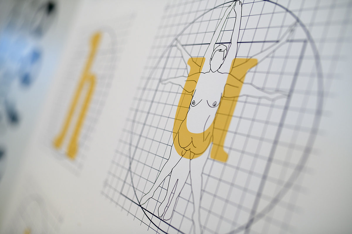
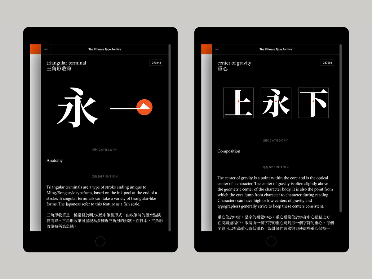
Within Chinese typography, the lack of common reference points and conceptual frameworks have made it difficult for students and designers to understand this area of design. To address this gap, the Chinese Type Archive was launched at the start of 2020 as an open, collaborative index of Chinese typographic resources consisting of typefaces, bibliographic resources, and conceptual terminology. Conceived as a purpose-built resource dedicated to bridging and creating cross-cultural connections between Chinese and Latin typography, the Archive provides easier access to hard-to-find typographic material through linked data, lists of previously unnamed historic typefaces, and tracking of evolving conceptual terminology. In its origin, the project reflects a broader wave of renewed interest in Chinese typography from practitioners over the last decade. The first phase of the project began with a seed collection of data, university and design organization funding, and several rounds of technical iteration before its beta launch.
Now, one year later online, we present our continued progress with the project with reflections on community feedback and the project’s iterative methodology. These have led to new insights on barriers-to-entry, the cataloguing process, and the formation of online communities with networked, crowdsourced knowledge. Beyond the immediate impact on the discussion of global typography, the project has raised new questions on how designers should conceive of typography. In addition, the project has tangible ramifications on our idea of collections as a way of creating new sources of design knowledge that can engage designers at any level: student, professional, educator, and researcher. The insights gained from this case study has direct ramifications on design pedagogy and practice, particularly in how the acts of collecting and cataloguing can be powerful methods for learning, contextualization, and critical making.
This research was presented at the Design Incubation Colloquium 7.2: 109th CAA Annual Conference on Wednesday, February 10, 2021.