Access needs to be core to the design process if we want emerging digital designers to design for the public good.
As a discipline, we often focus and reward visual design and aesthetics over, rather than in addition to, usability and accessibility. If we want emerging digital designers to design for the public good, then access needs to be core to their process and their education. Creating a learning environment that makes access a priority both in the way the course is delivered and in the learning objectives impacts who student designers consider as audiences and how they prioritize the needs and desires of those audience members.
Students in four sections of a beginning web design course over three semesters were given a pre-course survey, designed by Teach Access, to measure student perceptions and knowledge of accessibility and disability. Accessibility was regularly discussed throughout the course and was a design requirement on all assignments. Interventions across the three semesters evolved based on results of the prior semester. At the end of the course, students were given a post-course survey, to measure shifts in perception and understanding of accessibility.
In this session, I will share the interventions introduced each semester and the philosophy behind each intervention. In addition, I’ll share the statistically significant results and discuss the successes and failures of each iteration of interventions. As educators, the way we approach access in the classroom influences future generations of designers, therefore it is important to begin to systematically study the impact of the course design decisions we make.
Rebekah Modrak, Professor, University of Michigan Jamie Lausch Vander Broek, Librarian, University of Michigan Sam Oliver, Designer, Shaper Realities
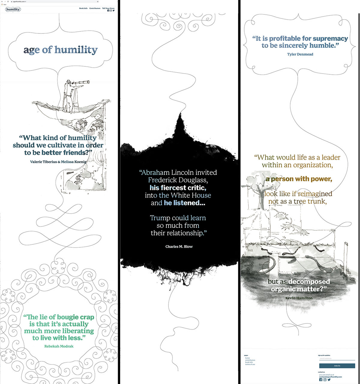
The Age of Humility project asks: can we reinvigorate humility from seeming like an archaic virtue studied by scholars and clergy to a living value, practiced in every workplace, from hospitals to courtrooms, and relevant in all realms, informing our choices as friends, colleagues, parents, and citizens? This project involves multiple work products—from a collection of essays to a series of researched posts distributed via social media—all with a centralized base: the Age of Humility website (AgeOfHumility.com). In designing the website and social media pages, our goal was to support the project and to inspire interest in humility as a value during this time in which political boasting and status-seeking are pervasive, and humility is rarely discussed.
In designing AgeOfHumility.com, we understood that exploring humility through scholarly research and anecdotal/personal narrative would not be served well by the current commerce-based paradigm for web design, which emphasizes self-promotion and facile consumption of information. Literary promotional websites, by default, have a self-congratulatory aesthetic. Their goal is to impress visitors. Critics’ praise, flattering headshots, and authors’ accolades take center stage in an effort to persuade would-be readers into making a purchase. We wanted to design an alternate approach.
We entered into the design process with several questions:
If humility involves a capacity to acknowledge error and learn new perspectives, how can the website design communicate and enact this openness to change?
How do we encourage users to see our contributors as an extension of their own community, and how can we prioritize ideas rather than promote people?
Can we approach web design in such a way that we encourage users to slow down and take time processing complex insights about humility?
Using a collaborative process, we developed several design strategies meant to engage visitors in conversation:
The meandering line — a line of curiosity that leads users from thought to thought.
The hand-drawn curlicue frame — a momentary pause to consider an idea or image.
The gradient — communicating the fallibility of represented perspectives.
The animated ink cloud / moving field of pigment — indicating that thought is not static. The ink cloud also conveys emotional content to indicate elation or turbulence.
All elements mimic organic movement to defy the flat space of the digital screen and the grid-based template of much web design.
The Age of Humility website and social media use this visual language to create contemplative space within a traditionally fast medium. The home page introduces viewers to diverse dialogues around humility. We intentionally avoid the primacy of the cursor’s point-and-click as the method of interaction. Instead, the main activator on the site is the imperfect, hand-drawn winding line that coils around quotations and entices users to scroll down the page, reading ideas that come politics, consumer culture, psychology, and other perspectives. The line and animated ink cloud all indicate that thoughts are pliant and yielding and prompt an introspective, gentle tempo for navigating the site. We use two complimentary fonts filled with a watercolor texture as a way of implying a spoken voice that fluctuates in timbre, and as a means to emphasize key words within that speech. The home page uses these designed tools to emphasize thoughts about humility rather than specific people.
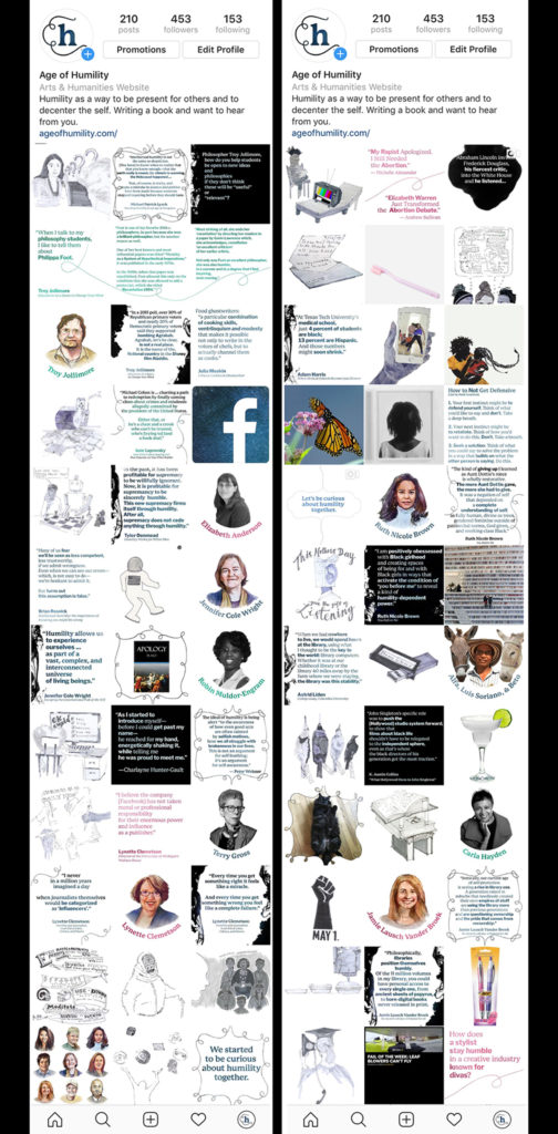
The site’s navigation menu leads users to the contributors page where we replaced the traditional headshots with watercolor portraits so that contributors are seen as approachable, and to convey the idiosyncratic nature of the project. The watercolor medium treats contributors as characters on the page within a book of tales about morality and ethics. None is more important than another and, collectively, they build a broad, diverse understanding of humility. On the individual profile pages, we again emphasized excerpts and perspectives over biographies.
As contemporary social media is synonymous with self-promotion, Instagram presented a more severe set of challenges. We designed a strategy here of featuring one discipline or perspective for a two-week sequence of posts. For example, humility and mathematics; humility and Black girlhood; humility and aging. Working with two-week increments, we developed the website’s toolkit to be dynamic and compelling for fourteen days. We developed multiple variations of hand-drawn coiling frames and ink clouds. The hand-drawn curlicue frame transferred well to social media, providing a recognizable and consistent hallmark and a border for logos, photographs and other content that we want to absorb onto our site. We extended the hand-drawn meandering line into fully drawn illustrations; each two weeks of content are illustrated by five or six whimsical drawings, rendered carefully but without hard lines. The color watercolor portrait of the contributor who has inspired the series begins each two-week period. And because putting a face to people is so important to us, we create black-and-white portraits of guest social media contributors as a way to distinguish them from long-term contributors.
The resulting Age of Humility website and social media sites avoid the tropes of vanity websites and become both a preface for and visual extension of our exploration of humility. The site launched in January 2019 and we are excited to note that the audience is growing every day, both through the mailing list and social media. We’ve just passed 4500 followers on Facebook. After viewing the Age of Humility sites, the literary agency Dunow, Carlson & Lerner offered us a contract to represent our forthcoming book, citing the compelling way we’ve created a conversation around humility on the website and social media. Most importantly, the site has set up a platform for us to connect with communities across the world. We recently hosted a week-long series about humility from the perspective of residents of Ishinomaki, Japan; we partnered with author Rob Walker for a series of joint posts in which our contributors commented on excerpts from his book Art of Noticing; and we provided a forum for artists working on issues of free speech and democracy to share their work.
Rebekah Modrak is an artist and writer who practices at the intersections of art, activism, discursive design, and creative resistance to consumer culture. Her net-based artworks critique brand appropriation. Re Made Co. (remadeco.org) takes the form of an online “company” to parody actual company Best Made Co.’s appropriation of working-class imagery and values for leisure consumption. Rethink Shinola analyzes a complex and patronizing agenda of marketing the White savior myth. Modrak’s writing, published in such journals and books as Consumption Markets & Culture and Afterimage, analyzes the links between design, education, and brand marketing. For the past three years, she co-built and directed the site Age of Humility, bringing together dozens of diverse participants representing fields such as philosophy, the arts, law, race theory, and business, to reflect upon humility. Rebekah is a professor at the Stamps School of Art & Design at University of Michigan.
Jamie Lausch Vander Broek
Jamie Lausch Vander Broek is a Librarian for Art & Design at the University of Michigan. This summer, she bought a book made of cheese for her library. You can read about it on saveur.com [https://www.saveur.com/cheese-book-university-of-michigan]. She holds a tailored Master’s degree from the U-M School of Information in Art and Art Museum Librarianship, and received a B.A. in Art History with a minor in Italian Studies from Wellesley College. Since arriving in Ann Arbor, she has been active in the local art and book communities, and is currently on the board of the Ann Arbor District Library.
Sam Oliver
Sam Oliver is the founder of Shaper Realities, a product and interaction design studio based in Brooklyn. He founded the studio as a rebuke to the industry standard separation of design and development. Shaper Realities strives to combine the two practices within a single process. The members of the studio are all technical, and have ownership of projects from conception through launch. The studio works primarily with startups using bleeding edge technologies and artists reimagining the future implications.
Outside of his studio practice Sam Oliver remains an active part of the Hacker community. He believes strongly in the virtues of creative ownership within any maker practice, and works within the community to promote whimsical, non-commercial applications of technology.
A panel discussion among design innovators about their design and use of type in today’s changing environment.
Saturday, November 9, 2019 2pm–4pm Type Directors Club 347 W 36th St., #603 New York, NY 10018
Typeface design and the implementation of typography has never been more exciting. In many cases, type is presented on monitors, tiny and huge electronic visual displays, i.e., screens. In collaboration with the Type Directors Club, Design Incubation will moderate a panel discussion among design innovators about their design and use of type in today’s changing environment.
Moderators
Liz DeLuna St John’s University
Dan Wong New York City College of Technology, CUNY
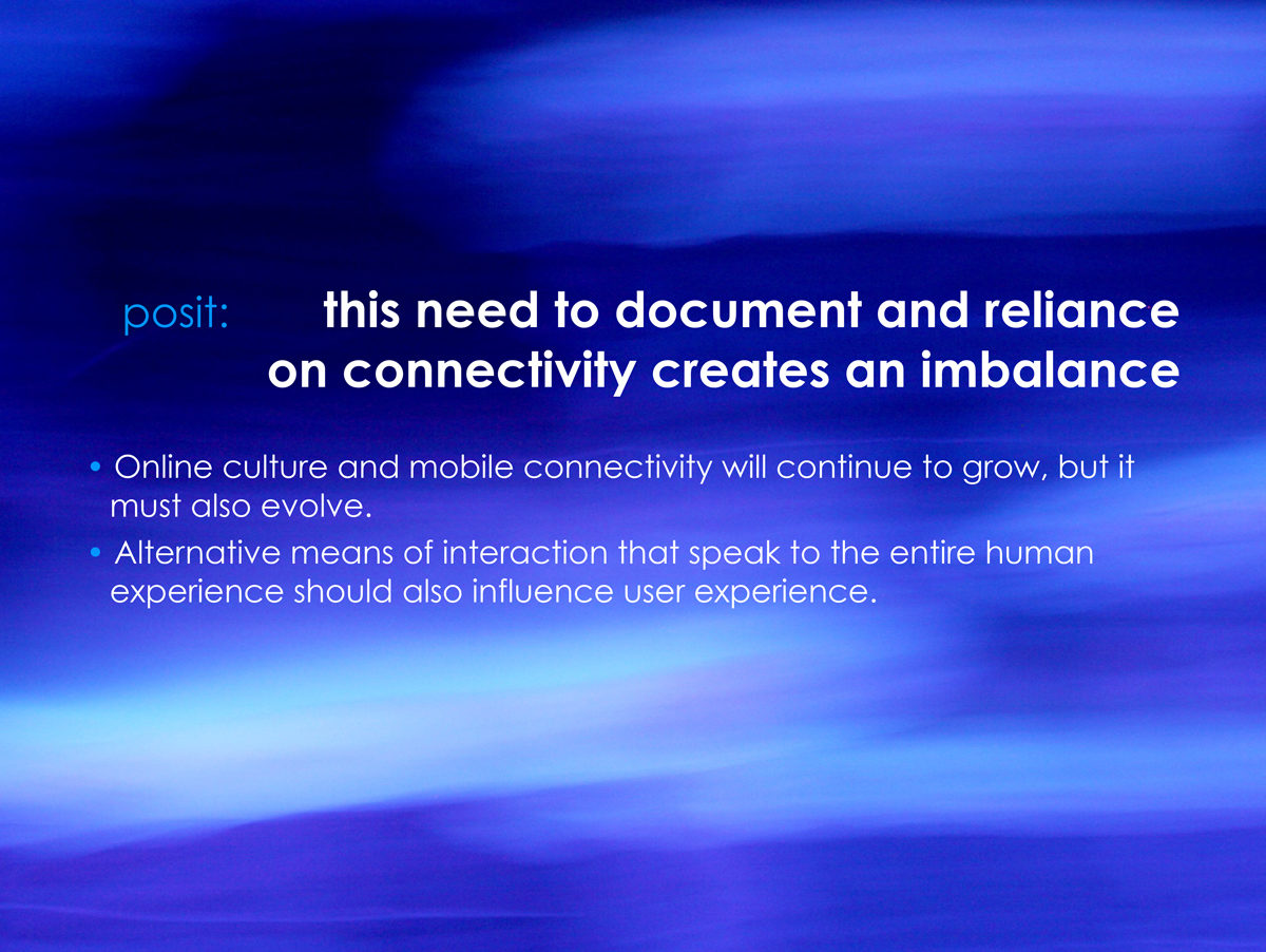
Designers should consider the balance between documentation and impermanence and ask what is permanent versus what is ephemeral?
Christopher Previte Associate Professor Franklin Pierce University
Many spaces on the web (social media, photo sharing, genealogy sites, etc.) ask us to document so much of our lives. From photographic evidence of what we eat and who we are with to digital dog-ears of our favorite music, political leanings, and familial connections, we willingly and slavishly create collections in an effort to connect with each other and prove that we matter. There is an implied permanence to these collections and they are used as currency in maintaining social hierarchy and relationships. This reliance on documentation creates an imbalance and denies the value of impermanence.
Buddhists, for example, believe that impermanence brings us hope and embodies the spirit of freedom and shatters the concept of predestination. Science teaches us that old cells in our bodies die and yield place continuously to the new ones that are forming. Technically speaking, no individual is ever composed of the same amount of energy. Impermanence and change are thus the undeniable and essential truths of our existence.
Therefore, while online culture and mobile connectivity continues to grow, it must also evolve.
Designers should consider the balance between documentation and impermanence and ask what is permanent versus what is ephemeral? Snapchat, for example, sought to convey what made face to face conversation special. The notions of impressions and deletion by default were baked into its user experience. At its best, user experience design focuses on the intangible and speaks to concepts such as atmosphere, personality, familiarity, and comfort—remembering that “users” are, in fact, humans. Given that, should not more research and discussion be dedicated to finding that balance and uncovering the value of impermanence?
Here we will begin that discussion and ways we can incorporate it into our design practice.
Bruno Ribeiro Assistant Professor of Graphic Design Department of Art and Design California Polytechnic State University
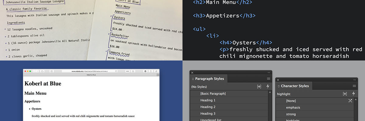
When introduced to the design of print publications, students often struggle with type hierarchy and sometimes they lack appreciation for simplicity. Learning HTML and its tagging system, however, can help them in both matters.
After taking their first web class, students tend to have a better understanding of systematic typography and make more conscious decision about typographical design. Through the logical language of HTML and the tagging system, students clearly see the supporting structure of type hierarchy. Pedagogically, it helps educators guide students to make better choices. Because web design is completely new to most of the students, it’s an opportunity to frame its structure as an approach on how to properly treat type hierarchy and consistency. Even the default style for HTML documents, with no formatting of any kind, provides a clear correlation between content hierarchy and visual hierarchy. Therefore, an early web design class improves students’ understanding of systematic formatting a wide range media. Web design can also promote an appreciation for simplicity in design. Every non-designer knows how to (often badly) format a printed page in their text processor of choice. Design students, then, tend to overly design to differentiate their work from what non-designers do. Simple design on the web, however, already brings a sense of accomplishment to the student who is able to make something they built from scratch available online. Even utterly simple designs are more tangible as a learned skill.
Web design should not be seen only as a skill that students need to learn. It is an effective means to teach the principles of systematic typography and visual hierarchy. The earlier students learn these concepts, better are the chances they will have of fully integrating them into their creative practice.
The 2014 winter colloquium will be held at Parsons, The New School. We invite all Communication Design researchers to submit abstracts for consideration by our panel of peers.
For more details, see the Submission Process description. Event Date: Tuesday, December 2, 2014