Variant Letterforms

Monica Maccaux
Assistant Professor
Graphic Design

University of Nevada, Reno

When considering the multitudes of typeface choice on the market, how does one approach the challenge of designing a typeface that is different from the competition? With the abundance of typeface choices, why is there a need for yet another typeface to be designed? These are valid questions when approaching the creative process of typeface design. There is the potential for there to be as many typefaces as there are people in the world; meaning, the possibilities are endless in the personalities and function of typefaces, and have the potential to grow along with the population.

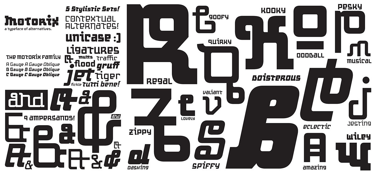
The typeface ‘Motorix’ solves the fatigue to a gluttonous font market by challenging the rules of form, beauty, and function all the while pushing the limits of what language looks like. The Latin (or Roman) alphabet, as it stands today, has undergone centuries of change and evolution which has resolved itself to current norms in letterform recognition. What will our letterforms look like in another couple of centuries? Will the letter ‘A’ still look the same? Will there be new letterforms added, or old ones removed? What can the letter ‘A’ look like? With the typeface ‘Motorix’, these questions were considered, along with how the expectation of aesthetics, and practicality drive the finished product.

Beauty and aesthetics aside, when approaching typeface design, one has to acknowledge that to design type, is to design language. As the designer of language, there are certain considerations that need to be made when formulating the letterforms: legibility, readability, beauty, form, versatility, and utility. It is no easy feat to design a typeface that is beautiful and practical, and has many applications (headlines, body copy, etc). But to design a typeface that confronts the notions of what beauty and practicality are, along with pushing the unspoken ‘rules’ of what language should look like, is something altogether different, and continues to be a modern-day challenge in typeface development.

This research was presented at the Affiliated Society Meeting: Design Incubation Special Program on Typography on February 23, 2018.

Making the Machine Human: Embracing Printing Technologies in Crafting a Present-Day Moveable Typeface

Peter P. Bella, Jr
Assistant Professor

Indiana University–Purdue University Fort Wayne

How human can the machine become in relation to the craft of moveable type and modern printing technologies? The letterpress has been an instrumental aspect of typography for centuries. The mechanical process of raised letterforms transferring ink to paper has a humanistic quality that exemplifies our senses and emotions. Movable type has seen centuries of adaptations—lead, wood, polymer and more; along with the creation tools and technologies—such as pantographs, plate makers, and computer. Has moveable type met its end, has letterpress found its zenith? Has technology surpassed this mechanical time machine and the cold nature of cast metal?

3D printing has varying qualities and expectations dependent on numerous variables. These virtues of 3D printing offer the design of typography, moveable type, and printing techniques an amplitude of potential expressions and experiential opportunities. Examples of 3D printing’s use in the realm of typography are found in 3D sculptures expressive of the letters architecture, and letterforms designed in three-dimensional space, never intended for physical traditional letterpress printing methods. This research is concerned with something entirely different finding a middle ground between perfection and form defining its own voice and concept through the qualities that are characteristically built into the machine.

This research suggest letterpress printing and moveable type has untapped life yet to be revealed presenting the challenging demands of typography and the mechanical properties of 3D printing methods applied to the creation of moveable type, its design, printing, and communicative qualities by personifying 3D printing technologies to create a moveable typeface with humanistic qualities and design voice. This moveable type exploration embraces the 3D printer as a machine to create a typeface never intended to meet the standards of perfection, but to embody the inherent artistic and humanistic aesthetics of the machine by pushing technology to its limits and discovering how human a 3D printed movable typeface can become.

This research was presented at the Design Incubation Colloquium 4.0: SUNY New Paltz on September 9, 2017.