Kelsey Elder
Assistant Professor
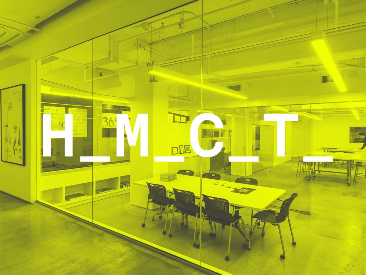
Carnegie Mellon University
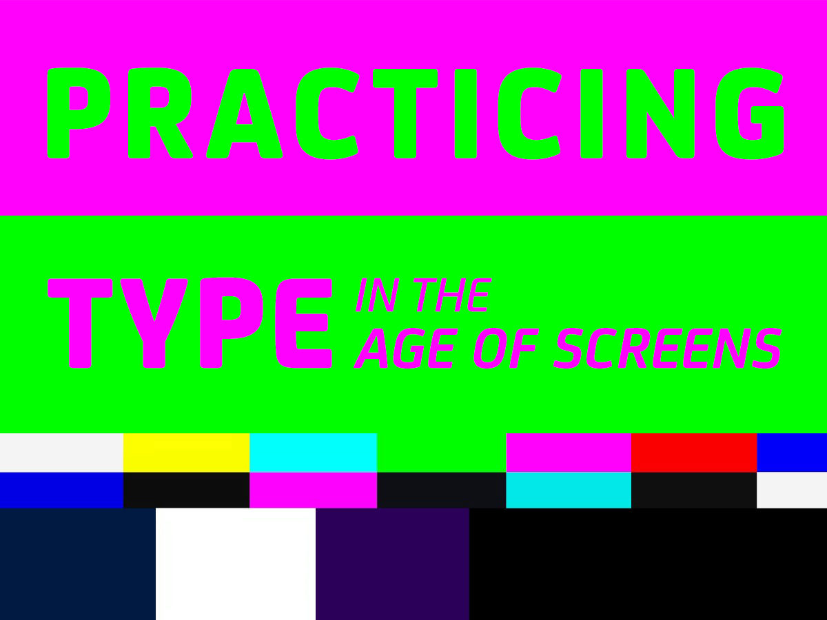
Variable is an elective that is the pedagogical manifestation of my research and creative practice surrounding typographic technologies, from the historical precedent to socio-cultural impact to the prosodic and practical potentials of formats today. It is part critical seminar and part experimental form laboratory. The course uses the metaphor of building cars (fonts) to drive/cruise to unexpected and new (typographic) destinations. Variable is divided into five mini-projects culminating in a final 5-week self-directed study project. Students investigate the socio-cultural impact of typographic technologies through embodied experiences and social activities. Talks and readings support by providing contextual history and future speculation to the world of typographic technologies. The projects allow students to learn and practice conventional techniques (letterpress) and novel techniques (variable fonts plus scripting) to design, render, and document glyphic forms. The course began as a graduate-level elective at the Rhode Island School of Design. It most recently ran as an undergraduate elective open to all majors at Carnegie Mellon University.
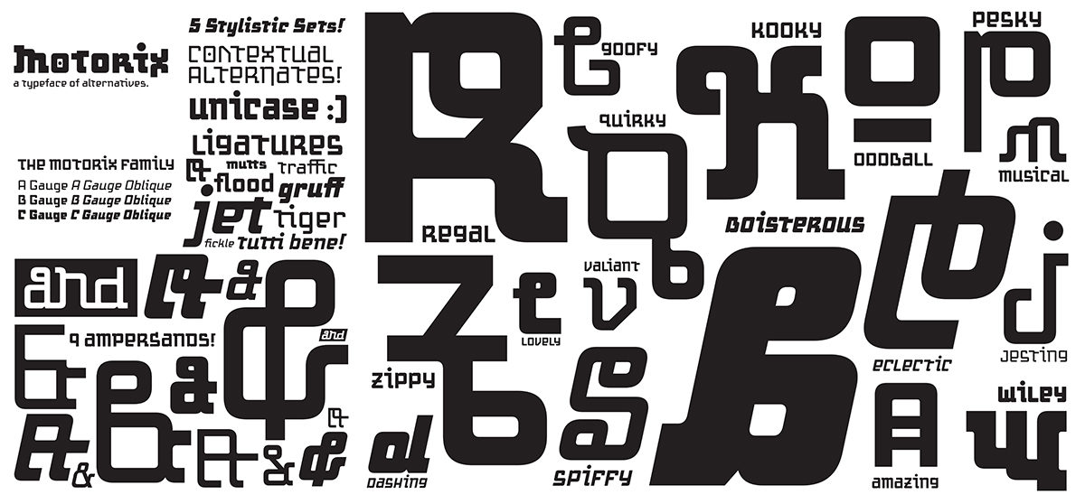
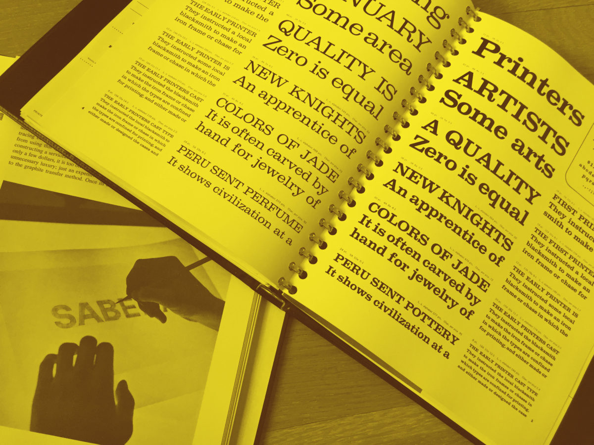
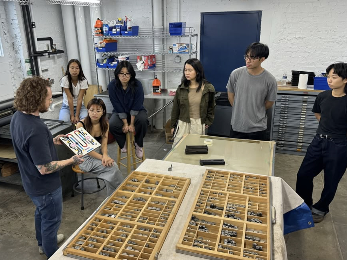
In the first project, Balance Bike, students learn about foundry type, printing, and type design foundational skills in Glyphs 3 through a collaborative alphabet prompt. This component-driven digital lettering exercise is then translated ‘type-high’ to letterpress by using a custom 3/4″ MDF and Lego Kit set up inspired by Pedro Neves’ “LegoType” letterpress printing course at UIC. In the second project, Kit Car, students practice drafting and basic type design practices (drawing, spacing, testing) through a component-driven workflow. Students are encouraged to observe the world around them and distill a kit of shapes from their insights. These sketches are turned into a digital set of parts (components) used to create a font; letters, icons, and/or patterns. This project picks up metaphorical and generative speed in project three, Gravity Racer, which introduces variable fonts and the generative potential of variable font workflows. Students expand their Kit Cars by adding one, two, and three axes through a series of workshops. They are also introduced to troubleshooting in font workflows, including scripting. Project four, Paint Booth, introduces color. The project introduces color font formats, including SVG, COLR/CPAL, color variable fonts, and layered font workflows. Students explore using these complex formats on the web, in print, and in interactive mediums they are already familiar with, illuminating each format’s opportunities and challenges. The final low-stakes project is titled Dune Buggy. In it, students remix, hack, and/or alter an existing open-source font through OpenType Feature writing, scripting, and developing programs/tools that can render their fonts. Students explore writing positional features, substitution features, and scripts that can manipulate vector data both in Glyphs 3 and outside of it (web, Processing, P5.js, Python). For the final 5-weeks, students can expand/revise/combine prior explorations into a culminating final self-directed study project titled Grand Prix.
While there have been necessary updates to the prompts due to the advancing nature of font technologies, the overall pedagogical methodology remains the same. The methodology is designed to reduce barriers related to typeface design, variable/color fonts, and programming. One significant barrier to learning typeface design is drafting. This is even more significant in variable fonts, where compatibility across drawings (masters) is a technical requirement. Another barrier is the need to craft/make rendering environments that allow these complex formats to flourish, often requiring a bit of ‘off-roading’ (code). The combination of these barriers commonly dissuades design students from engaging with typeface design and tool-making because there is a prevailing notion that it is ‘too technically difficult.’ Stemming from my research into patterning principles found across typographic technologies, I began exploring how to leverage the modular affordances of typeface design software today to reduce the barriers of access to the design sub-discipline. In foundry type, type founders used modular methods to reduce engraving (drawing) time via counterpunches. This allowed forms to be replicated easily; the same ‘counter’ of a /n/ could be used for /h/m/n/ and flipped to make the /u/. Digitally, ‘components’ do the same. Components are commonly used by type designers today not for counter-shapes but for language support—combining letters with marks via anchors. A liberal use of components to instead build letters from, akin to a pixel, when teaching variable fonts minimizes the complexity associated with drawing for master compatibility. One change in the component shape is immediately cascaded across all glyphs that use it. Instead of spending the majority of time resolving incompatible masters across hundreds of glyphs, students could more easily focus on developing their conceptual ideas and engaging the expansive design space of variable fonts and their generative possibilities when combined with computation. Scripting and programming custom tools are similarly broken into bits that successfully combine. Students begin by learning simple Python commands to troubleshoot their font. Then, OpenType Features, scripting, and basic custom program/tool making. Finally, they can combine and expand these skills towards their final project idea.
While access to type design technologies has perhaps never been easier, there remains a significant gap between the rate at which font technologies are developing in the field and the access to these emergent workflows in design education. Young designers must be given the ‘right to repair’ the linguistic tools of today and should be empowered through their education and lived experiences to create the ones of tomorrow. After all, type designers are responsible for stewarding the language traditions of our elders past, present, and future… and innovating new forms of communication. One of the most potent and effective ways of making the future of text-based communication more equitable is to have more type designers–or at least designers who have some typeface design experience and skill. This elective seeks to contribute to this future by providing access to conventionally exclusive design subdisciplines of typeface design and programming. The course offers a way of teaching at the intersections of typographic technologies, computation, and language to be more elastic to meet the needs of the languages of our lands where they are. Its materials are open for all to use, remix, and share.
This project was the 2024 Design Incubation Educators Awards winner recipient in the category of Teaching.
Biography
Kelsey Elder is an educator, typographer, and type-technology enthusiast based in Pittsburgh, Pennsylvania. He is an Assistant Professor at Carnegie Mellon University, teaching communication design, typeface design, and critical studies. He has previously taught at the Rhode Island School of Design, Purchase College (SUNY), and Virginia Commonwealth University. Elder holds a BFA from the Minneapolis College of Art and Design and an MFA from Cranbrook Academy of Art, with additional studies at the University of Reading and the Plantin Institute of Typography. His research on typographic technology’s socio-cultural impact and pedagogical practices has been presented at conferences like TypeCon, and by invitation for institutions including the Herb Lubalin Center, Museum Plantin-Moretus, and LAABF. His workshops on type design, including variable/color fonts, have been held at ATypI Brisbane and other venues. When he’s not teaching, crafting letters, or tinkering on a press, you’ll find him hanging out with his cats.