Fusing Old and New: Visual Communication for the Liberal Arts

Teaching Award Winner

Evelyn Davis-Walker
Assistant Professor
Valdosta State Universit
y

I have always been interested in the melding of the historical and the contemporary—tradition with experimentation. When designing new and exciting methods of engagement with my design students, I wanted a unique experience that was not offered anywhere else. Upon my arrival to Valdosta State University, I wrote a grant to help acquire letterpress equipment and supplies used in the late 1800s and early 1900s. 

My initial interest was to preserve a vital part of graphic design history for students to study and appreciate. What I ended up developing was a proposal in which I infused 100-year old historic machinery with today’s 3D printing and laser cutting technology capabilities. Once I was able to restore the vintage printing press, I recreated type  (letters) through the use of 3D printers and laser cutters. Ensuring the letters were the exact size for utilization on the press, I printed specific type/fonts currently unavailable in our library of letters. The ability to customize and create three-dimensional letters and eventually illustrations is game-changing. Students will have the capabilities to print in a traditional method of graphic design while using ideas, styles and messages of a 21st century student.  

I am also honored to be featured alongside my fellow Art & Design colleagues in the 4th issue of the 2019 Valdosta State Magazine for my imaginative pairing of old and new processes. In the article, Changing How Art is Made: VSU Merges Old-School Techniques and New Technology to Revolutionize Creative Instruction, I discuss my desire to merge old and new processes in my classroom. My job as an educator is to present content of today to my students, acknowledge what had been done in the past on a historical level, and most importantly, make new pathways for learning for the future.

Students in ART 3091, Introduction to Graphic Design 1, spend the first four weeks off the computer; understanding the history of graphic design through hand-lettering and letterpress printing. This is both frustrating and freeing to the students upon learning of the scheduled structure on the first day of class. 

Students are exposed to the historic practice of arranging and printing letters on paper to communicate a message. The process is painstaking, complex and imperfect—all aspects that become substantially easier once the computer is introduced in week five. In addition to the incorporation of the computer, students have been integrating 3D printing and laser cutting as means of experimentation – the blending of traditional and technology. My on-going research and scholarship regarding traditional and contemporary processes (integration of traditional and technology), has been fascinating. Below is a breakdown of the multi-phased project introducing students to the art of typography.

PROJECT 1 – Structure and Breakdown
This first assignment in Graphic Design 1 began with each student choosing one word that described their unique personality. 

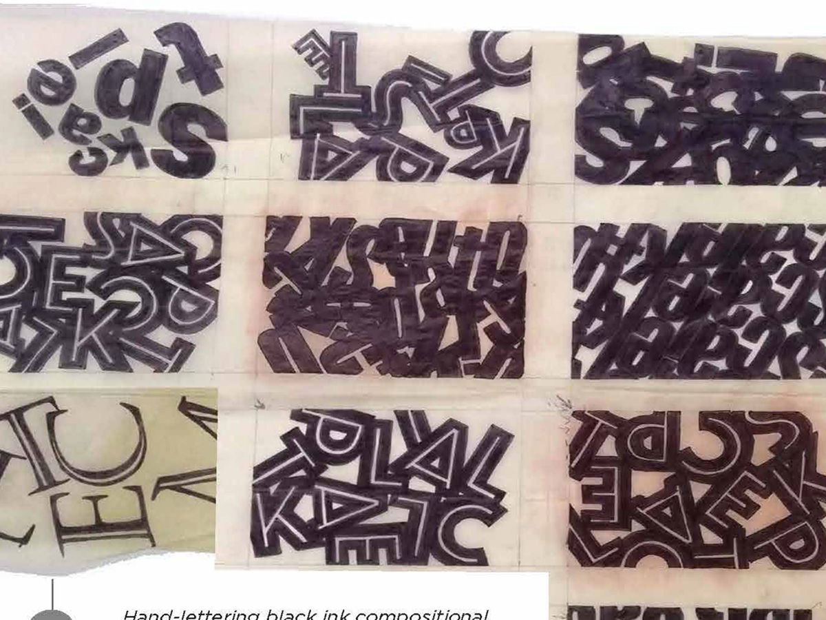
PHASE ONE: HAND LETTERING
Each student created 20 abstracted 4” x 6” compositions by hand with black ink. The students were expressive by using only letters that helped spell their word. By restricting the designer to create abstract compositions, students focused on pattern, repetition, scale and unity as design principles in a non-representational expression through the use of typography. 

PHASE TWO: CUT PAPERA
critique of the hand-lettering compositions were discussed as a class and the strongest three compositions were chosen to move forward into cut-paper iterations. (1-class vote, 1-professor vote, 1-individual designer vote.) The cut paper pieces were direct facsimiles of the hand-lettering designs, however color theory and relationships of positive and negative were addressed specifically with this phase.

PHASE THREE & FOUR: LASER CUT & HAND STAMPING
Technology was introduced in these two phases by scanning the strongest cut paper design and digitally preparing it for laser cutting in the wood-shop. Students glued their wooden letters onto a board, thus creating a mirrored design for hand-stamping. Using ink and rollers, designers stamped their digitized wooden blocks onto 4” x 6” cards.

PHASE FIVE: LETTERPRESS
The final phase involved understanding one of the oldest forms of graphic design, letterpress printing. While the first few phases involved focusing on the abstracted word, the letterpress printing was a direct and literal compositional print of the word’s definition. Students were trained on type-setting, inking and operation of the century-old machine. To successfully complete this phase, their focus involved typographical rules such as leading, kerning, line flow and line direction.


Evelyn Davis-Walker holds a B.A. in Visual Communication and Computer Art from Otterbein University and an M.F.A. in Advertising Design from Marywood. 

In 2010, Evelyn was awarded 25 for 25 AOL International Art Grant where 25 winners (9,000 applicants) were funded $25,000. Evelyn designed individual memory games for 200 Alzheimer’s patients. In 2015, Evelyn received the Otterbein University Young Alumni Recipient for Community Engagement. 

She was a graphic design professor at Virginia State University before coming back to Otterbein to teach Communication Design for eight years. In 2016, Evelyn moved to South Georgia where she currently oversees the Graphic Design area of Valdosta State University’s Art & Design department.  

Along with her commercial design work, Evelyn has a strong affinity for all things paper – from mixed media collage, to creating typographic prints on her letterpress machine. She has received numerous awards and has exhibited in solo, group and juried exhibitions.

Recipient of recognition in the Design Incubation Communication Design Awards 2019.

Breakfast and Letterpress Typography Workshop @HMCT

Hoffmitz Milken Center for Typography at ArtCenter College of Design is hosting a workshop to welcome Design Incubation and typography design researchers to the West Coast.

We are excited to announce the Hoffmitz Milken Center for Typography at ArtCenter College of Design is generously hosting a workshop to welcome Design Incubation and typography design researchers to the West Coast during the 106th Annual CAA Conference in Los Angeles.

Saturday, February 24, 2018
10:30AM–1:30PM
Hoffmitz Milken Center for Typography / Archetype Press 
South Raymond Avenue
Pasadena, California 91105

The Hoffmitz Milken Center for Typography [HMCT] at ArtCenter College of Design was founded in 2015 in memory of Professor Leah Hoffmitz Milken, a well-known typographer, letterform designer and esteemed faculty member at ArtCenter. Archetype Press houses more than 2,500 cases of rare American and European foundry type, wood type, and ornaments.

Gloria Kondrup, Executive Director of Hoffmitz Milken Center for Typography and Director of Archetype Press, will also be moderating a special program of typography research presentations during Affiliated Society Meeting: Design Incubation Special Program on Typography. For details visit the website announcement. All are welcome to attend these events. Please register in advance.

Making the Machine Human: Embracing Printing Technologies in Crafting a Present-Day Moveable Typeface

Peter P. Bella, Jr
Assistant Professor

Indiana University–Purdue University Fort Wayne

How human can the machine become in relation to the craft of moveable type and modern printing technologies? The letterpress has been an instrumental aspect of typography for centuries. The mechanical process of raised letterforms transferring ink to paper has a humanistic quality that exemplifies our senses and emotions. Movable type has seen centuries of adaptations—lead, wood, polymer and more; along with the creation tools and technologies—such as pantographs, plate makers, and computer. Has moveable type met its end, has letterpress found its zenith? Has technology surpassed this mechanical time machine and the cold nature of cast metal?

3D printing has varying qualities and expectations dependent on numerous variables. These virtues of 3D printing offer the design of typography, moveable type, and printing techniques an amplitude of potential expressions and experiential opportunities. Examples of 3D printing’s use in the realm of typography are found in 3D sculptures expressive of the letters architecture, and letterforms designed in three-dimensional space, never intended for physical traditional letterpress printing methods. This research is concerned with something entirely different finding a middle ground between perfection and form defining its own voice and concept through the qualities that are characteristically built into the machine.

This research suggest letterpress printing and moveable type has untapped life yet to be revealed presenting the challenging demands of typography and the mechanical properties of 3D printing methods applied to the creation of moveable type, its design, printing, and communicative qualities by personifying 3D printing technologies to create a moveable typeface with humanistic qualities and design voice. This moveable type exploration embraces the 3D printer as a machine to create a typeface never intended to meet the standards of perfection, but to embody the inherent artistic and humanistic aesthetics of the machine by pushing technology to its limits and discovering how human a 3D printed movable typeface can become.

This research was presented at the Design Incubation Colloquium 4.0: SUNY New Paltz on September 9, 2017.

Trianimals

Ned Drew
Professor
Department of Arts, Culture and Media
Rutgers University

Brenda McManus
Assistant Professor Graphic Design
Dyson College of Arts & Sciences
Pace University

This letterpress project encompasses the traditional printing method with a contemporary and modular printing system. Inspired by the minimalist children’s book design of artists such as Blexbolex, Bruno Munari and Paul Rand, we set out to develop a narrative, and its accompanying visual vocabulary, based on a simple shape—the triangle. Using this shape we developed a unique story, generated through a system of expanding interpretations and multiple combinations.

The overall concept and design of this project revolves around our dedication to the foundations of design. Basic design principles, such as color, shape, abstraction and layering are at the core of this initiative. We developed a printing system based on a single unit, a one-inch right triangle. Like building blocks, we set out to create a series of simplified illustrations that were comprised of this single unit (the triangle).

Although conceived as a letterpress project, our process started with a more contemporary tool, the computer. We used Adobe Illustrator to design the animal illustrations, this process would later serve as a digital blueprint to work from when translating the various layers to the press bed. Once we worked through the design we produced one hundred, type high, 1” x 1” right triangles. To implement this system we produced 3D printed 1×1” triangular counter forms or “slugs”. These slugs enabled us to easily “lock up” different configurations on the press bed. We also custom cut a set of plywood “furniture” in various sizes that acted to fill and organize the unused areas of the press bed. This marriage of old and new technologies allowed for exciting possibilities, a departure from the conventional pica based printing process.

The use of digital tools in the design phase was instrumental in the success of our illustrations and in implementing and managing the printing process.

We often discuss with our students the concept of “1+1=3”. This simple concept helps to illustrate that, in design, basic elements can be combined to make unique combinations. In our printing process this is was also true. A major design consideration was the correct and balanced layering of colors to achieve the different components of the animals’ portraits. These whimsical and simplified representations came to life through the subtle layering and manipulation of various color combinations.