Maria Smith Bohannon
Associate Professor
Oakland University
This paper argues that in the early twentieth century, American women played a critical role in shaping the material output and aesthetics of the Private Press movement, which built upon the Arts and Crafts movement and the ethos of William Morris’ Kelmscott Press to reject mass printing in favor of handcraft, high-quality materials, artistic layout, and limited-edition books. Women in the field did it all—typesetting, page layout, proofing, printing, and day-to-day operations—yet, like the legacies of women in the history of typography and book arts more generally, their work is often overshadowed by the eminence of the men with whom they worked. This presentation draws on physical and digital archival artifacts, period articles, and rare books to show how Bertha Goudy (1869-1935) of The Village Press, among others, played a pivotal role in shaping typography and fine printing as works of art in the 20th century. By looking at the professional life of Goudy and other women in the Private Press Movement, their work, and their labor practices, and centering them as authorial rather than peripheral, this paper offers an expanded discussion on women who influenced fine printing, book design, typesetting, and typography—and a few of the women at its core. Analyzing historical and cultural context, this paper contributes to contemporary efforts to diversify and expand design history.
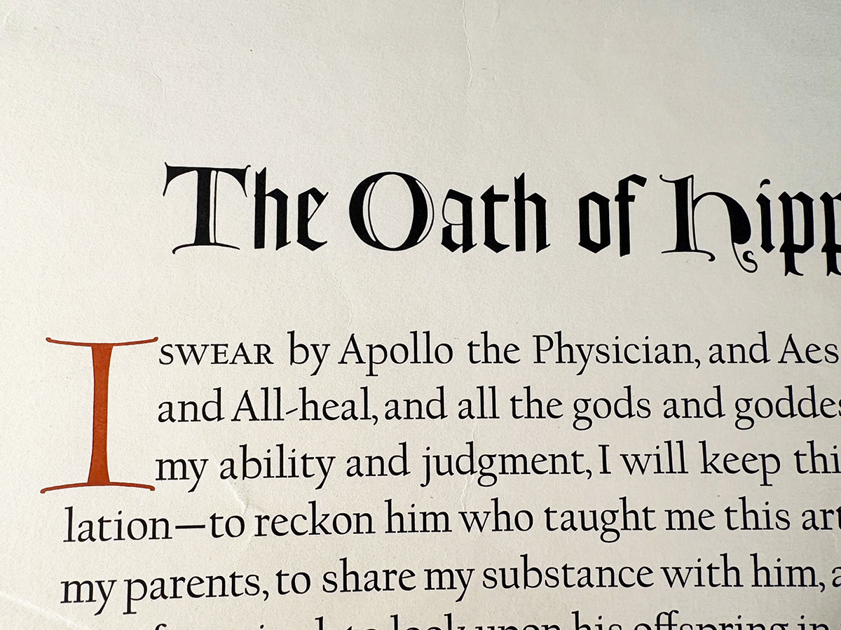
image credit: Goudy Collection Broadside #115, Rare Book and Special Collections Division of the Library of Congress, Washington, DC.
This design research is presented at Design Incubation Colloquium 12.2: Annual CAA Conference 2026 (In-person only) on Thursday, February 19, 2026.