Facilitating a Culture that Celebrates Experimentation and Addresses the Fear of Failure through Assessment

Alex Girard
Assistant Professor
Graphic Design
Art Department
Southern Connecticut State University

At Southern Connecticut State University, it has been observed that students pursuing a design degree are entering the program with a background dominated by a philosophy in which success equals providing a pre-defined, correct answer to a problem. This approach does not prepare students for a design process in which experimentation is paramount, as there is no singular correct answer to a given design problem.

The test-taking model of assessment assumes that information is disseminated by the instructor, retained by the student, and then recalled during a test. In this model, correct answers are consistent across submissions; it does not allow for the synthesis of something new, which is key to a successful design solution. Further, students in this process are often creatively crippled by fear of failure, as failure will negatively impact their final grade. Applying this philosophy of a singular correct answer, students are hesitant to embrace a process that encourages the exploration of ideas with multiple solutions.

While parameters guide a design project, end results are not measured against a pre-defined, correct design solution. In theory, each solution has the potential to be vastly different from another, yet still successful. Developing an assessment model that reinforces this process of experimentation with multiple solutions can be challenging for an instructor.

This presentation outlines a response to the perceived disconnect between the academic background of incoming students and the process required to achieve a successful design solution, utilizing an alternative project assessment model at Southern Connecticut State University. While this assessment model was applied in a limited context, positive results were immediately apparent and lasting; most notably, a marked increase in student experimentation with multiple solutions was observed.

This research was presented at the Design Incubation Colloquium 4.0: SUNY New Paltz on September 9, 2017.

Reconstructing a BA Graphic Design Program: Scalpel or Sledgehammer?

Nancy Wynn
Associate Professor
Merrimack College

In the fall of 2015, as the new faculty member at Merrimack College, I was thrust into this position. A cold dose of reality hit—my senior students’ work was, sadly, a mess. It was clear the design program needed to be rebuilt and renamed. Acting fast became necessary, because moving slowly would continue the problem. Both scalpel and sledgehammer were required (along with lots of coffee) delivering a newly redesigned BA Graphic Design program for approval and implementation by fall 2016. The program bridged both design thinking and making with the skill set of a Liberal Arts education.

The analysis started with the NASAD/AIGA analytical and consultative briefing papers. They were a good starting point, but they did not answer the question of how to build an expanded BA model responsibly? How elastic is the BA model? What beneficial Liberal Arts skills could be integrated into a graphic design student’s education? How could avenues be created for various types of students to be successful? And, where and how should professional engagement enter into the program?

This story begins by sharing methods for responsibly creating a “hybrid” BA model, keeping students’ best interests in mind, and honoring the industry’s professional standards. Topics to be shared include evaluating existing majors and minors; partnering with other majors and departments; which courses to keep vs. which should be thrown out; setting sizable goals for a 4-year BA graphic design program; ideas on future learning spaces and technology; and, understanding what is valuable in a 21st century graphic design education as the industry continues to evolve.

This research was presented at the Design Incubation Colloquium 4.0: SUNY New Paltz on September 9, 2017.
Thinking Like a Forest / Ecological Empathy

Jason Dilworth
Associate Professor
Visual Arts + New Media
SUNY at Fredonia

Since 2013 our organization has worked to respond and understand the forest as an idea generator for the designer. Through a process of exploration, reflection,and action we investigate through objects and questions. We seek to understand how complex forests systems work and sometimes fail. Through our investigations we find connections to the communities and work to build global partnerships while also creating a better understanding of our local bioregions, specifically the forests that live around us.

The presentation will introduce our research into the material and design culture of historic New York utopian communities and how their ideas contributed to, or countered, the ideological thinking that forever altered the region’s ecology and economies. Additionally we will also present our work and research on the reforestation efforts happening in East Iceland and explain the role that design is playing in building community and government support for the effort.

This research was presented at the Design Incubation Colloquium 4.0: SUNY New Paltz on September 9, 2017.

Making the Machine Human: Embracing Printing Technologies in Crafting a Present-Day Moveable Typeface

Peter P. Bella, Jr
Assistant Professor

Indiana University–Purdue University Fort Wayne

How human can the machine become in relation to the craft of moveable type and modern printing technologies? The letterpress has been an instrumental aspect of typography for centuries. The mechanical process of raised letterforms transferring ink to paper has a humanistic quality that exemplifies our senses and emotions. Movable type has seen centuries of adaptations—lead, wood, polymer and more; along with the creation tools and technologies—such as pantographs, plate makers, and computer. Has moveable type met its end, has letterpress found its zenith? Has technology surpassed this mechanical time machine and the cold nature of cast metal?

3D printing has varying qualities and expectations dependent on numerous variables. These virtues of 3D printing offer the design of typography, moveable type, and printing techniques an amplitude of potential expressions and experiential opportunities. Examples of 3D printing’s use in the realm of typography are found in 3D sculptures expressive of the letters architecture, and letterforms designed in three-dimensional space, never intended for physical traditional letterpress printing methods. This research is concerned with something entirely different finding a middle ground between perfection and form defining its own voice and concept through the qualities that are characteristically built into the machine.

This research suggest letterpress printing and moveable type has untapped life yet to be revealed presenting the challenging demands of typography and the mechanical properties of 3D printing methods applied to the creation of moveable type, its design, printing, and communicative qualities by personifying 3D printing technologies to create a moveable typeface with humanistic qualities and design voice. This moveable type exploration embraces the 3D printer as a machine to create a typeface never intended to meet the standards of perfection, but to embody the inherent artistic and humanistic aesthetics of the machine by pushing technology to its limits and discovering how human a 3D printed movable typeface can become.

This research was presented at the Design Incubation Colloquium 4.0: SUNY New Paltz on September 9, 2017.

Unforeseen Structures: Chaos, Materials, and Emergent Process

Mitch Goldstein
Assistant Professor
School of Design

Rochester Institute of Technology 

My research focuses on the examination of form and methodology using darkroom photography techniques, specifically the photogram. Photograms use no cameras or lenses — instead, objects are placed on or near unexposed photographic paper and briefly exposed to light. This process results in abstract black and white compositions, which emerge unpredictably from the physical materials used in their creation. Control is relinquished, and instead intuition and chance allow form and structure to develop from the process.

This work closely parallels my visual design practice working in publication design, as well as my applied pedagogy teaching art and design students. My talk focuses on three concepts that this research explores: how to work with chaos and unpredictability, the usage and synthesis of materials and methods, and the exploitation of emergent process. My photogram work, my publication design work, and some of my classroom projects will be shown as examples of these ideas and how they manifest across different contexts.

This research was presented at the Design Incubation Colloquium 4.0: SUNY New Paltz on September 9, 2017.

Zika and Public Health Guidelines: Prototyping Models for Different Personas

Courtney Marchese
Assistant Professor of Interactive Media + Design
School of Communications
Quinnipiac University

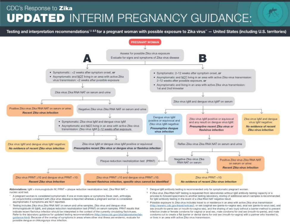
: In graphic design, models are material prototypes that help synthesize research into testable forms. Through experimentation and testing, many rounds of revisions are made to culminate in a visual that can effectively speak to its audience. In an age of infinite information, data visualization, particularly in global health, is a critical arena for accurate and useful visual modeling. For example, the Center for Disease Control (CDC) has Zika Pregnancy Guidelines in the form of a flowchart (Figure A). While it is certainly a necessary model to share with the general public, it is often cumbersome and difficult to understand. Riddled with professional medical terminology, footnotes, and companion charts, the model fails to serve as an accessible form to the information most needed by its audience. In examining the CDC’s guidelines, it is unclear whether they intend to communicate with health professionals or women potentially infected with zika. Rather than using a “one size fits all” approach to the chart, I propose modeling different forms that the information can take as viewed through the lens of different people in different environments and scenarios. Each prototype will take on a persona and emphasize the most important information to a specific audience explaining what to do before, during, and after exposure to zika virus. As such, each persona also serves as a model of sorts to represent an audience segment. By prototyping multiple forms, my goal is to make critical health information engaging and clear to those who need it most. Additionally, these prototypes can serve as a model for other issues within public health communication.

This research was presented at the Design Incubation Colloquium 4.0: SUNY New Paltz on September 9, 2017.

Racism Untaught

John O’Neill
Assistant Professor of Graphic Design
University of Minnesota Duluth

My presentation will speak to the legacy of how the graphic design industry throughout history has reflected racism in mass communication, shaping the attitudes and behaviors of the general public.

Teaching graphic design students the racial impact of design is as important as instructing them in software or conceptual and visual form-making skills. Racial components are often overshadowed within socially conscious design, for example higher sustainability standards to decrease waste and pollution. If students learn how racism is experienced within mass media, they will gain greater sensitivity how their graphic work could perpetuate racial stereotypes.

My presentation will showcase how a higher sensitivity to racism provides a greater context for the way different cultures and communities around the globe can perceive the same visual messages differently. Students will also gain an in-depth sense of empathy and critical thinking, which can be applied to other aspects of their design skills, most notability through their use of UI/UX design principles as they design interfaces. Students need to have the same sensitivity to societal and cultural norms when designing content for the 21st century, no matter if it is print or digital media.

With the use of web 2.0 and social media, graphic designers can have worldwide audiences for their projects larger than what could have been possible before. Communities around the globe are becoming more diverse, which requires graphic designers to have the skills to recognize racism in all of its forms. By doing so, they will avoid provoking overt and subtle racism in the work they produce.

Graphic designers are no longer limited to promoting social causes in their work to evoke social change. Instead, they can be agents of social change by intentionally preventing racial stereotypes in mass media.

This research was presented at the Design Incubation Colloquium 4.1: San Jose State on Saturday, Sept 30, 2017.

Drawing Type, Drawing Connections

Joel Mason
Professor Emeritus
Department of Communication Design
New York City College of Technology, CUNY

In 1979, as a full-time member of the Communication Design department at NYC College of Technology, I was assigned Lettering and Typography, a first semester course teaching students to draw three basic alphabets: Caslon, Bodoni and Helvetica using the “built-up” method with broad sketching pencils. Reviewing the course outline and required textbook, David Gates’ Lettering for Reproduction I realized there were gaps in my education.

When I was a student, classes in graphic design history/theory didn’t exist. Gates briefly covered design history and theory but also explained the role of geometry, visual perception, printing technology, history and aesthetics in the design and evolution of letterforms. Now, I understood that while demonstrating lettering techniques, I would also need to relate them to these other disciplines. As a result, my thinking about teaching typography changed, seeing its potential as a multidisciplinary subject with links to the liberal arts and sciences.

Lectures included the role of geometry in shaping the proportional systems underlying Old Style and Modern Style typefaces, along with discussions and demonstrations of the role of visual perception and illusion in adjusting shapes to create harmonious optical relationships among letterforms. Examples of how Caslon and Bodoni appeared when first printed in the 18th century and how paper, ink and presswork affected their appearance were integrated into the narrative. History could also be introduced in surprising ways, by explaining for example, that the first copies of the American Declaration of Independence were printed using Caslon, which was imported from England prior to the Revolution. Drawing and constructing letterforms also demonstrated how fundamental design principles (also being taught in other first year design classes) such as contrast, balance, proportion and rhythm contributed to an aesthetically pleasing result. The class was also showed thow organic forms in nature served as a source of inspiration.

Taken together, students not only learned to draw letterforms, but saw how the broad web of connections with other disciplines could enrich their learning experience. I taught the course for five years, but by the early 90’s digital technology replaced hand-lettering. Recently, there has been a resurgence of interest in calligraphy and hand-lettering. Regardless of the technology used, teaching typography, particularly at the introductory level, can be transformed by the multidisciplinary approach.

This research was presented at the Design Incubation Colloquium 4.0: SUNY New Paltz on September 9, 2017.

Visualizing Mental Models

Joshua Korenblat
Assistant Professor
Graphic Design

State University of New York at New Paltz

Visual communicators can work at the center of ideas by understanding mental models. A mental model is an abstract representation of reality that enables thinking, understanding, and knowledge sharing. In his book Visual Complexity, Mapping Patterns of Information, researcher Manuel Lima identifies two broad historical trends in mental models: earlier tree-based models of knowledge, illustrated in the literal form of trees, shift into today’s more abstract, network-based models of knowledge.

As summarized by Raph Koster in his influential book A Theory of Fun for Game Design, thinking is pattern-matching against experience. Patterns are stored in memory as chunks of information. Most of the time, the brain works with these abstract chunks—a type of autopilot—rather than processing incoming information in detail. Poetry breaks us from the autopilot mode through vivid descriptions and figurative verbal language. Like a poem, a visual mental model can break readers from their autopilot mode by allowing them to examine their assumptions in a material way. These diagrams rely upon an elegant visual alphabet. Mental models appear in user experience research as affinity maps and user journeys. Or they can show systems, a set of interdependent parts, below the threshold of events and action. Ultimately, the most vivid mental models allow the reader to see a belief or story.

After presenting historic mental models, I’ll show a simple design case study for how to make a mental model, adapted from systems theorist Derek Cabrera. I’ll then discuss when to represent the model in an abstract way, and when it might benefit the designer to represent the model in a more illustrative way. Designers who wish to create vivid, shareable artifacts of our world can use mental models as a tool to enhance communication, conversation, and action with their constituents.

This research was presented at the Design Incubation Colloquium 4.0: SUNY New Paltz on September 9, 2017.

Reading Design: An Introduction to Critical Theory

Dave Peacock
Associate Creative Director, LiveAreaLabs
Faculty, Vermont College of Fine Arts

What is theory? How does theory relate to graphic design? In short, theories are frameworks for understanding and making sense of the world. Further, they allow us to ask specific kinds of questions and follow particular lines of reasoning. For designers, theory is a means to move beyond purely aesthetic concerns and address issues such as power, representation, and commodity culture.

This presentation will highlight a handful of theories that have influenced literature, art history and, more recently, design discourse over the last few decades. Examples from art, popular culture and graphic design will help facilitate an introductory understanding of several important ideas, including Marxism, Structuralism, Post-Structuralism and Feminism. Designers and educators will also gain insight into how to incorporate theory into their writing, research and design work.

Dave Peacock is a designer and educator based in Seattle, Washington. He is an Associate Creative Director at LiveArea (livearealabs.com), a creative, marketing and technology agency with a focus on interaction design and digital retail. Dave also serves as co-chair and faculty at Vermont College of Fine Arts, where he teaches in the Graphic Design MFA program. Dave has exhibited nationally and internationally, and his work has been recognized by Type Directors Club, Communication Arts, Graphic Design USA, AIGA, The ADDY Awards, Print Magazine, How Magazine, The Northwest Emmy Awards and The Seattle Show. A Colorado native, Dave holds an MFA in Visual Communication Design from the University of Washington and a BFA from the University of Utah.

This research was presented at the Design Incubation Colloquium 4.1: San Jose State on Saturday, Sept 30, 2017.