Visualizing Self-Tracked Data to Navigate Well-being

An explorative process, grounded in Positive Psychology’s core concepts like gratitude, acts of kindness, goal-setting, and mindfulness

Yvette Shen
Associate Professor
Ohio State University

As a visual communication design educator specializing in Information Design and Data Visualization, Shen views teaching as a collaborative journey of discovery with her students. The journey in education here goes beyond honing technical skills, venturing into an enlightening realm where learning outgrows traditional methods and tools.

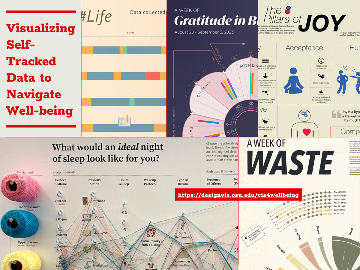
Since 2018, students entering her classroom have embarked on this explorative process, grounded in Positive Psychology’s core concepts like gratitude, acts of kindness, goal-setting, and mindfulness. Through meticulously structured visualization projects that involve tracking and visually rendering their behavior and emotion over time, they not only learn design skills but also engage in profound self-reflection, leading to meaningful well-being insights. In these classes, students engage in the active self-tracking of their daily experiences, encompassing everything from emotional states and physical activities to altruistic behaviors and environmental interactions. This process, supported by a combination of manual logging and digital tools and rooted in Positive Psychology principles, yields a rich dataset. This data becomes a canvas for each participant to visualize and analyze, offering unique insights into students’ narratives.

This educational strategy bridges the practical application of data visualization with the theoretical constructs of Positive Psychology. During the COVID-19 pandemic, for instance, students’ self-tracked metrics evolved beyond mere numbers. Interpreted through Positive Psychology principles, these metrics narrated stories of resilience, coping, and the joy found in everyday interactions. Acts of kindness, when quantified and analyzed, transformed into powerful reflections of character strengths such as empathy and compassion. The synergy of data visualization with Positive Psychology equips students with a dual-lens: the self-tracking acts as a reflective mirror, while Positive Psychology offers interpretive tools to decipher these reflections. More than 180 students have engaged with this pedagogical model over the years, revealing that the alignment of daily actions with personal values fosters a sense of purpose. Moreover, the act of savoring positivity encourages students to cultivate an appreciative outlook on life.

Navigating through the data visualization process presents its challenges. Students must make coherent sense of raw data and determine the most impactful visual representations. Dissecting qualitative data to discern patterns and crafting personal stories from it remains a continuously evolving puzzle, demanding critical engagement and thoughtful interpretation. While the course centers on the foundational principles of information design—including the gathering, sorting, categorization, and analysis of information—the incorporation of Positive Psychology highlights a vibrant nexus between data visualization and personal well-being. Students not only master design intricacies but also witness the empowering effect of design on individual well-being. They emerge with enhanced data literacy, design thinking skills, and a strengthened culture of introspection and ongoing personal development.

This educational journey in Information Design and Data Visualization aims to transcend scholarly pursuit; it seeks to become a transformative experience that enriches student lives. It cultivates an appreciation for the storytelling power of data and deepens the significance of introspection in personal growth. The hope is that this approach to Information Design will exemplify how the meticulous art of visual communication, in synergy with human-centered design philosophy, can illuminate the path to holistic wellness and enlightened self-awareness.

This project was the 2023 Design Incubation Educators Awards runner-up recipient in the category of Teaching.

Yvette Shen is an Associate Professor in the Department of Design at the Ohio State University and the program coordinator in the area of Visual Communication Design. The focus of her current creative and research pursuits is centered on the field of information design and information visualization. Specifically, she is interested in exploring how design can facilitate a deeper understanding of complex information and foster increased interest in learning, as well as how visualization and user experience can promote positive behaviors and emotions. Yvette holds an M.F.A. degree in Visual Communication Design and a B.S. degree in Computer Science.

Convergence of Science and Art to Support Climate Resilience in Central American Smallholder Communities

This innovative application assists farmers in planning their planting and harvesting activities based on rainfall forecasts

Qiuwen Li
Assistant Professor
Santa Clara University

Sara Wheeler
Undergraduate Student
Santa Clara University

Contributors: Iris Stewart-Frey, Ed Maurer, Allan Báez Morales, Gautam Chitnis, Alex Avila, Tanmay Singla, Turner Uyeda, Briana Guingona

Farming communities in vulnerable regions of Northern Nicaragua heavily rely on rain-fed agriculture amidst climate variability. Unfortunately, smallholder farmers often lack timely climate forecasts to inform their decisions. To address this challenge, a collaborative team from Santa Clara University (SCU) has partnered with a Nicaraguan NGO to develop the NicaAgua app. This innovative application assists farmers in planning their planting and harvesting activities based on rainfall forecasts.

This app innovatively simplifies presenting probabilistic rainfall forecasts. Our project leverages resources and advocates integrating data visualization with shapes, symbols, and attributes, following human-centric principles for accessible climate data.

Forecasts’ use relies on perceived skill (Babcock, 2016). The main challenge is converting rain forecasts across language and geography, aligning with local knowledge and ensuring accessibility. We employed participatory methods, surveys, focus groups, and workshops. In design, Gestalt principles make our visuals digestible, aiding in identifying relevant metrics for local climate efforts.

Through visual aids and expertise, this initiative empowers Nicaraguan farmers. We’ll share insights in the session, covering student-centered research, participatory methods, and app design.

References

Babcock, Gabrielle Wong-Parodi, Mitchell J. Small and Iris Grossmann, Stakeholder perceptions of water systems and hydro-climate information in Guanacaste, Costa Rica, Earth Perspectives (2016) 3:3, DOI 10.1186/s40322-016-0035-x

This design research is presented at Design Incubation Colloquium 10.2: Annual CAA Conference 2024 (Hybrid) on Thursday, February 15, 2024.

Designing with Power: Drawing Parallels Between Design Pedagogy and Writing Workshops

Graphic design has become affiliated with practices far afield from aesthetic foundations

Joshua Korenblat
Associate Professor
State University of New York at New Paltz

As described in his classic book Writing with Power: Techniques for Mastering the Writing Process (published in 1981), a more reliable method includes strategies for students to iterate and see their work from fresh perspectives. With these methods, graphic design students instead get the right idea before getting the idea right, to paraphrase designer Bill Buxton. In my course, writing workshops adapted for a graphic design intent included: Freewriting, the Loop Writing Process, Metaphor Priming, and haiku poetry reframed as comics. Cut-and-Paste Revising and the Collage also become essential at the end of the semester. By the end of the course, students reported an increased awareness of their decision-making, discernment of intentions and intuition, and mindfulness of audience and medium. Their final work shows appropriate graphic design decisions within a real-world context. At the same time, their work retains an authentic personal voice—a legacy of the handmade thinking from the earlier workshops.

In contrast to art studio pedagogy, which emphasizes visual products, writing workshops help writers develop an articulate voice for self and audience, emphasizing practice over vivid outcomes. Today, methods devised by Professor Elbow that seem most relevant for graphic design students—no matter the course they are in—include Freewriting for ideation and the Collage for editing and prototyping. These methods help graphic designers move discovery work from the art studio to a communication context. As designer Dave Gray notes, designers work with a visual language that supports the same purpose as verbal language. Gray cites Using Language, a book by Stanford linguistics professor Herbert H. Clark: designers use visual language to think, converse, communicate, collaborate, and co-create. Writing workshop strategies span prose and poetry; by adapting them for graphic design purposes, educators crystallize the everyday activities carried about by language and formalize them in design practice.

Most college graphic design programs operate in Art Departments in the United States. A legacy of the Bauhaus, this structure creates an implicit aesthetic foundation for visual communication. However, graphic design has become part of practices far afield from these aesthetic foundations. These practices have emerged as people inexperienced with visual communication can produce compelling graphics using intuitive apps. This change puts more emphasis on conceptual thinking and empathy in emergent fields of graphic design—skills that might not be taught in studio art academies, which democratize who can become a professional designer. Significant emergent fields of graphic design practice include user experience design, which draws upon ethnography and psychology, and data visualization, which converges data analytics with storytelling. Yet even classic practices, such as Art Direction, can benefit from the reframing of design with writing workshops. Students become more empowered to find their authentic voice and the practice of design becomes more democratic.

This design research was presented at Design Incubation Colloquium 9.1: Kent State University on Saturday, October 15, 2022.

Prototyping Interactive and Exploratory Visualizations for Interdisciplinary Dialogues

The visualization of interdisciplinary dialogues between design faculties and practitioners

Eugene Park
Associate Professor
University of Minnesota

Visualization of archives is a perennial challenge in the field of design that offers unique opportunities in storytelling in the context of big data. Recognizing the importance of data-driven experiences, this presentation will highlight the creative and educational opportunities as well as the challenges involving the visualization of interdisciplinary dialogues between design faculties and practitioners held over Zoom. By aggregating voice and chat transcripts into unified datasets, it becomes possible to transform them into a series of graphics that visualizes how these interdisciplinary discussions evolved across various topics.

Aided by Python scripts, the data was prepared and analyzed by design students who attended the zoom meetings and rewatched the video recordings. Instead of relying on unsupervised machine learning techniques, students discussed amongst themselves and determined the word groups for each Zoom session, which was the basis of visualizing the evolution of discussion topics over time. The intention behind this process was not to establish an efficient and scalable data pipeline, but to create a learning experience for students to disseminate what was discussed among design faculty and practitioners and become involved in the visualization process.

The outcomes of this project revealed how visualizing interdisciplinary discussions can unveil narratives and insights that otherwise might have been missed in other modalities. By observing how topics evolved over time, it was possible to see the collective areas of expertise of the dialogue participants as well as their knowledge gaps. Ultimately, this project raises questions on the assumptions behind data visualization outcomes and processes. What are the limitations of visualizations for topic modeling? How can animation and interactivity affect the experience of data-driven narratives? And how can students and algorithms work together to promote learning experiences? These are some of the major questions that will be explored through this presentation and subsequent discussion.

Information Design and Voter Education: A Reflection on the 2018 Midterms and How to Design for 2020

The goal of the project was to first identify why Millennials weren’t voting as much as older generations, and ultimately attempt to inspire higher turnout in the local university community.

Courtney Marchese
Associate Professor
Quinnipiac University

In the summer of 2018, a design student-professor collaboration produced a 100-page Midterm Election Guide, that set out to tackle the lopsided statistic that millennial voters (18-35 years old in 2016) had a nearly 20% lower voter turnout in 2016’s presidential election, as compared to Baby Boomers (53-71) despite having a near equal portion of eligible voters (each about 30%).

The goal of the project was to first identify why Millennials weren’t voting as much as older generations, and ultimately attempt to inspire higher turnout in the local university community. Through an initial survey of college-aged students, the vast majority noted that they do not typically vote because they feel like they don’t know enough about the issues at stake and are not educated on the purpose of midterm elections. They further noted which issues are most important to them, which are the issues that are focused on in this guide: the environment, the economy, immigration, foreign policy, the treatment of minority groups, gun policy, healthcare, and women’s rights. While these issues surfaced as top priorities to millennials, it was evident that these topics resonate across generations.

Data from the internationally-recognized Quinnipiac Polling Institute, Pew Research Center and a variety of government websites, was used to create an organized system of timelines, key terms, and data visuals to help explain today’s complex politic issues and seeks to help young voters understand their demographic significance in today’s society. This presentation describes the effect that the guide had in the 2018 midterms, and looks at the evolving strategy for how it will educate voters in 2020.

This research was presented at the Design Incubation Colloquium 5.3: Merrimack College on March 30, 2019.

Visualizing Mental Models

Joshua Korenblat
Assistant Professor
Graphic Design

State University of New York at New Paltz

Visual communicators can work at the center of ideas by understanding mental models. A mental model is an abstract representation of reality that enables thinking, understanding, and knowledge sharing. In his book Visual Complexity, Mapping Patterns of Information, researcher Manuel Lima identifies two broad historical trends in mental models: earlier tree-based models of knowledge, illustrated in the literal form of trees, shift into today’s more abstract, network-based models of knowledge.

As summarized by Raph Koster in his influential book A Theory of Fun for Game Design, thinking is pattern-matching against experience. Patterns are stored in memory as chunks of information. Most of the time, the brain works with these abstract chunks—a type of autopilot—rather than processing incoming information in detail. Poetry breaks us from the autopilot mode through vivid descriptions and figurative verbal language. Like a poem, a visual mental model can break readers from their autopilot mode by allowing them to examine their assumptions in a material way. These diagrams rely upon an elegant visual alphabet. Mental models appear in user experience research as affinity maps and user journeys. Or they can show systems, a set of interdependent parts, below the threshold of events and action. Ultimately, the most vivid mental models allow the reader to see a belief or story.

After presenting historic mental models, I’ll show a simple design case study for how to make a mental model, adapted from systems theorist Derek Cabrera. I’ll then discuss when to represent the model in an abstract way, and when it might benefit the designer to represent the model in a more illustrative way. Designers who wish to create vivid, shareable artifacts of our world can use mental models as a tool to enhance communication, conversation, and action with their constituents.

This research was presented at the Design Incubation Colloquium 4.0: SUNY New Paltz on September 9, 2017.

Data Visualization Research: How It Informs Design and Visual Thinking

Joshua Korenblat
Assistant Professor, Graphic Design
SUNY New Paltz

Design research aligns with the process of researching a data visualization project. Data visualization maps numbers to visual variables; many design projects, meanwhile, have concerns other than numbers and statistics. Yet the research process that contributes to a sound data visualization can offer valuable insights into visual thinking and storytelling. Data visualization is the end result of data analytics, an exploratory process that cultivates a mindset familiar to designers.

Curiosity guides this mindset: observational, descriptive methods allow the creator to understand a topic from multiple angles, ultimately honing clarity in communicating an idea. The process might at times proceed from details to a big picture; other times, from a big picture to details. This data analytics mindset dovetails with emergent processes in design thinking. In both processes, small sprints often yield results more optimal than a grand master plan.

Data analytics involves spatial visual thinking skills that designers—all of whom work with points, lines, planes, and color—have the ability to understand. One of the leading visualization packages for the open source statistic package R is called the “grammar of graphics,” akin to verbal and visual language. I will use an accessible information graphic that compares Presidential biographies at the time of first election. This case study will detail how the analytic process conducts along a circular track: gathering data, structuring it, finding an insight, and visualizing that insight in a memorable, authentic, and persuasive way for a specific audience. Designers, and designers interested in storytelling, can identify familiar experiences at each step of the process. For designers who have yet to work in data analytics and visualization, accessible methods of sketching with data can exercise observational skills and visual thinking processes that propel many design and teaching practices—even those unconcerned with data visualization as the end result.

This research was presented at the Design Incubation Colloquium 3.2: Parsons Integrated Design on Thursday, Feb 16, 2017.

Hearing What Isn’t Said: Visualizing Non-Verbal Responses In Data Analysis

Sanda Katila
Associate Professor
School of Visual Communication Design
Kent State University

Evidence suggests that people ages 60 and over take at least five different medications daily for distinct health issues, and that subsequent drug interactions create significant health problems. Secondary research shows that few patients can define the phrase, “drug interaction”. Despite this, little is written about what patients understand about drug interactions, and what is written lacks valuable data contributed by patients through nonverbal cues.

This paper examines the process of seeing patients’ nonverbal communication by visually mapping data, and suggests that mapping allows designers to look at data in fresh ways, which will ultimately open doors to further research in the area of drug interactions in an aging population. Visual theorist Johanna Drucker states that, “A basic distinction can be made between visualizations that are representations of information already known and those that are knowledge generators, capable of creating new information through their use.” (Drucker 2014, 65) Such design-generated knowledge has the potential to move the needle toward the reduction of harmful drug interactions.

The mapping process in this research specifically highlights connections between researchers’ questions and patients’ nonverbal responses. 13 non-verbal responses such as confidence, laughs, questioning, pause or deep breath, flat tone, etc. were coded to 31 questions to see if there are correlations between nonverbal responses and answers. Designers then, through visualizing these connections, may provide valuable new pathways in examining the qualitative research. More broadly, this paper will demonstrate the kind of value that designers can bring to qualitative research across a spectrum of data-rich fields.

This research was presented at the Design Incubation Colloquium 3.3: Kent State University on Saturday, March 11, 2017.

Visualizing Pesticide Use in Controlling Zika

Courtney Marchese
Assistant Professor of Interactive Media + Design
Quinnipiac University

Information graphics help condense large amounts of data into comprehensive visuals. One of the most critical topics for the general public to understand is issues of public health. Zika virus has come to the forefront as one of the most threatening mosquito-transmitted diseases in the Americas, with proven complications that include microcephaly and Guillain-Barré syndrome. Although there is currently no cure for Zika, there are a number of pesticides used in the affected areas in hopes of controlling the spread of the virus. In collaboration with scientists and other experts in the field, I will harvest and deliver the most important data to the general public. Through data visualization, we can track which pesticides are being used where, and how efficiently they are controlling the spread of the virus-carrying mosquitos.

My methodology in creating the information graphics is to research both data visualization techniques as well as pesticide use in the Americas as it related to controlling Zika transmission. I will also interview and collaborate with experts as I collect and analyze the necessary layers of data. From there, many iterations of potential visualizations will be created and critiqued until the best possible solutions have been created. My hope is that these graphics will help provide a comprehensive overview of the relationship between various pesticide use and the spread of Zika virus.

This research was presented at the Design Incubation Colloquium 3.0: Massachusetts College of Liberal Arts (MCLA) on Saturday, Sept 24, 2016.

Colloquium 1.3: Call for Submissions

Deadline: November 26, 2014

The  2014 winter colloquium will be held at Parsons, The New School. We invite all Communication Design researchers to submit abstracts for consideration by our panel of peers.

For more details, see the Submission Process description.
Event Date: Tuesday, December 2, 2014

The New School University Center
65 5th Ave, Academic entrance (corner of 13th St)
New York, New York
Room 617

3PM – 5PM

Please RSVP if you plan on attending.