Drawn Together: Exploring the Intersection of Image-Making and Community-Building

The Center was “founded” in response to a lack of design student cohesion and camaraderie.

Grace Preston
Professor
Texas State University

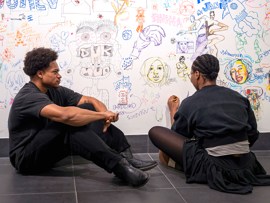
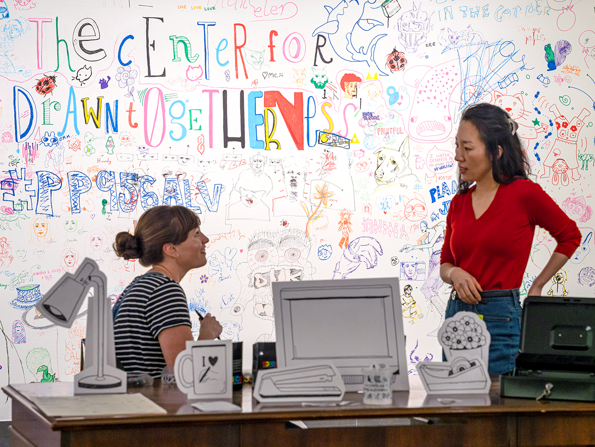
My paper recounts a collaborative initiative between myself and a cohort of undergraduate design students that we named the Center for Drawn Togetherness. The Center was “founded” in response to a lack of design student cohesion and camaraderie as our institution transitioned back to a fully in-person model post-pandemic. To address these issues, we conceptualized a series of interlocking illustration events that culminated in an exhibition. Each event asked participants to work together, challenging the idea that drawing is a solitary activity and exploring how drawing together could strengthen bonds among participants.

In the first event, a risograph workshop, participants collaboratively designed and printed an official “currency” for the Center. The second event allowed participants to earn “money” by contributing to a collaborative mural, asking them to respond to prompts that could be completed with a partner. The culminating event allowed participants to spend their “money” in a student-run illustration pop-up shop. All happenings were housed in an exhibition that doubled as a gathering space for design students, with student collaborators facilitating the events.

Event planning sessions emphasized Sasha Constanza-Chock’s principles of Design Justice, particularly their assertion that communities should co-lead and control design projects intended to benefit them (2020). Since I was concurrently teaching my student collaborators, planning sessions also challenged the traditional roles of teachers and students, proposing that we can operate as equals.

The workshops received positive feedback from participants, which was gathered through surveys and interviews after the events concluded. The Center plans to use this feedback to develop new initiatives in this upcoming school year. We will continue to investigate how in-person drawing events can potentially promote empathy among students, advocate more collaborative relationships between teachers and students, and encourage young designers to feel ownership over their educational experience.

This design research is presented at Design Incubation Colloquium 11.1: Boston University on Friday, October 25, 2024.

You Look Like the Right Type

In a daily ritual since 2008, exact-dialogue fragments of overheard conversations are made into illustrated quotes

Mark Addison Smith
Associate Professor
DePaul University

On November 23, 2008, in the Chicago downtown loop, while hurrying to catch the subway, a young woman approached Mark Addison Smith and asked for a cigarette. “I don’t smoke,” he said. She snapped her fingers and replied: “Ahhh, you look like the right type.” Suddenly and strangely inspired by the exchange, he raced home and illustrated their brief conversation with expressive hand lettering, and a daily artistic practice was born.

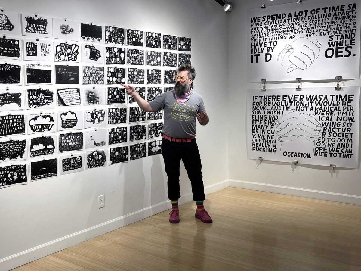
In a daily ritual since 2008, Smith redraws exact-dialogue fragments of overheard conversations as 7×11-inch India ink works-on-paper, combining verbatim, hand-drawn text with visual and tonal embellishment; he often draws more than one quote per day. For gallery installations and artist’s books, Smith edits the single drawings into larger, theme-based conversations between people who have never met or exchanged words. When amassed together as modular narratives, the black and white drawings—voiced by strangers and collectively titled You Look Like The Right Type—share grayscale conversations across time, place, age, and gender (the who, what, when, where, why, and how of documentary storytelling). And the audience, as interlocutor, triangulates the conversation by reading that which was once spoken (a tenet of grammatology) and making their own non-linear, grayscale associations between text, image, and completion of what’s left unsaid.

https://www.markaddisonsmith.com/you-look-like-the-right-type

November 2023 marked the fifteenth anniversary of Mark Addison Smith’s You Look Like The Right Type archive, now containing over 6,000 works-on-paper; he has never missed a day of eavesdropping and drawing other people’s words since he first began this series.

Select exhibitions:

In 2023, McMaster Gallery, within the School of Visual Art and Design at the University of South Carolina, celebrated the fifteenth anniversary of You Look Like The Right Type with an exhibition of Smith’s drawings, artist’s books, and sketchbooks. The exhibition spotlighted drawings Smith generated during the 2020 COVID-19 lockdown, in which he held remote conversations with strangers across the world and translated their words into drawn, visual essays of how they were grappling with the pandemic.

In 2019, The Bakery Atlanta, co-presented by Atlanta’s Eyedrum Gallery, celebrated the tenth anniversary of You Look Like The Right Type with an exhibition of 365 drawings.

Other solo exhibitions include Chicago’s Center on Halsted Gallery, where Smith showcased the original 24 drawings from his Years Yet Yesterday drawing series, sourced in language spoken by gay rights activist Larry Kramer, to commemorate World AIDS Day.

Group exhibitions include the Center for Book Arts in New York, Co-Prosperity in Chicago, Hegyvidék Gallery in Budapest, the Kinsey Institute in Bloomington, Leslie-Lohman Museum of Art in New York, and Minnesota Center for Book Arts (MCBA).

Mark Addison Smith’s type specimens and broadsides are included in the permanent collections at Emory University, the Kinsey Institute, Leslie-Lohman, Ringling College of Art and Design, and Virginia Commonwealth University.

Select interviews with Mark Addison Smith about this work:

Steven Heller, “The Daily Heller: Drawing to Manage Stress,” PRINT, July 1, 2022.

Debbie Millman, “Illustrating Sound,” The Mic, produced by NYCxDesign, episode one, October 30, 2020. 

Mark S. King, “This gay artist draws what he (secretly) hears you say on the streets,” Queerty, September 5, 2020.

Steven Heller, “The Daily Heller: Typographic Eavesdropping,” PRINT, May 5, 2020.

Kathryn Weinstein, “Sharing Loudly,” Designer, University & College Designers Association, Volume 24, Number 2, Summer 2017.

This project was the 2023 Design Incubation Educators Awards winner recipient in the category of Scholarship: Creative Works.

Mark Addison Smith is a queer artist whose design specialization is typographic storytelling: allowing illustrative text to convey a visual narrative through printed matter, artist books, and site installations. With his on-going, text-based archive, You Look Like The Right Type, he has been drawing snippets of overheard conversations every single day since 2008 and exhibiting the works as larger-scale conversations between strangers exchanging words on topics never spoken. You Look Like the Right Type has been featured in All Things Letters, Deadline, Design Sponge, Goodtype, Hyperallergic, I Love Typography, PRINT Magazine’s The Daily Heller, Queerty, MAGMA Brand Design’s Slanted Magazine, and in conversation with Debbie Millman for the very first episode of NYCxDesign’s podcast, The Mic. His artist’s books are housed in over 80 permanent collections and library archives, including Brooklyn Museum Artists’ Books Collection, Center for Book Arts, Cooper Hewitt Smithsonian Design Museum, Getty Research Institute, Guggenheim Museum Library and Archives, Joan Flasch Artists’ Book Collection, Library of Congress, The Metropolitan Museum of Art Thomas J. Watson Library, MoMA Franklin Furnace, Museum of Contemporary Art (MCA) Chicago, ONE National Gay and Lesbian Archives at the University of Southern California, Smithsonian American Art and National Portrait Gallery Library Artists’ Book Collection, Walker Art Center Archives and Library, and the Whitney Museum of American Art Frances Mulhall Achilles Library. Smith holds a Master of Fine Arts in Visual Communication Design from the School of the Art Institute of Chicago (SAIC).

Utterly Butterly Propaganda: An Analysis of Illustration as a Tool of Persuasion in Amul™ Ads

A pop culture icon and a beacon of upper-caste, liberal politics in India.

Kruttika Susarla
Graduate Student
Washington University in St. Louis

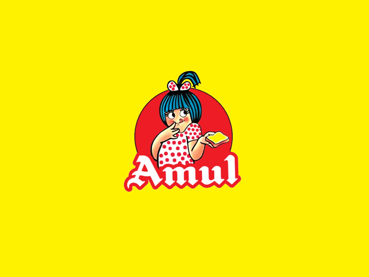
Brands have used mascots as a tool for persuasion and personalization of everyday commodities for ages (Dotz, Husain, 2003). Amul™ is an Indian dairy brand whose mascot is a fair-skinned girl in a white polka-dot dress and a matching bow in her blue hair. She was designed in 1967 and has since been used on product packaging and in political cartoon advertisements on billboards, print advertisements, and social media. The design of the mascot has remained consistent through the years and draws heavily on a rounded shape language. The Amul™ girl has been a pop culture icon and a beacon of upper-caste, liberal politics in India. Over the last six years, these advertisements shifted from liberal messaging to pro-state propaganda with a change in power in Indian politics to Hindu nationalism.

Amul™ uses visual and phonological puns, portmanteaus, and polysemous words in English and Hindi. The mascot transforms into politicians, celebrities, and sports persons depending on context. Her shape language is aggressively cute. Bright primary colors and consistent watercolor treatment with black outlines draw the audience into a nostalgic “good old” past while placing the mascot in an ever-changing political landscape. 

This presentation will visually analyze this evolution by examining the Amul™ illustration style, character design, and slogans. The analysis will use a dialectic method to read into the disarming aesthetics of the illustrations. It will contrast connoted messages with the material reality of the subjects of these ads by placing them in a historical, socio-political context. By doing so, we gain insight into how illustration has been used in these advertisements as a tool to normalize harmful government policies, the military, or pro-surveillance laws (Bhatia, 2020).

Spencer Thornton Banks in St. Louis

A historical case study in the links between aesthetics and culture

Aggie Toppins
Associate Professor
Washington University in St. Louis

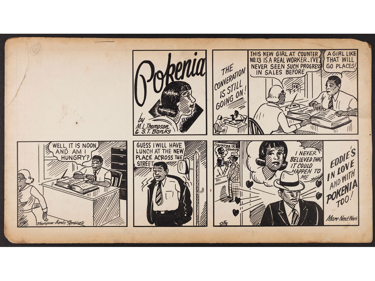
Spencer Thornton Banks (1912–1983), was a Black illustrator and graphic designer who practiced in St. Louis for over 50 years. His life and work were contextualized by significant social changes on a national level—the Great Migration, World War II, and Civil Rights—as well as a local level in a city deemed “The Broken Heart of America,” by historian Walter Johnson. The history of St. Louis is a story of racial segregation, removal, and abandonment. Banks’ aesthetic attests to empowerment and self-representation amidst urban decline. His comic strip “Pokenia,” which ran in the St. Louis Argus in 1939, is a rare example of a narrative about Black professional life, by a Black artist, published in a Black newspaper. Banks was also regularly commissioned to promote events, such as the National Negro Baseball League Championship and the Pine Street Y Circus, which were important to St. Louis’ Black community. This pecha kucha will present Banks’ oeuvre in the context of his time and place while exploring the way his forms expressed autonomy and self-respect.

A rarely discussed Black graphic artist of exceptional formal merit, Spencer Thornton Banks is a historical case study in the links between aesthetics and culture. His work has not been included in traditional design canons, in part because of historiographical bias, yet he coincided with a transitional and tumultuous time in St. Louis and national history. His unique approach to visual communication issued positive images of Black cultural life. This is a relevant topic in communication design in that it aims to expand the scope of historical knowledge through contributions from an underrepresented community while noting the concurrence of Banks’ celebratory representations with dominant narratives that evince mainstream racist ideology.

This research was presented at the Design Incubation Colloquium 7.2: 109th CAA Annual Conference on Wednesday, February 10, 2021.

State of Flux

Natacha Poggio
Assistant Professor
University of Houston Downtown

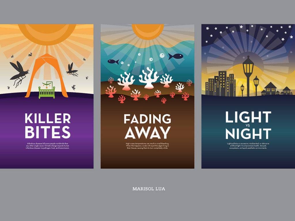
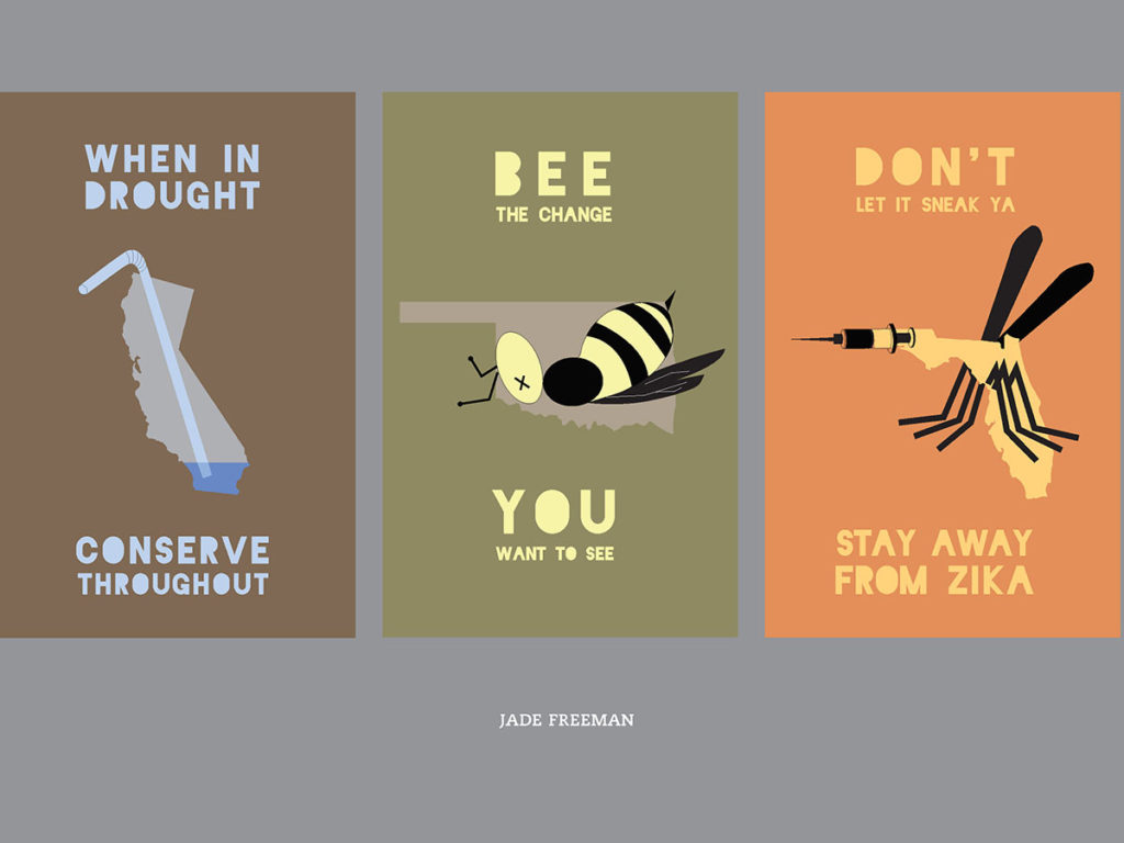
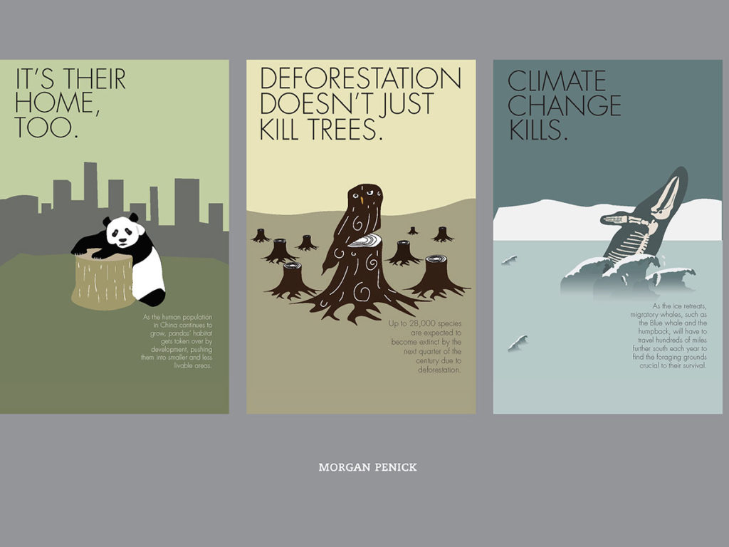
The climate change debate is divided into two major sides. One argues that the current global warming is caused by human factors while the other side insists it is occurring because of natural forces. Scientists around the world have conducted research that shows human activities contribute the most to today’s climate change. Human activities like the burning of fossil fuels, agriculture and changes in land-use patterns contribute to tip the Earth’s energy balance by trapping more heat, leading to global warming. The increased temperature fluctuations on Earth lead to more frequent extreme weather events (hurricanes, floods, droughts, wildfires) which are another indication that climate change is, in fact, a reality.


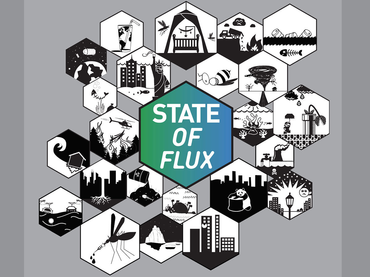
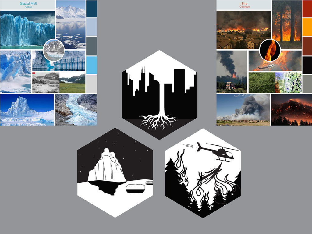
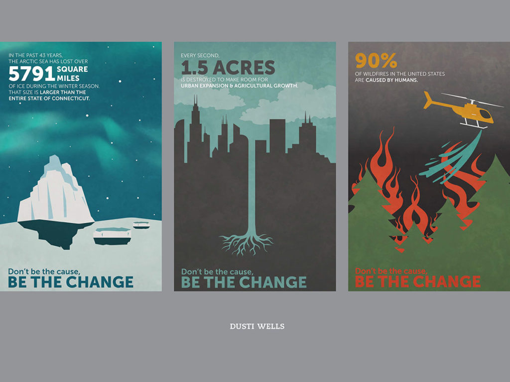
“State of Flux” is a poster design series on climate change issues, showcasing our planet in a state of flux. My presentation will address how students of different illustration skill levels learn about systems-thinking, design principles and the importance of raising awareness of natural and human interventions that led to climate change.

This research was presented at the Design Incubation Colloquium 5.2: CAA 2019 Conference New York on Thursday, February 14, 2019.

Science Through Storybooks

Teaching Award Runner-up

Martha Carothers
Professor
University of Delaware

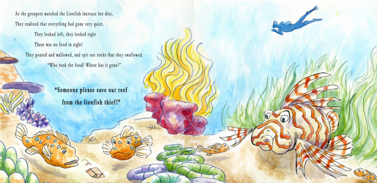
Students created visual storybooks to communicate scientific methods and principles about the ocean and aquatic life to children. The five storybooks teach the scientific findings of published research on tropical coral reef lionfish to children age three to seven. The concept of each individual storybook focuses on a single research finding. Marine Science, Art & Design, and Psychology students in an interdisciplinary course format (three-student teams) created and evaluated the effectiveness of the visual storybooks.

Professors Martha Carothers (Art & Design), Danielle Dixson (Marine Science), and Agnes Ly (Psychology) initiated the storybook course to establish the framework for teaching communication through creative expression, utilizing the skills and expertise throughout the University. Science-based children’s storybooks began with learning how to read a scientific paper, understanding the research findings, and developing a concept map. This was followed by developing the storyline from the concept map and writing the story. Next was illustrating the story, designing the storybook, and producing the hardcopy. The efficacy of the creative, non-traditional communication efforts was evaluated by quantitative data collection during story hours with children.

The long-term outcome of this course is to establish an interdisciplinary and information- synthesis capstone experience to promote engaged, experiential learning that fulfills multiple general education objectives: (1) engage in constructive ideation, (2) to communicate effectively in writing, orally, and through creative expression and (3) work collaboratively and independently within and across contexts and differences, and (4) reason quantitatively and scientifically. These objectives prepare students to meet the broader goal of becoming “engaged citizens, involved in the world around them, and who understand the major challenges and debates of the day.” (University of Delaware General Education Objectives 2014)

Scientific research is front-page news. Sea-level rise, biodiversity loss, climate change, and the collapse of sustainable food sources are some of today’s most pressing news topics facing policymakers, researchers and the general public. A basic understanding of these issues is critical to the overall protection of environmental capital, ecosystem services and society as a whole1. The interdisciplinary scientific principles underlying these topics should therefore be a primary goal of education for our undergraduates.

The storybooks build on previous research indicating that reading aloud with young children is considered one of the best predictors of children’s early reading success2 and despite a scarcity of information books in elementary classrooms, non-fiction reading material plays a role in building children’s background knowledge and vocabulary in content areas3, 4, 5. Therefore, the development of specific science-based picture books could increase awareness for conservation initiatives at an early age, create the mindset of environmental consciousness, and increase early exposure to STEM fields6.

ScienceThroughStorybooks

  1. President’s Council of Advisors on Science and Technology (PCAST) (2011) Sustaining Environmental Capital: Protecting Society and the Economy.
  2. Neuman SB, Copple C and Bredekamp S (2000) Learning to read and write: developmentally appropriate practices for young children. Washington DC: National Association for the Education of Young Children.
  3. Brabham E, Boyd P, Edgington WD (2000) Sorting it out: elementary students’ response to fact and fiction in information storybooks as read aloud for science and social studies. Reading Research and instruction, 39: 265-290
  4. Duke NK (2000) 3.6 minutes per day: the scarcity of informational text in first grade. Reading Research Quarterly, 35: 202-224
  5. French L (2004) Science as the center of a coherent, integrated early childhood curriculum. Early Childhood Research Quarterly, 19: 138-149
  6. Leung CB (2008) Preschoolers’ acquisition of scientific vocabulary through repeated read-aloud events, retellings and hands-on science activities. Reading Psychology 29: 165-193

https://www.art.udel.edu/news/Pages/SCIENCE-THROUGH-STORYBOOKS.aspx

http://delawarepublic.org/post/simplifying-science-udel-students-create-children-s-books-research

http://www.udel.edu/udaily/2017/april/science-storytelling/

http://udreview.com/new-class-engages-children-in-science-through-storybooks/

Martha Carothers is Professor of Art & Design at the University of Delaware where she teaches visual communications, typography, book arts, and foundation design. Carothers’ book arts often highlight text about books, reading, and typography. Her artist’s books are letterpress, hand bound, and computer generated under The Post Press. Carothers’ creative work has been exhibited internationally and is included in national and private collections. Carothers’ graduate graphic design research at Penn State University focused on pop-up and moveable books. She continues to research conceptual design and illustration in children’s books. Carothers directed study abroad programs between 2002-2010 to Australia teaching design in the visual arts and introductory digital photography. Carothers was a 2011-2012 Fulbright Scholar affiliated with the City University of Hong Kong.

Recipient of recognition in the Design Incubation Communication Design Awards 2017.

Data Visualization Research: How It Informs Design and Visual Thinking

Joshua Korenblat
Assistant Professor, Graphic Design
SUNY New Paltz

Design research aligns with the process of researching a data visualization project. Data visualization maps numbers to visual variables; many design projects, meanwhile, have concerns other than numbers and statistics. Yet the research process that contributes to a sound data visualization can offer valuable insights into visual thinking and storytelling. Data visualization is the end result of data analytics, an exploratory process that cultivates a mindset familiar to designers.

Curiosity guides this mindset: observational, descriptive methods allow the creator to understand a topic from multiple angles, ultimately honing clarity in communicating an idea. The process might at times proceed from details to a big picture; other times, from a big picture to details. This data analytics mindset dovetails with emergent processes in design thinking. In both processes, small sprints often yield results more optimal than a grand master plan.

Data analytics involves spatial visual thinking skills that designers—all of whom work with points, lines, planes, and color—have the ability to understand. One of the leading visualization packages for the open source statistic package R is called the “grammar of graphics,” akin to verbal and visual language. I will use an accessible information graphic that compares Presidential biographies at the time of first election. This case study will detail how the analytic process conducts along a circular track: gathering data, structuring it, finding an insight, and visualizing that insight in a memorable, authentic, and persuasive way for a specific audience. Designers, and designers interested in storytelling, can identify familiar experiences at each step of the process. For designers who have yet to work in data analytics and visualization, accessible methods of sketching with data can exercise observational skills and visual thinking processes that propel many design and teaching practices—even those unconcerned with data visualization as the end result.

This research was presented at the Design Incubation Colloquium 3.2: Parsons Integrated Design on Thursday, Feb 16, 2017.

You Look Like The Right Type

Mark Addison Smith
Assistant Professor
Electronic Design and Multimedia
The City College of New York, CUNY

An illustration manifests “thought” through the viewer’s decoding of visual-based representation—be it text-based, image-based, or a combination of both. Logocentrism holds that original thought generates a need for spoken communication and, in turn, speech generates a need for writing. In a daily ritual since 2008, I redraw exact-dialogue fragments of overheard conversations as 7×11-inch India ink illustrations (combining direct-quote text with visual and tonal embellishment) and combine the single illustrations into larger, theme-based conversations between people who have never met or exchanged words. When amassed together as modular narratives, my black and white drawings—collectively titled You Look Like The Right Type—start having grayscale conversations with one another across time, place, age, and gender (the who, what, when, where, why, and how of journalistic-narrative documentation). And the audience, as interlocutor, triangulates the conversation by reading that which was once spoken and making their own non-linear, grayscale associations between text, image, and completion of what’s left unsaid. Thus, original thought emerges not only through my reinterpretation of other voices, but also through z-axis, non-linear readability (or, Scott McCloud’s “infinite canvas”).

In his 1967 text, Of Grammatology, Derrida argues for a definition of grammatology in which written language is not derivative of spoken language, but, rather, the two become independent, legitimate signifiers for original thought. Thus, the written word (including text-based illustration) can be understood from a stance as comprehensive as the spoken word. Within my You Look Like The Right Type series, I’ve been archiving daily conversation fragments as black and white illustrations since 2008 in a ritualistic effort to not only bring permanence to the spoken form, but also to manifest original thought—via the recycled thoughts of others—within illustrated type-and-image works on paper. In keeping with the principles outlined in Derrida’s text, I argue—using my archive of 3,000+ illustrations coupled with theories of documentary-style narrative, montage editing, logocentrism, and the z-axis of non-linear comic paneling—that spoken language and written language are autonomous and equal forms of communication, feeding off of one another to generate new storytelling.

An archive of these daily works can be found at YouLookLikeTheRightType.com.

This research was presented at the Design Incubation Colloquium 2.5: Fashion Institute of Technology (FIT) on Saturday, March 12, 2016.

Espiritu, Texas 1886-2015: An Essential Part Of American History

Andrés Vera Martínez
Assistant Professor,  Cartooning and Illustration
Lesley University College of Art and Design
Cambridge, MA

The Spanish term Mestizos, meaning mixed, came into popular usage during the 16th century to describe the offspring of Spaniards and Native Americans. Vaqueros, or the first cowboys, were Mestizos and their cowboy culture has been mythologized and marketed; but too often stripped of the ethnic origins before presented for popular consumption. Tejanos, or the first Texans, were borne of the mix of Spaniards and Native Americans and were the original cowboys of the United States. This culture lives on today in Texas through the food, language and ranching culture.
Espiritu, Texas 1886 -2015 will tell the story of a Texas built upon the struggles and triumphs of diverse people. This presentation will focus on one chapter, Lamesa, TX 1961: Andrew Martínez.

This research was presented at the Design Incubation Colloquium 2.0: The City College of New York, CUNY on Wednesday, June 3, 2015.

Colloquium 1.4: Call for Submissions

Deadline: January 15, 2015

The  2015 winter colloquium will be held at St. John’s University Manhattan Campus. We invite all Communication Design researchers to submit abstracts for consideration by our panel of peers.

For more details, see the Submission Process description.
Event Date: Thursday, January 15, 2015

Manhattan campus of St. John’s University
51 Astor Place
New York, NY 10003

Please RSVP if you plan on attending.