The notion of decolonizing type is massive in scope: from its history, to its design, application, technology, and future.
Laura Rossi García Professional Lecturer DePaul University
This research examines the history, practice, and pedagogy of typography. Typography is at the core of design—both implicit and explicit in its role in shaping language, culture, and power structures—but it is mired in “racial homogeneity and dominated by white men.”1 The selection, use, and application of typography—from style to legibility—can uphold or disrupt dynamics of power: who can read it, who uses it, who made it, whose voice does it carry—human, machine, the included or the excluded. While there is great movement to decolonize design, less is happening specific to decolonizing typography, or decolonizing type pedagogy. “Letterforms are loaded cultural objects” 2 —a container for language— and an “extension of the spiritual, social, political, and historic mind-set of nations”.3
The very notion of decolonizing type is massive in scope: from its history, to its design, application, technology, and future. How do we broaden and re-frame the structures and systems that exist in order to make room for oppressed and marginalized voices and make inclusive the societies in which we live? This presentation will introduce a series of case studies that serve as examples for how to reconsider the very root of thought around type systems and their effects and influence on our students, the field of design, and ultimately our products, systems, and societies.
1. Munro, Silas. “Typography as a Radical Act in an Industry Ever-dominate by White Men,” AIGA Eye on Design, August 26, 2019. Accessed: December 15, 2020. URL: https://eyeondesign.aiga.org/tre-seals-is-turning-typography-into-a-radical-act/ 2. Munro, Silas. Ib, id. 3. Shehab, Bahia and Haytham Nawar. “Early Arabic Printing” in A History of Arab Graphic Design. American University in Cairo Press: 2020. pp. 29-41.
Students explore and investigate the abstract concepts of personal, social, and intersectional identities.
Linh Dao Assistant Professor California Polytechnic State University
Alcoholic beverage labels captivate and fascinate. Some excite with promises of novelties, while others connect on a deeper level, reaching for similarity or intimacy. Yet they all have one thing in common: they vary in their levels of authenticity. Designers tell stories for their clients. Some never get to tell their own.
A package design expresses brand identity, as well as personal identities, in addition to building relationships with consumers. In the classroom, such a project should encourage students to tell their own stories, especially if they are underrepresented or marginalized. The project would allow students to both develop and explore their identities, as well as connect and build their communities.
The Interactive Storytelling for Packaging Design project was designed specifically for that purpose. It uses the theoretical framework of the identity wheels developed by the University of Michigan as a starting point. It helps students explore and investigate the abstract concepts of personal, social, and intersectional identities. Students are then encouraged to consider the format of a physical package as a self-portrait, with the exterior and the interior being the more and less obvious identities that are more or less keenly felt in different social contexts. While identities are ever-changing, the fact that they can have an effect on how we treat others remains the same.
This project aims to (1) to be actively unbiased towards privileged, white, mid-socioeconomic cultures and (2) to tackle the topic of identity in a substantive way of fostering identity development beyond elementary visual representation.
The project is exciting because it pairs abstract concepts with emerging new technology. Students learn to formulate their ideas, creating assets, and building the prototypes. They get the opportunity to blend both 2D and 3D graphics. They can write their own unconventional narrative about themselves and connect to consumers in an intimate yet powerful way. The opportunities are endless.
My presentation explains how augmented reality can be used to add interactive storytelling elements to a traditional beverage label package design. It outlines the appropriate parameters of such a project for a graphic design classroom, including contextual background, technology implementation, and limitations. It also includes student deliverables consisting of print designs and augmented reality extensions that are playable on mobile devices such as the iPhone or the iPad.
Educators need diverse representation in course materials—students must feel seen in order to truly succeed.
Mia Culbertson Assistant Professor Kutztown University
Typography is central to design, yet the standard curriculum centers around Western, able-bodied, straight, white, and male figures, frequently misrepresenting or excluding marginalized communities. In educational and professional spaces, this can have harmful effects on BIPOC, LGBTQ+, and disabled designer and student communities. Creating a typography classroom that prioritizes equitable representation will avoid alienating minority student communities and reduce stereotyping through uninformed design decisions.
There has been a recent push in our discipline to decenter and decolonize our curriculum with the publication of resources like Decentering Whiteness in Design History Resources (Pass et al., 2020) and Extra Bold (Lupton et al., 2021); in this presentation I will discuss the importance of doing so specifically within the realm of typography. As the visual preservation of language, typography can be intricate, particularly when positioned within the larger context of world history. As often seen in other fields, minority communities’ contributions are often excluded from the canon despite frequently serving as the foundation on which Western designers expanded on; for example, facets of typography in the Belgian Art Nouveau movement can be linked to traditional Congolese motifs.
To send emerging designers out into the world who truly understand the cultural nuances of typography and creating with rather than for communities, educators need diverse representation in course materials—students must feel seen in order to truly succeed. Teaching non-Latin communications such as the ancient Vai syllabary and introducing designers from marginalized communities like Angel DeCora empowers students and ensures these significant contributions to the development of typography are not forgotten or “othered”; it also helps ensure students’ broad perspective and historical context as they develop their own typographic practices, avoiding stereotypes and appropriation in design. Decentering pedagogical perspective in the typography classroom has widespread implications for marginalized student communities and our discipline at large.
A design charrette that explores the collision of time and form through a system of carefully devised prompts.
Ryan Slone Assistant Professor University of Arkansas
Bree McMahon Assistant Professor University of Arkansas
As design educators, we feel it is imperative to prepare students for the wicked problems of the 21st century. Design Futures, the briefing papers released by AIGA in 2018, anticipates a complex future where design solutions must be increasingly open-ended to accommodate many layers of uncertainty. To model such unpredictable constraints, we developed the Mash Maker project, a design charrette that explores the collision of time and form through a system of carefully devised prompts. The conditions encouraged first-year design students to utilize improvisation methods, iteration, and collaboration while underscoring the value of process over outcome.
Music provided a logical framework for exploring this relationship, specifically hip-hop, using time-based characteristics to structure sound (Caswell). In many ways, a beat mimics “the grid,” a principle of design. For example, students designed songs in real-time using specific visual and typographic prompts. By designing and listening in tandem, students connected the auditory to the visual in a pro-process experience that often led to uncertain territory.
The outcomes of this project revealed to students the value of improvisation, conceptual design, and tackling wicked problems. Students learned to avoid fixation, something designers — especially novices — often struggle to overcome (Cross 2010). In learning principles of improvisation, students experienced their potential to “increase creativity by encouraging positive evaluation of deviant ideas” (Kleinmintz, Goldstein, Abecasis, Shamay-Tsoory, 2014). Moreover, in fostering community, they built a studio culture of solidarity, collaboration, and participation.
A pop culture icon and a beacon of upper-caste, liberal politics in India.
Kruttika Susarla Graduate Student Washington University in St. Louis
Brands have used mascots as a tool for persuasion and personalization of everyday commodities for ages (Dotz, Husain, 2003). Amul™ is an Indian dairy brand whose mascot is a fair-skinned girl in a white polka-dot dress and a matching bow in her blue hair. She was designed in 1967 and has since been used on product packaging and in political cartoon advertisements on billboards, print advertisements, and social media. The design of the mascot has remained consistent through the years and draws heavily on a rounded shape language. The Amul™ girl has been a pop culture icon and a beacon of upper-caste, liberal politics in India. Over the last six years, these advertisements shifted from liberal messaging to pro-state propaganda with a change in power in Indian politics to Hindu nationalism.
Amul™ uses visual and phonological puns, portmanteaus, and polysemous words in English and Hindi. The mascot transforms into politicians, celebrities, and sports persons depending on context. Her shape language is aggressively cute. Bright primary colors and consistent watercolor treatment with black outlines draw the audience into a nostalgic “good old” past while placing the mascot in an ever-changing political landscape.
This presentation will visually analyze this evolution by examining the Amul™ illustration style, character design, and slogans. The analysis will use a dialectic method to read into the disarming aesthetics of the illustrations. It will contrast connoted messages with the material reality of the subjects of these ads by placing them in a historical, socio-political context. By doing so, we gain insight into how illustration has been used in these advertisements as a tool to normalize harmful government policies, the military, or pro-surveillance laws (Bhatia, 2020).
This process relies on steps familiar to designers: problem identification, research, and the cyclical process of iteration, making, and user testing.
Dori Griffin Assistant Professor University of Florida
Writing, like design and design education, is an iterative process which benefits from informal peer critique. Type Specimens: A Visual History of Typesetting & Printing (Bloomsbury Academic, forthcoming December 2021) is a global narrative of typographic history. It considers the problem of typography as a tool of capitalism and colonization and — according to Reviewer Two — “irresponsibly shows beginners too many [global] examples that aren’t canonical.” The Cary Fellowship at the Rochester Institute of Technology and the Design Incubation Fellowship, among others, have supported its development. Throughout, social media played a key role as a process tool in the book’s research-writing-design. This approach echoes how designers and educators deploy informal peer critique in the studio as a community-driven teaching and learning tool. This presentation explores how social media can support meaningful design-writing scholarship. This process relies on steps familiar to designers: problem identification, research, and the cyclical process of iteration, making, and user testing. As design develops a disciplinary literature of its own, designers can bring visual ways of knowing and learning to the process of writing our own diverse and often previously unknown histories. We can leverage tools seemingly alien to the scholarly writing process: sketching, informal peer critique, and social media texts, images, and discussions. I’ve approached Type Specimens as a project framed by code-switching and multilingual text production; the visual is, after all, a set of languages. Social media has been a powerful tool to fuel and document this process. This presentation shows that journey.
Saturday, October 23, 2021
Time: 1:00pm–2:00pm
Online ZOOM event
Hosted by Christine Lhowe, Assistant Professor and Christine Krus, Professor of Art & Design, College of Communication and the Arts, Seton Hall University.
Presentations will be published on the Design Incubation YouTube Channel after October 5, 2021. Virtual Conference will be held online on Saturday, October 23, 2021 at 1pm EST.
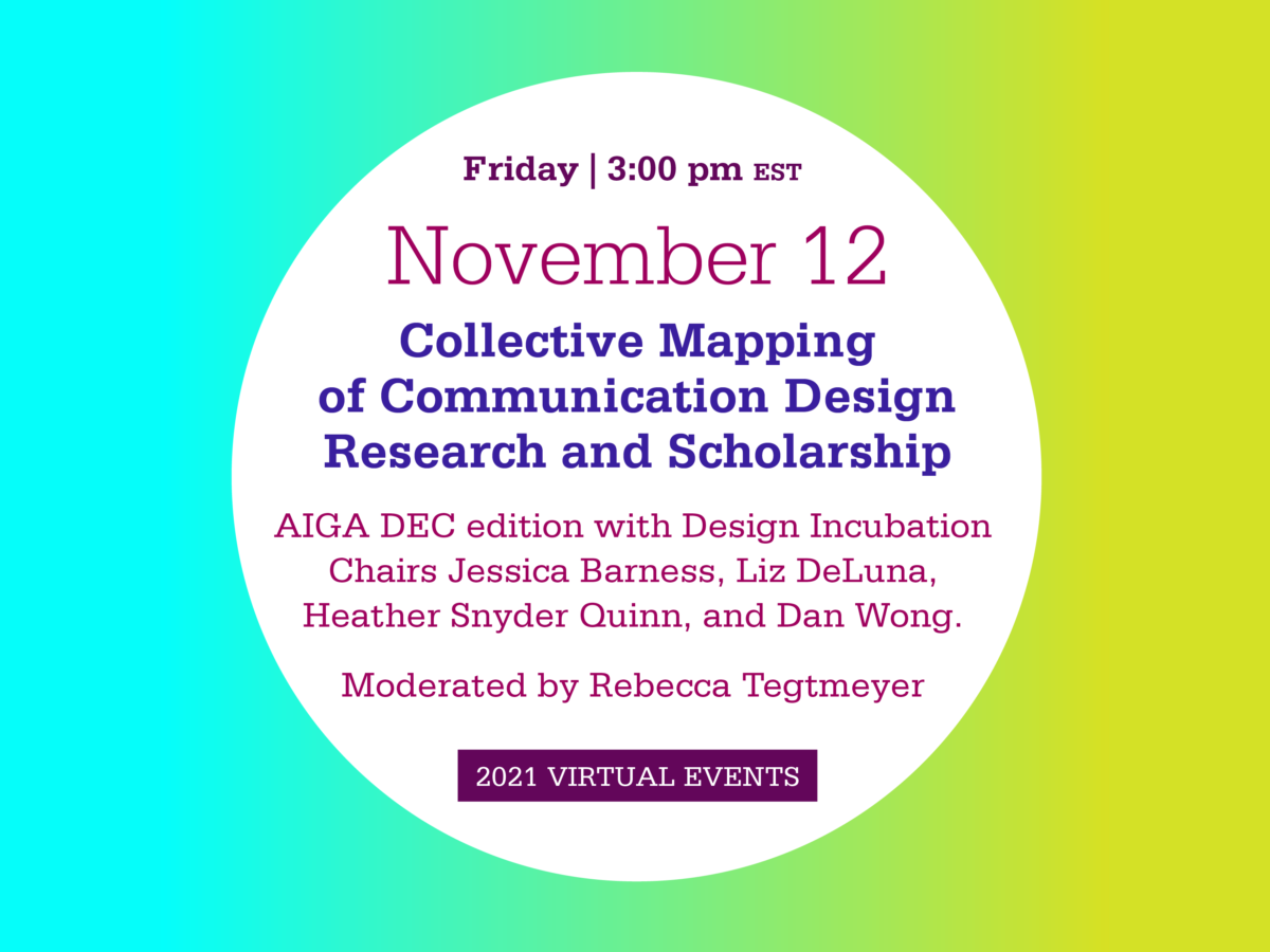
Friday, October 29, 2021
4PM EST
Online ZOOM Event
Designing Your Research Agenda is an panel discussion and open forum for design scholars and researchers to discuss various aspects of their research agendas. We aim to open a dialog regarding multiple challenges discovering one’s design research inquiry. Design Incubation will also be discussing some of their ongoing work with the mission and focus of supporting design research. Designing Your Research Agenda is an ongoing design research event series.
Some of the questions we will discuss with panelists
How did you determine your research agenda (high level timeline of your career/trajectory)
How do you define research and why do you think it matters — for society, the field, yourself?
How do your department and institution define and support the work you do?
How would you describe/categorize your department and institution?
How do you position your research: design theory, design history, design practice, design research (traditional graphic design, speculative design, UX/UI, typography, AR, VR, creative computing, design solutions, etc.), design pedagogy, or something else?
What barriers (if any) exist at your institution or in the field for creating and disseminating your research?
Moderators
Jessica Barness and Heather Snyder Quinn
PANELISTS
Tasheka Arceneaux-Sutton Associate Professor of Graphic Design North Carolina State University and Faculty at Vermont College of Fine Arts
Tasheka Arceneaux-Sutton is an Associate Professor of Graphic Design at North Carolina State University. She has taught graphic design at Southeastern Louisiana University and Typography at Loyola Marymount University. She is also a faculty in the low-residency MFA program in Graphic Design at Vermont College of Fine Arts. In addition, Arceneaux is the principal at Blacvoice Design, a studio specializing in branding, electronic media, identity, illustration, print, and publication design for educational institutions, non-profit organizations, and small businesses. Arceneaux’s research focuses on discovering Black people omitted from the graphic design history canon. Recently, her research is focused on Black women who have made significant contributions to the graphic design profession. She is also interested in the visual representation of Black people in the media and popular culture, primarily through the lens of stereotypes.
Liat Berdugo Associate Professor of Art and Architecture University of San Francisco
Liat Berdugo is an artist and writer whose work investigates embodiment, labor, and militarization in relation to capitalism, technological utopianism, and the Middle East. Her work has been exhibited and screened at Yerba Buena Center for the Arts (San Francisco), MoMA PS1 (New York), Transmediale (Berlin), V2_Lab for the Unstable Media (Rotterdam), and The Wrong Biennale (online), among others. Her writing appears in Rhizome, Temporary Art Review, Real Life, Places, and The Institute for Network Cultures, among others, and her latest book is The Weaponized Camera in the Middle East (Bloomsbury/I.B.Tauris, 2021). She is one half of the art collective, Anxious to Make, and is the co-founder of the Living Room Light Exchange, a monthly new media art series. Berdugo received an MFA from RISD and a BA from Brown University. She is currently an Associate Professor of Art + Architecture at the University of San Francisco. Berdugo lives and works in Oakland, CA. More at www.liatberdugo.com
Caspar Lam Assistant Professor Director of the BFA Communication Design Program Parsons School of Design
Caspar Lam is an Assistant Professor and the Director of the BFA Communication Design Program at Parsons. He is also a partner at Synoptic Office, an award-winning design consultancy working globally with leading cultural, civic, and business organizations. His research and practice explore the systematic relationships among graphic design, data, language, and their influence on visual culture. Caspar holds an MFA from Yale and degrees in biology and design from the University of Texas at Austin. He formerly led design and digital strategy at Artstor, a Mellon-funded non-profit developing digital products related to metadata and publishing for institutions like Harvard and Cornell. Adobe, AIGA, and the ID Annual Design Review have recognized his work. He has been a visiting critic at the Hong Kong Design Institute and served as an Adjunct Associate Research Scholar at Columbia University ́s GSAPP. He sits on the board of directors of AIGA NY.
Has it been a hectic year for you too? Phew. And we’re not sure how this autumn will go. But we do know that there has been some very fascinating work produced recently. Great published works, creative and experimental projects, innovative teaching methods, and important designed service initiatives.
We’ve decided we’re going to break some rules and extend our own deadlines. The annual international Design Incubation Communication Design Awards 2021 have extended their nomination and entry period to Wednesday, December 1, 2021.
We hope you will enter your work, or nominate the work of a colleague or graduate student. There’s lots of really great stuff out there, and our friends want to see it! Help us shine the light on these and offer you some recognition.
What is the $20 entry fee for? There are lots of hidden costs when running an all-volunteer organization. Even though most of them are relatively small, they add up to more than you would think. However, if this is the only thing stopping you from entering your work, please don’t let it be. Submit anyway. It’s on us. We are not motivated by profits at Design Incubation, we are motivated by seeing you succeed 🙂
It’s been a season of change here at Design Incubation, and we have news to share with you. In addition to continuing our colloquia virtually, we’ve also started a Designing Your Research Agenda series of public events, and we continue to work on new resources for design faculty.
Design Incubation provides infrastructure and support for researchers and we develop initiatives to serve design faculty. The Design Incubation Fellowship, which has run annually for the past seven years, is now fully “incubated.” Aaris Sherin and Robin Landa will continue the Fellowship, independent of Design Incubation. They are thrilled with all the wonderful outcomes of the Fellowship over the years and look forward to continuing to work with design writers. Design Incubation will continue to support design writing initiatives, and we are planning future DI activities such as workshops and writing groups.
In light of taking full responsibility for the Fellowship, and after seven years of service, Aaris Sherin will be stepping down from her position as Chair of Design Incubation. She has enjoyed working on the colloquia, the 2017 Census, and various initiatives to help design faculty with writing. Aaris is proud of how the organization has grown and is honored to have been part of that process.
Additionally, after six years of service, Robin Landa will be stepping down from her position as Chair of Design Incubation. She found working with design writers on their book proposals in the DI Fellowship very fulfilling and was proud to be part of the Fellowship team. She also is gratified to have connected so many design faculty with DI during her tenure and was thrilled about the recent collaborations between the AIGA DEC and DI. Robin is honored to have been part of this fine organization.
Alex Girard who has been leading our peer review efforts for the past four years will be moving on from the role of Director of Peer Review. We are grateful for all Alex’s work and expertise in helping to shape the colloquia. Alex recently received tenure and was promoted to Associate Professor. Congratulations, Alex!
We are excited to announce that Camila Afanador-Llach will be joining the Design Incubation leadership team as Director of Peer Review. Camila is an Assistant Professor in the Department of Visual Arts and Art History at Florida Atlantic University. Through her work, she imagines futures for the discipline of graphic design by mapping relationships between design practice and humanistic inquiry.
In addition to their current directorship roles, Jessica Barness and Heather Synder Quinn will be stepping into the roles as Chairs of Design Incubation, joining Liz DeLuna and Dan Wong.
Please join us in thanking Aaris, Robin, and Alex for all their contributions over the years, and welcoming Camila to the team!
Design Incubation has additional Director of Communications role(s) to fill, in the areas of communications, design, and marketing. If you are interested in participating with the organization, please contact us at info@designincubation.com and provide a cv and letter of interest.