Recognizing that certain words, phrases, and cultural meanings are untranslatable.
Shuang Wu Assistant Professor Virginia Tech
My research explores how graphic design can bridge cultures through translation. Drawing from a multicultural educational background, the study examines the complexities of translation across diverse cultures. Recognizing that certain words, phrases, and cultural meanings are untranslatable, it asks: how can graphic design convey these non-translatable elements through visual expression? The study addresses this question through personal works and pedagogical experiments.
The research begins with A Poetic Space, an immersive project that visualizes ancient Chinese poems using lines, motion, sound, and typography. This approach transcends literal translation, allowing non-Chinese-speaking audiences to appreciate the essence of thousand-year-old Chinese poetry.
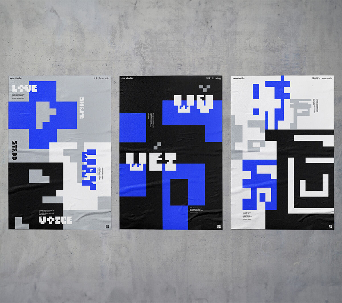
Expanding on this, we also explore how visual aids enhance the translation of Chinese culture. A poster series featuring Taoism-inspired phrases reconstructs Chinese characters using an innovative grid, revealing Taoist concepts within the phrases.
In the classroom, I prompt students to investigate how visual elements can translate languages beyond Chinese. Students visually explored non-translatable words from different languages through multimedia. For example, one student created a book based on the Russian word “Toska,” meaning deep sorrow, using a broken typewriter to convey a personal and emotional narrative. This project demonstrates how design can express universal human feelings across languages.
This research shows that graphic design can convey cultural and linguistic nuances that have no direct translation, offering a model for similar projects in various languages and cultures. By using innovative visual methods, it provides ideas for designers and educators to enhance cross-cultural communication and understanding. The practice also aims to shift the focus away from Western design philosophy, encouraging international audiences to appreciate and embrace underrepresented cultures and designers to experiment with their design elements.
Empowering faculty with data-driven information to establish a transparent salary structure.
MiHyun Kim Associate Professor Texas State University
Have you ever wondered whether you’re being fairly compensated for your work? Have you experienced frustration due to an unfair salary structure? Do you question if factors like your gender, race, or connections to higher-level administrators play a role in this inequitable environment?
This study explores the persistent challenges of salary compression and inversion across various fields in higher education, with a specific focus on the discipline of art and design. Institutions often face the need to attract new talent with specialized skills, resulting in higher starting salaries for new hires and creating disparities among existing faculty members.
As a Faculty Senate Fellow at Texas State University during the 2022-2023 academic year, I developed a series of compelling data visualizations based on regional and national salary compression data sourced from institutional data and the College and University Professional Association for Human Resources (CUPA). The study found that as of the 2022—2023 academic year, 51.8% of the faculty at Texas State University earned below the national median salary and 46.8% of the faculty at the School of Art and Design earned below the national median salary.
By examining salaries across different colleges, departments, and ranks, I aimed to identify trends and patterns in compensation, comparing state universities in Texas and peer institutions across the nation. Also, I pinpointed faculty members earning below the national median salaries, highlighting disparities, especially among senior lecturers, minorities, and full professors. As a result of the study, the university increased the salaries of faculty members whose incomes were below 90% of the national median salary.
To investigate the topic deeper from various perspectives, a salary sub-committee among the faculty senates was formed, and a survey was conducted to gather information and insights from faculty members regarding salary compression issues at the university. The responses were categorized into five groups, and these categories were visualized to encourage empathy and understanding among faculty members and upper-level administrators.
The ultimate goal of this project is to advocate for fair and equitable compensation practices, empowering faculty with data-driven information to establish a transparent salary structure. This presentation explores the visualized data, gains a deeper understanding of salary equity challenges, and contributes to the conversation on reshaping compensation practices within higher education.
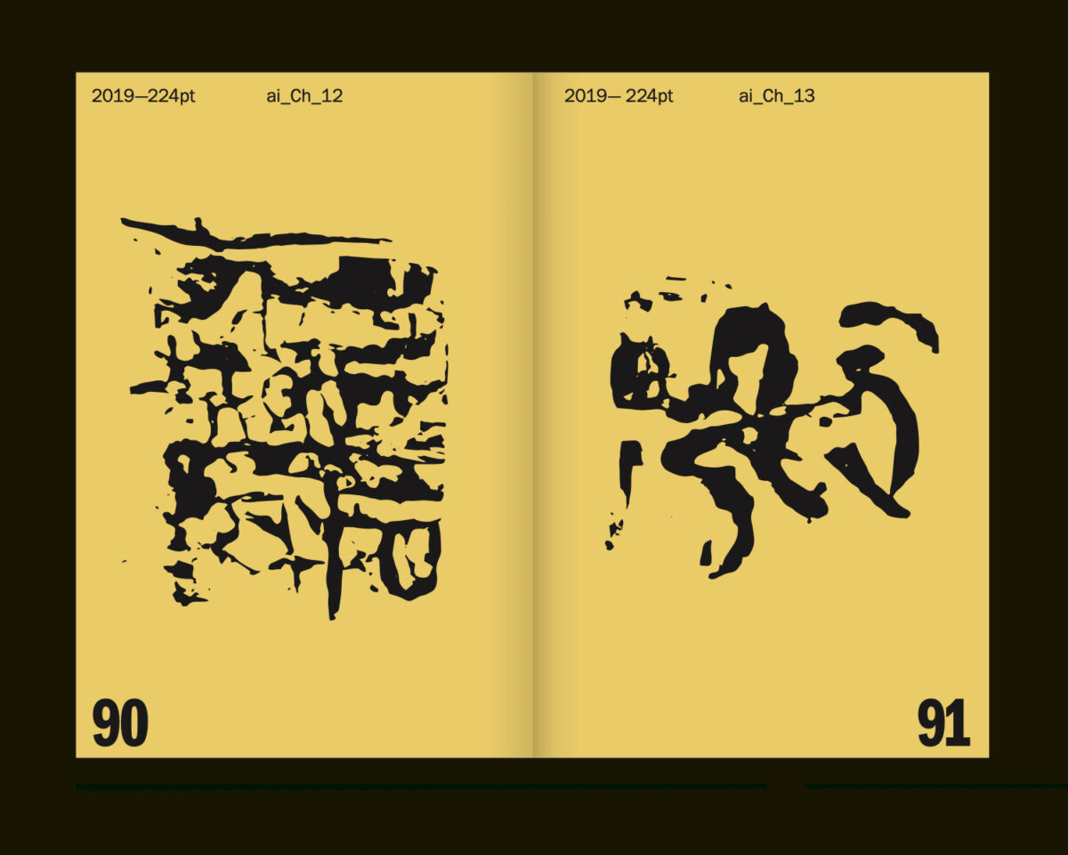
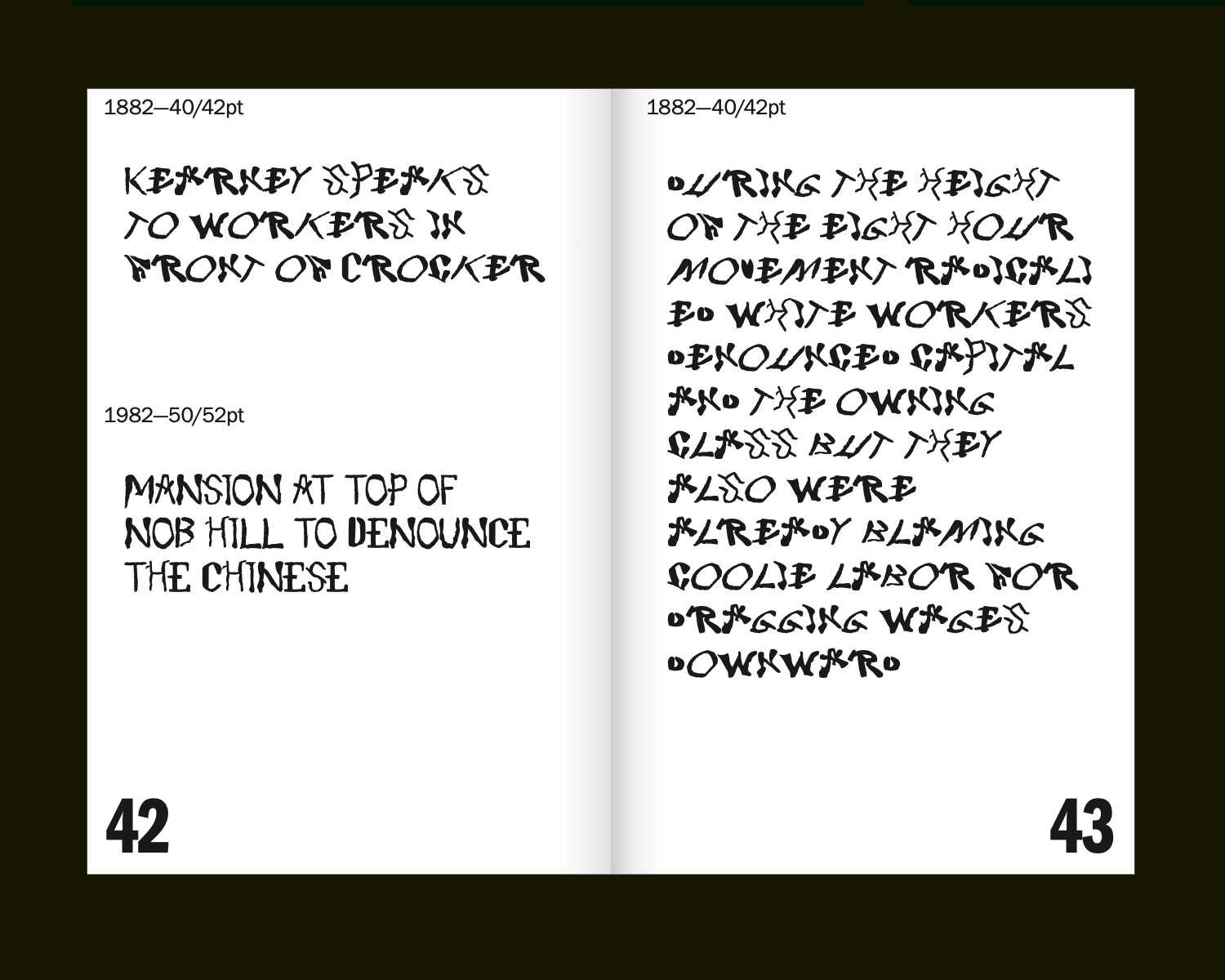
This project undertakes the design of a “chop suey” typeface called 1882–1982–2019. The general aim of the project vis-a-vis design research is to explore the capacity of conventional genres of activity in graphic design to narrate historical phenomena, while also figuring design as a vehicle of antagonism, and as a space of contestation. The project enacts graphic design research not by dint of the traditional forms of scholarly research and creative activity that go into it (i.e. as transparents texts written for academic publications, or work created for display in public exhibitions, where both constitute forms of production valorized within through institutional peer-review processes, for instance), but rather by the fact that it produces a form (a typeface) that is not typically legible as an artifact that instantiates scientific knowledge production. Furthermore, such an artifact acts as a case that exceeds the conventional pathways initiating and animating design (i.e. the client brief), and thus does not satisfy even commercial valorization—that is to say, it has little to no prospective value as a commercial product. In sum, the project is an argument for design outcomes as a form of discursive (quasi-)autonomous design-as-research, recognized as such only by the grace of its inclusion in design discourse (hence, the above qualification, “quasi”).
Screenshot
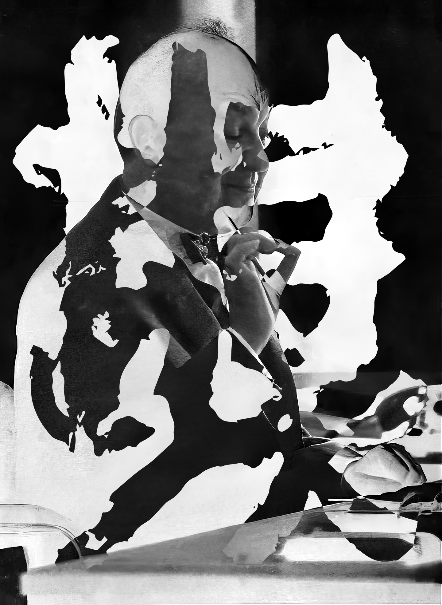
In the case of this project—a typeface in three ‘weights’ (called 1882, 1982, 2019, respectively)—the outcomes serve as vehicles for a historical narration of the status of the “Asian,” or what Iyko Day calls “alien capital” in North American settler-colonial political economy. The primary outcome of this project is the process of producing the typeface itself. This entails a raw archival excavation directly sourced from historical material (1882, the year that the Chinese Exclusion Act was passed by Congress); the “correction” or “refinement” of these according to the kinds of normative idealizations articulated by figures like Gerard Unger, Karen Cheng, etc. (1982, a seminal year in the history of the formation of “Asian-American” as a racial subject position); as well as the generation of AI generated “hanji” (Chinese ideograms) in resonance with Day’s characterization, as well as popular depictions of the “Yellow Peril” that persist from the anti-Chinese attitudes that have persisted from the 1880s until today (2019). In sum, the work aims to prompt a reflection on the extent to which design outcomes are inflected by somatic knowledge and subjective performance (from calligraphic skill to “craftsmanship” in writing AI prompts), in spite of the fact that very little to none of this is residual and legible in the final artifact. Sofie Fetokaki’s work on classical musical performance pedagogy provides a clarifying lens for examining the role of performance and charisma in valorizing and institutionalizing what Diana Taylor calls “performatic” knowledge as objective, inevitable, and stable basis of evaluation in graphic design outcomes in formal educational contexts like accredited design schools.
The typeface is framed by a typographic specimen book that serves the conventional functions of such publications, namely, unpacking the origins/inspirations of the typographical forms. The story that emerges demonstrates the ways that “alien capital” has served as one foil (that is, one Other, amongst whiteness’ many other Others) against which white Euro-American normativity has been defined. Tracing the history of anti-Chinese, and more broadly, anti-Asian animus for over a century and a half, yields an account of attitudes that are resonant with the ones that subtend and stabilize otherwise contestable ideas about validity, correctness, and progressive excellence in typography and graphic design today. As scholars in whiteness studies like Ruth Frankenberg have articulated, “whiteness” lacks its own internally coherent content, and is figured primarily by all the things that it is not. In short, the project aims to serve as a case for examining the way that typographic design has participated in the construction of whiteness. The project casts typography itself as a racialized field, while also functioning as an actuator of what the race scholars Michael Omi and Howard Winant call “racialization.” In this narrative, Euro-American craft is given its content, marked tautologically by aesthetic ideals articulated primarily in contrast to the outcomes of “cheap Chinese labor.”
The Design + Translation panel aims to recenter perspectives and prioritize inclusivity by representing a wider range of voices that build design community.
Three Tracks: Books, Academic Articles and Book/Exhibition Reviews
Do you have an idea for a book? Are you working on an article? Are you a new design writer trying to figure out where to publish first?
The Design Writing Fellowship (formerly the Design Incubation Fellowship Program) has three tracks: Books, Articles, and Reviews. Participants take part in a 3-day virtual writing workshop, during which they receive feedback, learn about the publishing process, and commit to working on their writing projects for 3-6 months.
Applications will be accepted until December 1st. The Fellowship Workshop will be held May 28-30, 2025.
113th CAA Annual Conference, Hybrid format.
Deadline for abstract submissions: August 29, 2024.
We invite abstract submissions on presentation topics relevant to Communication Design research. Submissions should fall into one or more of the following areas: scholarly research, case studies, creative practice, or design pedagogy. We welcome proposals on a variety of topics across the field of communication design.
Submit an abstract of 300 words using the Design Incubation abstract submission form found here (indicating preference for virtual or in-person session): https://designincubation.com/call-for-submissions/
Submissions are double-blind peer-reviewed. Reviewers’ feedback will be returned. Accepted presentation abstracts will be published on the Design Incubation website.
A 6-minute videotaped presentation is required for participation. The video is due on January 15, 2025. It will be published on the Design Incubation YouTube channel.
The 113th Annual CAA conference session will consist of live presentations plus a moderated discussion.
113th CAA Annual Conference Virtual and New York City February 12–15, 2025 Live presentations and moderated discussion in a hybrid format.
Presenters are required to follow the basic membership and fee requirements of CAA.
We are accepting abstracts for presentations now until August 29, 2024.
Camila Afanador Llach Associate Professor Florida Atlantic University
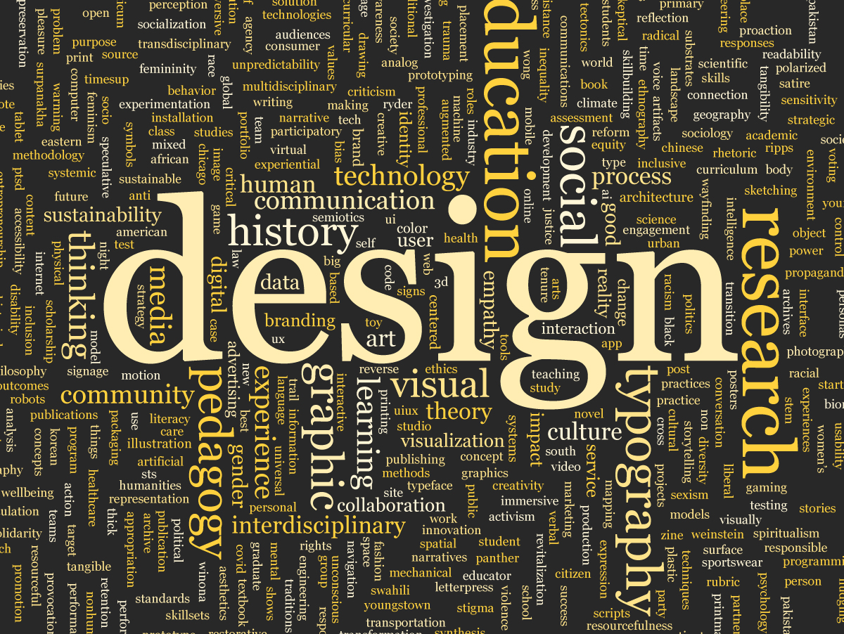
Every year since 2014, Design Incubation has hosted public colloquia for communication design academics and practitioners to share and discuss their research and creative practice. The titles, abstracts, and keywords for these presentations are published and archived in the Design Incubation website. This archive contains a portion of the story of communication design research during the last decade mostly in the United States through the work of professors, adjunct faculty, grad students, and practitioners that have participated in the colloquia. Education, design pedagogies, collaboration, research, design theory, design history, and many other topics are part of this archive. Each abstract’s keywords provide an overview of the focus of each presentation. What can these keywords tell us about the field of communication design research in the past 10 years? Using text analysis tools, this presentation will give an overview on the most common research topics in the field year by year during the last decade.
Silas Munro Partner at Polymode Artist, Design Author, and Design Educator
From the funky, fresh Black modernism of the Johnson Publishing Company’s headquarters designed by John Warren Moutoussamy with Arthur Elrod and William Raiser to the expressive graffitied grids of Adam Pedelton’s monumental canvases in black and white, there lives a wide-ranging matrix of possibilities for what I consider to be a Black Grid. The renowned design scholar Audrey G. Bennett’s text, “Follow the Golden Ratio from Africa to the Bauhaus for a Cross-Cultural Aesthetic for Images“, traces a lineage of fractal ingenuity in the Sub-Saharan Cameronean palace of a Chief in Logone-Birni that likely influenced Egyptian, North African Temple architecture, linking to Italy through the mathematician Fibonacci know for his so-called “golden ratio” that then informed European ideals of beauty circulating in the infamous Bauhaus art school. Bennett’s postulations connect to my meandering search to see myself as a Black designer, artist, and unexpected design historian in a sea of pedagogies that don’t represent me or my lived experience. This brief visual essay charts a series of experimental meditations on how grids can shape Black liberatory forms. My Polymodal design investigations set a curious space that asks, What might be a Black Grid?
The repurposing of Variable OpenType technology as a tool of digital preservation
Javier Viramontes Visiting Lecturer Rochester Institute of Technology
“Copy, Transform, Combine,” refers to a 2017 University of New Haven exhibition of historically significant Swiss posters from the private collection of Tom Strong, with the aim of deepening the historical/practical education of graphic design students with a more immersive material and contextual experience. The title of the exhibition outlines a methodology of using archives in an experiential manner to engage history, not as a static memory, but rather as an experience that allows students to revisit design history through their own perspectives, allowing them to copy, transform, and combine new works based on historical exemplars.
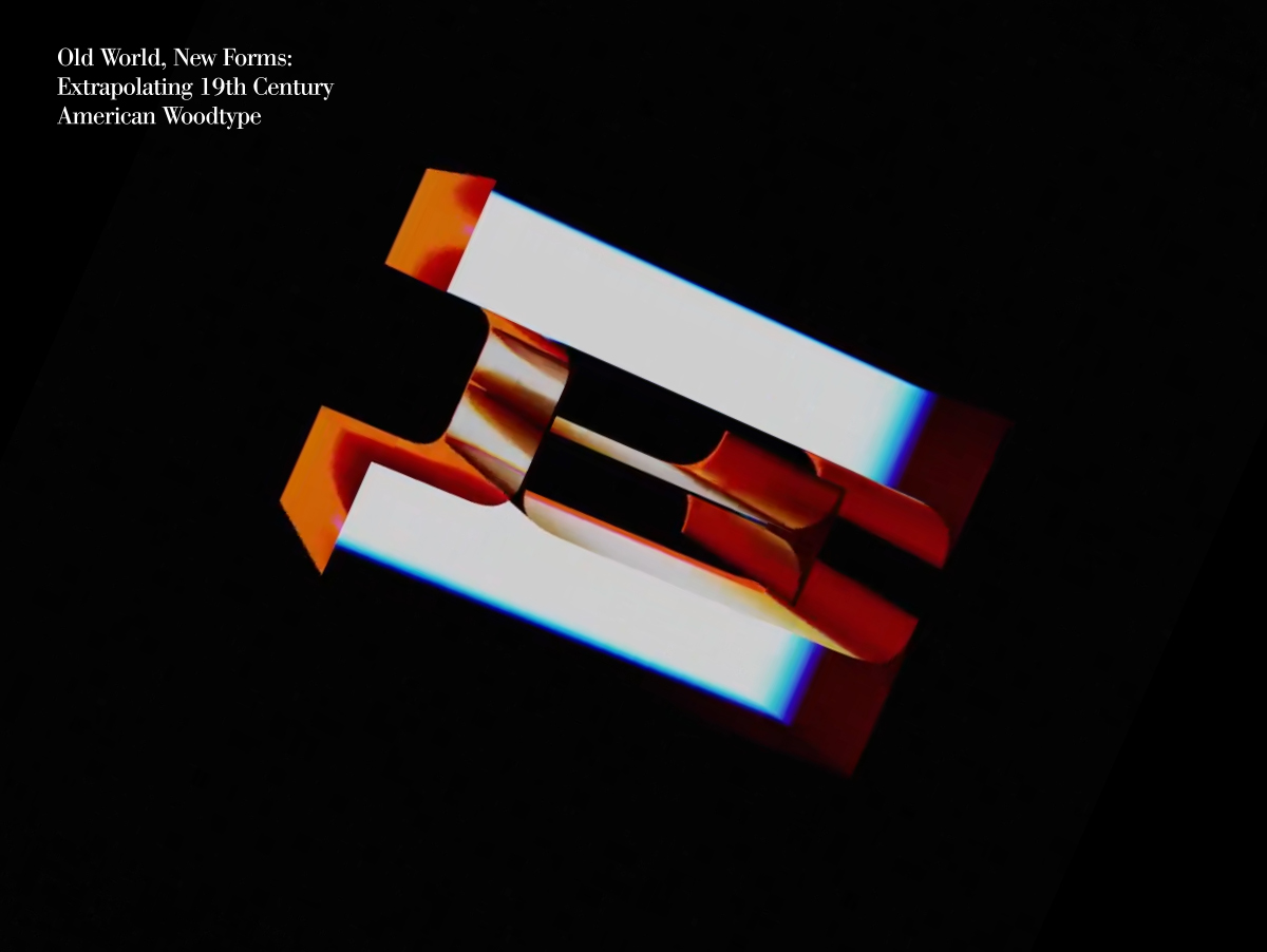
“Copy, Transform, Combine,” can also serve as a unique way to rethink historical preservation. For this presentation, we will discuss the repurposing of Variable OpenType technology as a tool of digital preservation of Aldine Expanded, a 19th-century American Wood Type design, first manufactured by The Hamilton Mfg. Co., Two Rivers, Wis. As indicated by the research of David Shields, Associate Professor, Department of Graphic Design, Virginia Commonwealth University, 19th-century letterforms such as Aldine Expanded were produced in a time without standardized classification systems. Furthermore, without notions of intellectual property or copyright, 19th-century movable wood type designs were often plagiarized, altered, or expanded without a sense of attribution. This typographic revival aims at mapping and classifying Aldine’s various copies and offshoots into a single digital Variable Opentype font file sourced from various design archives.
This presentation will discuss the early and middle stages of this experiment. We are interested in engaging design educators looking to engage archives through preservation, remixing, and the study of historical visual culture through contemporary design technologies.
Where technological advancements continually redefine the human experience of urban spaces
Dho Yee Chung Assistant Professor Oakland University
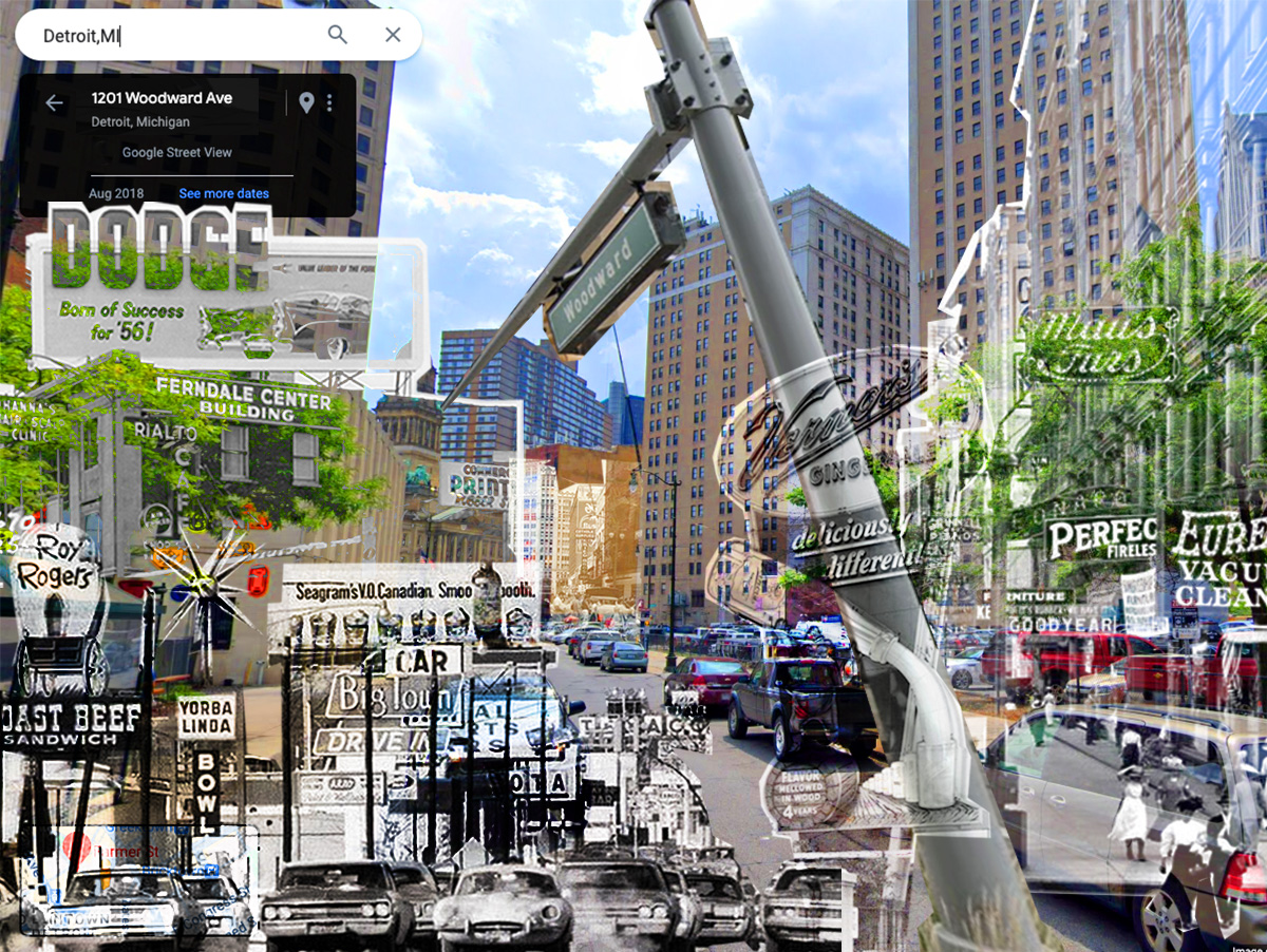
Detroit is the epitome of the urban development crisis in the United States. Although it’s a city with a rich history in the automobile industry, it faces significant infrastructural challenges and urban decay. As the automobile industry decentralized from Detroit, the city’s booming metropolis experienced abandonment and neglect. Accordingly, the once-thriving industrial engine and the various signages that shaped Detroit’s urban landscape disappeared into its history. The symbolism in these signages is significant because it represents the visual artifacts of respective eras. Recognizing the importance of preserving this visual heritage, my project aims to create a digital archive that revitalizes Detroit’s vernacular visual language.
To ground a framework for symbolism in urban landscapes, this talk revisits Robert Venturi, Denise Scott Brown, and Steven Izenour’s seminal work, Learning from Las Vegas, which suggests a new paradigm in the urban landscape—communication over space. While Venturi and his colleagues focused on the context of Las Vegas in the 1960s, my project extends their ideas by bringing them into the present, where technological advancements continually redefine the human experience of urban spaces. With the advent of GPS platforms and self-driving cars with LiDAR technology based on real-time data, the traditional reliance on physical street signs has diminished. However, digital space suggests a new opportunity to transfer the lost vernacular language of the past into a digital archive accessible by any user.
My project seeks to bridge the gap between past and future by acknowledging forgotten history while enriching visual communication relating to Detroit’s urban landscape. This talk is expected to contribute to ongoing dialogues surrounding the intersection of technology, urban development, and visual communication, ensuring that the city’s rich heritage remains an integral part of its future trajectory.