Visualizing Self-Tracked Data to Navigate Well-being

An explorative process, grounded in Positive Psychology’s core concepts like gratitude, acts of kindness, goal-setting, and mindfulness

Yvette Shen
Associate Professor
Ohio State University

As a visual communication design educator specializing in Information Design and Data Visualization, Shen views teaching as a collaborative journey of discovery with her students. The journey in education here goes beyond honing technical skills, venturing into an enlightening realm where learning outgrows traditional methods and tools.

Since 2018, students entering her classroom have embarked on this explorative process, grounded in Positive Psychology’s core concepts like gratitude, acts of kindness, goal-setting, and mindfulness. Through meticulously structured visualization projects that involve tracking and visually rendering their behavior and emotion over time, they not only learn design skills but also engage in profound self-reflection, leading to meaningful well-being insights. In these classes, students engage in the active self-tracking of their daily experiences, encompassing everything from emotional states and physical activities to altruistic behaviors and environmental interactions. This process, supported by a combination of manual logging and digital tools and rooted in Positive Psychology principles, yields a rich dataset. This data becomes a canvas for each participant to visualize and analyze, offering unique insights into students’ narratives.

This educational strategy bridges the practical application of data visualization with the theoretical constructs of Positive Psychology. During the COVID-19 pandemic, for instance, students’ self-tracked metrics evolved beyond mere numbers. Interpreted through Positive Psychology principles, these metrics narrated stories of resilience, coping, and the joy found in everyday interactions. Acts of kindness, when quantified and analyzed, transformed into powerful reflections of character strengths such as empathy and compassion. The synergy of data visualization with Positive Psychology equips students with a dual-lens: the self-tracking acts as a reflective mirror, while Positive Psychology offers interpretive tools to decipher these reflections. More than 180 students have engaged with this pedagogical model over the years, revealing that the alignment of daily actions with personal values fosters a sense of purpose. Moreover, the act of savoring positivity encourages students to cultivate an appreciative outlook on life.

Navigating through the data visualization process presents its challenges. Students must make coherent sense of raw data and determine the most impactful visual representations. Dissecting qualitative data to discern patterns and crafting personal stories from it remains a continuously evolving puzzle, demanding critical engagement and thoughtful interpretation. While the course centers on the foundational principles of information design—including the gathering, sorting, categorization, and analysis of information—the incorporation of Positive Psychology highlights a vibrant nexus between data visualization and personal well-being. Students not only master design intricacies but also witness the empowering effect of design on individual well-being. They emerge with enhanced data literacy, design thinking skills, and a strengthened culture of introspection and ongoing personal development.

This educational journey in Information Design and Data Visualization aims to transcend scholarly pursuit; it seeks to become a transformative experience that enriches student lives. It cultivates an appreciation for the storytelling power of data and deepens the significance of introspection in personal growth. The hope is that this approach to Information Design will exemplify how the meticulous art of visual communication, in synergy with human-centered design philosophy, can illuminate the path to holistic wellness and enlightened self-awareness.

This project was the 2023 Design Incubation Educators Awards runner-up recipient in the category of Teaching.

Yvette Shen is an Associate Professor in the Department of Design at the Ohio State University and the program coordinator in the area of Visual Communication Design. The focus of her current creative and research pursuits is centered on the field of information design and information visualization. Specifically, she is interested in exploring how design can facilitate a deeper understanding of complex information and foster increased interest in learning, as well as how visualization and user experience can promote positive behaviors and emotions. Yvette holds an M.F.A. degree in Visual Communication Design and a B.S. degree in Computer Science.

Critical Visual Analysis of Graphic Expressions of Emotions Over Time

The ‘feeling’ aspect of the typical ‘thinking, feeling, doing’ channels.

Ann McDonald
Associate Professor
Northeastern University

This presentation will provide critical visual analysis of various methods currently used for mapping emotions over time in experience maps and point to possible alternate methods. The intent is to challenge designers and researchers to examine the value of more meaningful data collection and visual synthesis of the emotional component or the ‘feeling’ aspect of the typical ‘thinking, feeling, doing’ channels represented in experience maps. (1)

Experience maps are timelines or chronologies created to help understand complex, abstract interactions that occur over time in the context of a customer or user achieving a goal or meeting a need. Design teams use experience and customer journey mapping and storyboard templates (2, 3) as a means to collect, analyze, and visually synthesize research observations of user experiences. These maps aid in the understanding of existing conditions, help identify pain points, and foster consensus about how to improve product and service offerings.

Mapping experiences is one of the multiple methods used to foster empathy in designers and collaborators. We develop understanding and empathy through interviews, observation, and the willingness to take time to discover the internal thoughts and reactions that drive others. A key element of experience mapping is representing changes in emotions over time. But temporal emotions are often simplified to a y-axis mapping of the intensity of vaguely identified emotions across an x-axis of phases over time. Emoticons and color are often added to define changes in positive and negative emotions. Conventions from literature also inform these models based on highs and lows of story arcs over narrative time.

We need to ensure there is adequate data collected by design research teams so we can meaningfully represent changes in emotional states. As humans, we readily pay attention to physical changes in the face, voice, and body as a means for expressing emotions. But understanding another’s cognitive and emotional states takes time and training in observation and interview techniques. Experience maps are often a synthesis of multiple individuals’ journeys and represent the experience of a persona–a summary user archetype crafted from research on multiple individuals in order to represent varied user types.

Some concerns found with personas development and use—they can be biased by their creators, based on insufficient or non-representative data, or used to justify preconceptions—may also follow as concerns for emotion mapping. (4) If we openly question experience mapping templates and assumptions, what alternate visual models of understanding experience and temporal emotions can evolve? What can be learned from other temporal representation models and fields to enrich research synthesis and visualization connecting storytelling (qualitative) and data (quantitative) to increase understanding and envisioning? How can we better use the power of information design to explain events and expose narratives, patterns, emotional responses, and relationships across time? How can we be more mindful of any culturally specific connotations of color and emotional response?

As information designers, we have an opportunity to create alternative models to communicate emotions and relations and connect multiple scales and time frames. Design teams could benefit from the use of more rigorous methods to offer nuanced representations of complex experiences that occur over both micro and macro time frames. This work is part of a broader investigation of notational systems and historical and innovative mapping as scores of experiences across multiple fields such as music, dance, performance, improvisation, urban planning, sports, etc.

1 Adaptive Path’s A guide to Experience Mapping, 2013.

2 Kalbach, James. Mapping Experiences: A Complete Guide to Creating Value through  Journeys, Blueprints, and Diagrams. O’Reilly Media, 2016.

3 Lupton, Ellen. Design Is Storytelling. Smithsonian Design Museum, 2017.

4 Salminen, J., Jansen, J., An, J., Kwak, H., & Jung, S. (2018). Are personas done? Evaluating their usefulness in the age of digital analytics. Persona Studies, 4, 47.

Barrett, L. F. (2012). Emotions are real. Emotion, 12(3), 413–429.

McCloud, S. (1994). Understanding Comics. Harper Collins.

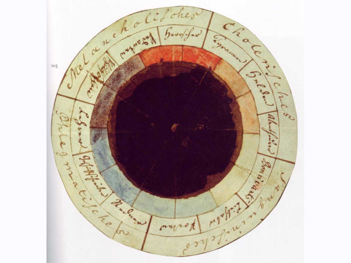
Rodrigues, D., Prada, M., Gaspar, R., Garrido, M. V., & Lopes, D. (2018). Lisbon Emoji and Emoticon Database (LEED): Norms for emoji and emoticons in seven evaluative dimensions. Behavior Research Methods, 50(1), 392–405. image: The “rose of temperaments” (Temperamenten-Rose) compiled by Goethe and Schiller in 1798/9. https://en.wikipedia.org/wiki/Color_psychology#/media/File:Goethe_Schiller_Die_Temperamentenrose.jpg

This research was presented at the Design Incubation Colloquium 6.2: CAA 2020 Conference Chicago on February 14, 2020.

Information Design and Voter Education: A Reflection on the 2018 Midterms and How to Design for 2020

The goal of the project was to first identify why Millennials weren’t voting as much as older generations, and ultimately attempt to inspire higher turnout in the local university community.

Courtney Marchese
Associate Professor
Quinnipiac University

In the summer of 2018, a design student-professor collaboration produced a 100-page Midterm Election Guide, that set out to tackle the lopsided statistic that millennial voters (18-35 years old in 2016) had a nearly 20% lower voter turnout in 2016’s presidential election, as compared to Baby Boomers (53-71) despite having a near equal portion of eligible voters (each about 30%).

The goal of the project was to first identify why Millennials weren’t voting as much as older generations, and ultimately attempt to inspire higher turnout in the local university community. Through an initial survey of college-aged students, the vast majority noted that they do not typically vote because they feel like they don’t know enough about the issues at stake and are not educated on the purpose of midterm elections. They further noted which issues are most important to them, which are the issues that are focused on in this guide: the environment, the economy, immigration, foreign policy, the treatment of minority groups, gun policy, healthcare, and women’s rights. While these issues surfaced as top priorities to millennials, it was evident that these topics resonate across generations.

Data from the internationally-recognized Quinnipiac Polling Institute, Pew Research Center and a variety of government websites, was used to create an organized system of timelines, key terms, and data visuals to help explain today’s complex politic issues and seeks to help young voters understand their demographic significance in today’s society. This presentation describes the effect that the guide had in the 2018 midterms, and looks at the evolving strategy for how it will educate voters in 2020.

This research was presented at the Design Incubation Colloquium 5.3: Merrimack College on March 30, 2019.