Introducing MUGEN — A Javascript Library for Teaching Code Through Game Design

This tool allows students to rapidly develop a small game-like interactive experience with a minimal amount of coding.

Brian James
Assistant Professor
St John’s University

Teaching computer coding to students of design presents a unique context, with its own set of challenges. Design students may lack deep intrinsic motivation toward the subject, perceiving code-related classes as unwelcome, stress-inducing requirements in the curriculum. Additionally, they may be intimidated not only by the task of coding in general, but also by the complexity of the software development kits used by more experienced coders. Finally, the time and cognitive load required to code even a small interactive project can be daunting even to the most motivated learner.

Design students do, however, bring unique strengths to the table. Designers are often highly motivated to learn tools that help them make tangible creative pieces. They typically bring skills such as illustration, photography, and project management to their work. And design students who have internalized the lessons of working with grids, character styles, and similar visual systems are primed to work with analogous systems in a coding context.

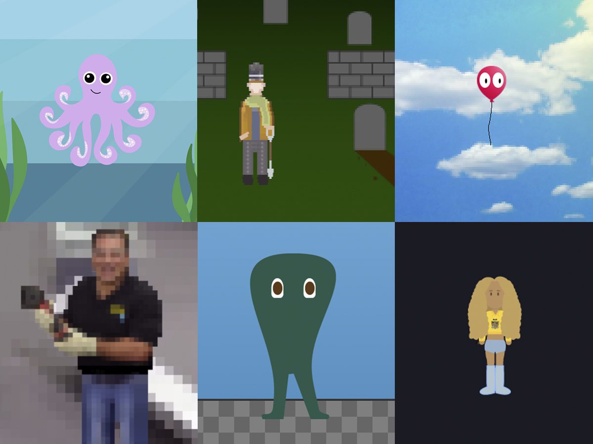
The Mini UnGame ENgine (MUGEN) is an attempt to bridge these challenges and opportunities by presenting design students with a simple, pedagogically oriented JavaScript library, developed by the author, that allows them to rapidly develop a small game-like interactive experience with a minimal amount of code. MUGEN offers teachers a flexible tool that can support an instructional approach focused on visual design, or an approach focused more on coding, or on an approach that balances the two.

This presentation will describe MUGEN’s aims and current state of development, share tentative results of its first deployment in a design classroom, and consider possibilities for future development and applications of this pedagogical work-in-progress.

This research was presented at the Design Incubation Colloquium 5.3: Merrimack College on March 30, 2019.
Disrupting Genius: A Dialogical Approach to Design Pedagogy

Disruptive making methods to teach collaboration, discourage individual bias, and support understanding and connection amongst design students.

Bree McMahon 
Assistant Professor 
University of Arkansas

Rachael L. Paine 
Adjunct Professor
North Carolina State University

We are interested in examining the theme of ego and idea hoarding in student studios and design culture, methods for disrupting the existing monological status quo approach to design pedagogy, and opportunities for future culture shifts. During a short presentation, we will examine these themes and the outcomes of a classroom workshop case study which employed disruptive making methods to teach collaboration, discourage individual bias, and support understanding and connection amongst design students.

Dr. Philip Plowright criticizes the culture of design which aims to keep design unknowable (Plowright, personal communication, October 24, 2018). The conceptual foundations of design practice claim to be “indescribable and personal” (Plowright, 2017), with designers clinging to assertions that methods are idiosyncratic, steeped in personal genius. A genius instructor, fearful of sharing knowable, repeatable methods, must surely produce students who further promote this broken culture. When a designer’s goal is to be the smartest person in the room, the ego runs wild, idea hoarding takes over, creativity dwindles, and conversation suffocates.

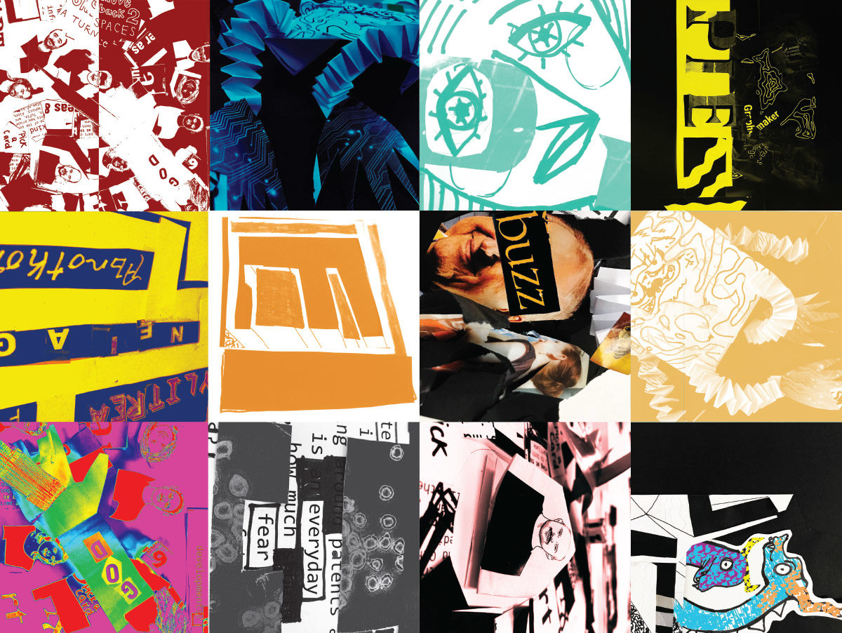
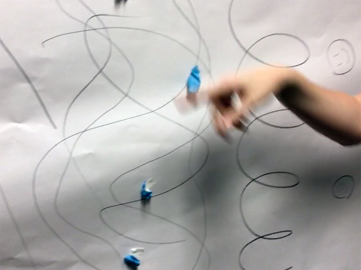
During a collaborative design charette, students responded to questions about design authorship, origination, and agency. Using rapid prototyping, iterative processes, design dialogue, and making methods, students created multiple compositions reflecting their insights. Disruptive prompts were introduced throughout the workshop. A formal discussion followed the charette and participants engaged in a conversation.

Students explored complex topics in design culture and also learned methods for collaboration, which allowed for free knowledge exchange, design critique, and creative innovation. Challenging the traditional studio model provides a learning space for addressing new challenges or “wicked problems” while also learning skills for reaching agreements, coordinating actions, discussing specific goals, and exploring new modes of discovery (Dubberly & Pangaro, 2017).

Adopting a pedagogical approach that disrupts the idiosyncratic design culture keeps the ego in check, generates collaboration, fosters creativity, and encourages conversation. In the case of this workshop, participants began to see themselves as a smaller part of the collective whole, rather than an individual genius seeking personal gratification and recognition.

CITATIONS:

Dubberly, H., & Pangaro, P. (2017). Distinguishing between control and collaboration—and communication and conversation. She Ji: The Journal of Design, Economics, and Innovation. 2. 116-118. 10.1016/j.sheji.2016.12.002.

Dubberly, H., & Pangaro, P. “What is conversation? How can we design for effective conversation?” Dubberly Design Office, 1 May 2009, Retrieved from www.dubberly.com/articles/what-is-conversation.html.

Pask, G. (1976). Conversation theory: Applications in education and epistemology. Elsevier Publishing Company, New York, NY, USA.

Plowright, P. (2017). Update – Project Goal. The cognitive structure of design methods (architecture). Retrieved from https://www.researchgate.net/project/The-cognitive-structure-of-design-methods-architecture

This research was presented at the Design Incubation Colloquium 5.3: Merrimack College on March 30, 2019.
Price of Values

The purpose of this study is to inform advertisers, designers and consumers of our individual values, collective values and ethical standards.

Shruthi Manjula Balakrishna
Graduate student
Vermont College of Fine Arts

When stopped to consider the culture of the 21st century: Each morning, we hear a half dozen ads on the radio before our feet touch the floor. Staggering out of bed, we pass brand logos on our clothing and in our bathrooms. By the end of the day, hundreds – perhaps thousands of marketing messages would have targeted us, and yet so little is understood about how marketing affects our lives, our society, our world and most importantly, our personal values.

This research paper takes a hard look at the dangerous side effects of advertising – especially for women. The paper reviews how us women, who are biologically more vulnerable to alcohol than men, and who often suffer from depression and eating disorders, are more likely to seek connection to alcohol, food, and cigarettes, partly as a response to disconnection in our human relationships. The paper proposes that this disconnection is a sense of emptiness, and people who feel empty make great consumers. The text ponders on how this emptiness makes us turn to products, especially potentially addictive products, to fill us up, to make us feel whole.

Additionally, the paper deliberates the importance of responsible and empathetic design to make real, world changing, culture defining, values shaping difference. It discusses how every one of us designers in the advertising industry have an important role to play, and since the advertising industry played a part in building and setting in motion the wagon of consumerism and capitalism that is now diving us to the edge of the cliff, we should help solve these worldwide problems in a responsible and engaging way.

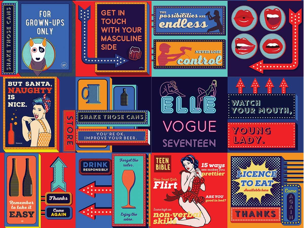
To demonstrate the observations, research, and opinions discussed in the paper, posters were designed in pop-art style because pop-art is not only drawn form mass media and popular culture, but is also “coolly” ambivalent. Whether that suggests an acceptance of the popular world or a shocked withdrawal is viewer interpretation – all with a sprinkle of parody.

The purpose of this study is to inform advertisers, designers and consumers that our individual values, collective values and ethical standards define us both as individuals and as people.

This research was presented at the Design Incubation Colloquium 5.3: Merrimack College on March 30, 2019.
African Americans in Advertising: Images, Stereotypes, and Symbolism

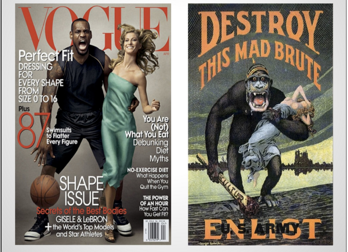
Dissecting social, cultural and historical meanings in images is to explore the dynamics of social power and ideology that produced them.

Omari Souza
Assistant Professor
Texas State University

Through advertising, designers play a vital role in crafting a product’s identity. These identities construct cultural “myths” and morality of products, teams, political affiliations, and their respective consumers. A brand is a visual signifier of a lifestyle that imbues the consumer’s social status with the economic and social value of the products they use.  While this may have positive economic implications, the consumer’s subscription to various brand narratives can encourage tribalism in addition to negatively impact the understanding of others.

For example, the characteristics and symbols that have historically been used to represent blacks in advertising have forged permanent images of African Americans into the American psyche. These characteristics have exceeded the conventional boundaries of symbols and evolved into an icon. These icons have had detrimental impacts on African Americans who reside in western society. 

The work of dissecting social, cultural and historical meanings in images is to explore the dynamics of social power and ideology that produced them. This research examines the manifestation of widely shared social assumptions of African Americans in Advertisements of the Jim Crow South. The 1940s psychological experiment Doll Test will be used to contextualize the impact of these images and will conclude by drawing parallels between racist ads of the past and current Ads that echo similar motifs.

This research was presented at the Design Incubation Colloquium 5.3: Merrimack College on March 30, 2019.
Teaching the History of Graphic Design to Visual Learners

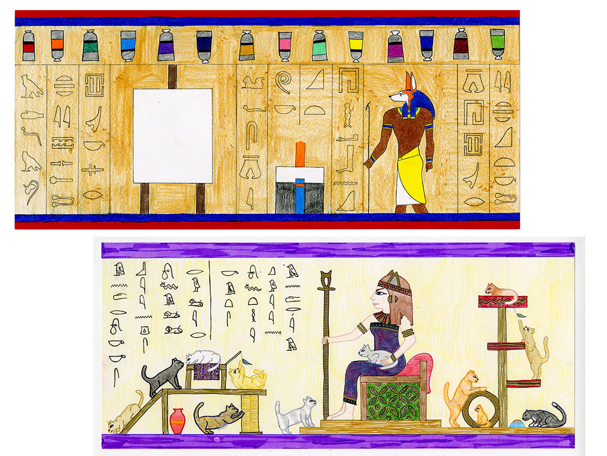
Solution: add a significant drawing component to the curriculum

Ingrid Hess 
Assistant Professor 
University of Massachusetts Lowell

I teach the History of Graphic Design to art and design students. Most of them are visual learners. I find it an exciting challenge to teach in a way that inspires learning among these students. Below are excerpts from an article I wrote for the international journal Visual Inquiry in 2013 entitled, “How Drawing Helps Keep History Present”.

When I was an art student, one of my favorite classes was art history. I remember my professor’s lectures to be fascinating yet I remember almost nothing about art history itself. The information she shared with the class didn’t stick with me. Two decades later I was asked to teach a History of Graphic Design class. I was thrilled and terrified. How could I teach a class as interesting as the one I took years before yet help my students retain the information they were learning? My solution was simple: add a significant drawing component to the curriculum. By having students create work based on the lectures I presented they put their knowledge into immediate use. The results were astounding. On tests throughout the semester, questions relating to the drawing assignments were much more likely to be answered correctly than other questions.

A pleasant surprise—regardless of a student’s inherent drawing skill, using drawing was an effective tool. My class consisted of both art majors and non-art majors. I graded not on the expertise of the rendering, but rather on how each student integrated new knowledge of graphic design history into the drawing assignments.

The most rewarding part of the course was seeing how much the students loved the drawing assignments. At the end of the class when I asked the students what they thought they would remember from the semester, all of them stated a lesson that went along with a drawing assignment.

This research was presented at the Design Incubation Colloquium 5.3: Merrimack College on March 30, 2019.

Using Icons to Encourage Visual Literacy on Campus

The role of design in instructional materials to engage a broad spectrum of student abilities.

Lance Hidy 
Accessible Media Specialist 
Northern Essex Community College

The academic administrators at Northern Essex Community College in Haverhill, Massachusetts, are considering adopting Universal Design for Learning (UDL) as a new methodology for improving student success and retention.

Having had disappointing results from other applied strategies, they are taking a fresh look at the role of design—especially for making instructional materials more accessible and engaging for a broad spectrum of student abilities. One important facet of UDL that the college is currently investigating is expanding the use of image content in text documents

To illustrate this idea, the Vice President of Academic and Student Affairs asked me to develop a system of icons to represent every degree and certificate offered by the college, along with icons for the six academic divisions, and the nine athletic programs—87 in all. Many of the faculty who were invited to participate in the process of icon development for their disciplines said that it was an eye-opening experience, being the first time they had engaged in a visual thinking exercise.

As the collection of icons was finalized and distributed, employees were invited to use them to promote their disciplines. Additionally, a colorful poster of all 87 icons is circulating on campus and off, providing not only a useful recruiting tool, but also a new way for employees and students to understand what the college is

It is too early to assess how persuasive this icon project will be in shifting the college culture toward UDL and improved visual literacy. But it is providing a popular, concrete example of UDL that is already being used by everyone, and is being cited as campus committees begin debating the role of UDL in the next strategic plan.

This research was presented at the Design Incubation Colloquium 5.3: Merrimack College on March 30, 2019.
The Value of Impermanence in Design

Designers should consider the balance between documentation and impermanence and ask what is permanent versus what is ephemeral?

Christopher Previte
Associate Professor
Franklin Pierce University

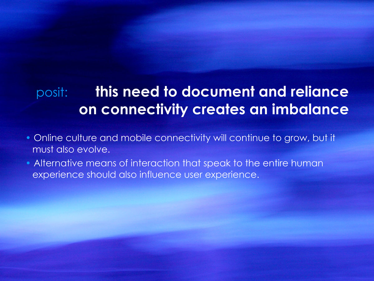
Many spaces on the web (social media, photo sharing, genealogy sites, etc.) ask us to document so much of our lives. From photographic evidence of what we eat and who we are with to digital dog-ears of our favorite music, political leanings, and familial connections, we willingly and slavishly create collections in an effort to connect with each other and prove that we matter. There is an implied permanence to these collections and they are used as currency in maintaining social hierarchy and relationships. This reliance on documentation creates an imbalance and denies the value of impermanence.

Buddhists, for example, believe that impermanence brings us hope and embodies the spirit of freedom and shatters the concept of predestination. Science teaches us that old cells in our bodies die and yield place continuously to the new ones that are forming. Technically speaking, no individual is ever composed of the same amount of energy. Impermanence and change are thus the undeniable and essential truths of our existence.

Therefore, while online culture and mobile connectivity continues to grow, it must also evolve. 

Designers should consider the balance between documentation and impermanence and ask what is permanent versus what is ephemeral? Snapchat, for example, sought to convey what made face to face conversation special. The notions of impressions and deletion by default were baked into its user experience. At its best, user experience design focuses on the intangible and speaks to concepts such as atmosphere, personality, familiarity, and comfort—remembering that “users” are, in fact, humans. Given that, should not more research and discussion be dedicated to finding that balance and uncovering the value of impermanence?

Here we will begin that discussion and ways we can incorporate it into our design practice.

This research was presented at the Design Incubation Colloquium 5.3: Merrimack College on March 30, 2019.
Enter and Exit

Temporary built environments and events that provide deliverable outcomes that served to inform, educate and engage.

Cheryl Beckett 
Associate Professor 
University of Houston

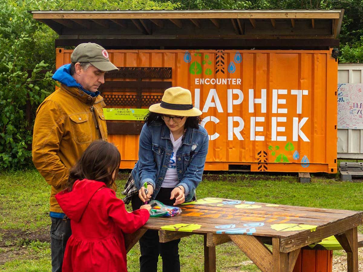
For over a decade, the faculty of the University of Houston Graphic Design Program spearheaded site-specific collaborations to move students beyond the classroom to address real world and community-based issues including environmental sustainability, neighborhood empowerment, and educational programming. The results of these investigations are temporary built environments and events that provide deliverable outcomes that served to inform, educate and engage.

While the main objective is to give voice to a community, it also provides an opportunity to immerse the students into the community, the locality of the site, and messaging. It is not always obvious to students that design can be a vehicle for social good. Through involvement in local efforts and neighborhoods, we hope to instill the potential for design to transform places and provide people with a public forum for expression.

While the outcomes of these one – two semester projects were successful in the short term, the colloquium presentation would examine long-term social impact. Three case studies would serve as talking points for discussion:

  1. The Park at Palm Center Pavilion: a hub in an active community garden
  2. Marfa Voices: a project by a design graduate student who felt discomfort in walking into and out of the lives of the locals
  3. Encounter: a series of short-term site-based installations which encouraged communities to shape development along the bayou.

The follow-up on these projects would look at assessments by students, community members and project stakeholders. The goal is to determine qualities for long term success within project constraints and to have a dialogue on case studies by other attendees to the colloquium.

This research was presented at the Design Incubation Colloquium 5.3: Merrimack College on March 30, 2019.

Visual Synthesis: Temporal and Expressive Exercises

Synthesis allows us to process qualitative research, investigate existing conditions, services, and experiences, and envision and orchestrate future frameworks.

Ann McDonald
Associate Professor
Northeastern University

Visual synthesis is one of the primary methodologies that designers use to analyze and understand human-centered research and make meaning. Synthesis allows us to process qualitative research, investigate existing conditions, services, and experiences, and envision and orchestrate future frameworks. Jon Kolko has long called attention to the critical and often under-valued role that design synthesis plays in human-centered design research.1 Experience and touch-point mapping models2 and narrative storyboard models3 have evolved to enable collection and synthesis of research observations regarding user experiences. But these templates and models do not fully engage the power of visual communication and information design to express evocative stories that read at multiple levels to best expose narratives, patterns, and relationships across time frames.

Design teams could benefit from the use of more rigorous information design methods to offer more nuanced representations of complex experiences that occur over varied time frames. We need to develop further diverse ways to represent complex services, shifts in points of view, narratives and time frames. This presentation will share in-progress pedagogical design explorations in three settings; 1) a STEM high school student half-day workshop introducing the value of design methods, 2) an entry-level undergraduate Design Process class and 3) a graduate-level Notational Systems for Experience design class exploring the use of information design strategies across multiple fields as a methodology for research synthesis and envisioning. In all three cases, in-class exercises were used to encourage students to experiment with the depiction of different time frames and expressively visualize data gathered in participation/observation of defined experiences occurring over time. Using a collaborative process of visual synthesis exposed multiple points of view, increased understanding, and offered insight into the value of visual artifacts in consensus building.

As designers, we need further study in how the process of prioritizing, editing, identifying relationships, forging connections and applying visual organization and hierarchy can help make explicit the importance of visual synthesis in the understanding and envisioning of conditions and frameworks for experiences. This work is part of a broader investigation of notational systems and historical and innovative mapping of experiences across multiple fields.

1 Kolko, Jon. Exposing the Magic of Design: A Practitioner’s Guide to the Methods and Theory of Synthesis. Oxford University Press, 2015.

2 Kalbach, James. Mapping Experiences: A Complete Guide to Creating Value through Journeys, Blueprints, and Diagrams. O’Reilly Media, 2016.

3 Lupton, Ellen. Design Is Storytelling. Smithsonian Design Museum, 2017.

This research was presented at the Design Incubation Colloquium 5.3: Merrimack College on March 30, 2019.
Humblebrag: A Game of Influence

A game that uses satire to draw attention to narcissistic behavior in the digital age and invite self-reflection.

Kathy Mueller
Assistant Professor
Temple University

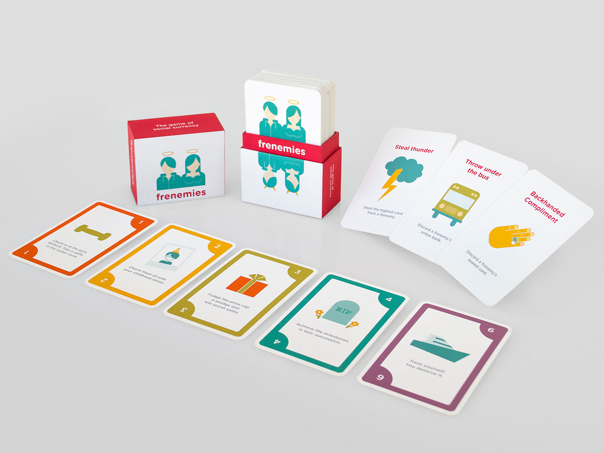
A national study found loneliness to have reached epidemic levels in the United States, and found Generation Z to be the most vulnerable. While built with an intention of creating meaningful connections, social media may accomplish the opposite. Studies have found it increases social comparison and envy. It is especially pertinent for young people, entrenched in behavioral norms of the digital age, to think critically about how they contribute to culture. Humblebrag is a game that uses satire to draw attention to narcissistic behavior in the digital age and invite self-reflection.

In this easy-to-learn strategy card game, 4–6 players compete to earn the most social influence. Players collect influence with point value cards such as “check-in at the gym” and “craft the perfect effortless look.” To get ahead, players must keep others down through the use of action cards, such as “Backhanded compliment,” that steal influence from other players. Five cards in a bank closes the round, and the player with the highest influence wins.

The game uses entertainment to engage with themes of narcissism, selfishness, envy, self-esteem, and empathy. Presenting the behaviors outside of their native digital context exposes frivolous aspects of influencer culture. The presentation will discuss the work-in-progress, spark critical conversation, and examine outcomes—such as a potential shift in awareness, measured in a survey before and after Humblebrag game play.

This research was presented at the Design Incubation Colloquium 5.3: Merrimack College on March 30, 2019.