This open forum will have design scholars and researchers discuss various research topics, offer their ideas, discuss opportunities for contributors/participants/collaborators, and open dialog regarding multiple challenges within the design research field.
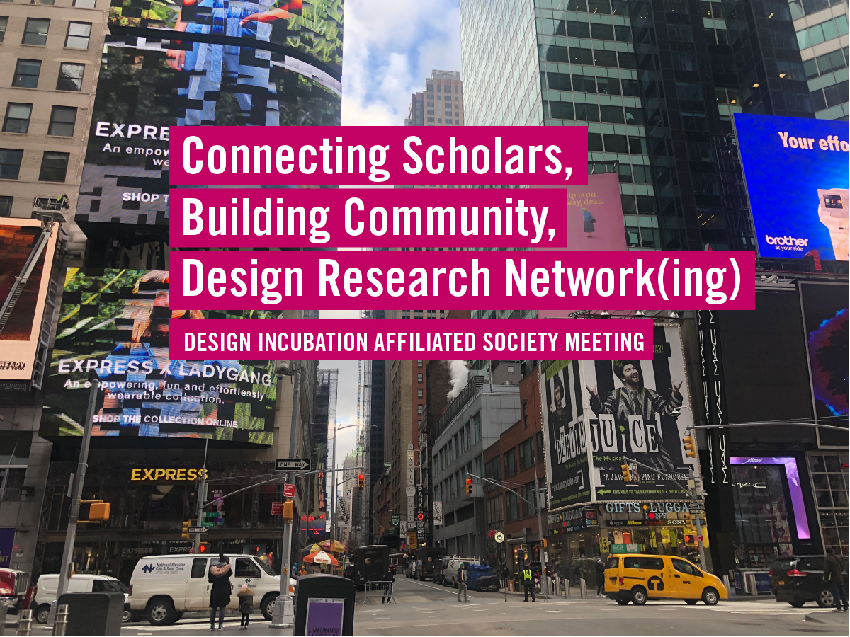
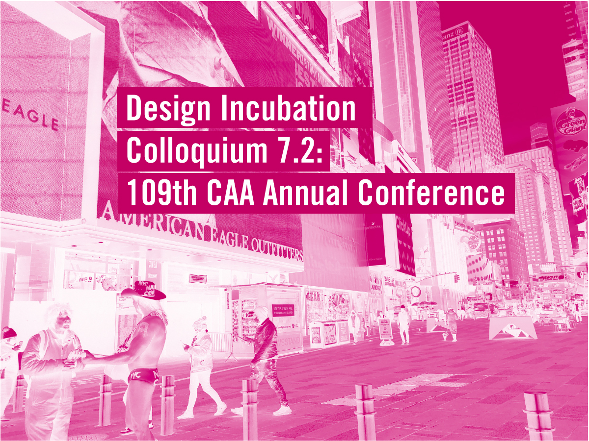
Connecting Scholars, Building Community, Design Research Network(ing) | Design Incubation Affiliated Society Meeting
Friday, February 12, 2021
12:30 PM Eastern Time (the US and Canada)
Online ZOOM Event
This is the Affiliated Society meeting of the 109th CAA Annual Conference. The meeting is open to non-conference attendees as well. Please register in advance for this event.
Overview:
Please join us at The College Art Association (CAA) Design Incubation Affiliated Society meeting | Connecting Scholars, Building Community, Design Research Network(ing) virtually on Friday, February 12, from 12:30-1:30 pm (EST).
Design Incubation is a volunteer academic organization whose focus and mission are facilitating research and scholarship in design. We aim to foster discussion and collaboration among academics and industry professionals. We are a resource for those working and studying within the field.
This open forum will have design scholars and researchers discuss various research topics, offer their ideas, discuss opportunities for contributors/participants/collaborators, and open dialog regarding multiple challenges within the design research field. Design Incubation will also be discussing some of their ongoing work with the mission/focus of supporting design research.
Some of the questions we will discuss with panelists include:
- How did you determine your research agenda?
- How do your dept and institution define and support the work you do?
- How would you describe/categorize your dept and institution?
- If you were going to position your research within a category, would you say your work addresses: design theory,
design history, design practice, design research (traditional graphic design, speculative design, UXUI, typography, AR, VR, creative computing, design solutions, etc.), design pedagogy, something else?
MODERATOR:
Dan Wong
Associate Professor, New York City College of Technology, CUNY
Co-founder/Executive Director, Design Incubation
Dan’s research considers the forms and methodologies of communication design research and innovates through the practice of communication design.
PANELISTS:
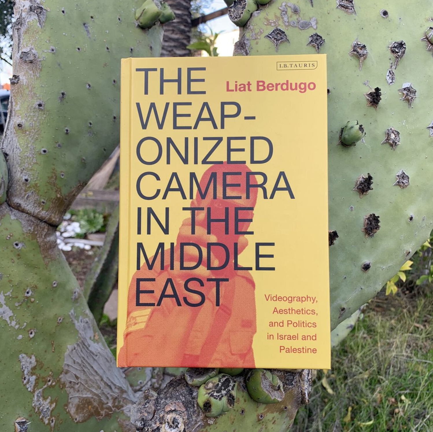
Heather Snyder Quinn
Assistant Professor, DePaul University’s School of Design
Director of Design Futures, Design Incubation
Heather’s research uses design fiction and speculative design to question the ethics of emerging technologies, challenge technocratic power, and imagine possible futures.
Jessica Barness
Associate Professor, School of Visual Communication Design, Kent State University
Director of Research Initiatives, Design Incubation
Jessica’s research focuses on social media, publication practices, and the design of scholarship, and how these relate to issues of power and representation.
Ayako Takase
Assistant Professor of Industrial Design, Rhode Island School of Design
Director of Master Program
Co-Founder, Observatory Design
Ayako’s design research focuses on evolving relationships between people, objects, and technology in the context of work.
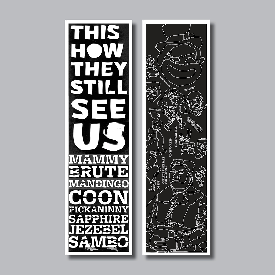
Penina Acayo Laker
Assistant Professor, Sam Fox School of Design & Visual Arts, Washington University St. Louis
Co-Principal Investigator, Mobility for All by All
Penina’s research centers around topics that utilize a human-centered approach to solving social problems.
Registration required. Please use your institutional email to register.