How important is it that an author has written a book before?

Question: How important is it that an author has written a book before? Does that improve their chances of you taking on their project and giving them a contract? –MR

Answer: While there is an element of reassurance if an author has already published a book before, everyone has to start somewhere and there will always need to be a ‘first book’ at some point. 

Some big textbook lists/publishers may not sign unpublished authors as the bigger textbook projects have a higher risk factor than an academic monograph might do, but this isn’t the same across the board. 

I’ve worked on subjects where academic scholarship was relatively new, so the pool of previously published authors was very small – getting new voices into the mix was really important to build up the high quality literature in the area.

Equally, if someone has written many books before, it doesn’t mean that they will necessarily be offered a contract for their next book. 

Whether you have tons of experience as an author, or are brand new, the combination of the project itself and your experience in the area (as a researcher, practitioner or teacher, depending on the type of book) along with the feedback from the peer reviews is a more realistic predictor of whether a project would be approved.  If in doubt, just drop the editor/publisher an email and see if it’s worth submitting a proposal.

Louise Baird-Smith
Commissioning Editor – Design and Photography
Bloomsbury Visual Arts

“Ask the Editor” is a Design Incubation series, where design academics, researchers, and practitioners pose their questions to editors of books, journals, conferences and other academic and design trade publishing organizations. If you would like your questions answered by publishing professionals, send your questions to Design Incubation via the “Ask the Editor” form on our website.

TDC Member of the Month: Liz DeLuna

Our very own Liz DeLuna is kicking off 2018 as the TDC Member of the Month . Check out her biography and see examples of her recent work there. Congratulations!  Great work, Liz!


Breakfast and Letterpress Typography Workshop @HMCT

Hoffmitz Milken Center for Typography at ArtCenter College of Design is hosting a workshop to welcome Design Incubation and typography design researchers to the West Coast.

We are excited to announce the Hoffmitz Milken Center for Typography at ArtCenter College of Design is generously hosting a workshop to welcome Design Incubation and typography design researchers to the West Coast during the 106th Annual CAA Conference in Los Angeles.

Saturday, February 24, 2018
10:30AM–1:30PM
Hoffmitz Milken Center for Typography / Archetype Press 
South Raymond Avenue
Pasadena, California 91105

The Hoffmitz Milken Center for Typography [HMCT] at ArtCenter College of Design was founded in 2015 in memory of Professor Leah Hoffmitz Milken, a well-known typographer, letterform designer and esteemed faculty member at ArtCenter. Archetype Press houses more than 2,500 cases of rare American and European foundry type, wood type, and ornaments.

Gloria Kondrup, Executive Director of Hoffmitz Milken Center for Typography and Director of Archetype Press, will also be moderating a special program of typography research presentations during Affiliated Society Meeting: Design Incubation Special Program on Typography. For details visit the website announcement. All are welcome to attend these events. Please register in advance.

Leveraging the Smartphone as a Teaching Tool

Heather Snyder-Quinn
Professional Lecturer
DePaul University
College of Computing and Digital Media
School of Design

Heather Snyder-Quinn 
Professional Lecturer
DePaul University 
College of Computing and Digital Media 
School of Design

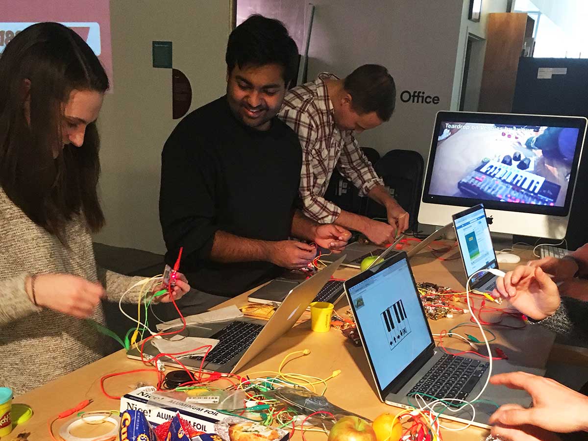
Educators are often frustrated with students’ constant attachment to their smartphones. But why do we assume the smartphone isn’t a creative tool akin to a pencil or brush—a simple way of seeing and interpreting the world around us?

As the world of design vacillates forever between the digital and analog, it’s imperative that students (and educators) understand an ever-expanding array of principles. In the words of Seymour Papert: “The role of the teacher is to create the conditions for invention rather than provide ready-made knowledge.” And as classroom content grows, the best thing we can teach students is how to be adaptive and curious thinkers.

Students can best embrace uncertainty and find comfort in a process of discovery by exploring and pushing the boundaries of the familiar. This is where the phone excels as a teaching tool. Analogous to the way a drawing teacher encourages mark-making with a branch or one’s foot, we can use a smartphone’s features in unintended ways that harness its power as a creative tool by altering our own expectations.

The smartphone is a device that most students have as an extension of their hand (though we must be vigilant of our own assumptions from privilege). Once students learn to use the smartphone in unintended and perceptively novel ways, they can extend this method to both past technologies and those yet to be imagined. By having students hack, make, and create in this manner, we are teaching them to think beyond the hand and machine, to the tool that has not yet been discovered.

Lastly, by exploring/investigating the capabilities of, and ever-present reliance upon our smartphones, we can raise awareness and open the classroom conversation to discuss ethical implications in design, including privilege, accessibility, inclusion, privacy and addiction.

This research was presented at the Design Incubation Colloquium 4.2: CAA 2018 Conference Los Angeles on February 24, 2018.

Geometries of the Sacred and Profane in Lewerentz’s St Peters

Nathan Matteson
Assistant Professor
DePaul University
College of Computing and Digital Media
School of Design

Nathan Matteson
Assistant Professor
DePaul University
College of Computing and Digital Media
School of Design

As the world of visual communication redefines itself around the design of experiences, and as those experiences are increasingly immaterial and mediated by technology (e.g. AR/VR, social media, etc.), there is much to learn from trans-disciplinary explorations of past interventions into human activity.

The architecture of Sigurd Lewerentz (1885–1975) comprises of relatively few buildings though his career spans several decades. His work, encompassing stylistic maneuvers from the neo-classical to the newly brutal, is lauded for its formal approaches to spatial organization and composition. Widely regarded as a peerless example of poetic materiality, St Peters in Klippan (built 1967) is held by many to be the culmination of this master architect’s lifelong exploration of form—a uniquely *authentic* visual and material expression.

Recent onsite documentation and archival research has further revealed connections across his output suggesting that, rather than making a turn away from classicism in the middle of his career, this thesis–antithesis was always present and ever evolving. This project proposes a new reading of St Peters’ seemingly intentional ‘differences’ or ‘frictions’: rotated plans, imperfect symmetries, ever-changing patterns within brickwork and floor tiles. These anomalies appeared throughout the entire span of the architect’s output, but never so vigorously as in this final church. Posited as visual proxies for authenticity, these frictions provide an antidote to contemporary template-driven culture and provide design strategies for creating visual and material experiences that are at once technological and humane.

This research was presented at the Design Incubation Colloquium 4.2: CAA 2018 Conference Los Angeles on February 24, 2018.

Rethink Typography Education for Digital Content Design

Christie Shin
Assistant Professor
Communication Design
Fashion Institute of Technology

Christie Shin
Assistant Professor
Communication Design

Fashion Institute of Technology

The printed page is not obsolete, and it will probably never be “dead” as many have predicted.  As a matter of fact, a new wave of indie magazines has been thriving in recent years as a result of the streamlined process of publishing. However, as far as the overall media consumption is concerned, the war is over, and the printed media has lost. Today, screens in a variety of sizes are undoubtedly the primary platform for delivering and disseminating messages and information.

Despite the shift in media channel dominance, typography remains as the soul of visual communication design. The art of designing and using typeface as a means of communication and expression can still single-handedly elevate or destroy the aesthetics and function of a design – regardless whether it is printed on a piece of cardboard, or projected onto a silver screen.

The new possibilities in typographic design exponentially expanded following the transition to screen-based media, and the rules and principles of typography have changed in the world of digital design. As stated by Michael Worthington in the seminal book, The Education of a Graphic Designer, “ Most of graphic designers understand how printed type conveys its message to an audience, what its form signifies, but few understand how that differs in the environment of the screen. On the screen-based world of typography, what was stable in the print world becomes movable, alterable, and temporal. Some of Gerstner’s possibilities for static typography seem irrelevant, restrictive, or untranslatable in this new world. If his rules have been made anachronistic by current technology, I found myself questioning whether the written word should still be such a major part of our communication process.”

In order for the new generation of graphic designers to embrace and explore new possibilities in screen-based typography, we must begin to take concrete steps toward a true typography education reform. This presentation introduces the best typographic design projects from the newly developed courses at FIT including Kinetic Typography, Typography for Digital Content Design, Typography for Digital Product Design, and Content Centric App Design. The primary goal for the presentation is to showcase the innovative uses of pedagogy and teaching methodologies for teaching digital typography.

This research was presented at the Affiliated Society Meeting: Design Incubation Special Program on Typography on February 23, 2018.

Insectile Indices, Los Angeles 2027

Yeawon Kim
Graduate student
Media Design Practices
Art Center College of Design

Yeawon Kim
Graduate student
Media Design Practices
Art Center College of Design

Crime prediction technology – we have all seen it in the movies, but what has in the past been pure fiction is now quickly becoming a reality.  Predpol, HunchLab and ComStat are different types of relatively new crime prediction software, or “predicative policing” software, that demonstrate how algorithms and other technologies can be used within urban infrastructures to predict crime.  However, utilizing these technologies and algorithms to collect data to predict crime, which is invariably subject to and tainted by human perception and use, can lead to a number of adverse ethical consequences – such as the amplification of existing biases against certain types of individuals based on race, gender or otherwise. On the other hand, if data can be gathered by some artificial intelligence (AI) means – thereby removing the human component from such data collection, can doing so result in more efficient and accurate crime prediction?  Furthermore, will we in doing so also reshape the aesthetic of urban landscapes, especially when one takes into account the constant evolution of AI?

Insectile Indices is therefore a speculative design project that considers how electronically augmented insects could be trained to act as sophisticated data sensors, working in groups, as part of a neighborhood crime predicative policing initiative in the city of Los Angeles, 2027.  This project is not only an investigation into the ethics of this controversial idea, but an aesthetic exploration into the deliberate alteration to a natural wildlife ecosystem of insects and the potential reshaping of an urban landscape.

In 2007, the Defense Advanced Research Projects Agency (DARPA) asked American scientists to submit proposals to develop technology to create insect-cyborgs, the results of which led to a plethora of troubling and worrisome commentary.  Rather than build off of a frightening narrative that discusses the potential sinister militaristic use of such technology, this project does the opposite and imagines instead an aesthetically pleasing utopia where these insect-cyborgs have social utility and work towards the public good of humanity.  Insectile indices also plays with the idea of aesthetics in our future techno-driven world by addressing whether we are more apt to silently “turn the other cheek” to more pervasive surveillance if these insect-cyborgs, or the urban landscapes they have the potential to reshape, become more aesthetically pleasing to the eye.

In this session, I plan to share the process of researching and creating the visual representation of this speculative fiction.

This research was presented at the Design Incubation Colloquium 4.2: CAA 2018 Conference Los Angeles on February 24, 2018.

Empathic Typography

Michele Damato McCaffrey
Assistant Professor
Department of Design
Syracuse University

Michele Damato McCaffrey
Assistant Professor
Department of Design
Syracuse University

How are students going to become empathic designers when they live and learn in a guarded design institution for four years? Can we develop courses/projects that encourage them to interact with communities outside of their own?

My work with students has shown they want to feel invested in their learning. Millennials are the most ethnically and racially diverse generation in the U.S. and are highly committed to social change. As design educators, we can use this information to tailor classes that will challenge them socially as citizens and designers so that they may have a deeper emotional connection to their work.

In my Experimental Typography Class, students are required to photograph the typographic signage/markings of an unknown neighborhood. For many, this may have been the first time visiting a neighborhood/culture significantly different from their own. Through typography only, the students designed a double-sided poster that communicates the culture and experience of that place. They come to understand how typography alone can reflect the ethnicity, culture, and socio-economic structure of a neighborhood. Though challenging and uncomfortable to some, students enjoy this project because they have the freedom to choose communities; take their own photography; spend time outside the boundaries and solitude of the classroom; and are in a new environment.

As a result, students often felt an investment and commitment to the neighborhood they chose to present. Not only did they fall in love with this new approach of discovering typography but also how they visually represented their story. Having students move outside of the classroom and interacting in new communities allowed them to (a) utilize their own strengths to develop their voice as designers and (b) raise their awareness of other communities as a first step toward becoming empathic and socially engaged citizens.

This research was presented at the Affiliated Society Meeting: Design Incubation Special Program on Typography on February 23, 2018.

Transforming “Graduate Students” Into “Competent Designers”

Benson Cheung
Associate Professor
Technological and Higher Education Institute of Hong Kong (THEi)
Faculty of Design and Environment

Benson Cheung
Associate Professor
Technological and Higher Education Institute of Hong Kong (THEi)
Faculty of Design and Environment

Recent reports published in Hong Kong highlight the lack of experienced and competent designers in Hong Kong (Heskett, 2003; The DesignSmart Research Project, 2008; Cheung, 2015). Two possible reasons behind this problem are insufficient training provided to recent university graduates upon their transition into the workplace and the fact that academics and employers may not think they have a role to play in the transition. University-workplace transitions have been studied extensively around the world, with researchers pointing out that there is often a ‘learning gap’ between the two settings (Schein, 1972; Argyris & SchÖn, 1989; Eraut , 1994, 2007; Boshuizen, 2003; Tuomi-Grohn, Engestrom & Young, 2003; Smeby, 2007; Asian Development Bank, 2012). Thus, this paper aims to reveal on the professional training situation and stakeholders’ responsibilities (Academics; Employers; Design Professional Bodies) of Hong Kong communication design graduates for the first three years after graduation.

This study adopted the qualitative interview method. The interviewees consisted of seven academics; seven employers and eight graduate designers of communication design in Hong Kong. The findings confirm that there is a learning gap identified between the academia and professional practice settings. It was found that neither academics nor employers consider themselves as having the primary responsibility for providing training to graduates during the transition. Communication design graduates confirmed additional training at workplace was needed; as the scope of previous academic training was broad whereas workplace requirements were very specific. All stakeholders agreed that Hong Kong lacks competent communication designers and the employers confirmed that as an urgent need. Closer Collaboration between stakeholders (Academics; Employers; Design Professional Bodies) in terms of Hong Kong design policies are needed in training junior designers.

This research was presented at the Design Incubation Colloquium 4.2: CAA 2018 Conference Los Angeles on February 24, 2018.

Variant Letterforms

Monica Maccaux
Assistant Professor
Graphic Design

University of Nevada, Reno

When considering the multitudes of typeface choice on the market, how does one approach the challenge of designing a typeface that is different from the competition? With the abundance of typeface choices, why is there a need for yet another typeface to be designed? These are valid questions when approaching the creative process of typeface design. There is the potential for there to be as many typefaces as there are people in the world; meaning, the possibilities are endless in the personalities and function of typefaces, and have the potential to grow along with the population.

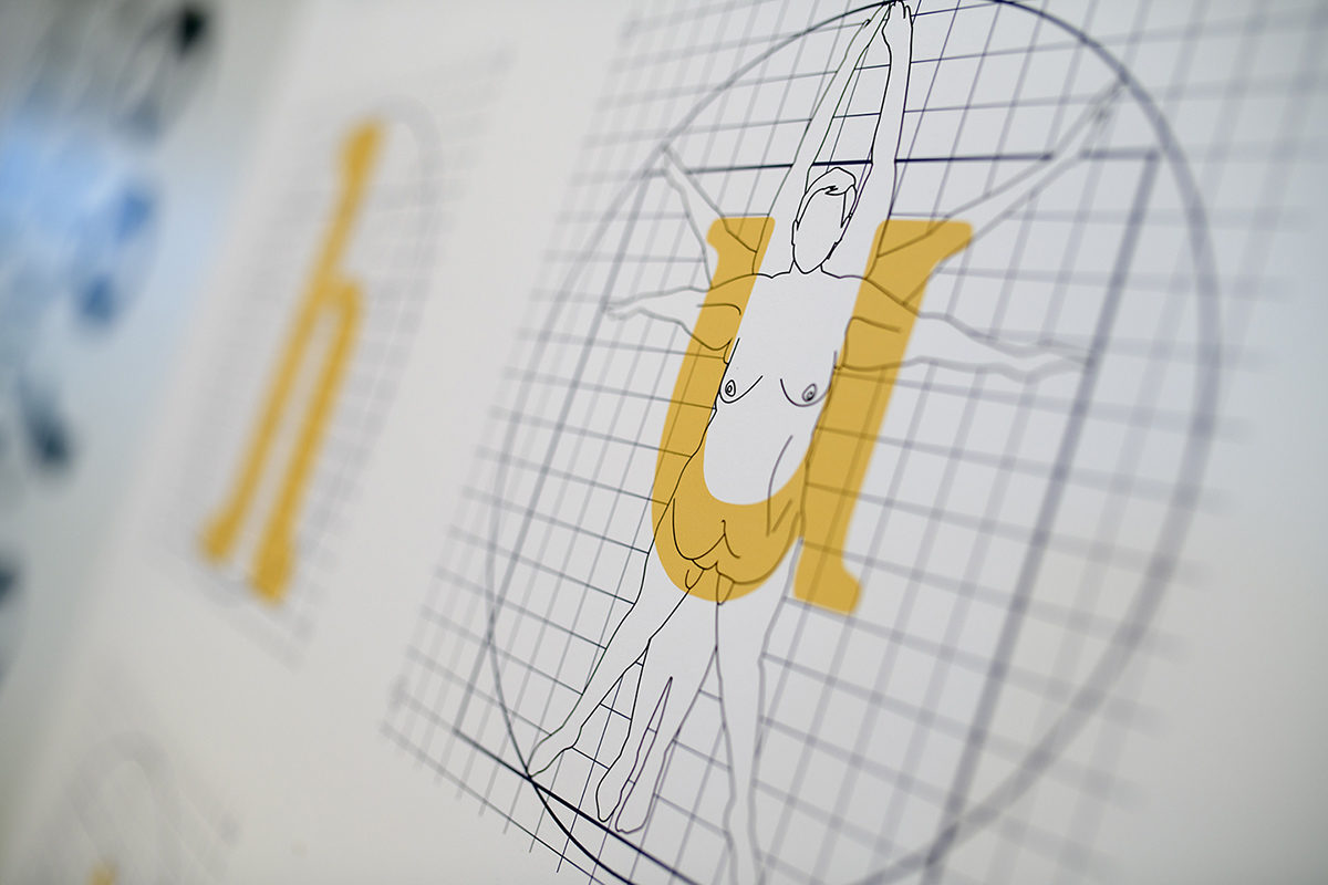
The typeface ‘Motorix’ solves the fatigue to a gluttonous font market by challenging the rules of form, beauty, and function all the while pushing the limits of what language looks like. The Latin (or Roman) alphabet, as it stands today, has undergone centuries of change and evolution which has resolved itself to current norms in letterform recognition. What will our letterforms look like in another couple of centuries? Will the letter ‘A’ still look the same? Will there be new letterforms added, or old ones removed? What can the letter ‘A’ look like? With the typeface ‘Motorix’, these questions were considered, along with how the expectation of aesthetics, and practicality drive the finished product.

Beauty and aesthetics aside, when approaching typeface design, one has to acknowledge that to design type, is to design language. As the designer of language, there are certain considerations that need to be made when formulating the letterforms: legibility, readability, beauty, form, versatility, and utility. It is no easy feat to design a typeface that is beautiful and practical, and has many applications (headlines, body copy, etc). But to design a typeface that confronts the notions of what beauty and practicality are, along with pushing the unspoken ‘rules’ of what language should look like, is something altogether different, and continues to be a modern-day challenge in typeface development.

This research was presented at the Affiliated Society Meeting: Design Incubation Special Program on Typography on February 23, 2018.