Ryan Molloy
Professor
Eastern Michigan University
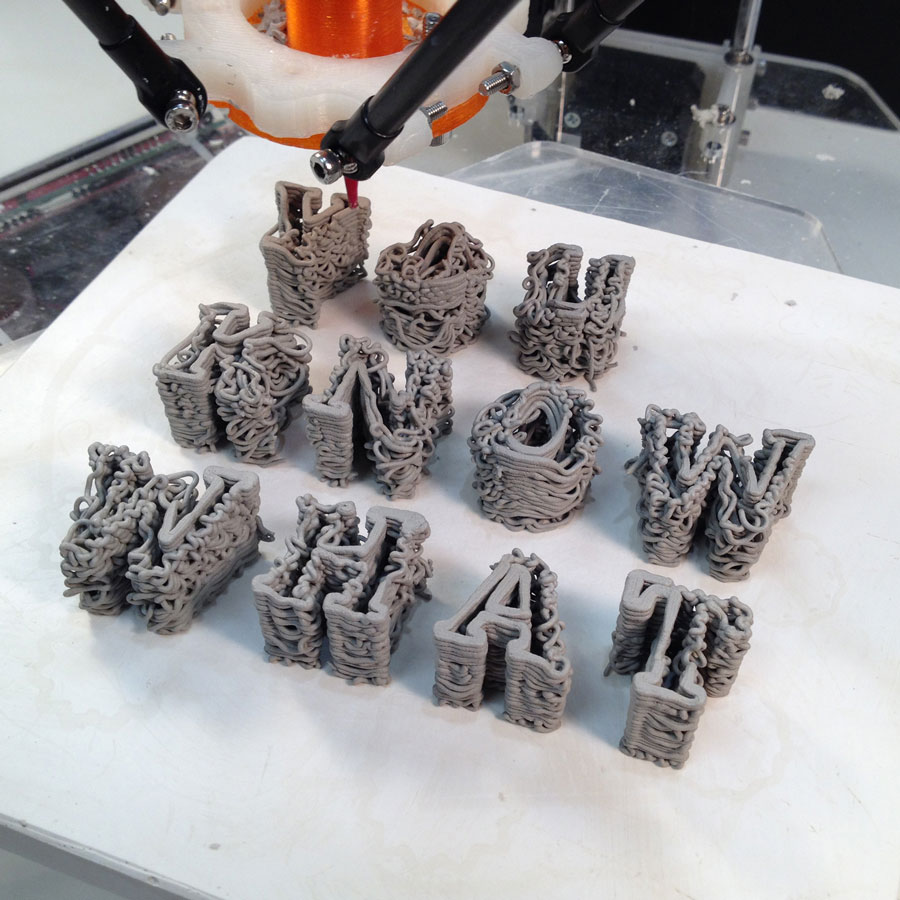
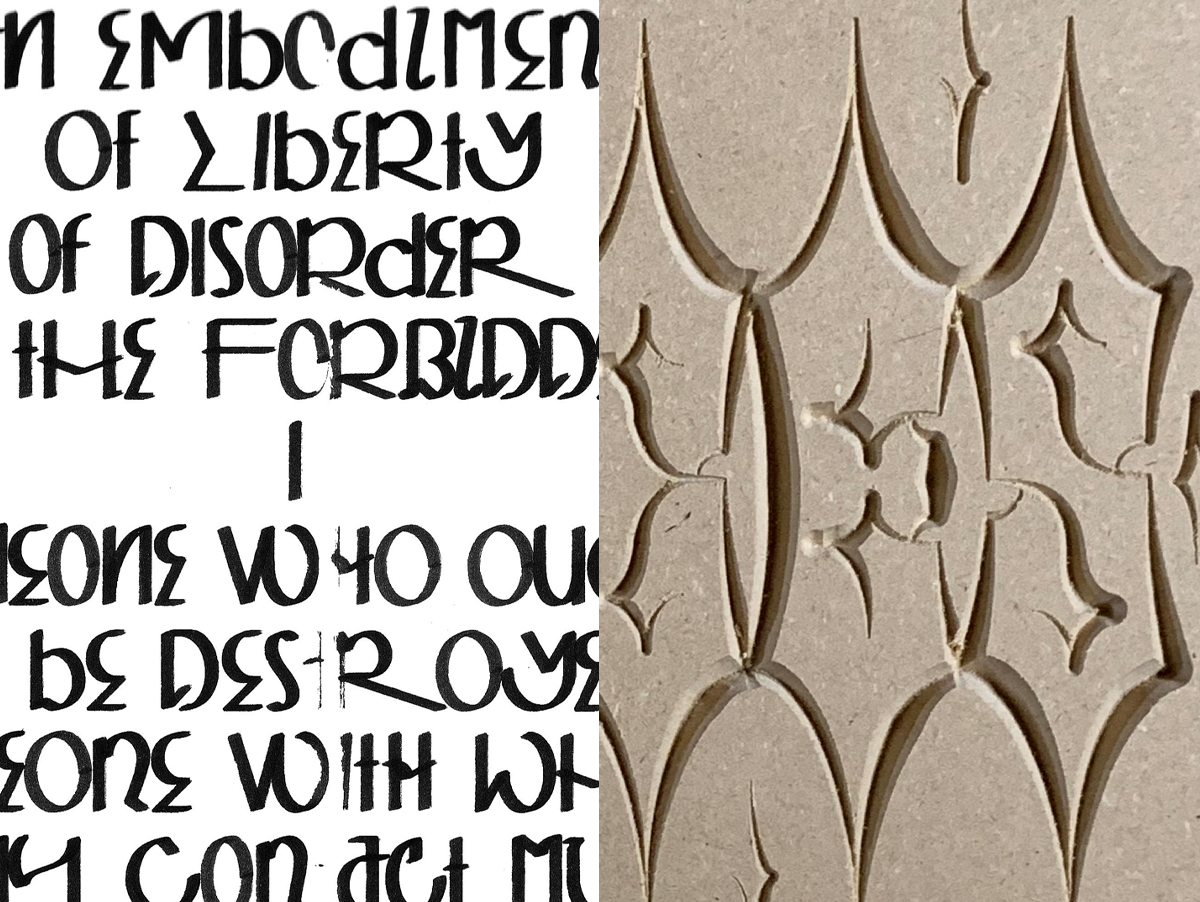
Single-line fonts—also known as engraving fonts, pen plotter fonts, and stick fonts—have a long history ranging from architectural hand drafting to use on pen plotters and engraving devices. As applications of digital fabrication—cnc milling, 3D printing, laser engraving, pen plotters, and craft cutters—have become more commonplace the demand for single line fonts has increased. Majority of the fonts produced and used today are outline fonts, enclosed and filled vector graphic forms. In contrast, a single-line font is composed solely of single vector lines (not enclosed). In applications of digital fabrication the use of single-fonts significantly reduces production time because machine paths are not duplicated.
Contemporary type design has long had a history of emulating the contrasting strokes created through hand manipulation of a brush. The increased demand from maker communities for single-line fonts has led to the development and commercialization of new single-line fonts or tools to convert outline fonts into single-line fonts. However, despite the traditions of type design and the movements of the machine allowing the potential to mimic traditional form of lettering most single-line fonts are designed only for a constant stroke weight. This presentation will showcase a number of personal typographic experiments and typefaces created in an attempt to find novel solutions and applications to the design of single-line fonts. From pen plotters, to engraving, to the creation of letterpress wood type, and drawing inspiration from calligraphy to graffiti the work seeks to ask how can we further reinsert the hand into digital writing.
This research was presented at the Design Incubation Colloquium 7.1: Oakland University, MI on October 17, 2020.