Rethink Typography Education for Digital Content Design

Christie Shin
Assistant Professor
Communication Design
Fashion Institute of Technology

Christie Shin
Assistant Professor
Communication Design

Fashion Institute of Technology

The printed page is not obsolete, and it will probably never be “dead” as many have predicted.  As a matter of fact, a new wave of indie magazines has been thriving in recent years as a result of the streamlined process of publishing. However, as far as the overall media consumption is concerned, the war is over, and the printed media has lost. Today, screens in a variety of sizes are undoubtedly the primary platform for delivering and disseminating messages and information.

Despite the shift in media channel dominance, typography remains as the soul of visual communication design. The art of designing and using typeface as a means of communication and expression can still single-handedly elevate or destroy the aesthetics and function of a design – regardless whether it is printed on a piece of cardboard, or projected onto a silver screen.

The new possibilities in typographic design exponentially expanded following the transition to screen-based media, and the rules and principles of typography have changed in the world of digital design. As stated by Michael Worthington in the seminal book, The Education of a Graphic Designer, “ Most of graphic designers understand how printed type conveys its message to an audience, what its form signifies, but few understand how that differs in the environment of the screen. On the screen-based world of typography, what was stable in the print world becomes movable, alterable, and temporal. Some of Gerstner’s possibilities for static typography seem irrelevant, restrictive, or untranslatable in this new world. If his rules have been made anachronistic by current technology, I found myself questioning whether the written word should still be such a major part of our communication process.”

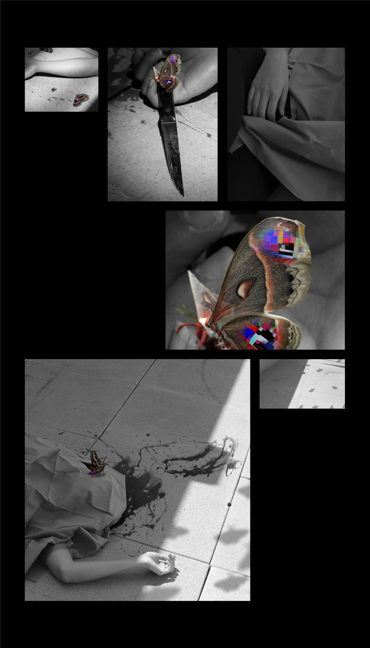
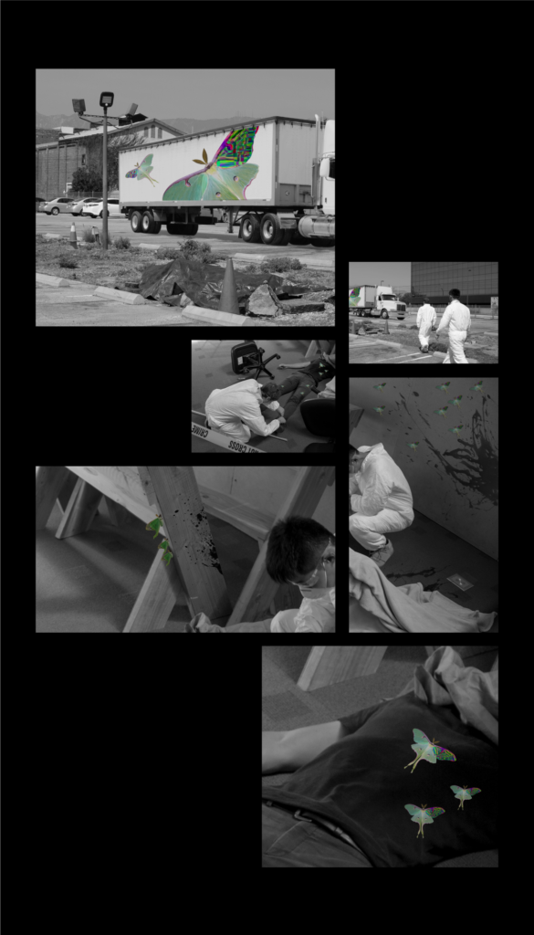
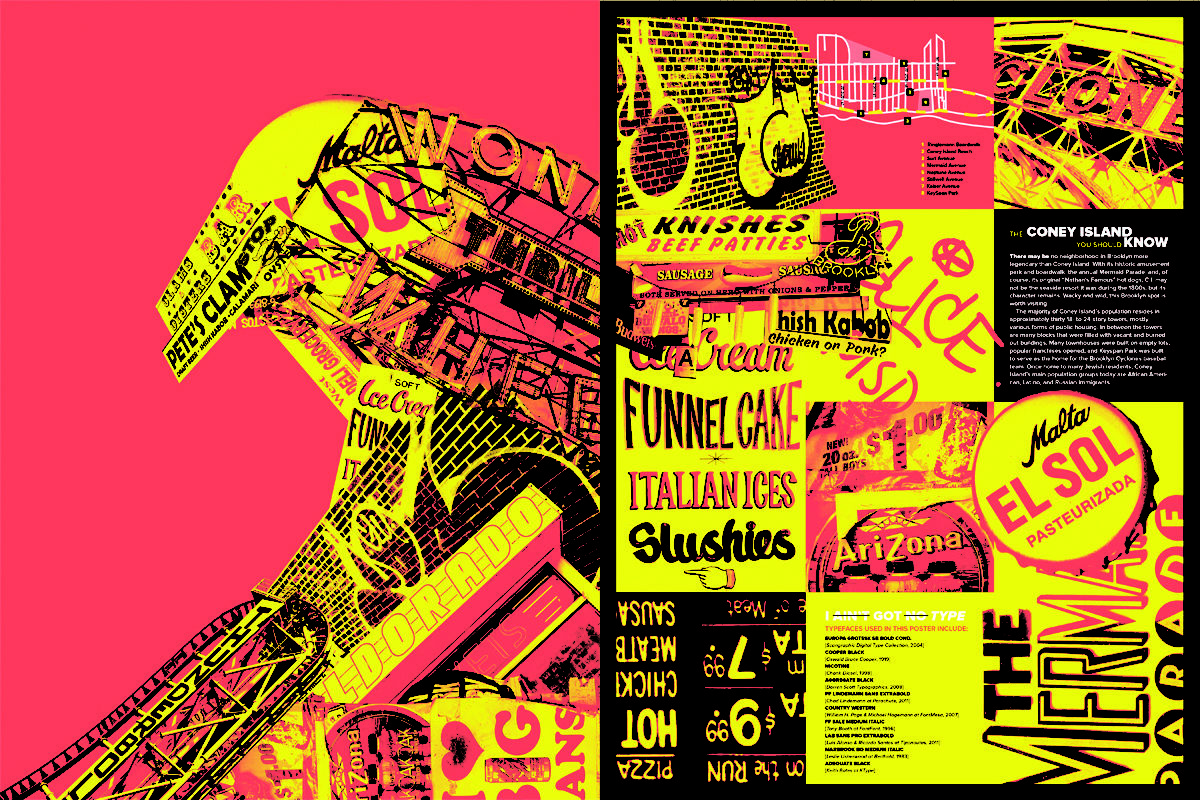
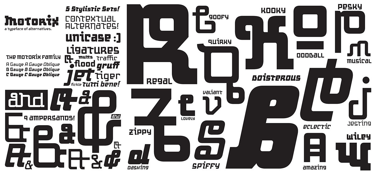
In order for the new generation of graphic designers to embrace and explore new possibilities in screen-based typography, we must begin to take concrete steps toward a true typography education reform. This presentation introduces the best typographic design projects from the newly developed courses at FIT including Kinetic Typography, Typography for Digital Content Design, Typography for Digital Product Design, and Content Centric App Design. The primary goal for the presentation is to showcase the innovative uses of pedagogy and teaching methodologies for teaching digital typography.

This research was presented at the Affiliated Society Meeting: Design Incubation Special Program on Typography on February 23, 2018.

Insectile Indices, Los Angeles 2027

Yeawon Kim
Graduate student
Media Design Practices
Art Center College of Design

Yeawon Kim
Graduate student
Media Design Practices
Art Center College of Design

Crime prediction technology – we have all seen it in the movies, but what has in the past been pure fiction is now quickly becoming a reality.  Predpol, HunchLab and ComStat are different types of relatively new crime prediction software, or “predicative policing” software, that demonstrate how algorithms and other technologies can be used within urban infrastructures to predict crime.  However, utilizing these technologies and algorithms to collect data to predict crime, which is invariably subject to and tainted by human perception and use, can lead to a number of adverse ethical consequences – such as the amplification of existing biases against certain types of individuals based on race, gender or otherwise. On the other hand, if data can be gathered by some artificial intelligence (AI) means – thereby removing the human component from such data collection, can doing so result in more efficient and accurate crime prediction?  Furthermore, will we in doing so also reshape the aesthetic of urban landscapes, especially when one takes into account the constant evolution of AI?

Insectile Indices is therefore a speculative design project that considers how electronically augmented insects could be trained to act as sophisticated data sensors, working in groups, as part of a neighborhood crime predicative policing initiative in the city of Los Angeles, 2027.  This project is not only an investigation into the ethics of this controversial idea, but an aesthetic exploration into the deliberate alteration to a natural wildlife ecosystem of insects and the potential reshaping of an urban landscape.

In 2007, the Defense Advanced Research Projects Agency (DARPA) asked American scientists to submit proposals to develop technology to create insect-cyborgs, the results of which led to a plethora of troubling and worrisome commentary.  Rather than build off of a frightening narrative that discusses the potential sinister militaristic use of such technology, this project does the opposite and imagines instead an aesthetically pleasing utopia where these insect-cyborgs have social utility and work towards the public good of humanity.  Insectile indices also plays with the idea of aesthetics in our future techno-driven world by addressing whether we are more apt to silently “turn the other cheek” to more pervasive surveillance if these insect-cyborgs, or the urban landscapes they have the potential to reshape, become more aesthetically pleasing to the eye.

In this session, I plan to share the process of researching and creating the visual representation of this speculative fiction.

This research was presented at the Design Incubation Colloquium 4.2: CAA 2018 Conference Los Angeles on February 24, 2018.

Empathic Typography

Michele Damato McCaffrey
Assistant Professor
Department of Design
Syracuse University

Michele Damato McCaffrey
Assistant Professor
Department of Design
Syracuse University

How are students going to become empathic designers when they live and learn in a guarded design institution for four years? Can we develop courses/projects that encourage them to interact with communities outside of their own?

My work with students has shown they want to feel invested in their learning. Millennials are the most ethnically and racially diverse generation in the U.S. and are highly committed to social change. As design educators, we can use this information to tailor classes that will challenge them socially as citizens and designers so that they may have a deeper emotional connection to their work.

In my Experimental Typography Class, students are required to photograph the typographic signage/markings of an unknown neighborhood. For many, this may have been the first time visiting a neighborhood/culture significantly different from their own. Through typography only, the students designed a double-sided poster that communicates the culture and experience of that place. They come to understand how typography alone can reflect the ethnicity, culture, and socio-economic structure of a neighborhood. Though challenging and uncomfortable to some, students enjoy this project because they have the freedom to choose communities; take their own photography; spend time outside the boundaries and solitude of the classroom; and are in a new environment.

As a result, students often felt an investment and commitment to the neighborhood they chose to present. Not only did they fall in love with this new approach of discovering typography but also how they visually represented their story. Having students move outside of the classroom and interacting in new communities allowed them to (a) utilize their own strengths to develop their voice as designers and (b) raise their awareness of other communities as a first step toward becoming empathic and socially engaged citizens.

This research was presented at the Affiliated Society Meeting: Design Incubation Special Program on Typography on February 23, 2018.

Transforming “Graduate Students” Into “Competent Designers”

Benson Cheung
Associate Professor
Technological and Higher Education Institute of Hong Kong (THEi)
Faculty of Design and Environment

Benson Cheung
Associate Professor
Technological and Higher Education Institute of Hong Kong (THEi)
Faculty of Design and Environment

Recent reports published in Hong Kong highlight the lack of experienced and competent designers in Hong Kong (Heskett, 2003; The DesignSmart Research Project, 2008; Cheung, 2015). Two possible reasons behind this problem are insufficient training provided to recent university graduates upon their transition into the workplace and the fact that academics and employers may not think they have a role to play in the transition. University-workplace transitions have been studied extensively around the world, with researchers pointing out that there is often a ‘learning gap’ between the two settings (Schein, 1972; Argyris & SchÖn, 1989; Eraut , 1994, 2007; Boshuizen, 2003; Tuomi-Grohn, Engestrom & Young, 2003; Smeby, 2007; Asian Development Bank, 2012). Thus, this paper aims to reveal on the professional training situation and stakeholders’ responsibilities (Academics; Employers; Design Professional Bodies) of Hong Kong communication design graduates for the first three years after graduation.

This study adopted the qualitative interview method. The interviewees consisted of seven academics; seven employers and eight graduate designers of communication design in Hong Kong. The findings confirm that there is a learning gap identified between the academia and professional practice settings. It was found that neither academics nor employers consider themselves as having the primary responsibility for providing training to graduates during the transition. Communication design graduates confirmed additional training at workplace was needed; as the scope of previous academic training was broad whereas workplace requirements were very specific. All stakeholders agreed that Hong Kong lacks competent communication designers and the employers confirmed that as an urgent need. Closer Collaboration between stakeholders (Academics; Employers; Design Professional Bodies) in terms of Hong Kong design policies are needed in training junior designers.

This research was presented at the Design Incubation Colloquium 4.2: CAA 2018 Conference Los Angeles on February 24, 2018.

Variant Letterforms

Monica Maccaux
Assistant Professor
Graphic Design

University of Nevada, Reno

When considering the multitudes of typeface choice on the market, how does one approach the challenge of designing a typeface that is different from the competition? With the abundance of typeface choices, why is there a need for yet another typeface to be designed? These are valid questions when approaching the creative process of typeface design. There is the potential for there to be as many typefaces as there are people in the world; meaning, the possibilities are endless in the personalities and function of typefaces, and have the potential to grow along with the population.

The typeface ‘Motorix’ solves the fatigue to a gluttonous font market by challenging the rules of form, beauty, and function all the while pushing the limits of what language looks like. The Latin (or Roman) alphabet, as it stands today, has undergone centuries of change and evolution which has resolved itself to current norms in letterform recognition. What will our letterforms look like in another couple of centuries? Will the letter ‘A’ still look the same? Will there be new letterforms added, or old ones removed? What can the letter ‘A’ look like? With the typeface ‘Motorix’, these questions were considered, along with how the expectation of aesthetics, and practicality drive the finished product.

Beauty and aesthetics aside, when approaching typeface design, one has to acknowledge that to design type, is to design language. As the designer of language, there are certain considerations that need to be made when formulating the letterforms: legibility, readability, beauty, form, versatility, and utility. It is no easy feat to design a typeface that is beautiful and practical, and has many applications (headlines, body copy, etc). But to design a typeface that confronts the notions of what beauty and practicality are, along with pushing the unspoken ‘rules’ of what language should look like, is something altogether different, and continues to be a modern-day challenge in typeface development.

This research was presented at the Affiliated Society Meeting: Design Incubation Special Program on Typography on February 23, 2018.

Robin Landa’s 6th Edition of Graphic Design Solutions

We’re excited to announce our very own Robin Landa’s recent publication, the 6th Edition of Graphic Design Solutions, publisher Wadsworth. Congrat’s Robin on completing this 2 year project.

For a little insight, check out the articles she wrote, “Graphic Design Career Competencies & Expectations in the Digital Age” and “Notes on Composition: Closed versus Open Composition“.

Guided Experiential Learning for Design Innovators

C.J. Yeh
Professor, Assistant Chair
Graphic Design

Fashion Institute of Technology

FIT is one of the pioneers in creative technology and design education. For this presentation, the founder of the Creative Technology program at FIT, C.J. Yeh, will introduce the most innovative design projects from FIT’s creative technology courses.

FIT’s Creative Technology curriculum has strong focuses on augment and virtual reality, user experience design, design thinking, and digital thinking. Digital thinking is probably the primary difference between Creative Technology and the other programs at FIT. For Creative Technology program at FIT, technology is more than just a tool, it is an arena in which the students learn to explore new possibilities in digital media and conceptualize new experiences and digital product innovations that has never been done before.

One of the most unique pedagogy from FIT’s Creative Technology and Design Program is called “Guided Experiential Learning.” It is a unique merger between the traditional studio classes and internship. Through its Guided Experiential Learning initiatives, FIT faculty and students have worked with major brands and international research institutions like the National Football League (NFL), Infor, and Fabrica–a highly regarded research center in Italy. For each Guided Experiential Learning project, FIT’s faculty design customized workshops, lectures, and training to maximize the learning for students, and, at the same time, ensure the collaborating brands/organizations receive the highest quality design products at the end of the process.

This presentation will share case studies, best practices, and insights on how Guided Experiential Learning has been adopted in higher education. Relevant pedagogies and teaching methodologies will be introduced, and a discussion regarding the challenges and opportunities particularly in its application and relevance to college-level design education.

This research was presented at the Design Incubation Colloquium 4.2: CAA 2018 Conference Los Angeles on February 24, 2018.

Lessons from Mom & Pop on Resourceful Design

Kelly Porter
Assistant Professor, Graphic Design
Art & Design, College of Arts & Sciences

East Tennessee State University

My first introduction to design was a sign on the outside of my Pop’s shop, which was on the same property as the house I lived in. My Pop was a country mechanic. He hand painted the sign on the masthead of his garage. JOE’S AUTO SERVICE. My dad followed in the same genre of work as my Pop. He was a traveling tire salesperson for more than a decade between the 70’s and 80’s. We would travel across the southeast with tires piled higher than the cab of his 1975 two-toned brown Chevy Bonanza. Most of the clientele were located in rural or isolated towns and non-metropolitan areas. These backroads were peppered with mom and pop businesses like JOE’S AUTO SERVICE, many of whom created their own signs just like my Pop. These signs were made with the “amateur aesthetic,” a term borrowed from Alfred Stieglitz and applied to untrained “designers” who create their own signs. These rural towns were not homogenized “omnitopias”, but rather were, and in some cases still are remote islands of authenticity, resourcefulness and ingenuity when it comes to visual communication.

This paper examines the vernacular of small town amateur aesthetics in design including techniques and materiality as well as mythology and humanity inherent in hand made vernacular and DIY signage. I will also acknowledge and discuss cultural hierarchy and privilege that separate the design world from the untrained naïve design. Can we collapse the distinction between the professional and the amateur? What opportunities present themselves in the divide? What can we learn from these approaches?

This research was presented at the Design Incubation Colloquium 4.2: CAA 2018 Conference Los Angeles on February 24, 2018.

Research for Designers

Meredith James
Assistant Professor
Graphic Design

Portland State University

There are a number of textbooks on the market for research strategies used by designers, from A Designer’s Research Manual by O’Grady and O’Grady, to Visual Research by Bestley and Noble, to Design Research by Laurel and Lunenfeld. These texts offer a range of approaches, from marketing strategies used by designers, to more academic case studies. However, what is missing from the marketplace is a simple “how-to” guide that introduces basic primary and secondary research techniques to students.

This presentation will provide a literature review of tactics every designer and educator should know, and then present a practical research guide created for designers that fills the gap in existing literature. This pocket guide is being used in design classes at both foundational and advanced levels. Our students work has advanced to be more culturally and critically aware due to the implementation of these techniques. 

This research was presented at the Design Incubation Colloquium 4.2: CAA 2018 Conference Los Angeles on February 24, 2018.

Design Incubation Colloquium 4.2: Special Program on Typography

This is a special program during the College Art Association Annual 2018 Conference in Los Angeles.

This is a special program during the College Art Association Annual 2018 Conference in Los Angeles.

Affiliated Society: Design Incubation
Friday, 2/23/18: 12:30–1:30 PM
LA Convention Center: 406B

ModeratorS

Gloria Kondrup
Executive Director
Hoffmitz Milken Center for Typography
Graphic Design Faculty, ArtCenter College of Design

Liz DeLuna
Associate Professor
Graphic Design
St. John’s University

Presentations

A Modular Approach to Type Design – The Identification and Design of Particular Elements and Patterns
Leon Butler
Research Fellow
National University of Ireland, Galway

Rethink Typography Education for Digital Content Design
Christie Shin
Assistant Professor
Fashion Institute of Technology

Empathic Typography
Michele Damato McCaffrey
Assistant Professor
Department of Design
Syracuse University

Variant Letterforms
Monica Maccaux
Assistant Professor
University of Nevada, Reno

Typographic Landscape Ecologies
Joshua Singer
Associate Professor
San Francisco State University