Kelly Porter
Assistant Professor, Graphic Design
Art & Design, College of Arts & Sciences
East Tennessee State University
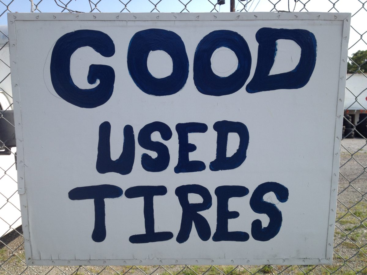
My first introduction to design was a sign on the outside of my Pop’s shop, which was on the same property as the house I lived in. My Pop was a country mechanic. He hand painted the sign on the masthead of his garage. JOE’S AUTO SERVICE. My dad followed in the same genre of work as my Pop. He was a traveling tire salesperson for more than a decade between the 70’s and 80’s. We would travel across the southeast with tires piled higher than the cab of his 1975 two-toned brown Chevy Bonanza. Most of the clientele were located in rural or isolated towns and non-metropolitan areas. These backroads were peppered with mom and pop businesses like JOE’S AUTO SERVICE, many of whom created their own signs just like my Pop. These signs were made with the “amateur aesthetic,” a term borrowed from Alfred Stieglitz and applied to untrained “designers” who create their own signs. These rural towns were not homogenized “omnitopias”, but rather were, and in some cases still are remote islands of authenticity, resourcefulness and ingenuity when it comes to visual communication.
This paper examines the vernacular of small town amateur aesthetics in design including techniques and materiality as well as mythology and humanity inherent in hand made vernacular and DIY signage. I will also acknowledge and discuss cultural hierarchy and privilege that separate the design world from the untrained naïve design. Can we collapse the distinction between the professional and the amateur? What opportunities present themselves in the divide? What can we learn from these approaches?
This research was presented at the Design Incubation Colloquium 4.2: CAA 2018 Conference Los Angeles on February 24, 2018.