Warren Lehrer, Designer, Professor, SUNY, Purchase (visualizations)
Dennis J Bernstein, Poet, Executive Producer, Flashpoints Pacifica Radio (poems)
Five Oceans in a Teaspoon is a book and multimedia project written by journalist/poet Dennis J Bernstein, visualized and structured by designer/author Warren Lehrer. A large collection of short visual poems, Five Oceans consists of a 300 page book (Paper Crown Press), animations, a traveling exhibition (premiering at City Lore Gallery, NYC), and reading/performances. Steven Heller wrote the introduction to the book.
In 1979, Dennis J Bernstein and I began working on a book of poems, originally titled Stretch Marks. Instead of completing that book, we leapt into writing our first play together, and over the intervening years we collaborated on three books, including French Fries (1984), which has since been written about in scores of textbooks on visual literature, typography, graphic design and artists’ books. A few years ago, we began collaborating again on visual poetry, bringing together Bernstein’s words and my typographic visualizations. Forty years after our original effort we completed the project, now titled Five Oceans in a Teaspoon. Like with many of my previous works, this book sits at the center of a multibranched project.
Bernstein’s poetry, like his investigative journalism, reflects the struggle of everyday people trying to survive in the face of adversity. Structured like a work of music, the book (and exhibit) is divided into eight movements spanning a lifetime: growing up confused by dyslexia and a parental gambling addiction; graced by pogo sticks, boxing lessons and a mother’s compassion; becoming a frontline witness to war and its aftermaths, to prison, street life, love and loss, open heart surgery, caring for aging parents and visitations from them after they’re gone.
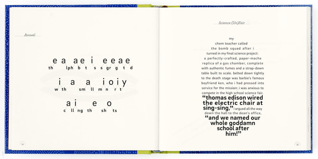
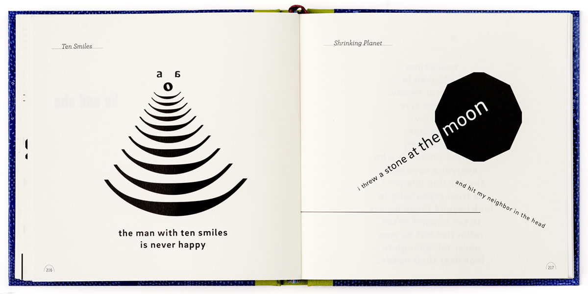
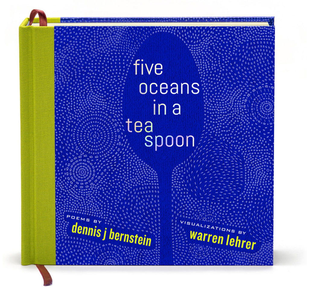
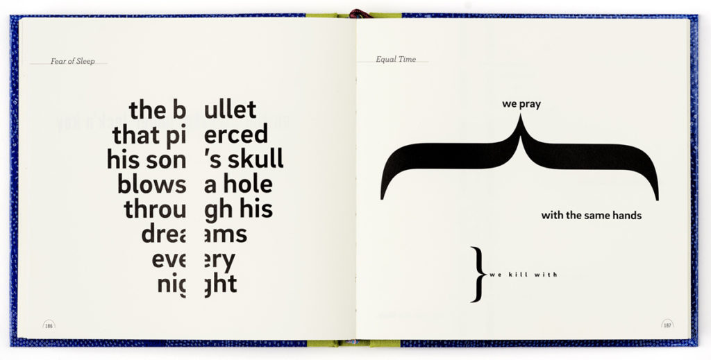
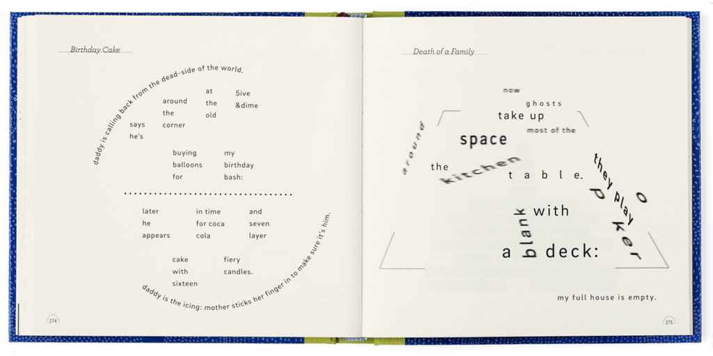
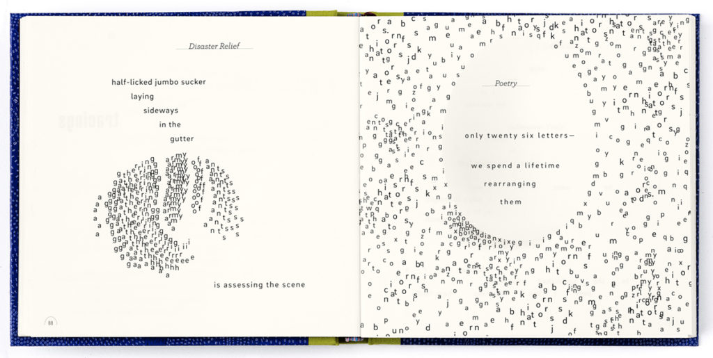
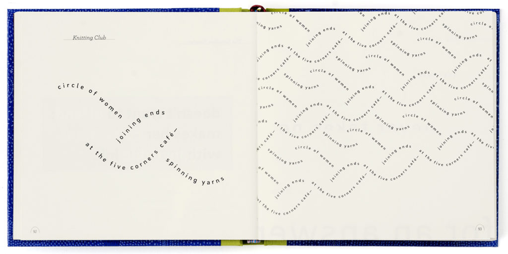
My methodology for this project: I selected the poems—out of thousands of Bernstein’s short poems written over 45 years—and arranged them into the book which can also be seen/read as a memoir in short visual poems. Each poem lead me to a composition. The ideas within the poem, its themes, metaphors, allusions, double meanings, ambiguities, subtexts, conflicts, voices, structure, rhythmic cadences, pauses and silences, underlying intent—were all grist for the mill. Many of the compositions give form to the interior, emotional underpinnings of the poem. Many compositions engage the reader to become an active participant in the discovery, navigation, puzzle, and interpretation of the poem. Some compositions allude to figuration or landscape, while others work more abstractly. At their best, the typographic compositions help create experience—within and across the pages of the book and in the animations. In a poem about Alzheimer’s, letters struggle to become words, search for memory; thoughts halt, rotate and stretch in a confusion of pleasure, frustration, habit and empathy. In a poem seen through the eyes of a child, letters and words form a colony of ants inspecting and devouring a discarded piece of candy. Other poems function diagrammatically, tracing patterns of relationships, war and peace, and struggles for human and civil rights.
Most of my previous projects embrace complexity, polyphony, and are longform works such as the 4 volume 1000+ page “Portrait Series” documenting American eccentrics, or my illuminated novel A LIFE IN BOOKS: The Rise and Fall of Bleu Mobley, containing 101 books within it embedded within a fictionalized memoir. For Five Oceans, I made dozens and dozens of iterations of each poem until a visual setting felt right—like it couldn’t be any other way. In his introduction, design historian/critic Steven Heller writes, “some of the compositions seem so simple and transparent resulting in self-evident grace and revelation.” This was the challenge of this project, to distill (like the writing does and the title suggests) a wide swath of experiences and emotions into a small space with minimal means: a seven inch square book, black and white, just using one type family throughout for the central voice of each poem, engaging the emptiness/fullness of the off-white page or screen.
Animations allow for a different kind of typographic realization/performance of select poems via time, kinetic typography, and soundtracks scored by composer/performer Andrew Griffin. Animations are featured in the live performance/readings, in the exhibition, public screenings and projections, and online. The exhibit also features prints of select poems from each movement.
Regarding impact and contribution to the field: As I write this, Five Oceans hasn’t even been published yet, officially. Yet there are indications that it will be impactful and receive critical attention. After reading an advance copy, Johanna Drucker, perhaps the foremost scholar of Visual Literature, writes: “In the long history of graphic word works, few, if any, have this range and repleteness.” In her forthcoming review in the Los Angeles Review of Books, Drucker calls Five Oceans an “engaging masterwork that has only a handful of precedents in literary and design history.” Bob Holman, leading chronicler of contemporary poetry writes, “Five Oceans re-envisions a poetry memoir via a textual kaleidoscope… Bernstein and Lehrer are the Rodgers and Hart of Visual Poetry.” Pulitzer Prize winning author Alice Walker calls Five Oceans “Brilliant and Beautiful.” Gail Anderson and Steven Heller’s recent book “Type Tells Tales” includes three sections on my work, one devoted to Five Oceans as a work-in-progress. Tim Samara’s new edition of Making and Breaking the Grid analyzes select poems from Five Oceans as exemplars of “verbal deconstruction/ narrative allusion/ pictorialization.” An article on Five Oceans just came out in Creative Review; others are due out in AIGA’s Eye on Design, Afterimage, Electric Book Review, JAB and other media outlets. Debbie Millman is interviewing me in October about Five Oceans and my work for her Design Matters podcast, and Dennis and I will be presenting this work at Letterform Archive in San Francisco, at the NY Art Book Fair, City Lore, and other locations around the US.
Warren Lehrer is a writer, designer and book artist known as a “pioneer of visual literature and design authorship.” His books and multimedia projects attempt to capture the shape of thought and reunite oral and pictorial traditions of storytelling in books, animations, performance and installations. Awards include: The Brendan Gill Prize, IPPY Outstanding Book of the Year Award, Innovative Use of Archives Award, International Book Award for Best New Fiction, three AIGA Book Awards, Media That Matters Award, grants and fellowships from NEA, NYSCA, NYFA, Rockefeller, Ford, Greenwall Foundations. He is a 2016 Honoree of the Center for Book Arts. His work is in many collections including MoMA, Getty Museum, Georges Pompidou Centre, Tate Gallery. A frequent lecturer and performer, Lehrer is the Leff Distinguished Professor at SUNY Purchase, a founding faculty member of SVA’s Designer As Author MFA program, co-founder of EarSay, a non-profit arts organization in Queens, NY.
Dennis J Bernstein is a poet, investigative journalist and award-winning host/producer of Flashpoints, syndicated by the Pacifica radio network. Recipient of many awards and honors, including Pulse Media’s Top Global Media Figure, Pillar Award in Broadcast Journalism, Artists Embassy International Literary Cultural Award. He founded the Muriel Rukeyser Reading Series in Brooklyn, NY. Books include Special Ed: Voices from a Hidden Classroom, Particles of Light, and three books with Warren Lehrer including French Fries, considered a seminal works in the genre. His poetry has appeared in New York Quarterly, The Chimaera, The Progressive, Texas Observer, ZYZZYVA, and numerous other journals.
Recipient of recognition in the Design Incubation Communication Design Awards 2019.