Dori Griffin, Assistant Professor, University of Florida (Editor)
The history of graphic design as expressed in survey texts is well-known for being overpopulated by white Euro-American men. I believe that escaping this disciplinary echo chamber requires active, intentional effort from scholar-practitioners within the discipline. My own position as a design scholar and educator is one I’m determined to operationalize for inclusion. Therefore I was excited when Mike Zender, editor of Visible Language, invited me to guest-edit a special issue devoted to the history of visual communication design. As the longest-running peer reviewed journal of visual communication design research in the United States, Visible Language has played a significant role in both constructing and deconstructing a canonical notion of graphic design history, a subject I examined in the journal’s fiftieth anniversary issue (Griffin 2016). In cultivating submissions for the history issue, I was determined to facilitate as global and diverse a range as possible. It was vital for the issue to contribute to the ongoing work of building a more inclusive history of graphic design. Part of this work relies on an active critique of the power structures which have led to a canonical history based on exclusions around race/ethnicity, gender/sexuality, class, professional identity, and geography. And part of the work requires intentionally and explicitly inviting as-yet unheard voices to contribute to the disciplinary dialogue. Though the term “decolonization” is often used to describe such efforts, I’m cautious about its application. In the words of Tuck and Yang (2012), “Decolonization brings about the repatriation of Indigenous land and life; it is not a metaphor for other things we want to do to improve our societies and schools.” Instead, I’d describe my editorial goal as recuperative, opening up the dialogic spaces of design-historical discourse to include individuals, ideas, and practices too long excluded from that narrative.
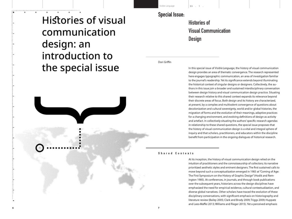
It’s a truism that graphic design history is predicated on a shallow understanding of stylistically conceptualized movements and that the discipline lacks an evidence-based, critically-informed history (e.g. Blauvelt 1994-5; Woodham 1995; Triggs 2009, 2011). Yet as I worked on this editorial project, I became convinced that this conceptualization is invalid. As I noted in the introduction to the special issue, it is not the case that histories of visual communication design, beyond style or connoisseurship or visual data, do not exist. Rather, they inhabit spaces conceptualized as external to the core of our discipline. There are scholars and practitioners already at work conducting historical research which significantly expands familiar, survey-text style notions of graphic design history. Their work may be published in adjacent fields in the humanities and social sciences, rendering it less familiar to design educators. Or historical research might undergird a contemporary studio design practice rather than a scholarly publishing practice, and thus it escapes representation in the formal literature of design history. It is vital to make room for these voices within our field. As I shaped the history-themed issue of Visible Language, I actively cultivated participation from both kinds of researchers. Including their voices within graphic design’s established communities of dialogue greatly enriches the conversations which can take place in these spaces.
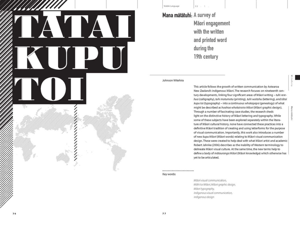
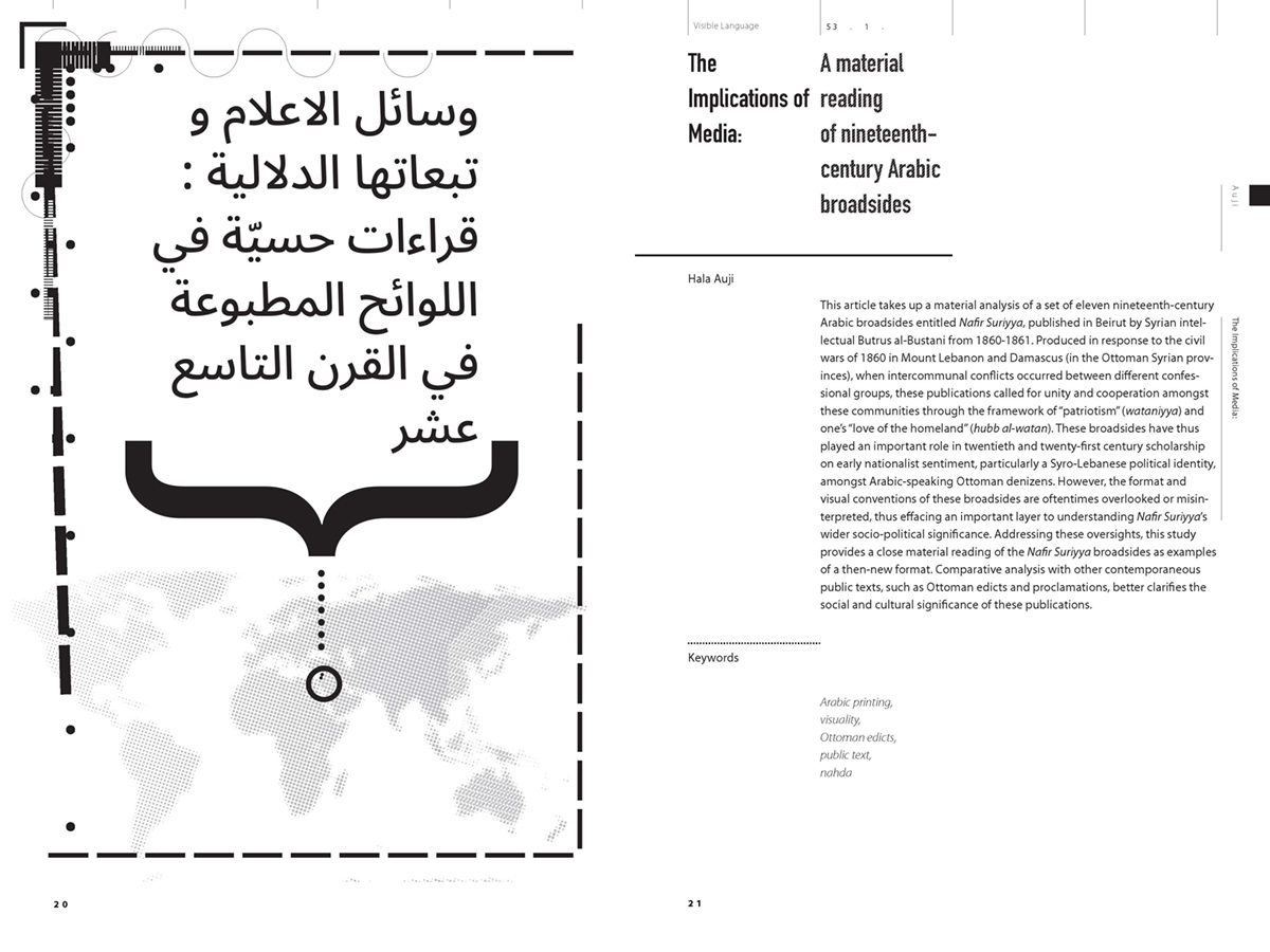
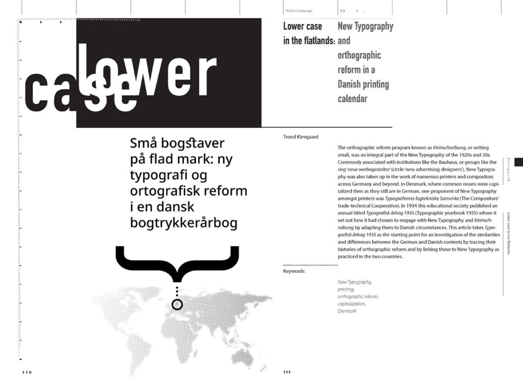
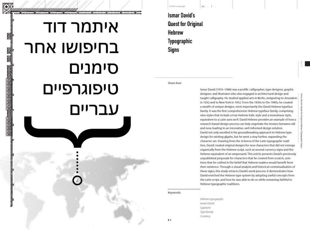
The four authors whose articles were selected for publication through the journal’s double-blind peer review process expand the narrative of graphic design history through specific case studies. Each illustrates the complexity of our discipline’s historical narratives. Collectively, the authors’ research speaks to the intersections between canonized Euro-American design conventions and the diverse ways design practice occurs and is understood in a wide range of local and global contexts. The authors’ contributions to the dialogic disciplinary narratives of graphic design history are the most important outcome of this project. In “The Implications of Media,” Islamic art historian Hala Auji undertakes a close contextual and material reading of the Nafir Suriya, a series of Arabic-language broadsides originally printed in Beirut in 1860 and re-issued in 1990. In “Ismar David’s Quest for Original Hebrew Typographic Signs,” practicing designer Shani Avni contextualizes David’s design process for the David Hebrew type family (1954), documenting David’s negotiation of the tension between tradition and innovation through a research-based design process. In “Mana Mātātuhi,” practicing designer Johnson Witehira documents Māori visual culture’s incorporation of Latin-alphabet lettering and typography into culturally specific ways of seeing, knowing, and expressing. In “Lower Case in the Flatlands,” design historian Trond Klevgaard explores the adaptation and application of Avant Garde Modernist strategies in locations traditionally defined as “peripheral.” The abstracts for all four articles are included in the “evidence of outcome” section.
Serving as guest editor for this special issue of Visible Language led to an invitation to join the editorial team as the associate editor for statements of practice at Design & Culture, the journal of the Design Studies Forum. The July 2019 issue is the journal’s first issue under the direction of its new editors in chief, who describe their “conscious formation of an editorial and advisory board of accomplished scholars who work beyond the silos of their disciplines and who hail from regions not always represented in design’s dominant canons and conversations.” They note that they “are also attentive to the politics of citations and are committed to broadening the scholarly dialog to include voices too frequently dismissed or engaged only at the margins” (Adams, Keshavarz and Traganou 2019, 154). Within this conceptual framework, the issue’s statement of practice is by Nadine Chahine, whose insightful essay discusses her work as a designer of Arabic typefaces and the complex role typography plays in a diverse range of Arabic cultural and political expressions. I’m honored to contribute to this ongoing work of diversification, in however small a way. It’s thrilling to collaborate with practitioners and scholars who prioritize a global, participatory, and inclusive notion of design history and praxis. Editorial work is not glamorous. But approaching it with a passion for cultivating diversity and inclusion holds the power to shape future histories of graphic design into narratives more representative of all peoples and practices within the domain of design. [989 words]
Bibliography
Adams, B., M. Keshavarz and J. Traganou. 2019. “Editorial.” Design and Culture 11:2, 153-6.
Blauvelt, A. 1994-5. “New Perspectives: Critical Histories of Graphic Design.” Visible Language volumes 28.3, 28.4, 29.1.
Griffin, D. 2015. “The Role of Visible Language in Building and Critiquing a Canon of Graphic Design History.” Visible Language 50:3, 6-27.
Triggs, T. 2009. “Designing Graphic Design History.” Journal of Design History 22 (4): 325–40. https://doi.org/10.1093/jdh/epp041.
———. 2011. “Graphic Design History: Past, Present, and Future.” Design Issues 27 (1): 3–6. https://doi.org/10.1162/DESI_a_00051.
Tuck, E., and K. Yang. 2012. “Decolonization Is Not a Metaphor.” Decolonization: Indigeneity, Education & Society 1:1, 1-¬40.
Woodham, J. 1995. “Resisting Colonization: Design History Has Its Own Identity.” Design Issues 11 (1): 22–37. https://doi.org/10.2307/1511613.
Dori Griffin is an assistant professor of graphic design in the University of Florida’s School of Art + Art History. Her research centers around two interrelated areas of inquiry. Her historical research expands the narrative of graphic design as it has been practiced and consumed in the past, with particular focus on how popular visual artifacts and print media shape national and international dialogues about culture, politics, and identity. Her pedagogical research explores how to develop globalized curriculum and diverse, learner-centered practices for design history pedagogy, particularly in the context of studio education. She is a frequent contributor to the peer-reviewed scholarly dialogues of the discipline, with publications in Dialectic, Visible Language, Design & Culture, the Journal of Communication Design, and the Journal of Design History, among others. Currently, she serves as the associate editor for statements of practice at Design & Culture.
Recipient of recognition in the Design Incubation Communication Design Awards 2019.
