Gadzooks: An Embellished Connection Between Like-Minded Characters

The College for Creative Studies / BFA Communication Design department began a partnership with The Henry Ford Museum of American Innovation’s Curators and Archivist

Susan LaPorte
Professor
College for Creative Studies

Communication Design and typography have been intertwined from the start, as the urge to express moved from the oral to the written, so has this partnership. Consider the enterprising graphic marks pressed into clay to communicate commerce by Sumerians, hieroglyphs documenting Egyptian rituals, the innovation of movable type first in the east, and then the west, to the typographic alphabet soup from the industry period, and ones/zeros that continue to document our thoughts through the words we write and the typographic expressions we employ to amplify their messages. The shape that typography has taken reflects the taste(s), technology(s), and need(s) of global citizens through time.

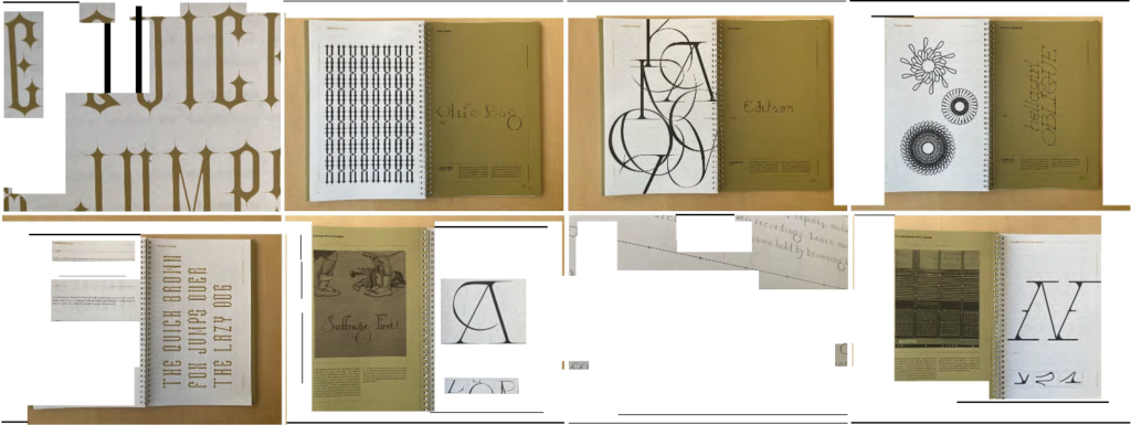
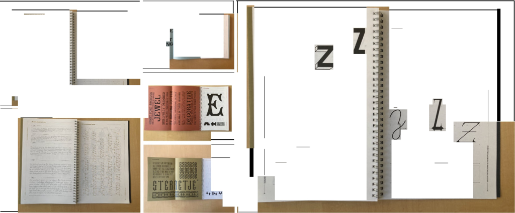
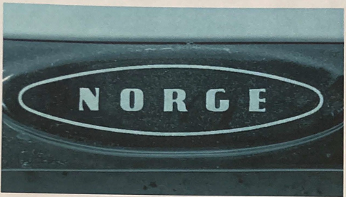
The College for Creative Studies / BFA Communication Design department began a partnership with The Henry Ford Museum of American Innovation’s Curators and Archivists. The class was given their vast collections of objects and artifacts as a starting point for their type design inquiry. Each student documented typography/or graphic marks found or embedded within carriages, signage, broadside, machinery, games, as inspiration for a new typeface that expanded the sample and inspired new alphabet of their own vision. Additionally, the goal was for students to see the importance of research around a design can broaden their design practice; that design is not always about serving a client, but also expanding knowledge around our discipline.

A typographic history lecture was shared to broaden their understanding of type, written communication, and the technology that shaped information through the centuries. Students then focused their own critical research, to discover greater relevance of context and meaning to the design of their type specimens. The process of creating were iterative, critical, and resulted expanding the students understanding of design practice and original type designs inspired from the collection.

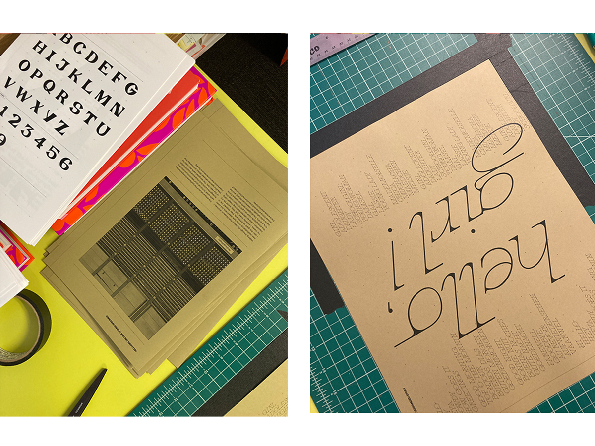
The results of this class and our partnership with the HFM, and with the financial support of the Ford Fund are a set of publications, entitled Gadzooks: An Embellished Connection Between Like-Minded Characters. It is a documentation of 13 new typefaces, designed by 13 new type designers, expanding our typographic legacy.
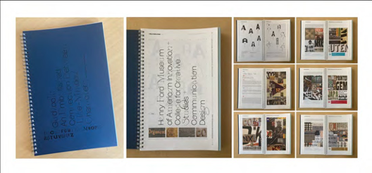
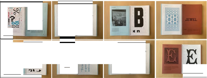
This design research was presented at Design Incubation Colloquium 9.1: Kent State University on Saturday, October 15, 2022.
Explorations of Data Lists: How Type, Hierarchy, and Color Reveal the Stories About the Titanic

Level one typography students think about data and typographic hierarchy.

Peggy Bloomer
Adjunct Professor
Quinnipiac University
Southern Connecticut State University

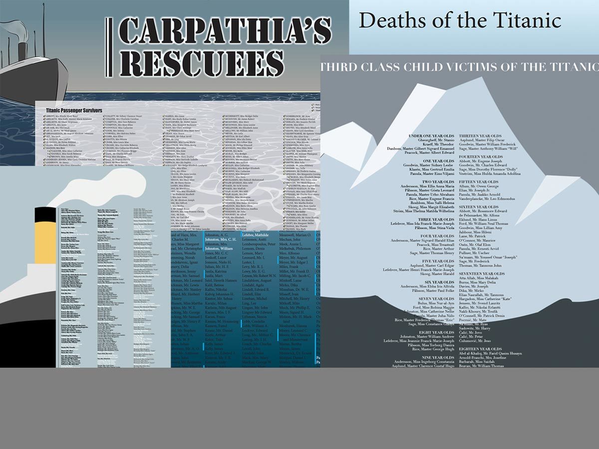
In this project I hoped to make level one typography students think about data and typographic hierarchy with. In my experience, students are not concerned about the data that is collected about them. I hoped to broaden their understanding of the power of data through their creation of a large format poster (24” x 26”) using lists about the passengers on the Titanic purchased from the “Encyclopedia Britannica.”

The textbook for the class is Ellen Lupton’s Thinking About Type. This assignment is an adaptation of Lupton’s hierarchy assignment “Long Lists.” According to Lupton, hierarchy is the organization of content using the spatial clues of indents, line spacing and placement. Other graphic elements that distinguish content include size, style and color.

Researching the list of passengers, students were asked to find human stories. The lists contained information about 1st, 2nd, 3rd class passengers and employees of the Titanic. Surnames, servants, gender, age, nationalities and origin of embarkment were provided. The poster was created in InDesign without photographic images. Students could use and InDesign tools to create color elements and many created ships, funnels, waves and other shapes.

The traditional process of information gathering, sketching and mocking up was used for designing the posters. In-class critiques of 3 smaller 11 x 17” versions helped students realize what was successful or not. Final versions were created to the larger size, printed, presented in class and hung in the department hallway for viewing.

In conclusion, most students realized the economic and gender consequences for passengers. One student used color to emphasize families and the impact was powerful: families died from infants to parents. The students gained knowledge about the power of simple data and almost all of them used size, style and color effectively. The use of indents, line spacing and style guides were not as successful. In the future, I plan to incorporate a slide show of memorials that include powerful images such as Flanders Field, The Vietnam Memorial and the Holocaust Memorial.

This research was presented at the Design Incubation Colloquium 6.1: Quinnipiac University on October 5, 2019.

The Process Of Exploring the Next Urban Condition

Adam Fromme
MFA Candidate
Department of Design
The Ohio State University

Urban transportation within the United States is at a critical point.

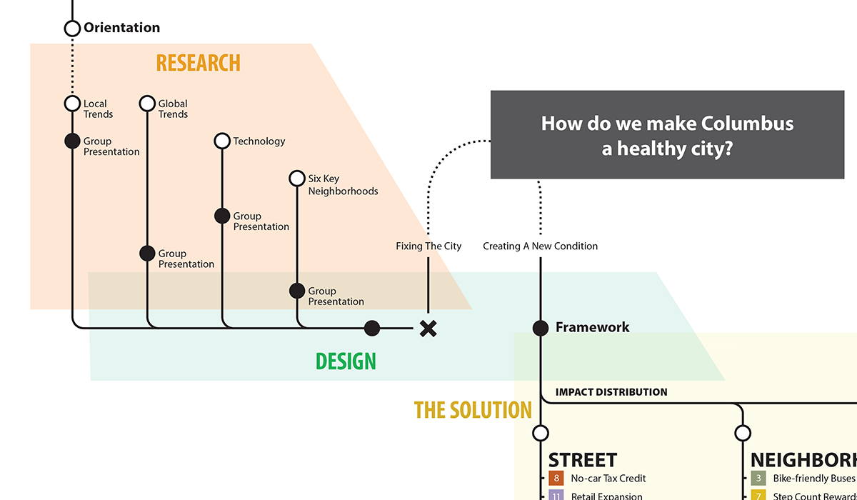
The automobile dictates our infrastructure, but there is a hunger for something else. Many mass transit solutions ignore the need to develop unique urban neighborhood identities. It seems time for a different approach. The Ohio State University’s Department of Design (Columbus, Ohio, USA) held a 16-week graduate studio in the spring of 2016 to explore this idea, based in our city’s needs.

The course structure provided a defined pathway through the problem’s complexity while allowing ‘the question’ to be responsive to the research. This sensitivity to the moment is in sharp contrast to traditional path-to-goal curriculum, yet reflective of most professional-facing design projects. While uncomfortable at times for the students, within this flexible format they were able to apply practices, trends, and technologies to specific city-, neighborhood-, and street-based needs in a system that would serve the unique needs of Columbus.

The deliverable was an immersive installation in a gallery space corresponding to the Barnett Symposium “Planning Creative Cities” 11–13 May 2016 in Columbus, Ohio. The 6 diverse graduate design students and their professor explored social change in a metro area, realizing that sometimes the best spark for change can come from building the tools to change the conversation.

This research was presented at the Design Incubation Colloquium 3.3: Kent State University on Saturday, March 11, 2017.