Exploring Identity Through Curatorial Practices: Gráfica Latina

The role of the graphic designer as curator addressing identity and belonging, culture, social justice, empowerment, and civic responsibility.

José Menéndez
Assistant Professor
Northeastern University

Tatiana Gómez
Assistant Professor
Massachusetts College of Art and Design

As Latin American graphic design educators and practitioners, we recognize the need for further research and understanding of the diversity of graphic design histories and their contextual backgrounds—commonly addressed as a monolithic culture.[1]

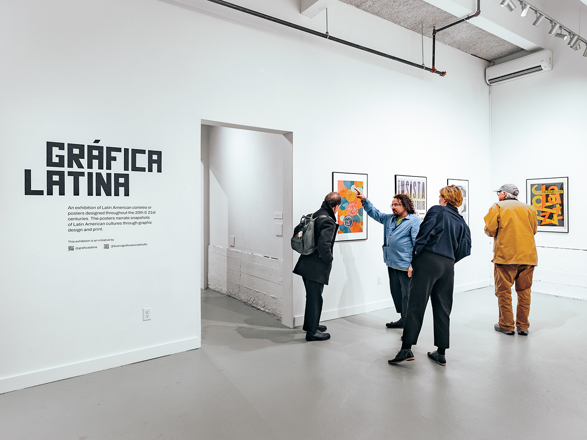
Gráfica Latina is a research project that seeks to address these needs through a digital and mobile poster archive of Latin American and Latinx graphic design. The goal of the archive is to speak about the social, economic, and political contexts in which these posters were—or/and still are— created in countries such as Argentina, Chile, Uruguay, Perú, Brasil, Ecuador, Colombia, Venezuela, Mexico, Puerto Rico, Cuba, Dominican Republic, and the United States. The collection is curated to represent the diversity of printing techniques, vernacular languages, methods of representation (illustration, typography/calligraphy/lettering, and color), and messaging ranging from cultural to political, and environmental.

This project is led by Colombian graphic designer Tatiana Gómez, Assistant Professor of Graphic Design at the Massachusetts College of Art and Design, and Puerto Rican graphic designer José R. Menéndez, Assistant Professor of Graphic Design and Architecture at Northeastern University, College of Art Media and Design.

Gráfica Latina’s collection has been exhibited at The Fine Arts Work Center, at Rhode Island College’s School of Social Work, and at the 2024 Southern

Graphics Council International. It has been featured as part of the “Incomplete Latinx Stories of Diseño Gráfico,”[2] the Letterform Archive “Salon Series,”[3] The Boston Globe Magazine,[4] and the RISD Alumni Podcast “Pulling on the Thread.”[5]

This presentation about Gráfica Latina illustrates, through curation, pop-up exhibitions, programming, and a digital archive, initiatives that investigate the role of the graphic designer as curator and how this practice can facilitate resources for education, engagement and dialogs with communities while addressing topics such as identity and belonging, culture, social justice, empowerment, and civic responsibility.


[1] Flores, Andrea. How UCLA is trying to break the myth of the Latino monolith. Los Angeles Times. 11/6/2023. www.latimes.com

[2] Menéndez López, José R. “Caribbean Contrast: Puerto Rican and Cuban Carteles and Their Representation of Distinct Political Relationships with the United States .” Incomplete Latinx Stories of Diseño Gráfico. BIPOC Design History, 1 Oct. 2021, PROVIDENCE, RI.

[3] Llorente, Ana, and Menéndez López, José R. “Call and Response: Histories of Designing Protest.” Letterform Archive, Salon Series 39. Strikethrough: Typographic Messages of Protest, 23 July 2022, San Francisco, California.

[4] Gómez, Tatiana, and Menéndez López, José R. “Gráfica Latina.” Boston Globe Magazine, 17 September 2023, p. Cover-Interior Cover.

[5] Gómez Gaggero, Tatiana, Speaker; Menéndez, José R. Pulling on the Thread, Season 6, Episode 2: Grafica Latina, Rhode Island School of Design, November 1st, 2021, https://alumni.risd.edu/podcast/grafica-latina. 11/22.

This design research is presented at Design Incubation Colloquium 11.1: Boston University on Friday, October 25, 2024.

Designing for Mental Health and Wellbeing: Integrating Mental Health Support into UI/UX Design Course

Collaborative work, peer feedback and positive psychology were integral to the whole process, fostering a supportive learning environment.

Ting Zhou
Assistant Professor
University of Connecticut

The mental health crisis is a significant challenge currently affecting college students. According to data from the Healthy Minds Study, which surveyed 76,406 students across the country, 41% of college students experienced depression, 36% experienced anxiety, 14% experienced eating disorders, 14% had suicidal ideation during the 2022-2023 academic year. The main barriers to help-seeking are “no need for services” (35%) and “not enough time” (24%).  (HMS National 2022-2023 Data Report) Given that 97% of Americans ages 18-29 own a smartphone (Pew Research Center, 2021), the mHealth (mobile Health) application has been one of the primary tools for wellness management, especially during COVID-19. It expands accessibility to support mental health and coping skills, helping students flourish on college campuses. Design thinking (DT) is the fundamental theory in UI/UX design that helps people to become more innovative and creative (Brown T., 2009).

This study aims to explore the integration of mental health support into design education by teaching students to design mHealth applications. The focus is on utilizing human-centered design principles to address mental health challenges among college students. Design students were guided through the design thinking process (empathize, define, ideate, prototype, test) to develop mHealth applications targeting mental health and wellness. Projects were based on students’ personal interests and experiences in mental health, addressing conditions such as ADHD, bipolar disorder, anxiety, sobriety, seasonal affective disorder (SAD), and dissociative identity disorder (DID).  Collaborative work, peer feedback and positive psychology were integral to the whole process, fostering a supportive learning environment.

Through the human-centered design process, students gained profound knowledge of mental health issues on campus and developed innovative solutions tailored to specific user needs. The collaborative approach promoted a culture of empathy and understanding, making students more comfortable discussing mental health and recognizing the importance of self-care. This method normalized help-seeking behavior and integrated positive psychology into their daily lives. It not only prepares future designers to create accessible mental health support tools but also promotes their own mental well-being and professional development.

References

  1. Pew Research Center. (2021). Mobile fact sheet. Retrieved from https://www.pewresearch.org/internet/fact-sheet/mobile/ on 6th of August, 2021.
  2. Brown, T. (2009). Change by design: how design thinking transforms organizations and inspires innovation. [New York], Harper Business.

This design research is presented at Design Incubation Colloquium 11.1: Boston University on Friday, October 25, 2024.

Advancing Design Practices: Assessing the Impact of New Technologies and Sustainable Innovation

The research offers memorable experiences that complement traditional marketing materials.

Caitlin Lu & Maidah Salman
Graduate student
Boston University

Purpose: This study investigates new approaches for displaying designs through digital visualization to enhance engagement and impact while considering the future of design. By integrating methods like projection mapping and digital signage, the research aims to offer memorable experiences that complement rather than replace traditional marketing materials.

The focus is on sustainability, adaptability, interaction, and error correction across various display sizes, including screens and projections. With the global shift toward sustainability, this study offers new strategies for designers to move beyond conventional methods and incorporate more eco-friendly practices.

Process: The research involves a workshop where participants test and compare digital design methods with traditional print media. This includes hands-on experience with projection mapping and a presentation introducing new digital marketing techniques. Following the workshop, participants will complete surveys to measure the effectiveness of different methodology.

Outcomes: Test theory by conducting a workshop where we will check the success rate of digital design as compared to tangible marketing collateral. The findings will highlight how digital visualization can enhance sustainability and audience engagement in design practices.

Significance: The study explores emerging digital techniques that advance conventional design methods, contributing to more sustainable and impactful communication strategies.

This design research is presented at Design Incubation Colloquium 11.1: Boston University on Friday, October 25, 2024.

Drawn Together: Exploring the Intersection of Image-Making and Community-Building

The Center was “founded” in response to a lack of design student cohesion and camaraderie.

Grace Preston
Professor
Texas State University

My paper recounts a collaborative initiative between myself and a cohort of undergraduate design students that we named the Center for Drawn Togetherness. The Center was “founded” in response to a lack of design student cohesion and camaraderie as our institution transitioned back to a fully in-person model post-pandemic. To address these issues, we conceptualized a series of interlocking illustration events that culminated in an exhibition. Each event asked participants to work together, challenging the idea that drawing is a solitary activity and exploring how drawing together could strengthen bonds among participants.

In the first event, a risograph workshop, participants collaboratively designed and printed an official “currency” for the Center. The second event allowed participants to earn “money” by contributing to a collaborative mural, asking them to respond to prompts that could be completed with a partner. The culminating event allowed participants to spend their “money” in a student-run illustration pop-up shop. All happenings were housed in an exhibition that doubled as a gathering space for design students, with student collaborators facilitating the events.

Event planning sessions emphasized Sasha Constanza-Chock’s principles of Design Justice, particularly their assertion that communities should co-lead and control design projects intended to benefit them (2020). Since I was concurrently teaching my student collaborators, planning sessions also challenged the traditional roles of teachers and students, proposing that we can operate as equals.

The workshops received positive feedback from participants, which was gathered through surveys and interviews after the events concluded. The Center plans to use this feedback to develop new initiatives in this upcoming school year. We will continue to investigate how in-person drawing events can potentially promote empathy among students, advocate more collaborative relationships between teachers and students, and encourage young designers to feel ownership over their educational experience.

This design research is presented at Design Incubation Colloquium 11.1: Boston University on Friday, October 25, 2024.

Kaithi Script’s Revival: An Intersection of Design and Cultural Inheritance

Script revival serves as a means of reclaiming and preserving cultural identity.

Anmol Shrivastava
Assistant Professor
Illinois State University

Kaithi (KAE-THEE), also known as Kayathi or Kayasthi, is a script that was once widely used in northern India. Now classified as a “major extinct” script, Kaithi once flourished alongside companion scripts like Devanagari and other major Indian scripts of today. The name Kaithi is derived from ‘Kayastha’, a cultural group known as “scribes”. I am a Kayastha.

Script revival is crucial to colonized cultures, serving as a means of reclaiming and preserving cultural identity. It fosters pride, heritage transmission, and resistance to cultural homogenization, empowering communities to rebuild unique identities and celebrate their heritage.

This presentation explores the intersection of design and ancestry through a personal journey to revive the nearly extinct Kaithi script, historically used by my ancestors, the Kayasthas. It will demonstrate how design can become a powerful tool for historical and cultural revival, offering a unique perspective on the interplay between design, identity, and heritage.

By delving into sparse historical documents of Kaithi and sharing a personal journey of self-learning the script, the presentation will showcase current and upcoming projects that combine typography, type design, lettering, poster design, and embroidery. It will explore projects aimed at broadening the reach of this nearly extinct script by making Kaithi easier to self-teach. This presentation will illustrate how design can play a crucial role in reconnecting with and reviving our ancestral roots, fostering a deeper sense of identity and belonging.

This design research is presented at Design Incubation Colloquium 11.1: Boston University on Friday, October 25, 2024.

A Sequence of Multiplicity

The design outcomes are realized through custom display typefaces, prints, posters, small books, animations, and mixed media. They generate a network of connections between projects.

Moon Jung Jang
Associate Professor
University of Georgia

My creative practice focuses on the simultaneous, multiple existences of mixed feelings or contradictory ideas about unseen things and their information. To understand such a phenomenon, I explore multiplicity as a visual concept and as narrative systems to capture the multiple existences in space-time. My design methodology is as follows: First, I select a group of interrelated unseen things and intangible information, such as temperature, labor, and alignment, that could be meaningful in my daily life. Second, I examine visual qualities that could consist of multiplicity, such as simultaneity, duality, polyhedral-ness, ambivalence, and modularity. Third, I design visual narrative systems to translate or transfer intangible information into metaphoric modules, sequential colors, and their values.

The design outcomes of my work are realized through custom display typefaces, prints, posters, small books, animations, and mixed media, which generate a network of connections between projects. For example, one project, A Sequence of Gray, consists of a book, a series of posters, and an animation that demonstrated the concept of ambivalence and gray gradients as narrative systems to translate the simultaneous existence of black and white. It led to A Sequence of Blue: Labor Day, an installation that translates my unseen laboring time into sequential blue values. In conclusion, this creative practice of multiplicity has allowed me to examine paradoxical, polyphonic, and metaphoric sequences in designing visual narratives and to have active perspectives to understand the unseen.

References

Kenneth Weisbrode, On Ambivalence, Cambridge, MIT Press, 2012

Mari Carmen Ramirez, Hélio Oiticica: The Body of Color, London & Huston, 2007

Italo Calvino, Six Memos for The Next Millennium, Vintage Books, New York, 1988

This design research is presented at Design Incubation Colloquium 11.1: Boston University on Friday, October 25, 2024.

Drawing Water: A Multi-disciplinary Approach to Representing Water Performance

Graphic Design, Landscape Architecture, and Architecture represent an understanding of water systems beyond existing conventions.

Eugene Park
Associate Professor
University of Minnesota, Twin Cities

Jessica Rossi-Mastracci & Matt Tierney
University of Minnesota

Visualizing water systems, across a range of varied spatial and temporal scales, is a complex problem that can be difficult to fully represent on a graphical outcome. Traditionally, these systems have been represented in static, print formats that only convey water’s dynamic flow at a single point in time. This often results in simplistic graphics that show water in a limited perspective, omitting a wide range of scenarios, such as flood and drought that are increasing in frequency and severity due to climate change.

Recognizing the need to innovate in this area, this research aims to develop hybrid representations to convey water and its fluidity across multiple spatial and temporal scales. To achieve this, faculty members in Graphic Design, Landscape Architecture, and Architecture formed a multidisciplinary research team where each discipline offered new insights and methods of representing and understanding water systems beyond existing conventions.

The research team first conducted a broad survey of visualization techniques related to water including heatmaps, chord diagrams, choropleth maps, technical sections, Sankey diagrams, 3-dimensional digital modeling, sequential sections, geospatial data and mappings, decision trees, and system diagrams. Then, these were analyzed to understand types of data that could be displayed, potential spatial scales of use, and relevant time scales, and organized into a graphic matrix that served as a guide to hybridize representation strategies to visualize water as a dynamic and fluid system.

Outcomes from this work resulted in a dashboard prototype that begins to spatially and conceptually represent flows, inputs, uses, and sinks at multiple water scenarios. The intention is to ultimately develop a tool where architects, landscape architects, designers, and engineers can use to plan for future water scenarios at specific locations. Ultimately, this project demonstrates that multiple design disciplines can develop innovative representation and data visualization methodologies through cross disciplinary collaboration.

This design research is presented at Design Incubation Colloquium 11.1: Boston University on Friday, October 25, 2024.

Design + Visual Translation and Cultural Bridging

Recognizing that certain words, phrases, and cultural meanings are untranslatable.

Shuang Wu
Assistant Professor
Virginia Tech

My research explores how graphic design can bridge cultures through translation. Drawing from a multicultural educational background, the study examines the complexities of translation across diverse cultures. Recognizing that certain words, phrases, and cultural meanings are untranslatable, it asks: how can graphic design convey these non-translatable elements through visual expression? The study addresses this question through personal works and pedagogical experiments.

The research begins with A Poetic Space, an immersive project that visualizes ancient Chinese poems using lines, motion, sound, and typography. This approach transcends literal translation, allowing non-Chinese-speaking audiences to appreciate the essence of thousand-year-old Chinese poetry.

Expanding on this, we also explore how visual aids enhance the translation of Chinese culture. A poster series featuring Taoism-inspired phrases reconstructs Chinese characters using an innovative grid, revealing Taoist concepts within the phrases.

In the classroom, I prompt students to investigate how visual elements can translate languages beyond Chinese. Students visually explored non-translatable words from different languages through multimedia. For example, one student created a book based on the Russian word “Toska,” meaning deep sorrow, using a broken typewriter to convey a personal and emotional narrative. This project demonstrates how design can express universal human feelings across languages.

This research shows that graphic design can convey cultural and linguistic nuances that have no direct translation, offering a model for similar projects in various languages and cultures. By using innovative visual methods, it provides ideas for designers and educators to enhance cross-cultural communication and understanding. The practice also aims to shift the focus away from Western design philosophy, encouraging international audiences to appreciate and embrace underrepresented cultures and designers to experiment with their design elements.

This design research is presented at Design Incubation Colloquium 11.1: Boston University on Friday, October 25, 2024.

Visualizing Faculty Salary Inequity: A Study of Salary Compression and Inversion and Its Impact in Higher Education

Empowering faculty with data-driven information to establish a transparent salary structure.

MiHyun Kim
Associate Professor
Texas State University

Have you ever wondered whether you’re being fairly compensated for your work? Have you experienced frustration due to an unfair salary structure? Do you question if factors like your gender, race, or connections to higher-level administrators play a role in this inequitable environment?

This study explores the persistent challenges of salary compression and inversion across various fields in higher education, with a specific focus on the discipline of art and design. Institutions often face the need to attract new talent with specialized skills, resulting in higher starting salaries for new hires and creating disparities among existing faculty members.

As a Faculty Senate Fellow at Texas State University during the 2022-2023 academic year, I developed a series of compelling data visualizations based on regional and national salary compression data sourced from institutional data and the College and University Professional Association for Human Resources (CUPA). The study found that as of the 2022—2023 academic year, 51.8% of the faculty at Texas State University earned below the national median salary and 46.8% of the faculty at the School of Art and Design earned below the national median salary.

By examining salaries across different colleges, departments, and ranks, I aimed to identify trends and patterns in compensation, comparing state universities in Texas and peer institutions across the nation. Also, I pinpointed faculty members earning below the national median salaries, highlighting disparities, especially among senior lecturers, minorities, and full professors. As a result of the study, the university increased the salaries of faculty members whose incomes were below 90% of the national median salary.

To investigate the topic deeper from various perspectives, a salary sub-committee among the faculty senates was formed, and a survey was conducted to gather information and insights from faculty members regarding salary compression issues at the university. The responses were categorized into five groups, and these categories were visualized to encourage empathy and understanding among faculty members and upper-level administrators.

The ultimate goal of this project is to advocate for fair and equitable compensation practices, empowering faculty with data-driven information to establish a transparent salary structure. This presentation explores the visualized data, gains a deeper understanding of salary equity challenges, and contributes to the conversation on reshaping compensation practices within higher education.

This design research is presented at Design Incubation Colloquium 11.1: Boston University on Friday, October 25, 2024.

Typography as Racialization: Euro-American Craft and Asian Labor

Exploring the capacity of conventional genres of activity in graphic design to narrate historical phenomena.

Chris Lee
Associate Professor
Pratt Institute

This project undertakes the design of a “chop suey” typeface called 1882–1982–2019. The general aim of the project vis-a-vis design research is to explore the capacity of conventional genres of activity in graphic design to narrate historical phenomena, while also figuring design as a vehicle of antagonism, and as a space of contestation. The project enacts graphic design research not by dint of the traditional forms of scholarly research and creative activity that go into it (i.e. as transparents texts written for academic publications, or work created for display in public exhibitions, where both constitute forms of production valorized within through institutional peer-review processes, for instance), but rather by the fact that it produces a form (a typeface) that is not typically legible as an artifact that instantiates scientific knowledge production. Furthermore, such an artifact acts as a case that exceeds the conventional pathways initiating and animating design (i.e. the client brief), and thus does not satisfy even commercial valorization—that is to say, it has little to no prospective value as a commercial product. In sum, the project is an argument for design outcomes as a form of discursive (quasi-)autonomous design-as-research, recognized as such only by the grace of its inclusion in design discourse (hence, the above qualification, “quasi”).

Screenshot

In the case of this project—a typeface in three ‘weights’ (called 1882, 1982, 2019, respectively)—the outcomes serve as vehicles for a historical narration of the status of the “Asian,” or what Iyko Day calls “alien capital” in North American settler-colonial political economy. The primary outcome of this project is the process of producing the typeface itself. This entails a raw archival excavation directly sourced from historical material (1882, the year that the Chinese Exclusion Act was passed by Congress); the “correction” or “refinement” of these according to the kinds of normative idealizations articulated by figures like Gerard Unger, Karen Cheng, etc. (1982, a seminal year in the history of the formation of “Asian-American” as a racial subject position); as well as the generation of AI generated “hanji” (Chinese ideograms) in resonance with Day’s characterization, as well as popular depictions of the “Yellow Peril” that persist from the anti-Chinese attitudes that have persisted from the 1880s until today (2019). In sum, the work aims to prompt a reflection on the extent to which design outcomes are inflected by somatic knowledge and subjective performance (from calligraphic skill to “craftsmanship” in writing AI prompts), in spite of the fact that very little to none of this is residual and legible in the final artifact. Sofie Fetokaki’s work on classical musical performance pedagogy provides a clarifying lens for examining the role of performance and charisma in valorizing and institutionalizing what Diana Taylor calls “performatic” knowledge as objective, inevitable, and stable basis of evaluation in graphic design outcomes in formal educational contexts like accredited design schools.

The typeface is framed by a typographic specimen book that serves the conventional functions of such publications, namely, unpacking the origins/inspirations of the typographical forms. The story that emerges demonstrates the ways that “alien capital” has served as one foil (that is, one Other, amongst whiteness’ many other Others) against which white Euro-American normativity has been defined. Tracing the history of anti-Chinese, and more broadly, anti-Asian animus for over a century and a half, yields an account of attitudes that are resonant with the ones that subtend and stabilize otherwise contestable ideas about validity, correctness, and progressive excellence in typography and graphic design today. As scholars in whiteness studies like Ruth Frankenberg have articulated, “whiteness” lacks its own internally coherent content, and is figured primarily by all the things that it is not. In short, the project aims to serve as a case for examining the way that typographic design has participated in the construction of whiteness. The project casts typography itself as a racialized field, while also functioning as an actuator of what the race scholars Michael Omi and Howard Winant call “racialization.” In this narrative, Euro-American craft is given its content, marked tautologically by aesthetic ideals articulated primarily in contrast to the outcomes of “cheap Chinese labor.”

This design research is presented at Design Incubation Colloquium 11.1: Boston University on Friday, October 25, 2024.