Gender, Transgression, and Ritual Torah Preparation

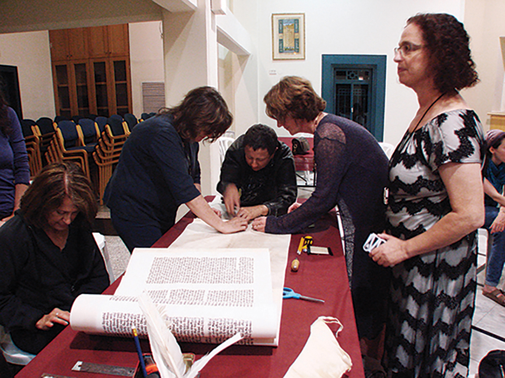
The highly scripted ritual performances, material processes, and acts of mediation that characterize the Torah scribing process.

Leslie Atzmon
Professor
Eastern Michigan University

According to the editors, Sami Sjöberg, Mikko Keskinen, Arja Karhumaa, the volume The Experimental Book Object considers how “historical and contemporary experimentation… has challenged what books are and could be from the perspectives of materiality [and] mediation.” Separating holy artifacts from mundane objects is one the most crucial mediations within most cultures—and it typically involves design. This mediation of materials commonly takes place through an elaborate series of ritual performances, some of which end up with a freshly designed sacred object.

In my chapter for The Experimental Book Object, “Gender, Transgression, and Ritual Torah Preparation,” I focus on the creation of a kosher Torah scroll. I am particularly interested in the highly scripted ritual performances, material processes, and acts of mediation that characterize the Torah scribing process.

This rule-bound undertaking—which involves interactions among the mundane materials used to make a kosher Torah scroll, the bodily and cognitive actions of its scribe, and the environment in which it is created—transforms a set of quotidian materials into a singular holy book object. Because the creating parameters are so strict, one could argue that a kosher Torah is not an experimental book. But I maintain that it is.

Making a kosher Torah scroll that is fit for ritual use is traditionally believed to be prohibited for women. I argue that this is due to women being considered contaminated two weeks out of every month due to menstruation. In this chapter, I use The Women’s Torah Project (2010)—which produced the first Torah written and embellished by an international community of women—as a test case for the role that gender or the gendered body might play in creating an experimental book.

I have long been fascinated by how designers use embodied thinking and making processes to transform raw materials into functioning objects. I have also been fascinated by the processes for making objects that are ostensibly imbued with holiness, such as a kosher Torah scroll. Exploring the relationship between these parallel processes taught me something about design and embodiment. Considering the role that bodily contamination plays in the Jewish bias against female Torah scribes, and realizing that the Torah scribing script is inherently ungendered, gave me new insights into how critical embodiment is to making processes. It also revealed that embodied making or ritual can be exclusive—or inclusive.

Writing this chapter also tested my response to the question “what makes an experimental book?” In The Open Book Project (2014) (https://infinitemiledetroit.com/The_Open_Book_Project.html), Ryan Molloy and I argue that experimental books challenge the definition of what a book can be, and that those who make experimental books interrogate aspects of book-ness. By this definition a Torah scroll is not an experimental book. In her Afterword for The Experimental Book Object, Johanna Drucker writes: “Leslie Atzmon’s discussion of the Women’s Torah Project…offers a significant insight into the way an act as basic as participation in the scribal production of a sacred text can be profoundly transgressive” (Drucker 2024, 306). By understanding making as an embodied process that involves the interplay of the scribe, materials, and environment, I argue that the transgressive act of a female Torah scribe challenges the making process and does interrogate book-ness. In this way, a Torah scribed by one woman or a group of women is indeed an experimental book.

Excerpt

Leslie Atzmon, “Gender, Transgression, and Ritual Torah Preparation” in The Experimental Book Object: Materiality, Media, Design, Sami Sjöberg, Mikko Keskinen, Arja Karhumaa, eds., London: Routledge, Copyright (2024), 216-217. Reproduced by permission of Taylor & Francis Group. 

The guidelines for the Hebrew letter beit … illustrate the meticulous process to be used for drawing each letter, as well as the critical traditional relationships between each letterform and the other letters (Hebrew letter names are in italic):

Beit: One should take care that the part which protrudes behind is square, so that it will not resemble khaf. If it resembles khaf, it is invalid, and if it is unclear, one shows it to a child (as explained in siman 6). Ideally the right-hand side of the roof has a little prickle pointing to the right and the left-hand side has a little prickle pointing upwards. According to the kabbalah [mysticism, or tradition] it has a thick heel at the bottom so that it resembles a dalet in the throat of a vav; if so, it must be squared at the top to resemble dalet, and have a substantial heel at the bottom which would be the head of the vav. Its height and width should both be three nib-widths, and the gap in the middle should be one nib-width wide (Darkhei Moshe) (Keset Ha Sofer as quoted in Taylor Friedman).

Each letter has specific detailed scribing rules like these ones for beit. Each letter must also have a certain amount of white parchment showing around it. The white spaces within and between letters are analogous to the white fire of the primordial Torah discussed in the previous section, and this letterspacing is integral to a Torah being considered kosher.

This project was the 2024 Design Incubation Educators Awards winning recipient in the category of Scholarship: Publication.

Biography

A designer and design historian, Leslie Atzmon writes on both experimental books and design and science.

In 2014, she edited The Open Book Project book, featuring a critical Introduction by Atzmon, a related exhibition catalogue, essays on the book, and an experimental book design workshop section. Currently she investigates the intersections between design and science.

In 2016, Atzmon was in the UK on a Fulbright fellowship at Central Saint Martins, UAL doing research on Darwin and design thinking.

In 2019/2020, she curated the exhibition Design and Science, which ran at Eastern Michigan’s University Gallery and The Esther Klein Gallery/Science Center in Philadelphia. Atzmon also edited a collection entitled Design and Science (Bloomsbury 2023). This collection examines overlap between design and science through visual metaphor and modeling; biomimicry and biodesign; makers and users; and data manifestation. Atzmon is working on a biodesign textbook with Professor Diana Nicholas of Drexel University.
Variable

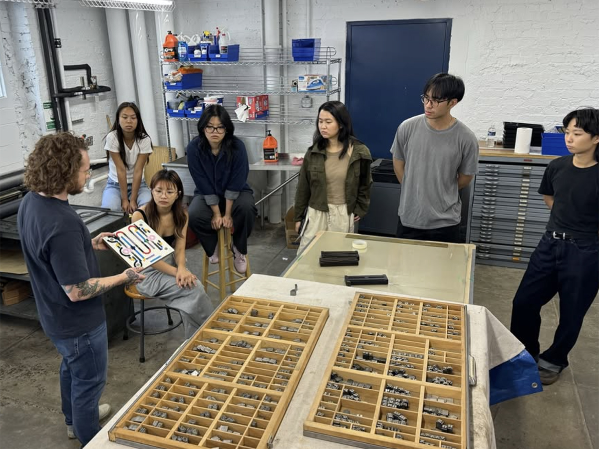
The course uses the metaphor of building cars (fonts) to drive/cruise to unexpected and new (typographic) destinations.

Kelsey Elder
Assistant Professor
Carnegie Mellon University

Variable is an elective that is the pedagogical manifestation of my research and creative practice surrounding typographic technologies, from the historical precedent to socio-cultural impact to the prosodic and practical potentials of formats today. It is part critical seminar and part experimental form laboratory. The course uses the metaphor of building cars (fonts) to drive/cruise to unexpected and new (typographic) destinations. Variable is divided into five mini-projects culminating in a final 5-week self-directed study project. Students investigate the socio-cultural impact of typographic technologies through embodied experiences and social activities. Talks and readings support by providing contextual history and future speculation to the world of typographic technologies. The projects allow students to learn and practice conventional techniques (letterpress) and novel techniques (variable fonts plus scripting) to design, render, and document glyphic forms. The course began as a graduate-level elective at the Rhode Island School of Design. It most recently ran as an undergraduate elective open to all majors at Carnegie Mellon University.

In the first project, Balance Bike, students learn about foundry type, printing, and type design foundational skills in Glyphs 3 through a collaborative alphabet prompt. This component-driven digital lettering exercise is then translated ‘type-high’ to letterpress by using a custom 3/4″ MDF and Lego Kit set up inspired by Pedro Neves’ “LegoType” letterpress printing course at UIC. In the second project, Kit Car, students practice drafting and basic type design practices (drawing, spacing, testing) through a component-driven workflow. Students are encouraged to observe the world around them and distill a kit of shapes from their insights. These sketches are turned into a digital set of parts (components) used to create a font; letters, icons, and/or patterns. This project picks up metaphorical and generative speed in project three, Gravity Racer, which introduces variable fonts and the generative potential of variable font workflows. Students expand their Kit Cars by adding one, two, and three axes through a series of workshops. They are also introduced to troubleshooting in font workflows, including scripting. Project four, Paint Booth, introduces color. The project introduces color font formats, including SVG, COLR/CPAL, color variable fonts, and layered font workflows. Students explore using these complex formats on the web, in print, and in interactive mediums they are already familiar with, illuminating each format’s opportunities and challenges. The final low-stakes project is titled Dune Buggy. In it, students remix, hack, and/or alter an existing open-source font through OpenType Feature writing, scripting, and developing programs/tools that can render their fonts. Students explore writing positional features, substitution features, and scripts that can manipulate vector data both in Glyphs 3 and outside of it (web, Processing, P5.js, Python). For the final 5-weeks, students can expand/revise/combine prior explorations into a culminating final self-directed study project titled Grand Prix.

While there have been necessary updates to the prompts due to the advancing nature of font technologies, the overall pedagogical methodology remains the same. The methodology is designed to reduce barriers related to typeface design, variable/color fonts, and programming. One significant barrier to learning typeface design is drafting. This is even more significant in variable fonts, where compatibility across drawings (masters) is a technical requirement. Another barrier is the need to craft/make rendering environments that allow these complex formats to flourish, often requiring a bit of ‘off-roading’ (code). The combination of these barriers commonly dissuades design students from engaging with typeface design and tool-making because there is a prevailing notion that it is ‘too technically difficult.’ Stemming from my research into patterning principles found across typographic technologies, I began exploring how to leverage the modular affordances of typeface design software today to reduce the barriers of access to the design sub-discipline. In foundry type, type founders used modular methods to reduce engraving (drawing) time via counterpunches. This allowed forms to be replicated easily; the same ‘counter’ of a /n/ could be used for /h/m/n/ and flipped to make the /u/. Digitally, ‘components’ do the same. Components are commonly used by type designers today not for counter-shapes but for language support—combining letters with marks via anchors. A liberal use of components to instead build letters from, akin to a pixel, when teaching variable fonts minimizes the complexity associated with drawing for master compatibility. One change in the component shape is immediately cascaded across all glyphs that use it. Instead of spending the majority of time resolving incompatible masters across hundreds of glyphs, students could more easily focus on developing their conceptual ideas and engaging the expansive design space of variable fonts and their generative possibilities when combined with computation. Scripting and programming custom tools are similarly broken into bits that successfully combine. Students begin by learning simple Python commands to troubleshoot their font. Then, OpenType Features, scripting, and basic custom program/tool making. Finally, they can combine and expand these skills towards their final project idea.

While access to type design technologies has perhaps never been easier, there remains a significant gap between the rate at which font technologies are developing in the field and the access to these emergent workflows in design education. Young designers must be given the ‘right to repair’ the linguistic tools of today and should be empowered through their education and lived experiences to create the ones of tomorrow. After all, type designers are responsible for stewarding the language traditions of our elders past, present, and future… and innovating new forms of communication. One of the most potent and effective ways of making the future of text-based communication more equitable is to have more type designers–or at least designers who have some typeface design experience and skill. This elective seeks to contribute to this future by providing access to conventionally exclusive design subdisciplines of typeface design and programming. The course offers a way of teaching at the intersections of typographic technologies, computation, and language to be more elastic to meet the needs of the languages of our lands where they are. Its materials are open for all to use, remix, and share.

This project was the 2024 Design Incubation Educators Awards winner recipient in the category of Teaching.

Biography

Kelsey Elder is an educator, typographer, and type-technology enthusiast based in Pittsburgh, Pennsylvania. He is an Assistant Professor at Carnegie Mellon University, teaching communication design, typeface design, and critical studies. He has previously taught at the Rhode Island School of Design, Purchase College (SUNY), and Virginia Commonwealth University. Elder holds a BFA from the Minneapolis College of Art and Design and an MFA from Cranbrook Academy of Art, with additional studies at the University of Reading and the Plantin Institute of Typography. His research on typographic technology’s socio-cultural impact and pedagogical practices has been presented at conferences like TypeCon, and by invitation for institutions including the Herb Lubalin Center, Museum Plantin-Moretus, and LAABF. His workshops on type design, including variable/color fonts, have been held at ATypI Brisbane and other venues. When he’s not teaching, crafting letters, or tinkering on a press, you’ll find him hanging out with his cats.

Maternal Health Hackathon: Community-Led Design for Reproductive Justice in Arkansas

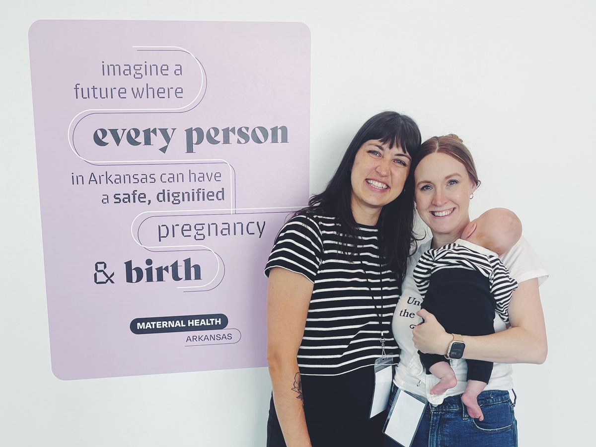
Participants from across the state were gathered to identify the root causes of the maternal health crisis and generate actionable visions for change

Bree McMahon
Assistant Professor
University of Arkansas

Alison Place
Assistant Professor
University of Arkansas

Since 2019, the maternal mortality rate in the United States has increased by more than 15%, according to the CDC. While the number of women who die during or after childbirth has fallen globally in recent decades, it has nearly doubled in the U.S. since 1987. In Arkansas, the maternal death rate is one of the highest in the nation. Arkansas also ranks fourth among states where a majority of women live in a maternal healthcare desert, with 37 counties that do not have a single OB/GYN. Furthermore, Arkansas has the highest teen pregnancy rate in the country and, since the Dobbs decision in June 2022, the fourth strictest anti-abortion laws in the country. The lack of access to providers coupled with laws that lead to forced birth has created a complex crisis of reproductive justice in the state, which disproportionately affects women who are poor, Black, and live in rural areas.  

Understanding the crisis of maternal health in the United States is difficult due to a lack of data, as well as a lack of access to data, because there is no national system for tracking maternal health issues, and laws and guidelines vary from state to state. In 2020, funded by a federal legislative proposal, the Arkansas Maternal Mortality Review Committee published findings that cited a distinct lack of data in the state as a key barrier to improving outcomes. In Arkansas, another significant challenge is the disparate and disconnected nature of birth worker communities. The experiences and perspectives of stakeholders vary widely, and there is a lack of collective understanding of the roots of problems or possible solutions. 

As designers, we explored how design can help untangle the complexities of birth and motherhood and dismantle the systems that perpetuate oppressive and manipulative practices. We were interested in how disparate stakeholders might provide valuable perspectives on this crisis, which could help to articulate a path forward. When it comes to complex systems, designers have a unique ability to approach issues from a collaborative mindset while also keeping in mind users and desirable (and undesirable) outcomes. 

Since 2022, we’ve teamed up with a group of researchers at the University of Arkansas with backgrounds in nursing, business, and design to generate various community-led design approaches to addressing the maternal health crisis. Inspired by the 2014 “Make the Breast Pump Not Suck!” Hackathon at the MIT Media Lab, we hosted the Arkansas Maternal Health Community Hackathon in 2023. Traditionally, hackathons are multi-day events attended by multidisciplinary professionals, such as programmers, designers, and engineers. While typical hackathons are rooted in patriarchal tech culture, feminist researchers and designers have recently co-opted them as participatory spaces for social change. With an emphasis on relationship-building and care, feminist hackathons lay the groundwork for a plurality of community-led solutions to complex problems that are equitable, sustainable, and inclusive.  

The Arkansas Maternal Health Community Hackathon was a free one-day event that brought participants from across the state together to identify the root causes of the maternal health crisis and generate actionable visions for change. The two primary goals of the hackathon were to start conversations and build connections, so we designed the event to make people feel comfortable and to accommodate a wide variety of needs. Nearly 100 people registered for the event, and 72 of them attended. Attendees included parents of all genders, birth workers, nurses, doctors, midwives, doulas, public health experts, legal experts, policymakers, journalists, designers, and artists. We were strategic in our promotion of the event, focusing especially on inviting people from rural areas of the state and practitioners with expertise in marginalized populations. Funding was provided to cover travel and lodging for attendees who came from other areas of the state.  

Programming was focused on clearly framing the maternal health crisis and providing opportunities for attendees to form deep connections and dialogues. The day’s events included two keynote speakers; an advocacy session on how to talk to legislators about maternal health; a documentary screening by Every Mother Counts, a national organization devoted to maternal health; a networking and storytelling space; a resource room; a pre-/post-natal yoga session; and free childcare. With the support of facilitated activities and an on-site makerspace, some participants formed teams to address specific problems related to maternal and infant health. Volunteer designers worked with practitioners and organizations to strategize ways to approach various problems and discuss possible outcomes. Projects completed as a result of the hackathon included promotional materials for a local midwife, information design about prenatal care options for a local hospital, screen-printed tote bags with home birth kits for a local midwife, and a strategy and prototype for a website for the women’s hospital. We captured the perspectives of attendees by inviting them to participate in a qualitative research study about the barriers to maternal health in the state. We also produced a short documentary about the event (link in PDF). 

The impact of the event was evident in the overwhelmingly positive feedback we received. We heard from dozens of participants during and after the event that it was incredibly meaningful for them to come together in a supported space to work toward addressing this enormous problem. Many said they would like the hackathon to be an annual event. We are excited by the relationships formed and the community built through this one event. With the feminist hackathon as a guide, we are continuing to build a model for participatory design with diverse communities to build coalitions in the uphill battle toward reproductive justice in the South.

This project was the 2023 Design Incubation Educators Awards winner recipient in the category of Service.

Bree McMahon is a designer and educator driven by examining complex topics through dialogical prompts that encourage conversation, critical perspective, and collective learning. She is an assistant professor of graphic design at the University of Arkansas School of Art and currently serves as the inaugural director of graduate studies for the Master of Design in Communication Design program. Her research is situated within design pedagogy and the state of the design discipline. After the birth of her first child, she established an additional research trajectory concerned with maternal health, health literacy, and storytelling for improving birth outcomes in the United States. Prior to teaching, she worked with start-ups, small businesses, and non-profits within her various communities across the country. She received her M.G.D. from North Carolina State University College of Design and previous degrees in graphic design and art history from Carthage College in Kenosha, Wisconsin.

Alison Place is a designer, educator, and researcher who works at the intersection of feminism and design to create spaces for critical making and radical speculation. She is the author of Feminist Designer: On the Personal and the Political in Design published by MIT Press in 2023. She is an assistant professor of graphic design at the University of Arkansas School of Art, where she also serves as the director of the graphic design program. She has held several leadership roles in the design community, including two terms on the AIGA Design Educators Community National Steering Committee, and has earned multiple national awards for her scholarship and creative work. Previously, she worked for more than ten years as a creative director and designer for nonprofit and higher education institutions. She earned an M.F.A. in experience design from Miami University of Ohio, as well as degrees in graphic design and journalism from the University of Cincinnati College of Design, Architecture, Art, and Planning.

Visualizing Self-Tracked Data to Navigate Well-being

An explorative process, grounded in Positive Psychology’s core concepts like gratitude, acts of kindness, goal-setting, and mindfulness

Yvette Shen
Associate Professor
Ohio State University

As a visual communication design educator specializing in Information Design and Data Visualization, Shen views teaching as a collaborative journey of discovery with her students. The journey in education here goes beyond honing technical skills, venturing into an enlightening realm where learning outgrows traditional methods and tools.

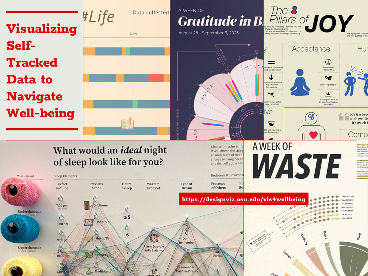
Since 2018, students entering her classroom have embarked on this explorative process, grounded in Positive Psychology’s core concepts like gratitude, acts of kindness, goal-setting, and mindfulness. Through meticulously structured visualization projects that involve tracking and visually rendering their behavior and emotion over time, they not only learn design skills but also engage in profound self-reflection, leading to meaningful well-being insights. In these classes, students engage in the active self-tracking of their daily experiences, encompassing everything from emotional states and physical activities to altruistic behaviors and environmental interactions. This process, supported by a combination of manual logging and digital tools and rooted in Positive Psychology principles, yields a rich dataset. This data becomes a canvas for each participant to visualize and analyze, offering unique insights into students’ narratives.

This educational strategy bridges the practical application of data visualization with the theoretical constructs of Positive Psychology. During the COVID-19 pandemic, for instance, students’ self-tracked metrics evolved beyond mere numbers. Interpreted through Positive Psychology principles, these metrics narrated stories of resilience, coping, and the joy found in everyday interactions. Acts of kindness, when quantified and analyzed, transformed into powerful reflections of character strengths such as empathy and compassion. The synergy of data visualization with Positive Psychology equips students with a dual-lens: the self-tracking acts as a reflective mirror, while Positive Psychology offers interpretive tools to decipher these reflections. More than 180 students have engaged with this pedagogical model over the years, revealing that the alignment of daily actions with personal values fosters a sense of purpose. Moreover, the act of savoring positivity encourages students to cultivate an appreciative outlook on life.

Navigating through the data visualization process presents its challenges. Students must make coherent sense of raw data and determine the most impactful visual representations. Dissecting qualitative data to discern patterns and crafting personal stories from it remains a continuously evolving puzzle, demanding critical engagement and thoughtful interpretation. While the course centers on the foundational principles of information design—including the gathering, sorting, categorization, and analysis of information—the incorporation of Positive Psychology highlights a vibrant nexus between data visualization and personal well-being. Students not only master design intricacies but also witness the empowering effect of design on individual well-being. They emerge with enhanced data literacy, design thinking skills, and a strengthened culture of introspection and ongoing personal development.

This educational journey in Information Design and Data Visualization aims to transcend scholarly pursuit; it seeks to become a transformative experience that enriches student lives. It cultivates an appreciation for the storytelling power of data and deepens the significance of introspection in personal growth. The hope is that this approach to Information Design will exemplify how the meticulous art of visual communication, in synergy with human-centered design philosophy, can illuminate the path to holistic wellness and enlightened self-awareness.

This project was the 2023 Design Incubation Educators Awards runner-up recipient in the category of Teaching.

Yvette Shen is an Associate Professor in the Department of Design at the Ohio State University and the program coordinator in the area of Visual Communication Design. The focus of her current creative and research pursuits is centered on the field of information design and information visualization. Specifically, she is interested in exploring how design can facilitate a deeper understanding of complex information and foster increased interest in learning, as well as how visualization and user experience can promote positive behaviors and emotions. Yvette holds an M.F.A. degree in Visual Communication Design and a B.S. degree in Computer Science.