The Keywork: Using AI for Insight, Not Replacement, in Creative Practice

The ethical use of artificial intelligence.

RJ Thompson
Associate Professor

University of Pittsburg

The rapid evolution of generative AI has reshaped professional practice in marketing, communications, and design, introducing both opportunities for efficiency and challenges of adaptation. While organizations increasingly adopt AI—55% already using it for marketing and communications according to Gartner—many professionals encounter decision and adaptation paralysis amid an overwhelming number of tools and pressures to “adapt or perish.” This presentation argues that the essential question is not whether AI can increase the quantity or incremental quality of creative work, but rather how it can sustain and expand human creativity in meaningful ways.

Our inquiry centers on divergent thinking as a method for transforming AI outputs into catalysts for original work. Techniques such as inverting AI-generated story beats, reframing prompts into yes/no pathways, and intentionally opposing machine-suggested structures create conditions for unique, non-homogenous outcomes. These approaches resist the creeping uniformity of AI-produced content, which risks reducing professional output to predictable patterns and disengaging audiences.

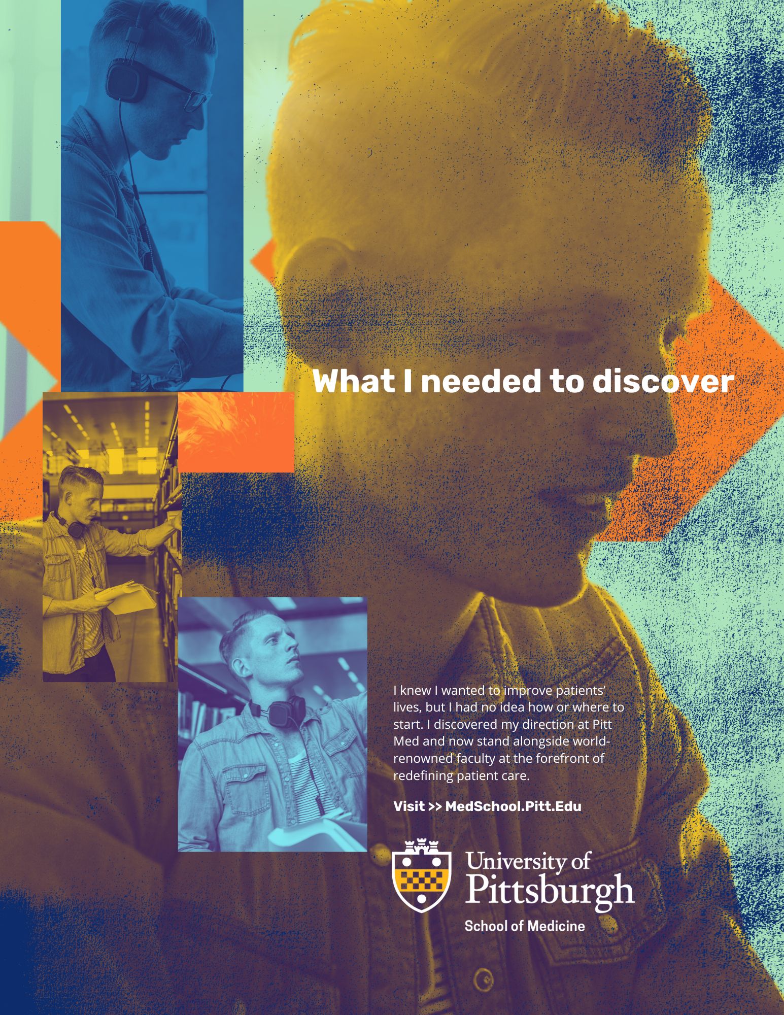
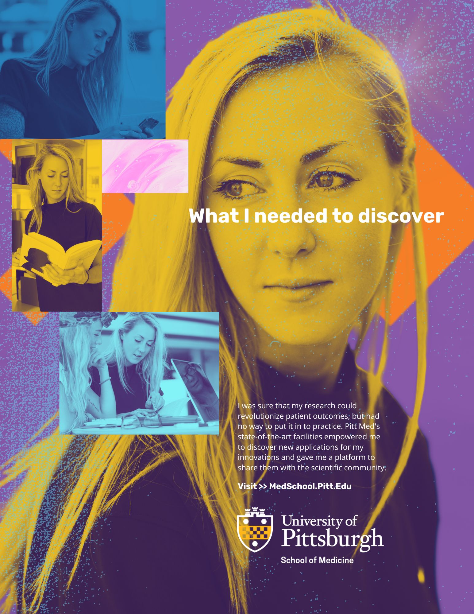
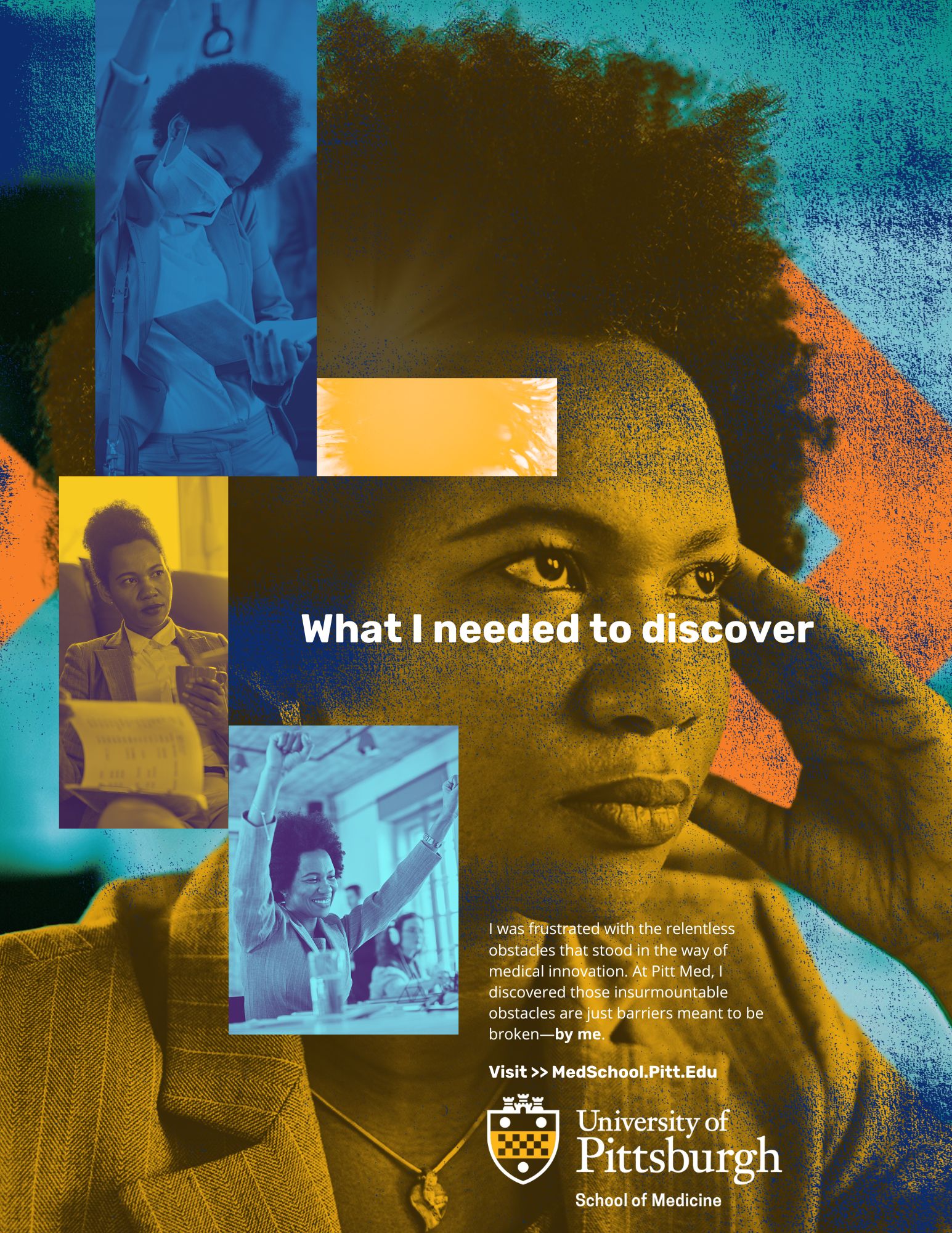
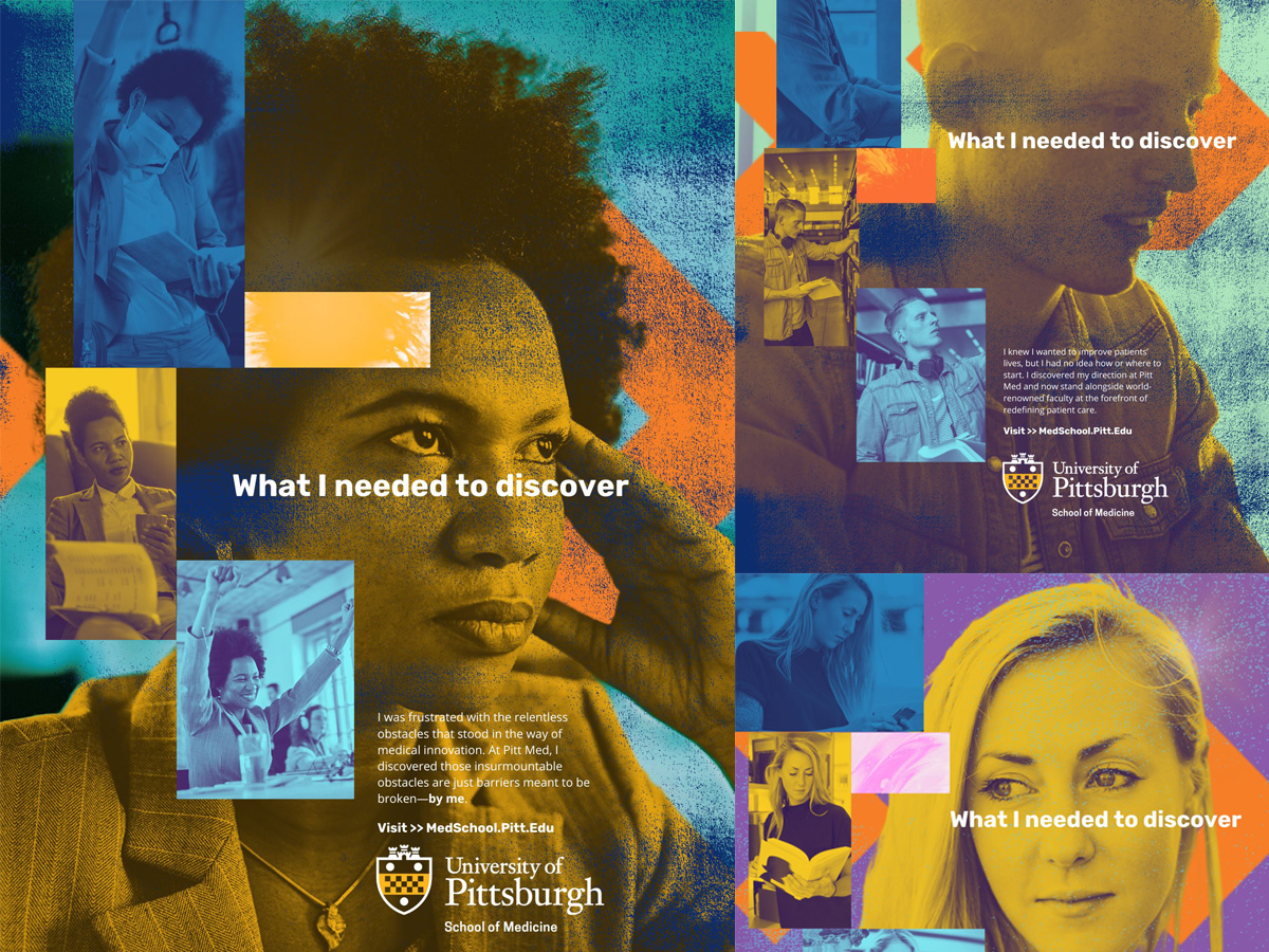
To ground these concepts, we present The Keywork, a project conducted by the University of Pittsburgh’s Health Sciences Strategic Communications team. Leveraging ChatGPT for qualitative data analysis, the project processed five years of institutional content to identify brand pillars and generate insights that freed capacity for human-centered creativity. Here, AI served not as a replacement but as an amplifier—streamlining analysis so designers and communicators could focus on innovation, resonance, and impact.

Our findings suggest that the key to thriving with AI is to treat it as an interpretive and analytical partner, not a creative substitute. By adopting divergent thinking practices and positioning AI as a tool for inspiration and capacity optimization, creative professionals can ensure that their work remains unique, resonant, and enduring in an increasingly AI-saturated landscape.

This design research is presented at Design Incubation Colloquium 12.1: Virtual Online on Friday, November 14, 2025.

Explorations of Data Lists: How Type, Hierarchy, and Color Reveal the Stories About the Titanic

Level one typography students think about data and typographic hierarchy.

Peggy Bloomer
Adjunct Professor
Quinnipiac University
Southern Connecticut State University

In this project I hoped to make level one typography students think about data and typographic hierarchy with. In my experience, students are not concerned about the data that is collected about them. I hoped to broaden their understanding of the power of data through their creation of a large format poster (24” x 26”) using lists about the passengers on the Titanic purchased from the “Encyclopedia Britannica.”

The textbook for the class is Ellen Lupton’s Thinking About Type. This assignment is an adaptation of Lupton’s hierarchy assignment “Long Lists.” According to Lupton, hierarchy is the organization of content using the spatial clues of indents, line spacing and placement. Other graphic elements that distinguish content include size, style and color.

Researching the list of passengers, students were asked to find human stories. The lists contained information about 1st, 2nd, 3rd class passengers and employees of the Titanic. Surnames, servants, gender, age, nationalities and origin of embarkment were provided. The poster was created in InDesign without photographic images. Students could use and InDesign tools to create color elements and many created ships, funnels, waves and other shapes.

The traditional process of information gathering, sketching and mocking up was used for designing the posters. In-class critiques of 3 smaller 11 x 17” versions helped students realize what was successful or not. Final versions were created to the larger size, printed, presented in class and hung in the department hallway for viewing.

In conclusion, most students realized the economic and gender consequences for passengers. One student used color to emphasize families and the impact was powerful: families died from infants to parents. The students gained knowledge about the power of simple data and almost all of them used size, style and color effectively. The use of indents, line spacing and style guides were not as successful. In the future, I plan to incorporate a slide show of memorials that include powerful images such as Flanders Field, The Vietnam Memorial and the Holocaust Memorial.

This research was presented at the Design Incubation Colloquium 6.1: Quinnipiac University on October 5, 2019.