Make, Print, Share: Collective Learning Through Risograph Printing 

Finding ways to make design learning more tactile, experimental, and accessible.

Kyla Paolucci
Assistant Professor

St. John’s University

Vic Rodriguez Tang
Assistant Professor
Texas State University

Motivation/Problem/Opportunity 

Risograph printing is having a moment. As a technology-based duplication process—often compared to a hybrid of screen printing and photocopying—it is recognized for its vibrant colors, layered textures, and presence in independent publishing and community printshops. While Riso is often celebrated as a trendy or aesthetic tool within design and art contexts, its pedagogical potential remains underexplored. There is an opportunity to frame Riso as a low-stakes, accessible teaching method that fosters technical literacy, collaboration, and community connection. Risograph printing can serve as an entry point into creative-related careers for students with little to no prior experience in art or design technologies. By offering a process-oriented environment where curiosity is enough to begin, Riso broadens participation in creative practice and helps learners reimagine design through experimentation and collective making. 

Thesis 

This project argues that constraint-driven, prompt-based Risograph printing can function as a model for pedagogy by combining technical skill-building, collaborative practice, and community engagement while moving beyond trend-based or perfection-oriented applications. 

Approach/Methodology 

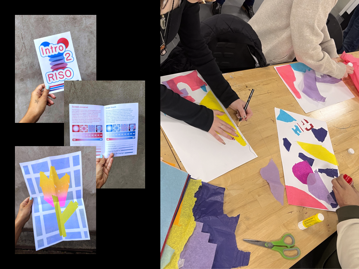
Two educators respond to the same prompts—printing on black paper, executing a four-color separation, or working exclusively on the flatbed—without sharing approaches in advance. The paired responses form a prompt-based archive including prints, prompts, and reflections on similarities, differences, and lessons learned. Over time, this archive evolves into a toolkit of adaptable prompts for classrooms and community workshops, framing Riso printing as both teaching and research practice. 

Results/Outcomes/Analysis 

Unlike short-term workshops, this project cultivates a sustained, evolving body of work that operates as both practice and pedagogy. Outcomes include collaborative prints, adaptable exercises, and a reflective zine compiling process documentation. The project demonstrates how structured experimentation can reduce gatekeeping, promote curiosity, and support equitable access to design education.

Conclusion 

This project reframes Riso as a tool for approachable experimentation and shared authorship, showing how analog technologies can support creativity, inclusion, and critical reflection in design pedagogy.

This design research is presented at Design Incubation Colloquium 12.1: Virtual Online on Friday, November 14, 2025.

Colored Bodies: Cultural Constructs in Standard Color Theory Pedagogy

Some of the most problematic aspects of standard color theory education

Aaron Fine
Professor
Truman State University

Color theory is often presented as a purely formal matter, with no suggestion that the color we are speaking of might apply to our bodies and all that they entail in terms of race, class, and gender. Despite the availability of focused research on isolated aspects of this problem, and more inclusive chapters being added to standard color theory textbooks, our default mode is to privilege a narrative that invokes the color science of Isaac Newton. We often imply that color wheels, primaries, and secondaries are universally applicable phenomena. But the truth is that each of these is a cultural construct with at best a tenuous connection to the natural laws of physics. And when Winckelmann stated, in his discipline founding writings, that “a beautiful body will, accordingly, be the more beautiful the whiter it is” he made perfectly clear that the more (or less) white bodies he was speaking of were our own. 

Drawing on content from my recently published book Color Theory: A Critical Introduction, I will discuss briefly some of the most problematic aspects of standard color theory education and suggest some of the ways we might improve our theory, practice, and pedagogy in this area. Topics include the rise of colorimetry in the mid 20th century, the embrace of spiritual notions about color, and colonialist views of certain cultures being more “colorful” than others. Grounded in scholarly research this presentation is relevant to design theory and pedagogy, but also has implications for creative practice. 

This research was presented at the Design Incubation Colloquium 8.2: Annual CAA Conference on Thursday, March 3, 2022.

Reading Color: Type in and on Color

A synthesized, inductive approach using Itten’s contrast of extension and Albers’s experimental color studies in application to the visual gestalt of typography.

Jeanne Criscola
Assistant Professor
Central Connecticut State University

Much has been theorized about the transformation of communication from cave paintings to written language and how humans employing materials and technologies impacted their evolution. In 1493, Johannes Gutenberg’s technologies marked a milestone for communication and its distribution with the mechanization of movable type printing. The transition from hot type that went obsolete in the 1950s, to cold type that met its demise around 1985 with desktop publishing, was short-lived. Now, digital typesetting technologies offering myriad configurations of size, font, and layout—in seemingly infinite spectrums of color—present limitless opportunities for the practice of communication design.

This fusion of type and color presents challenges for pedagogy and discourse in the fields of typography and color where they have historically been considered separately in books and in coursework. In typography books, examples typically use letterforms in varying degrees of sizes and contrast to demonstrate colors’ influence on legibility. In books on color theory, the properties of color are often demonstrated with pie-shaped diagrams, color wheels, grids, and in continuous bands. Each pedagogy falls short of modeling today’s communication technologies where typography and color are intrinsic, inseparable, and synergistic.

Methodologies that facilitate the study of typography and color in context and in situ would be welcome by educators and professionals alike. For educators, infusing color theory into the study of typography has advantages for curriculum and course development. For the design student, learning color theory with letterforms integrates their study and practice.

This paper sets out to initiate a synthesized, inductive approach using Johannes Itten’s contrast of extension and Joseph Albers’s experimental color studies in application to the visual gestalt of typography.

This research was presented at the Design Incubation Colloquium 6.1: Quinnipiac University on October 5, 2019.

History of Color In Comic Art: Technology, Aesthetics, and 64 Colors

Eli Neugeboren
Assistant Professor
Communication Design
New York City College of Technology, CUNY

Comic books are now considered high art and are included in museum collections around the world. They are given national awards, reviewed alongside literature and are printed on high quality paper. Their origins were not so lofty.

Comic books were cheap. They were printed on cheap paper, with cheap ink, and sold for pennies. To help cut costs special methods of coloring were developed to minimize the amount of ink used on the page. These methods allowed publishers to maximize the intensity and consistency of color while printing on what was essentially newsprint.

Most comics still use the stylistic look that was made necessary by limited resources and technology. The comics we see in comic shops (and online and on our iPads) today still, for the most part, have the same look they did at their inception. They have line art printed over color. The look of comic books is overdetermined and continues to reinforce itself from generation to generation; kids that grow up reading comics copy the style of the art and it becomes their style as well. In the age where digital comics are becoming more and more widespread, and is becoming the standard way to consume them, and where there is no need whatsoever to use line art because it is strictly pixels on a screen, the legacy of printing technology is ever present in every panel on the page and the screen.

This research was presented at the Design Incubation Colloquium 1.3: Parsons The New School on Tuesday, December 2, 2014.

Black and White: Basic Color Terms

Grace Moon
Adjunct Professor
Graphic Design, Dept of Art
Queens College, CUNY

Black and White: Basic Color Terms is the first chapter from a manuscript titled, An Illustrated History of Color, in theory and practice. The overall scope of this book, as the title implies, is to set out a comprehensive account and analysis of the development of color as it has been used by artists, designers, and craftspeople, as well as the history of its theoretical framework and language. The first chapter title is “Black and White; Basic Color Terms.”

First, the impetus for embarking on such a large and generalized topic is that color in academia has been reduced to modernist tropes that leave little to the imagination in its actual implementation especially as we move from pigment and ink to digital space. So entrenched have our ideas about color theory become that in all of the most current books published on the subject none stray from Modernist basic methodology and worse, many are rife with superficial anecdotes without proper reference and incorrect definitions of color terms and concepts. Also the topic of color crosses over into other non-visual disciplines such as anthropology, linguistics, child development, visual science and comparative literature. In exploring the topic of color at the intersection of the arts and sciences I believe we, as visual creators, will have a better grasp of what color is and means within our disciplines.

The first chapter is looking at “basic color terms,” —a label linguists have given to the general hue of a culture’s essential color palette. Industrial societies have eleven basic color terms; black, white, red, green, yellow, blue, purple, brown, orange, pink, grey. Linguists have also determined that color terms have historically developed along a specific path. For instance, preindustrial Black and White; Basic Color Terms societies have four or five basic color terms; black, white, red, followed by green or yellow—and if a culture has a sixth term, then it is blue. But, blue never precedes the other colors. While the sciences have puzzled over these curious findings; why is red always the third term, and why is blue not a term before green or yellow, artists and designers have not yet weighed in on this debate. Visual creators have innately understood the importance and relationships of colors and their dimensions and have a lot to add to this interdisciplinary study. The key points in the basic color term debate as well as point towards its impact within the arts and design fields will be addressed. That is, the impact of artists and designers’ upon basic color terms and the nature of how societies understand color itself.

This research was presented at the Design Incubation Colloquium 1.3: Parsons The New School on Tuesday, December 2, 2014.