Teresa Trevino
Professor
University of the Incarnate Word
Francesco Franchi, graphic journalist, described infographics as “impossibility in its purest form,” using the Penrose triangle to illustrate the complex coexistence of content, design, and data. This reflects the challenges that information designers face when aiming to inform and engage overstimulated audiences.
These challenges resonated in our Information Design studio course. While students begin the semester with enthusiasm, a shift occurs when transitioning from research to design. Confusion often sets in as they struggle to create effective visualization. Observing this recurring pattern over the years, I recently implemented a subtle yet significant change that led to improved outcomes.
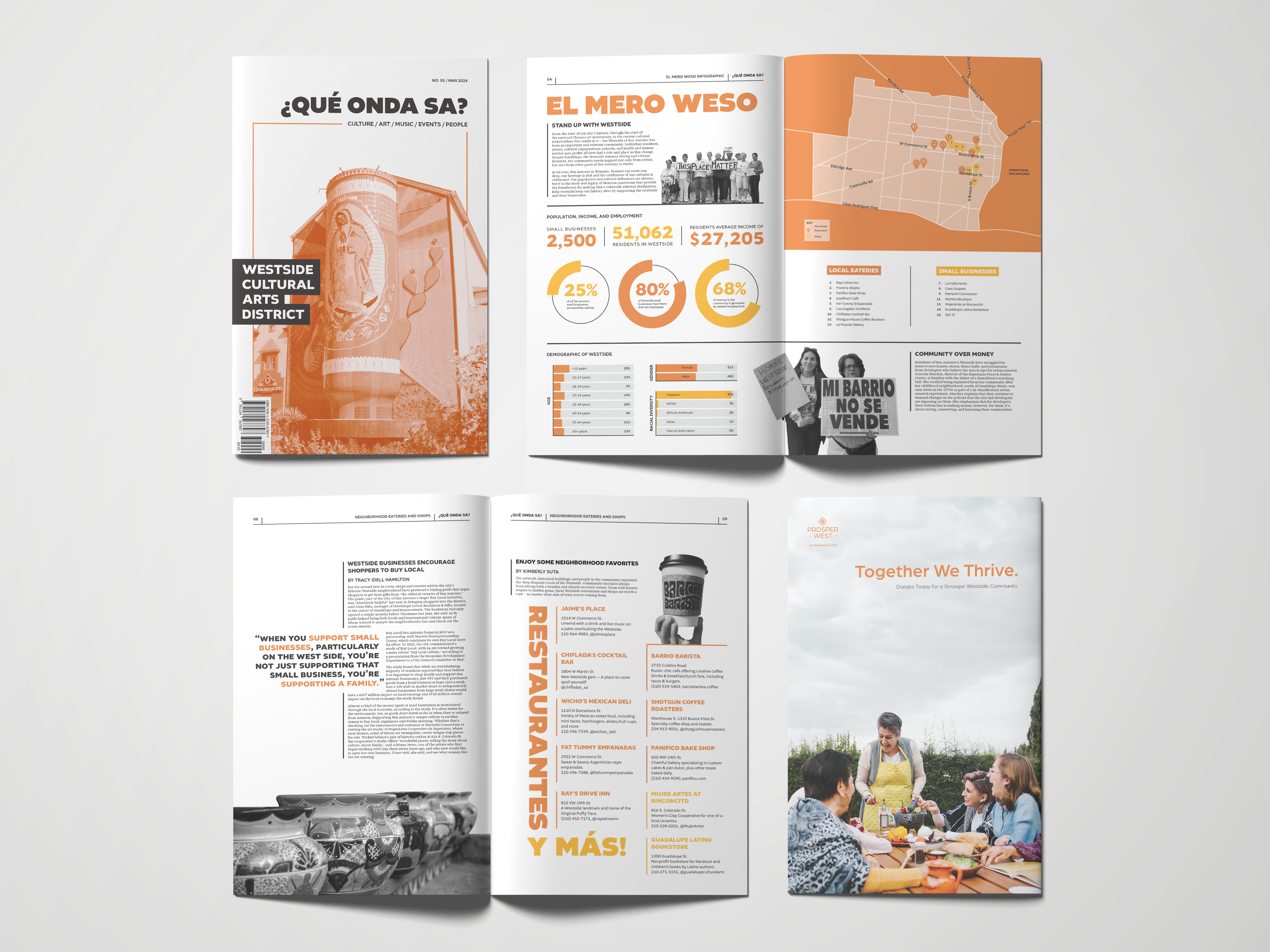
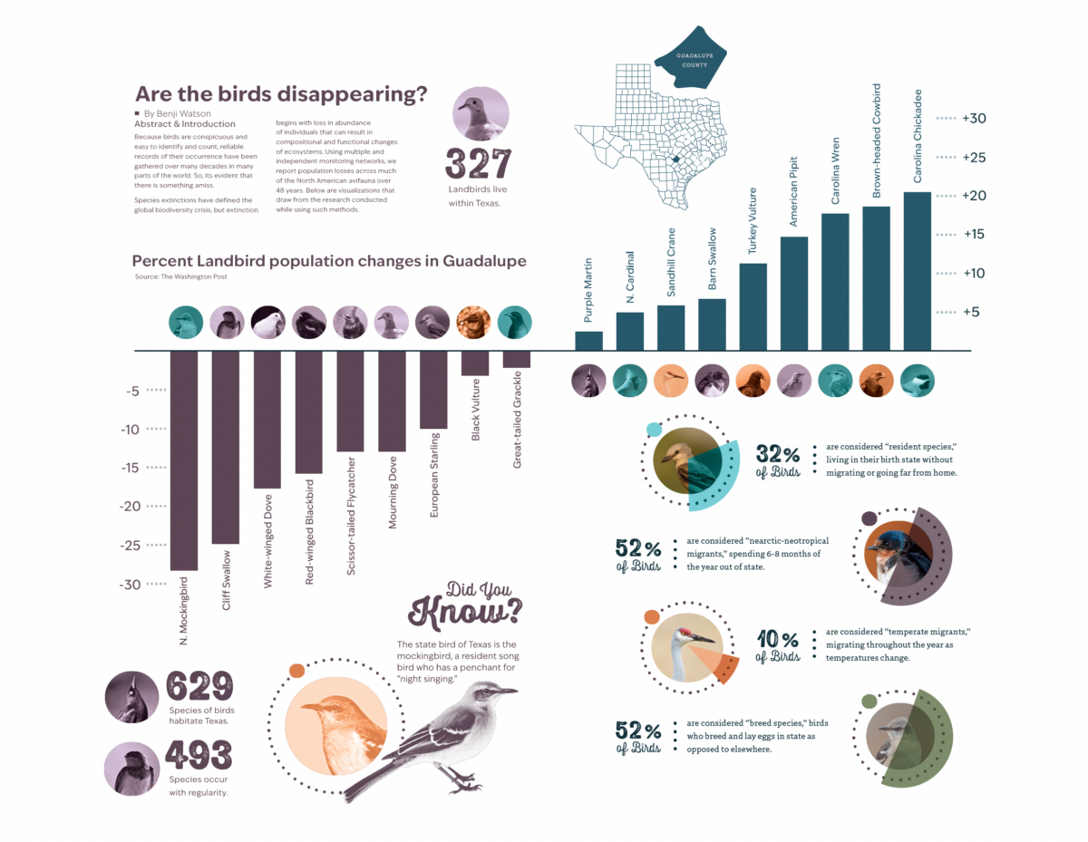
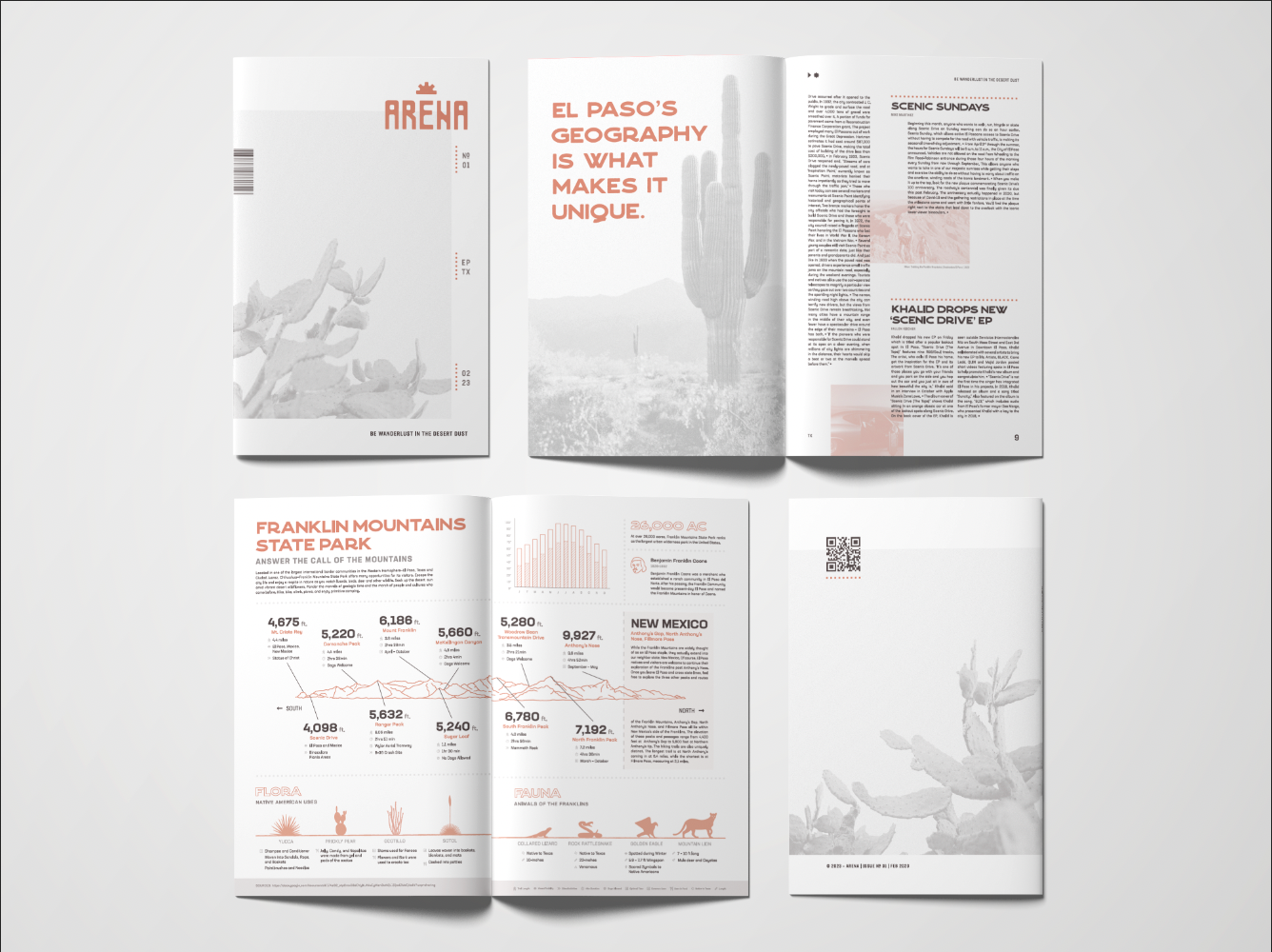
An original 5-week Infographic assignment became the current 8-week “Editorial Infographics” project. Students begin researching and gathering information for a newsletter. The revised assignment required students to design all pages including an infographic as the central spread. Despite the complexity added by merging Editorial and Information design as a unit, students now more effectively understand and display text, images and data.
References such as Franchi’s work for La Repubblica and Intelligent Lifestyle Magazine, along with Manuel Lima’s The Book of Trees: Visualizing Branches of Knowledge, and Nigel Holmes’ Map of Infographia and Infographic Design were instrumental.
The extended project introduced a learning curve, with some resistance to the longer assignments. However, most students reported increased confidence and have incorporated these skills into other projects, with some receiving recognition at design competitions and publications.
I will continue refining this project to enhance students’ information design skills and better prepare them for future challenges.
This design research is presented at Design Incubation Colloquium 11.2: Annual CAA Conference 2025 (Hybrid) on Friday, February 14, 2025.