Dave Gottwald
Assistant Professor
Art + Design
College Of Art And Architecture
University Of Idaho
I was faced with some interesting challenges this past spring when I was asked to revamp our Interaction Design coursework in the Art + Design program at the University of Idaho. I had to bring it up to current industry practice, which was no problem on the syllabi end. Software tools, however—that was going to be tricky. There are currently a handful of applications for UI/UX development that allow for the design of complete interfaces, user flows, and live prototyping. The most popular tool in the industry is a Mac-only product, but more than half our students own PC laptops. Ouch. Industry stalwart Adobe had recently introduced a competing product, but it’s still in beta for PC and Mac, so my university IT department said no go.
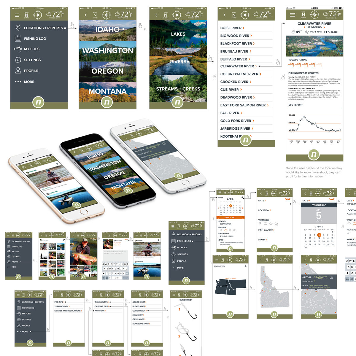
In hindsight, forcing me to innovate and leverage a tool which was already supported was actually the best thing the University could have done. What I discovered is that Adobe InDesign has value far beyond the page—the master pages, robust stylesheet support, and typographic finesse actually make it a winner for interaction design work. I was amazed at how quickly my students advanced, and all were UI/UX first-timers. The advantage they all shared was their familiarity with InDesign from prior courses.
Rather than having to teach students new thinking and completely new software within the same course, I could focus on conceptual pedagogy. I had found a hidden virtue; using a familiar tool in a new context, rather than trying to introduce a new tool. I argue that students in my Interaction Design I course experienced an accelerated learning curve—while producing portfolio pieces exhibiting far higher levels of craft—by repurposing software they had already mastered. All quickly developed fully tested, live, mobile app prototypes within a single semester.
This research was presented at the Design Incubation Colloquium 4.1: San Jose State on Saturday, Sept 30, 2017.
