Chris Lee
Associate Professor
Pratt Institute
This project undertakes the design of a “chop suey” typeface called 1882–1982–2019. The general aim of the project vis-a-vis design research is to explore the capacity of conventional genres of activity in graphic design to narrate historical phenomena, while also figuring design as a vehicle of antagonism, and as a space of contestation. The project enacts graphic design research not by dint of the traditional forms of scholarly research and creative activity that go into it (i.e. as transparents texts written for academic publications, or work created for display in public exhibitions, where both constitute forms of production valorized within through institutional peer-review processes, for instance), but rather by the fact that it produces a form (a typeface) that is not typically legible as an artifact that instantiates scientific knowledge production. Furthermore, such an artifact acts as a case that exceeds the conventional pathways initiating and animating design (i.e. the client brief), and thus does not satisfy even commercial valorization—that is to say, it has little to no prospective value as a commercial product. In sum, the project is an argument for design outcomes as a form of discursive (quasi-)autonomous design-as-research, recognized as such only by the grace of its inclusion in design discourse (hence, the above qualification, “quasi”).
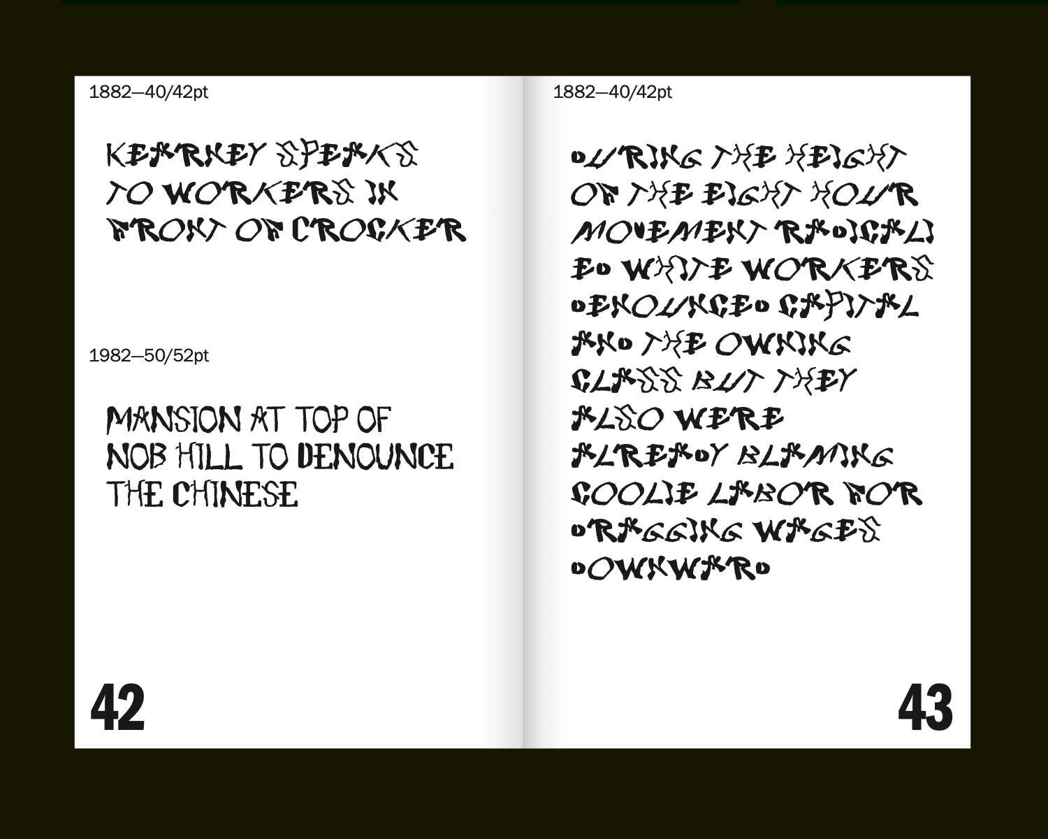
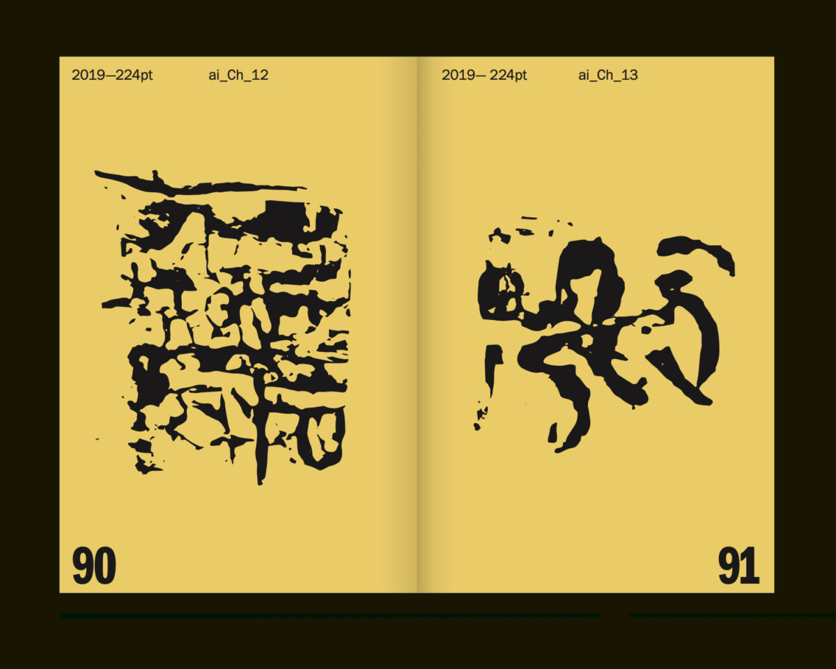
In the case of this project—a typeface in three ‘weights’ (called 1882, 1982, 2019, respectively)—the outcomes serve as vehicles for a historical narration of the status of the “Asian,” or what Iyko Day calls “alien capital” in North American settler-colonial political economy. The primary outcome of this project is the process of producing the typeface itself. This entails a raw archival excavation directly sourced from historical material (1882, the year that the Chinese Exclusion Act was passed by Congress); the “correction” or “refinement” of these according to the kinds of normative idealizations articulated by figures like Gerard Unger, Karen Cheng, etc. (1982, a seminal year in the history of the formation of “Asian-American” as a racial subject position); as well as the generation of AI generated “hanji” (Chinese ideograms) in resonance with Day’s characterization, as well as popular depictions of the “Yellow Peril” that persist from the anti-Chinese attitudes that have persisted from the 1880s until today (2019). In sum, the work aims to prompt a reflection on the extent to which design outcomes are inflected by somatic knowledge and subjective performance (from calligraphic skill to “craftsmanship” in writing AI prompts), in spite of the fact that very little to none of this is residual and legible in the final artifact. Sofie Fetokaki’s work on classical musical performance pedagogy provides a clarifying lens for examining the role of performance and charisma in valorizing and institutionalizing what Diana Taylor calls “performatic” knowledge as objective, inevitable, and stable basis of evaluation in graphic design outcomes in formal educational contexts like accredited design schools.
The typeface is framed by a typographic specimen book that serves the conventional functions of such publications, namely, unpacking the origins/inspirations of the typographical forms. The story that emerges demonstrates the ways that “alien capital” has served as one foil (that is, one Other, amongst whiteness’ many other Others) against which white Euro-American normativity has been defined. Tracing the history of anti-Chinese, and more broadly, anti-Asian animus for over a century and a half, yields an account of attitudes that are resonant with the ones that subtend and stabilize otherwise contestable ideas about validity, correctness, and progressive excellence in typography and graphic design today. As scholars in whiteness studies like Ruth Frankenberg have articulated, “whiteness” lacks its own internally coherent content, and is figured primarily by all the things that it is not. In short, the project aims to serve as a case for examining the way that typographic design has participated in the construction of whiteness. The project casts typography itself as a racialized field, while also functioning as an actuator of what the race scholars Michael Omi and Howard Winant call “racialization.” In this narrative, Euro-American craft is given its content, marked tautologically by aesthetic ideals articulated primarily in contrast to the outcomes of “cheap Chinese labor.”
This design research is presented at Design Incubation Colloquium 11.1: Boston University on Friday, October 25, 2024.